The Ontario Institute for Cancer Research (OICR) is an innovative, translational research institute dedicated to research on the prevention, early detection, diagnosis and treatment of cancer.
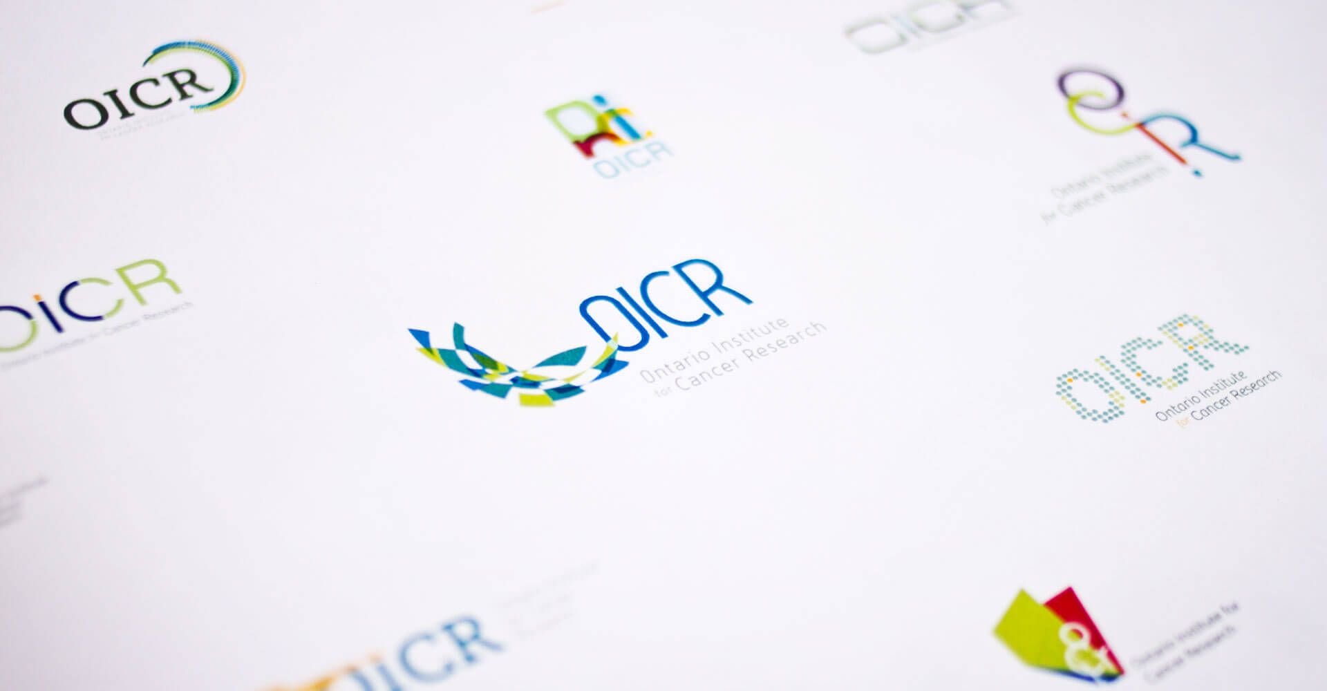
We were engaged by OICR to design a new brand identity for the government-funded organization that was relevant to their research and positioned them as a progressive thought leader.
Identity
The shape of the lettering in the acronym compliments the semi-circular icon and together they form a tight-knit visual identity.
The selected icon that surrounds the acronym is an abstract representation of a common cancer spectrometer reading, so it has meaning to those in the industry.
The green colour palette was selected to represent growth, learning and innovative thinking.