revitalizing a beloved B.C. brand
When Labatt needed a new look for “the beer out here”, they tapped us to spearhead it. We were selected after an extensive RFP process to redesign and revitalize the Kokanee brand. The objective was to recapture the attention of consumers in Western Canada who had let their loyalty drift over the preceding two years. The discount segment and numerous microbrew options had eroded Kokanee’s market share and some attention was needed to bring this prominent west coast brand back into a growth position. The Kokanee packaging had not seen change since 2002 and it no longer adequately conveyed the characteristics of its distinct position as B.C.’s ‘Glacier Beer’. Our goal was to make the most refreshing packaging possible within the context of the ‘mountain playground’ that the brand is synonymous with.
Identity, Packaging

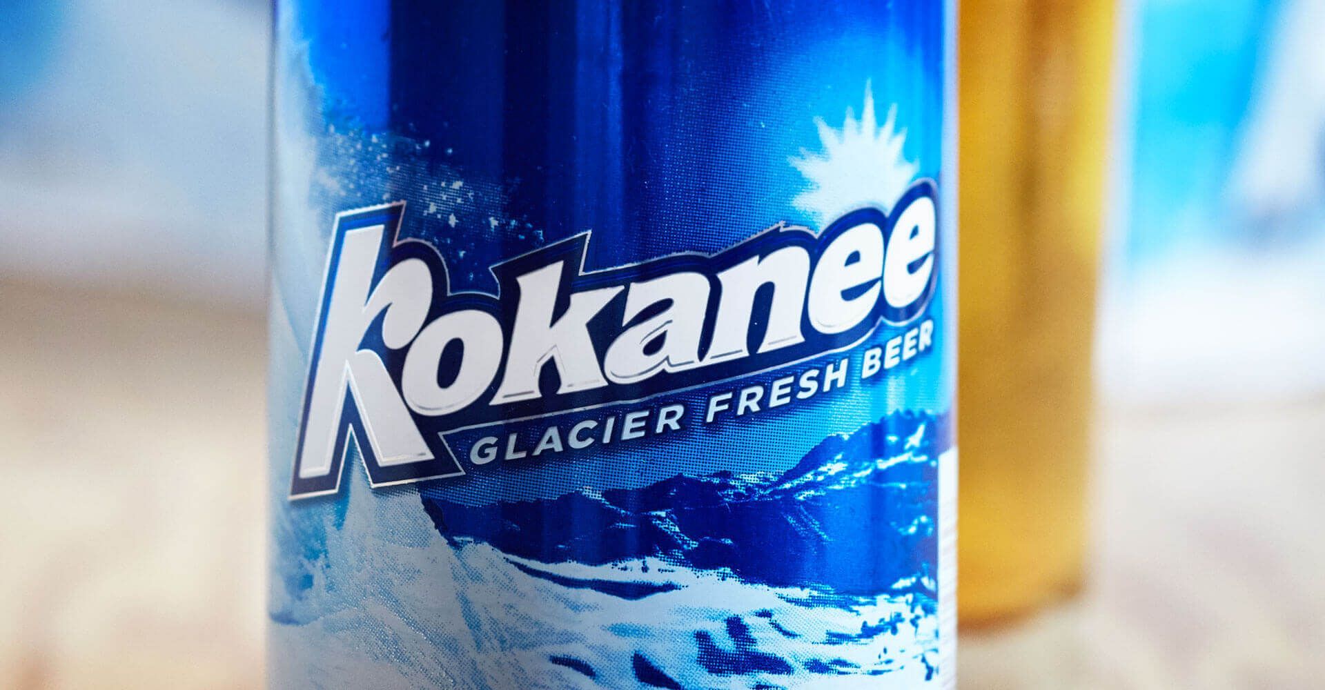
Taking our learnings from the initial brand definition exercises, we embarked on the identity overhaul, starting with the Kokanee logo. We began exploring ways to evolve the design and bring an energy to it that would work with a new backdrop. It was important to retain the iconic ‘K’ that had worked so well as a moniker for the brand in the past. When the final wordmark emerged, it was clear we had a winner. The new logo is bold and striking without sacrificing approachability. Its contemporary styling and upward angle give it energy while the equity of the Kokanee ‘K’ has been retained in a cleaner format.
introducing the "winter playground"
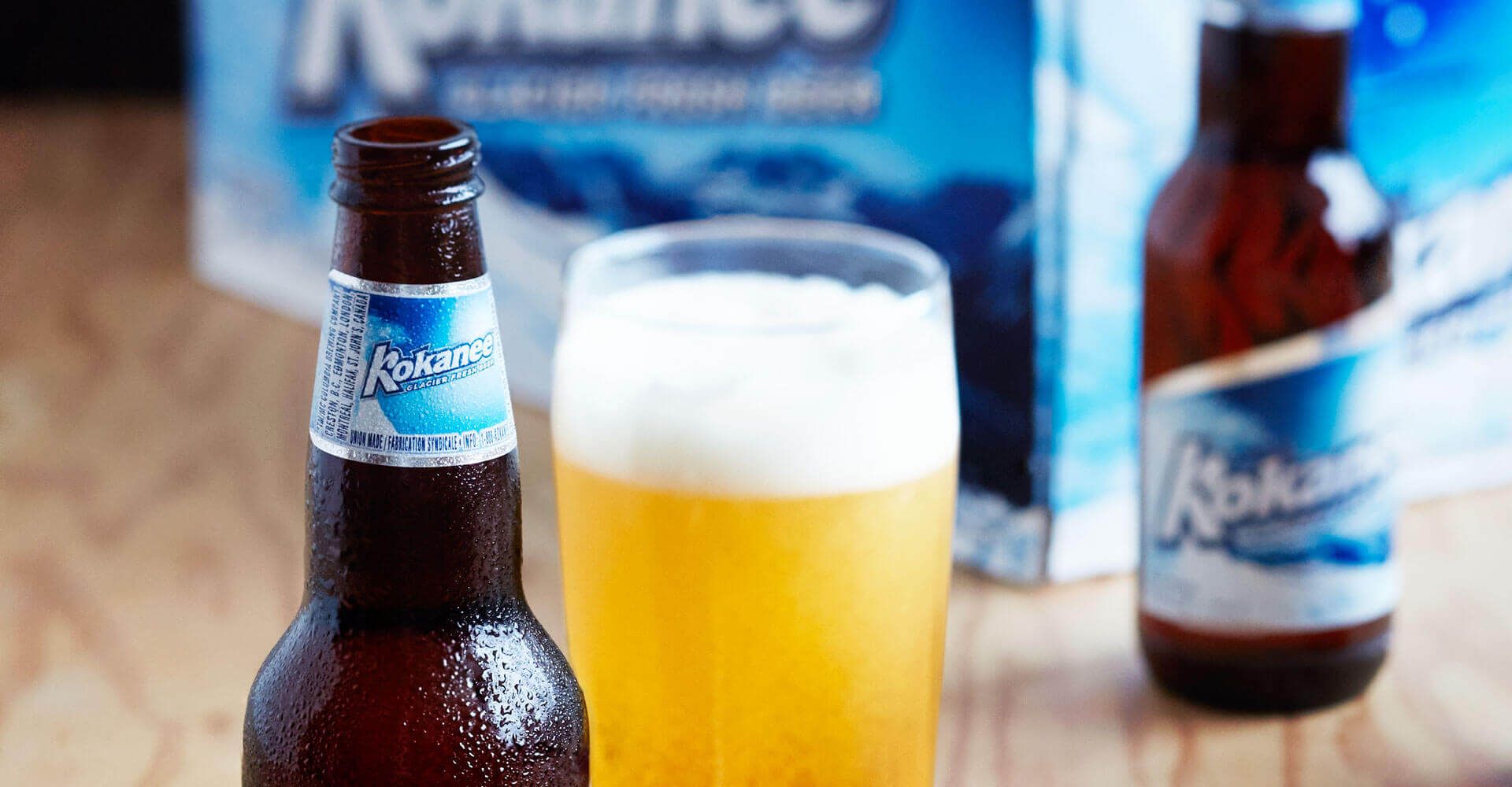
Our next task was to design a bottle, can and carton that would deliver the highest level of refreshment and complement the new logo. Working collaboratively with Labatt, we developed a broad range of concepts from revolutionary to evolutionary. The design that emerged employs a lower elevation mountain image that is more attainable and relevant to consumers as a ‘winter playground’. We introduced a more vibrant blue that embodies the essence of ‘glacier fresh’ and incorporated the sun into the design to capture the feeling of a cold, crisp B.C. mountain day that the core consumer can relate to. The blowing snow off the mountain slope brings another element of energy to the packaging as it drifts over the new Kokanee wordmark.

After research produced some of the highest scores in the company’s recent history, the new packaging was launched in Western Canada on May 25th. The new and improved Kokanee packaging and brand was perfectly positioned for the mass exposure it received at the 2010 Olympics in Vancouver.
“The team at Jump was eager to learn about our challenge and start working on solutions. Their attention to detail, professionalism and creativity are all evident in the new packaging design for Kokanee. Jump’s design produced some of the highest research scores in the company’s recent history and clearly exceeded all of our action standards. We are thrilled with the result.”
Richard Fortin Brand Manager, Labatt Breweries of Canada


