Tavolo: An Interview with Eric Boulden
23, Mar. 2015
Prior to his departure to Las Vegas for the 2015 A.R.E. Awards, I caught up with Eric Boulden, President of Jump Branding & Design Inc. and talked to him about the agency’s most recent design submission. Here’s what he had to say.
KH: This is five years in a row for Jump at the A.R.E. Awards…how does it feel to know that your designs continue to impress the judges?
EB: It feels great to be selected as a finalist again this year, and to know that our designs continues to be recognized by the design industry and relevant with our client’s customers. The Tavolo concept is one that we’re very proud of, and we’re just thrilled that it was recognized against some really great design concepts from all over the world.
KH: What was the inspiration behind the Tavolo design, and how do the elements in the restaurant support that?
EB: A table, or tavolo, is a symbol of hospitality, and no one fills a table like Italians. In Italy, a dining table is a gathering place, and along with good food comes good conversation. We took the approach that a guest at Tavolo should be able to immerse themselves in the experience, and escape from their everyday life to taste, live and enjoy Italian gastronomy, even if it’s just for a few moments.
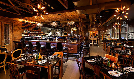
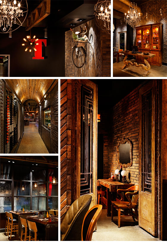
The objective of the interior design for Tavolo was to showcase Italian hospitality and the theatre of the kitchen, where cooking is the show, and the guests are the spectators. We wanted to create an authentic guest experience by blending old world with new, to create a ‘Vintage New’ theme. We defined it through architecture and then found items of reclaimed furniture and art installations to create discovered moments that tell stories of a rich history and create visual interest within the space.
KH: How does the design enhance the overall customer experience?
EB: The heart of Tavolo is about bringing people together over good food. Our client’s penchant for storytelling shines through in his love for eclectic discovered objects. The restaurant features items like vintage and modern chandeliers, antique mirrors, reclaimed Egyptian doors, early 19th Century feature tables, a grappa cabinet; every artifact and detail tells a story. We layered Tavolo with old and new artifacts to enhance the customer experience and create memorable moments within. Think stories on top of stories. In addition, a variety of seating exists to tailor to the guests’ dining preference and mood.
KH: Tavolo is a stunning space. What is it that makes this design so unique?
EB: The materials were key contributors to the tactile experience. Features like the copper surfacing on the bar, Nero Marquina marble surfacing, reclaimed Hemlock planks, natural oil rubbed live-edge walnut, weathered brick veneers in a herringbone pattern, and darkened grout all give the space elegance and warmth.
The ‘Vintage New’ theme is all about mixing past with present, in celebration of the future. We dug deep for the interesting décor, hitting antique shops and reclamation stores around Southern Ontario. Digging for treasure takes patience but can be very rewarding.
KH: The kitchen is incredible. Why did you make it such a feature of the space?
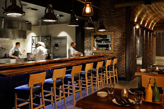
EB: Everything about Italian cooking begs to be put on stage. The custom full-service kitchen is a showstopper, allowing the chefs to showcase their craft firsthand to guests. The dining tables and seating are arranged with a direct focus on the kitchen, setting the stage for an inviting, transparent presentation of culinary theater.
KH: What are some of the more unique features of this design?
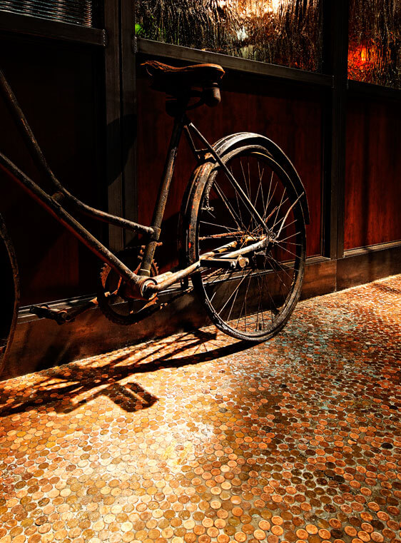
EB: One feature we’re particularly proud of is the reclaimed penny floor. The recently discontinued use of the penny in Canada provided an interesting opportunity to create a signature feature on the vestibule floor at the entry, as well as a unique marketing tactic. Our client provided coupons for a future meal to local children and families for the value of $.03 for every penny donated. In turn these pennies were set into the floor to create a stunning and contemporary feature that embodies the “Vintage New” theme.
KH: What were the biggest challenges you faced with this project?
EB: The biggest challenge was communicating the ‘Vintage New’ dining experience; A 4200 sq.ft. space tucked into a refurbished shopping center didn’t exactly scream authentic Italian.
To counteract the physical setting we used finishing materials that added a timeless quality, and weathered brick veneers to enhance the appearance and leverage the architectural nuances of the space. The reclaimed Hemlock wood structures balance modern detailing with strong heritage warmth as seen above the bar counter, and discovered moments and reclaimed features typify the “Vintage New” decor. Reclaimed Egyptian doors define the entry to the washrooms, and signature lighting from old navel vessels light up the counter at the kitchen. We infused meaning into the name Tavolo by sourcing an old worktable display for the washrooms, and using a heritage “Heart Console” table as the hostess station, as well as employing a variety of tabletops that create different dining moments for guests. Art installations created from found objects spot the walls and help to capture interest; each tells their own unique story to the guest.
Another challenge was the two entrances – one from the mall and one from outside. The entrances needed to lead from the points of entry into a definable feature that signified the Hostess Station. From the mall side guests walk under the vaulted ceiling of the wine display, while from outside guests will enter a vestibule that hearkens back to the past with factory sash style windows. To find the ‘right’ table for the Hostess Station we travelled to many rural vendors & auctions of reclaimed artefacts throughout Southern Ontario, finally discovering the transparent, yet solid Heart Console table. The station was further defined with a large found crystal chandelier and an 18th century cabinet for the Grappa display.
KH: Thanks for chatting, Eric, and we can’t wait to see what’s up next from Jump in the retail design space.
EB: My pleasure.
Postscript: Tavolo took the Silver Design Award and Reconition Award for the Flooring element at the 2015 A.R.E. Design Awards in the Casual Dining category, the fifth straight year Jump Branding & Design Inc. has won at the prestigious award ceremony. Read the press release here.
