Leverage Your Equity
05, May. 2009

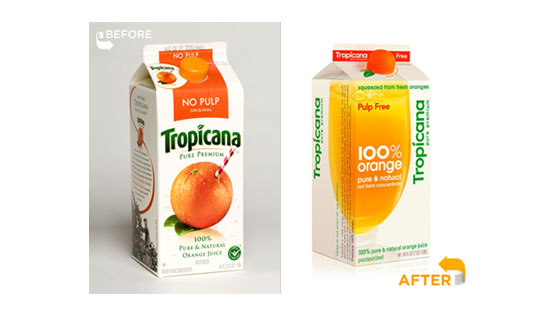
Comparison of the old (left) and new (right) Tropicana packaging. The new packaging has been pulled and the old design restored as a result of consumer backlash
As any real estate investor knows, you’ve got to use the equity you’ve worked so hard to build up to your advantage. It’s a lesson that applies to branding as well, as the folks at Tropicana (PepsiCo) found out last month.
PepsiCo has announced that they’re pulling the packaging redesign of Tropicana orange juice, less than a month after it’s launch in January of this year. Negative customer feedback has prompted the return to the old packaging design, as customers called the new packaging “ugly”, “stupid, and “generic”. More troubling is that customers complained about not being able to as easily distinguish between varieties (pulp, no pulp, etc.) or from their competition.
First, hats off to Tropicana for innovating. It is always a risky proposition to introduce a revolutionary packaging design for a beloved brand. It’s far easier to make minor changes year-in, year-out to keep the packaging current and either hold steady or gain incremental market share, but sometimes a radical redesign can make a big impact on the numbers – in a positive way.
However, there are some valuable lessons to be learned here.
One of the things that Tropicana has spent years building equity in is the idea of the straw tapping the orange. This speaks volumes about the freshness and real quality of the Tropicana offering, and is one of the things conspicuously absent from the new design. It is also one of things that disgruntled Tropicana fans missed in the new packaging. Neil Campbell, president at Tropicana North America, admits that they had underestimated the emotional attachment of consumers to the straw and orange. One would think that some diligent market research could have avoided that mistake, and given cause to rethink their redesign strategy.
One of the most notable differentiators for the Tropicana product line is the way in which it distinguishes between varieties; I can pick out the “no pulp” version from three aisles away. Dropping such a strong design element that customers relied on to find their OJ was a major no-no. Again, research into the key identifiers of their product on shelf could have discovered this valuable information.
At the end of the day, credit should be given to PepsiCo for listening to their core customers and reverting back to their old packaging, although that does open a whole new debate about the value of the court of public opinion when trying to innovate. Historically, innovative ideas have been met with public opposition and outcry from the vocal minority: resisting the urge to appease the masses has led to some incredible discoveries over the years. In the modern era, feedback is all too available, and comes in many forms, almost instantly. Time will tell if the Facebook-ification of focus groups will help or hinder the progress of design. For now, I’m just happy that I can find my OJ.