5 things you need to know about the Facebook’s new timeline layout
14, Jun. 2012
1. The new look
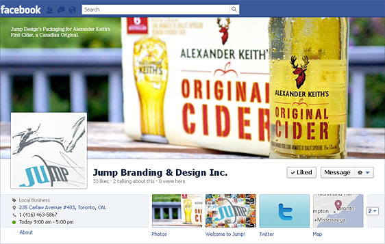
The first and most noticeable change from the previous version is the addition of the cover image. It is the largest image on the profile page and is centered right at the top. This change makes perfect sense because Facebook is all about photo-sharing.
What to do: The new timeline layout for brand pages is identical to the one for personal pages. This creates a consistent experience across Facebook’s various platforms. The aim of the new design is to help brands effectively deliver their story and engage their audience. By creating ‘Milestones’ to signify product/project launches, new store openings, corporate events and other news, fans of the brand are encouraged to interact and engage in conversations centered around the brand’s evolution.
The cover image creates a huge impact in itself, offering a first impression of the brand for viewers. It should be carefully designed to represent what the brand is about. See Facebook official rules for more details.
Embedded in the lower right-hand corner is a sized down version of the profile image. Custom tabs and landing pages on the left-hand side of the home page have been removed. In their place are two main columns that evenly split the page. All content now runs downward on a central dividing line, alternating between the two columns.
What to do: In the previous layout, brands often included their marketing messages in the profile picture. That is no longer possible with the new profile picture sizing restrictions (180px by 180px scaled down to 125px by 125px). Popular recognizable brands, such as Coco Cola, often rely on only their logo as their profile picture. Their marketing messages can be carried out using new posts.
The tabs component has been moved up to the top right of the page under the cover image. Brands are allowed up to 12 tabs, however only 3 will be visible along with the ‘Photos’ box. To see the rest of the tabs, viewers have to click on the drop down arrow to the right of the on-page tabs.
What to do: With only 3 visible tabs available, brands need to use on-page analytics to determine which tabs are the most interactive and will be of most use to the page. Further, company objectives and project popularity can also be factored as determinates in choosing the best tabs to feature.

2. Default landing page
The new layout does not provide this option, which was formerly a very favourable feature for brand pages. It allowed companies to control the first impression of the brand and what information the brand wished to promote.
What to do: A strategically placed combination of the cover image, visible tabs and top posts will replace this function in the new layout. Brands will have to be very careful in paying close attention to each of these elements in making sure their new and current fans have the impression of the brand they wish to convey when they land on the page.
3. Featured Post – Pinned post
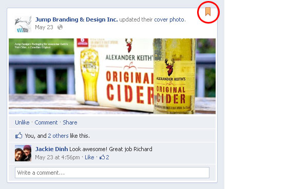
Similar to the ‘sticky post’ function, brands can choose a post to pin to the top of the timeline. This post will remain for 7 days before disappearing if it is not replaced by another post. While staying at the top, this post will also be visible at the original spot on the timeline where it was created. The orange flag on the top right corner can easily identify pinned post.
What to do: Brands can take advantage of this feature by pinning their most interesting content to the top of their page at any given time. They can use it to promote brand values, products, services or any call to action messages, (including ‘Like us’ or ‘Share this’ messages).

4. Tab icon and tab content layout size increases.
From the previous tab icon, the size went up from 16px by 16px to 111px by 74px in size.
What to do: This allows brands to be more flexible and creative in coming up with different ways to design these icons.
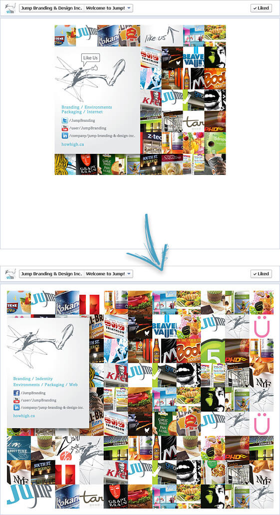
The Tab content is up to 810px width from 520px width.
What to do: By default, existing tab content will appear centered in the middle of the new page layout. It is a good idea to redesign the pages to better fit this new layout design. The generous amount of width now offered will also open up many new ways to present tab content and promote fan interaction on the page.

5. Private messaging between brands and viewers
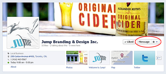
If the ‘Message’ option is enabled on the page, any viewer can privately message the brand. Brands can also send direct messages to their fans.
What to do: While this allows for much deeper interaction and stronger relationships between brands and their fans, also note that this new timeline layout can be easily cluttered. Therefore any message or inquiry that can be formatted as a private message should be use as such in order to help keep the timeline clean while still helping fans with questions or issues regarding the brand.

The new timeline layout will certainly redefine the way brands interact, share content and attract views to their Facebook page. To stay on top, brands need to fully understand the new changes and features to the design layout and functionality of their pages in order to take full advantage of the Facebook platform. Along with creating milestones and sharing interesting updates, brands need to rotate their tabs and pin relevant and engaging posts to continue to attract viewer attention and strengthen and expand their fan base.
Currently Facebook is testing another Timeline layout. We will be posting new updates about it. Stay tuned.
Need to improve your Facebook page, Twitter page, or LinkedIn page? Contact us at ac.hgihwoh@aidem.