A Decade of Pizza Hut
Yum! - Pizza Hut
Pizza Hut is one of the world’s largest pizza restaurant chains, with over 11,000 stores around the world, over half of which are in the U.S. It is a subsidiary of Yum! Brands, Inc., the world’s largest restaurant company.
We have been working with Pizza Hut and its parent Company Yum! Brands since 2005, on projects ranging from menus for the Canadian market to global restaurant redesign initiatives. We continue to work closely with our friends at Yum! on a variety of projects, as they work to revitalize the well-known brand in the North American market.
Project Type:
Related Projects:
PIZZA HUT CHANGES GEARS
When a storied brand needs a facelift, it must be handled with care. Pizza Hut – a fixture in the Canadian restaurant scene for decades, but was losing market share with dated assets and messaging that was no longer relevant to a more youthful demographic. Pizza Hut approached Jump to explore a new “What if?” brand position for the iconic eatery that would push them out of their comfort zone and embody a more youthful spirit. The question? “What if Pizza Hut was the Badboy of the Canadian pizza scene?”
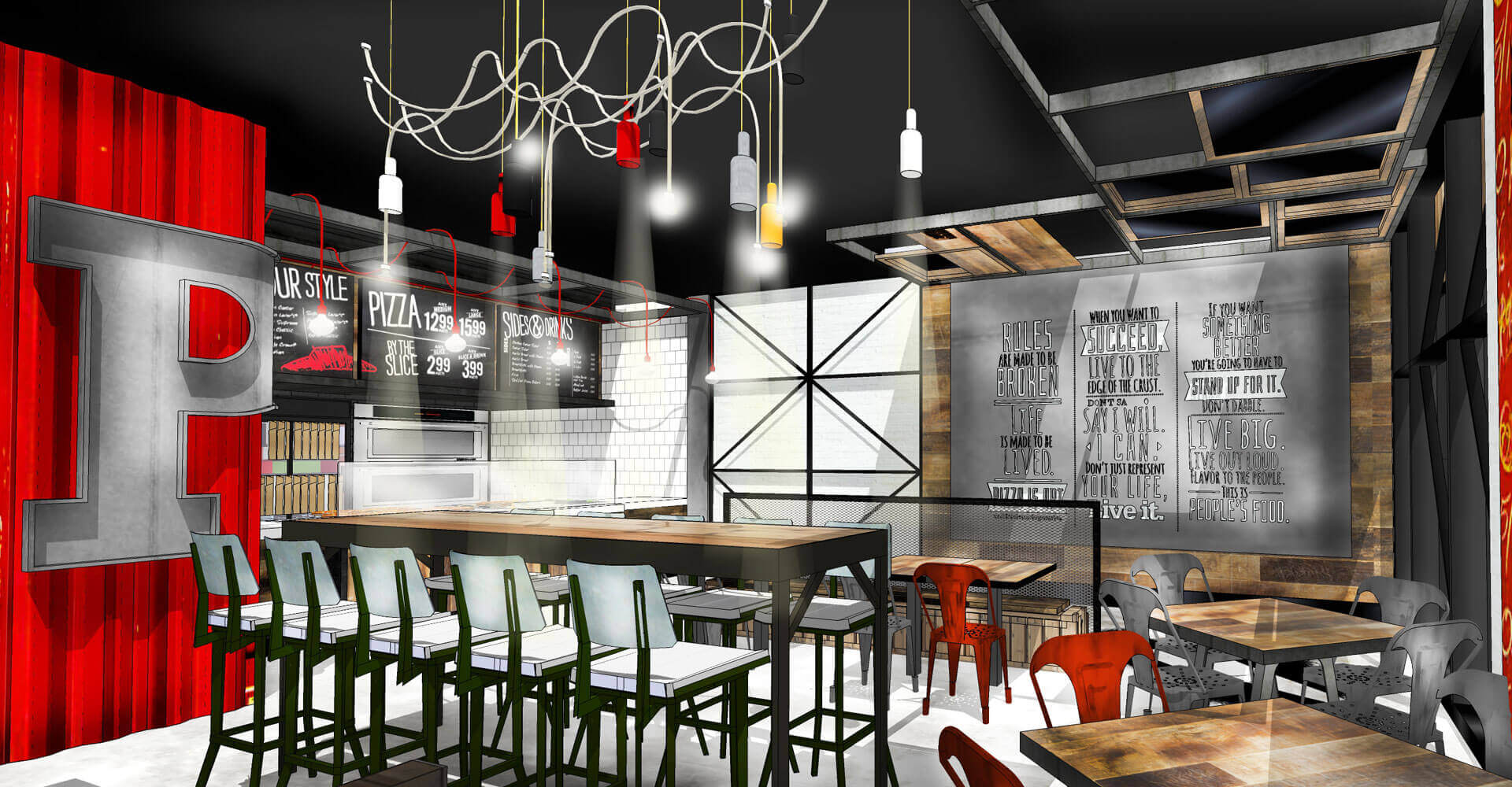

REIMAGINING AN ICONIC BRAND
Jump worked with Pizza Hut to explore the “Badboy” position, helping them internally to reimagine the brand in a way that is difficult to when confined by rigid brand standards and marketing directives. After the exercise, Pizza Hut decided to move the needle significantly, and retained much of the strong, independent, and carefree spirit that the “Badboy” position featured. It was important that Pizza Hut have messaging that is meaningful to older, brand loyal guests, or younger people just discovering Pizza Hut. Jump developed the brand visually for the restaurant application, but even more importantly, set the tone and vibe for a new and bolder Pizza Hut to emerge.
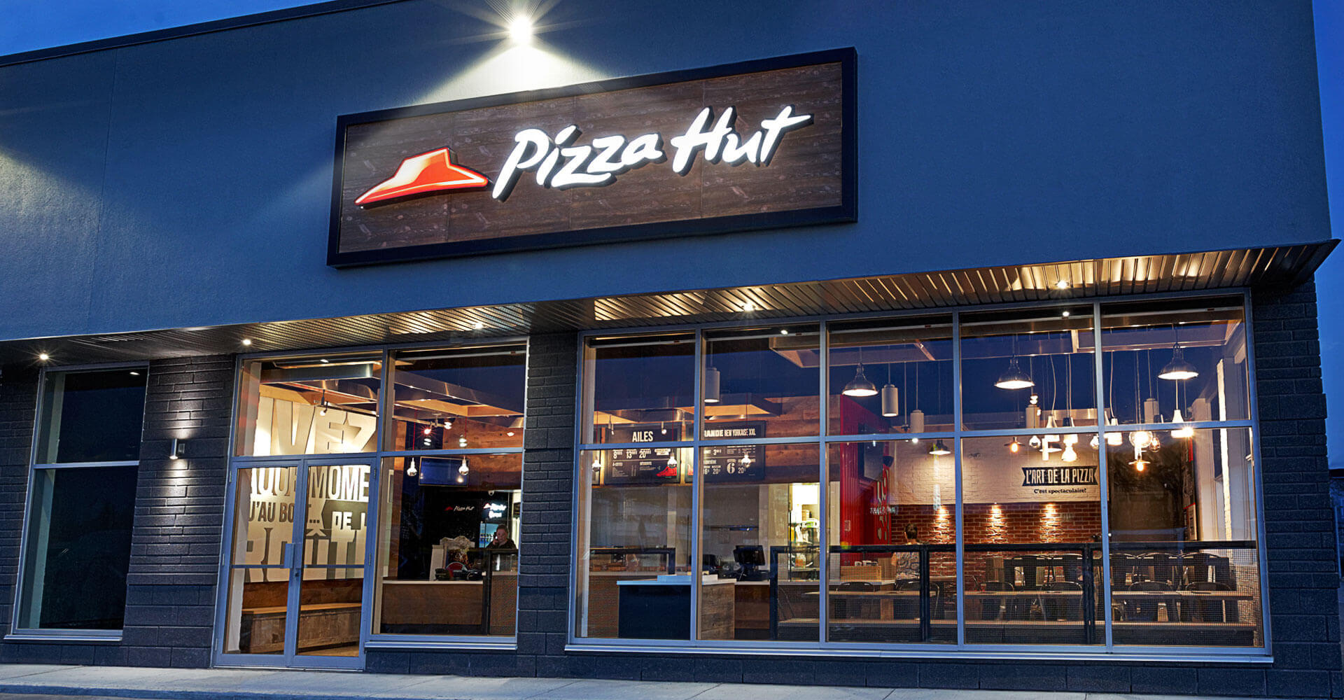
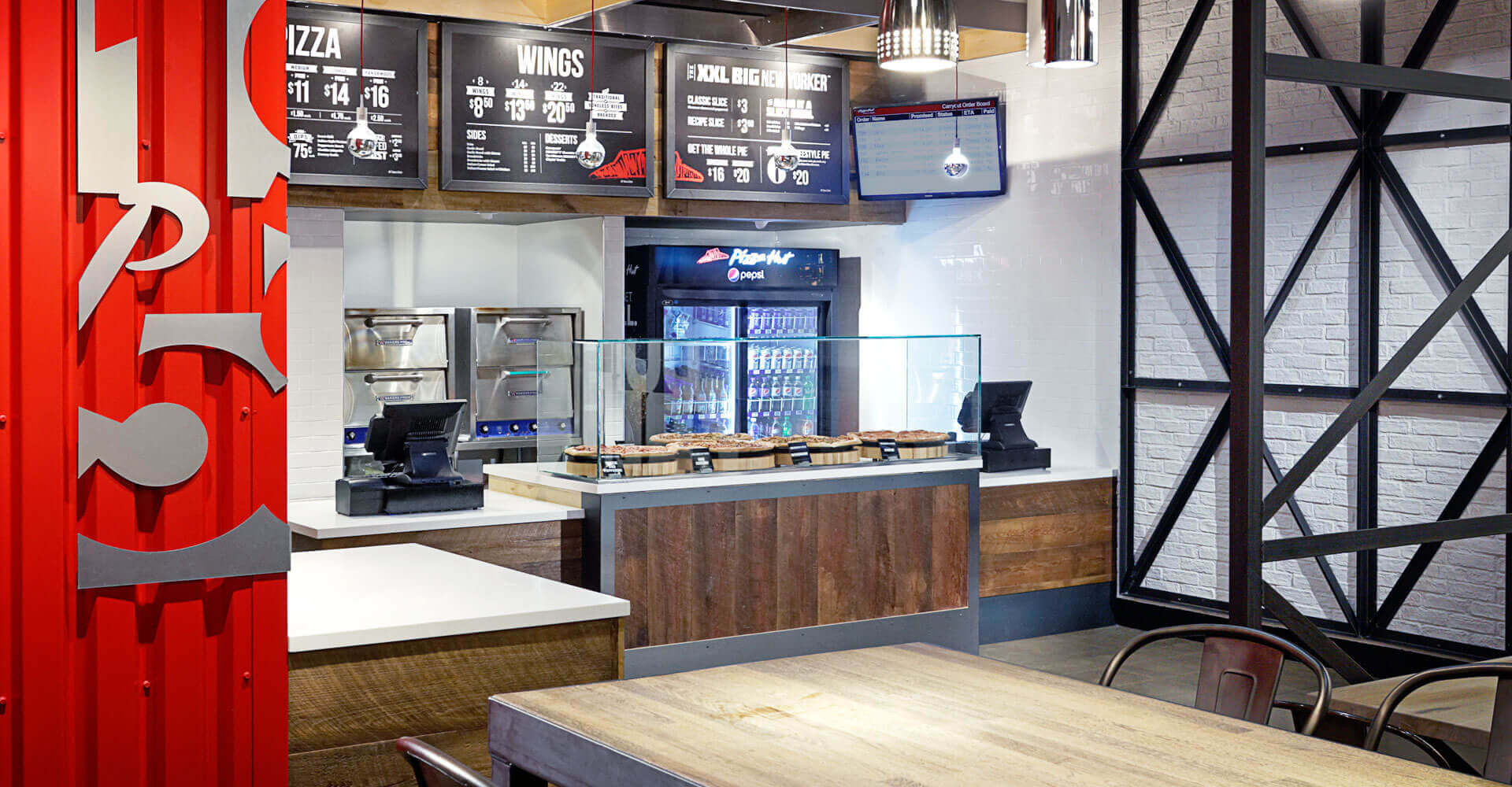
Jump worked with Pizza Hut to build out two locations – one in Langelier, Quebec, the other in Brockville, Ontario – that are prototypes infused with the new and revitalized Pizza Hut brand.
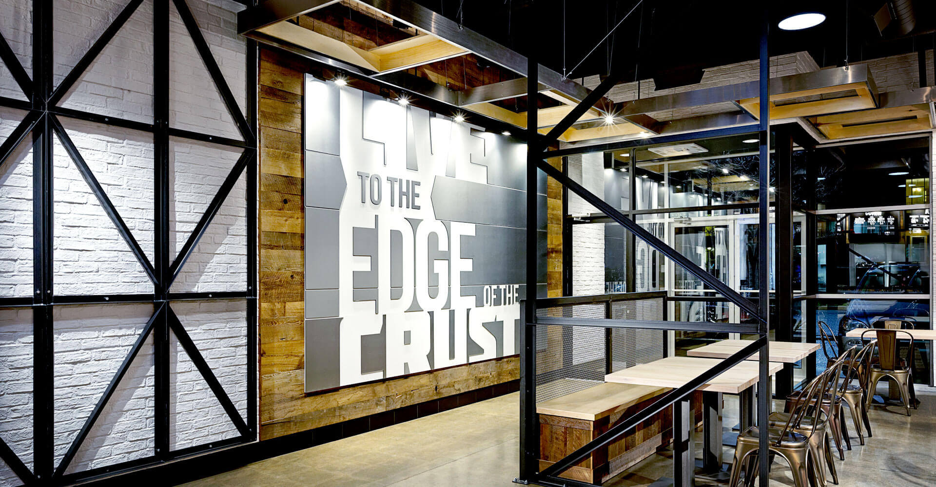
A CHANGING RESTAURANT
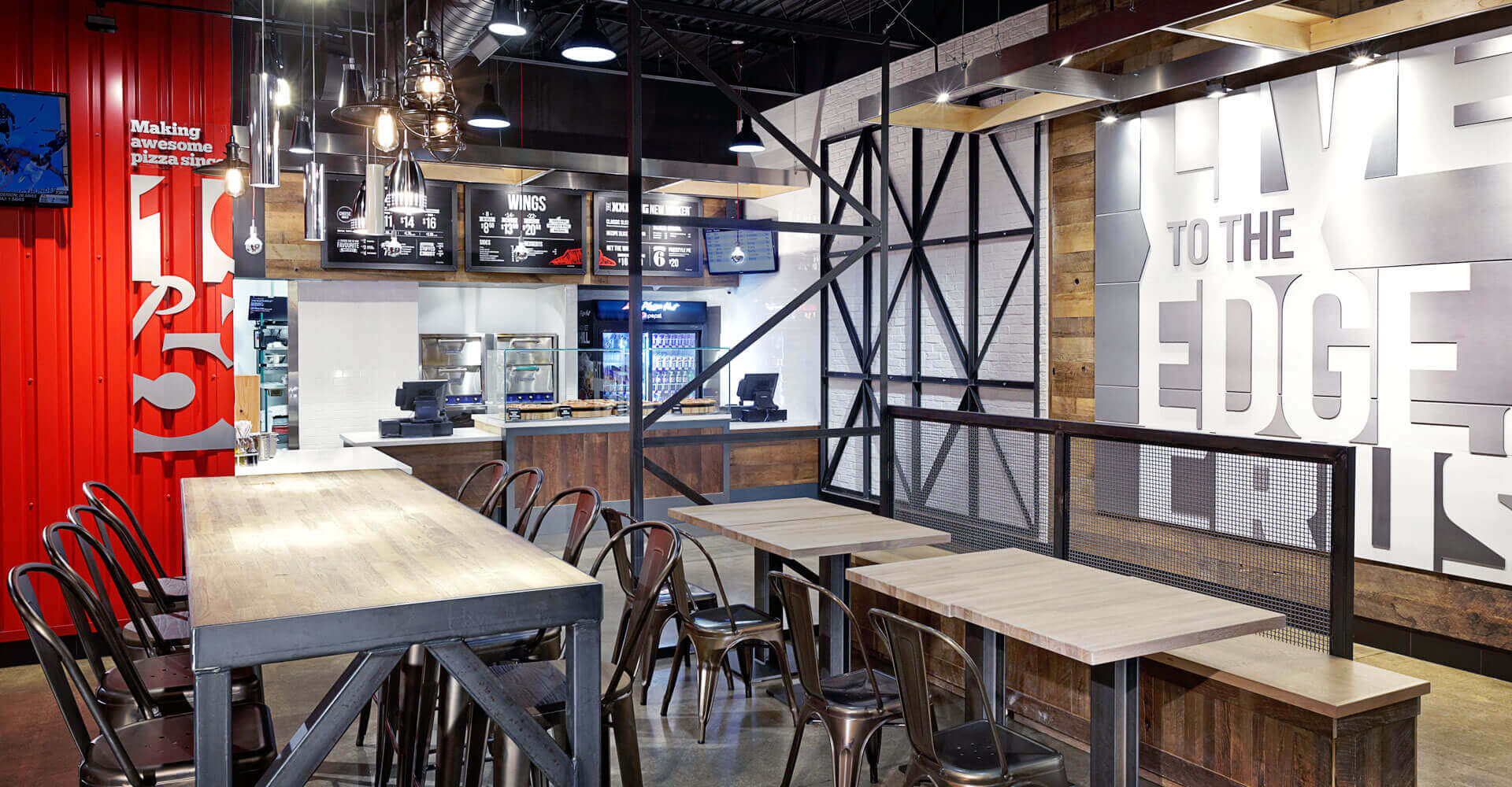
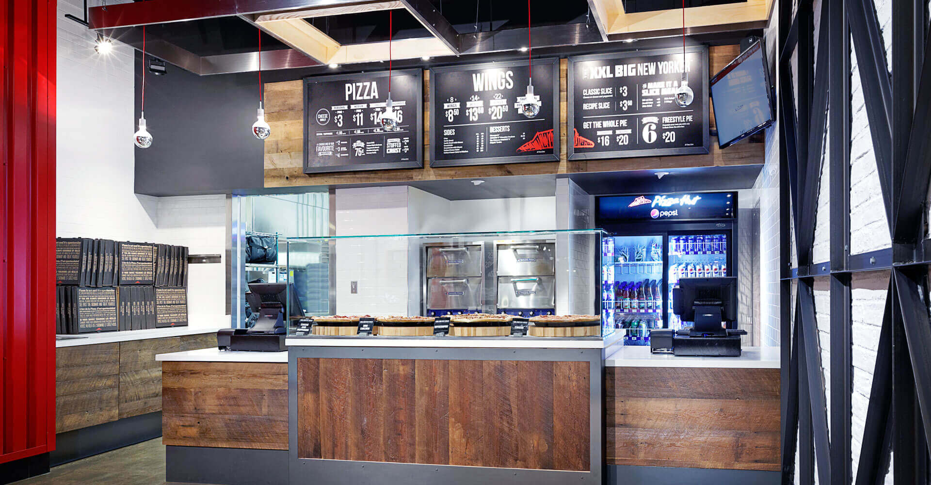
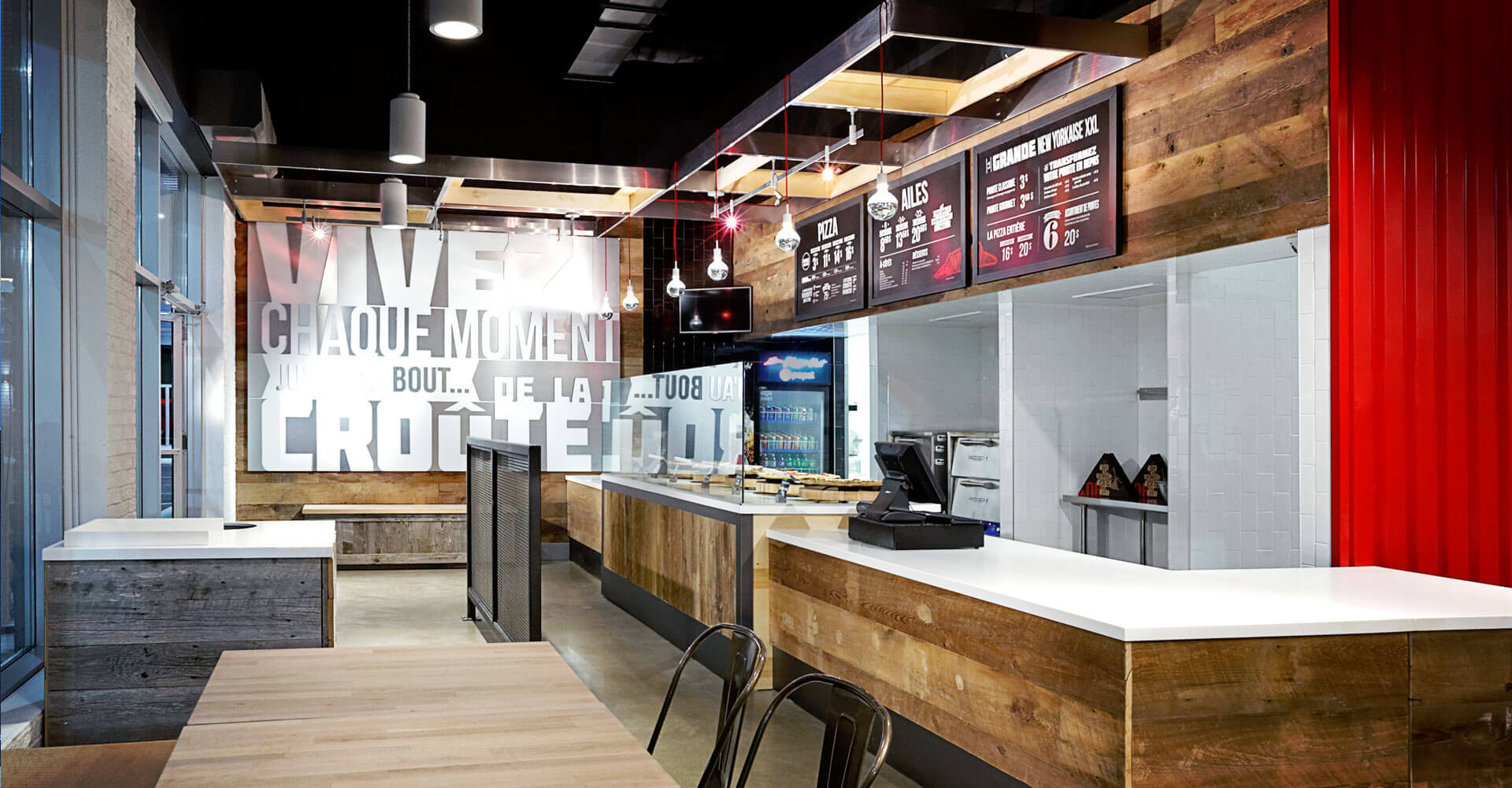
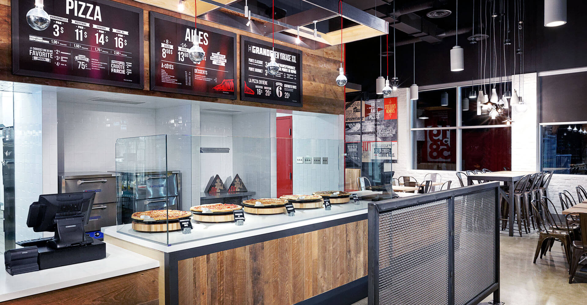
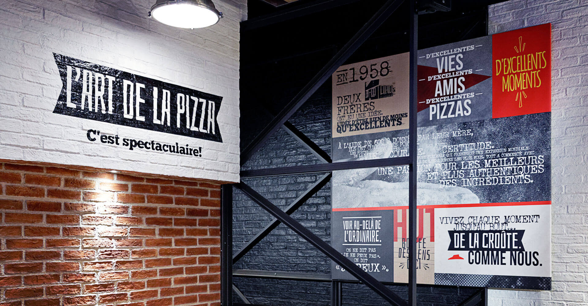
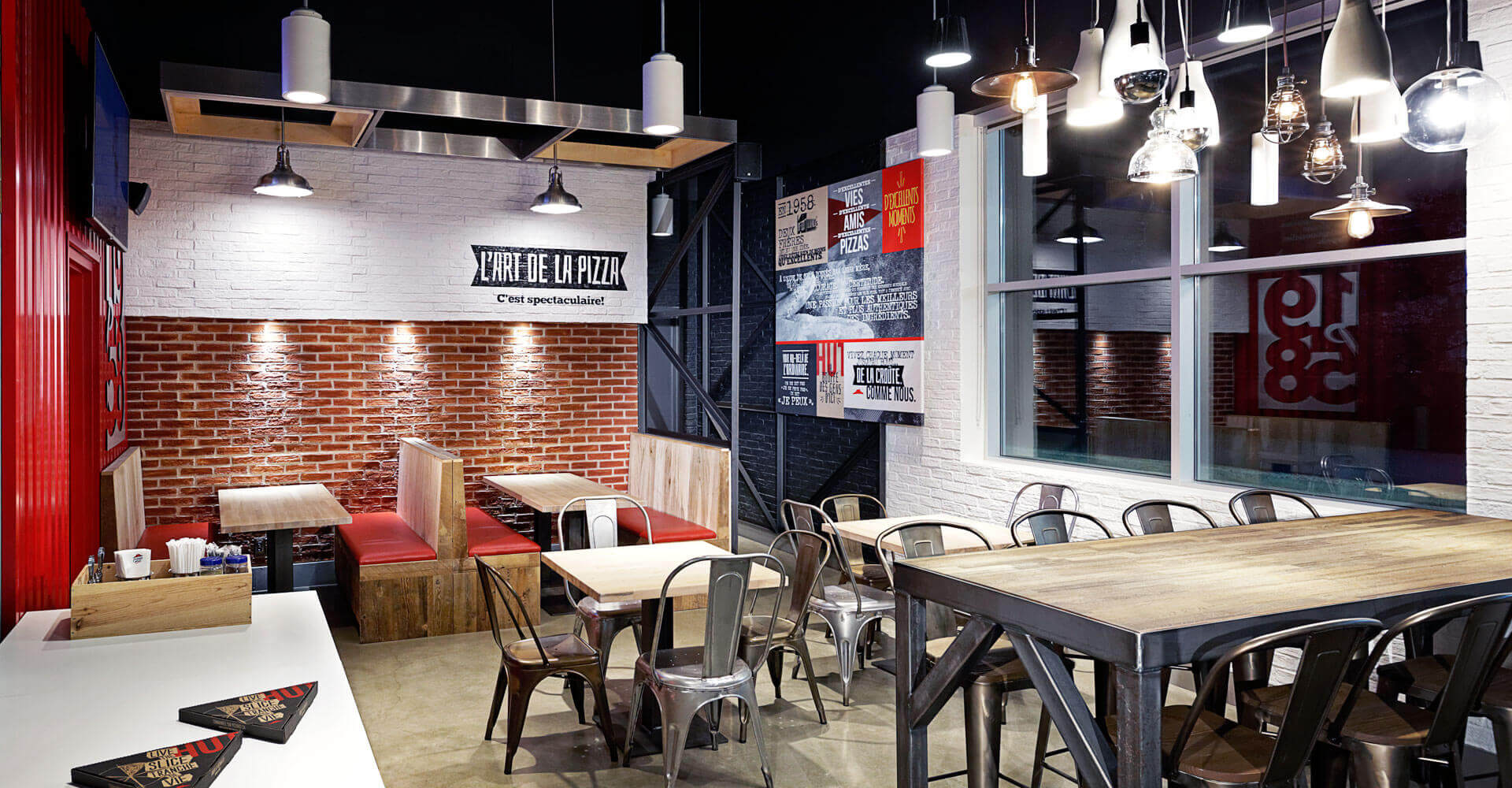
In the restaurant, Pizza Hut wanted to move away from their traditional sit-down restaurant model towards a fast casual dining concept. The transition away from their iconic standalone “Hut” restaurant to a street-front location changes the customer expectation of the experience, and gives an opportunity to use full-height windows to open up the interior to passersby, showcasing the updated and revitalized brand, and beckoning people in. Reclaimed woods and metals create an established feel that is consistent with the brand, and signage is integrated architecturally and executed with real materials and attention to detail. A quick serve counter allows for ordering and takeaway, while servers bring food to the table in a table service hybrid model. White painted brick walls contrast with lit natural brick and the signature Pizza Hut red, used sparingly on booth seating and a red signature wall, constructed with aluminum siding.
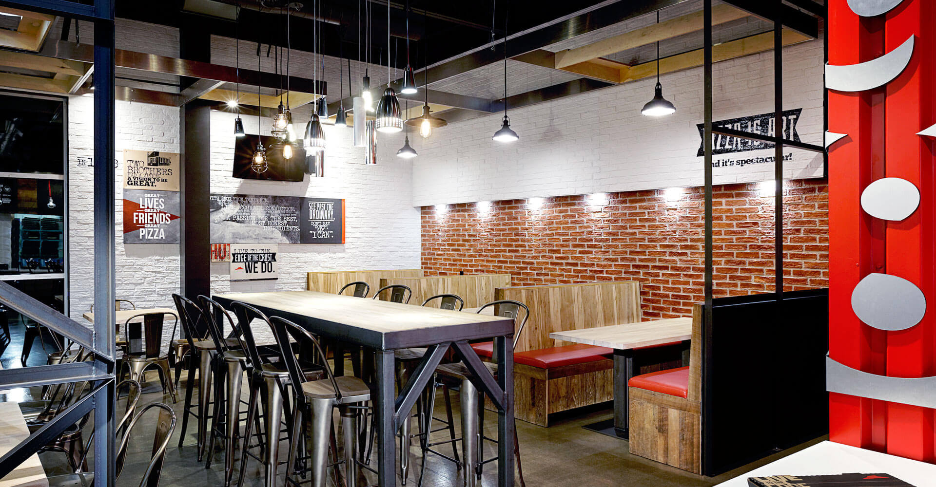
Rough-hewn timber creates the bench and booth seating base, while finished plywood backs with contrasting grain create a warm, inviting seating area. Metal chairs complement the fabricated steel table frame, which is mimicked in the half-wall dividers that are constructed with angle iron and steel mesh.
Modern industrial lighting is used throughout, with the signature harvest table the focal point. Singular hanging pendants are suspended high over the signature Pizza Hut booths which transition booth seating from a more intimate affair to something more communal, to reflect the shift in the Pizza Hut customer demographic.
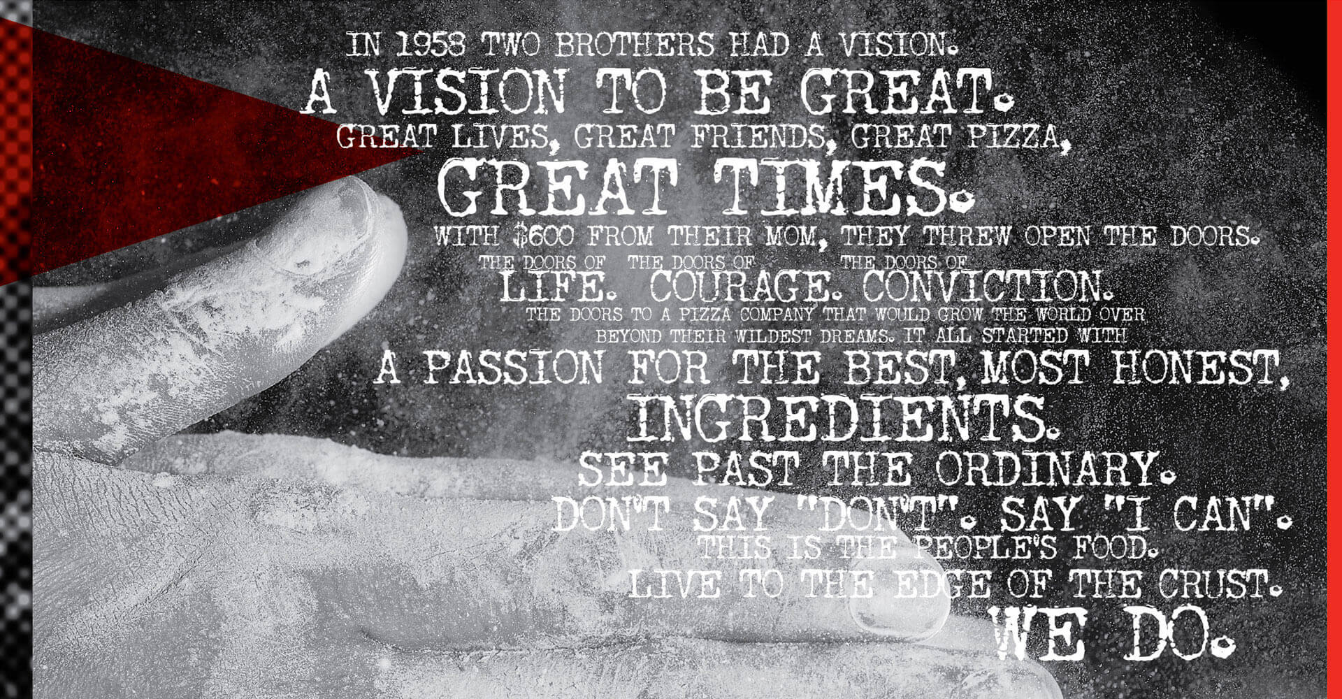
MESSAGING INJECTS NEW LIFE
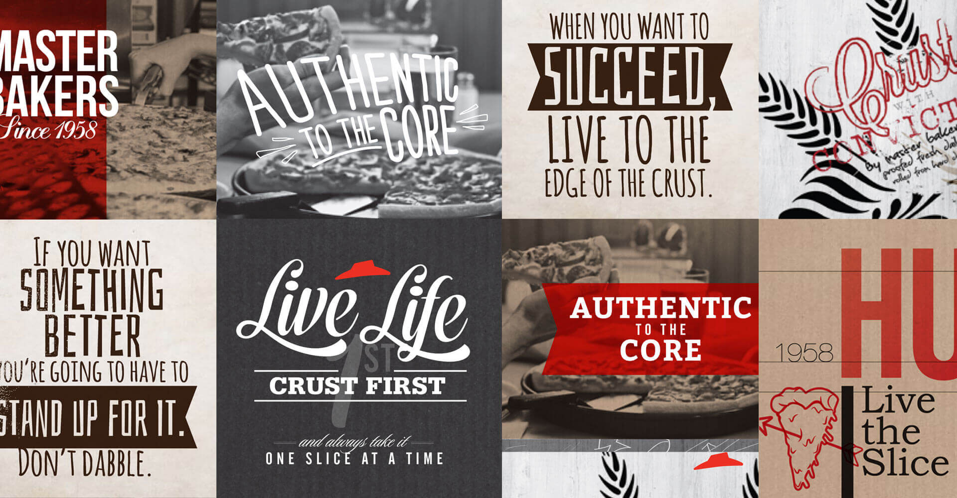
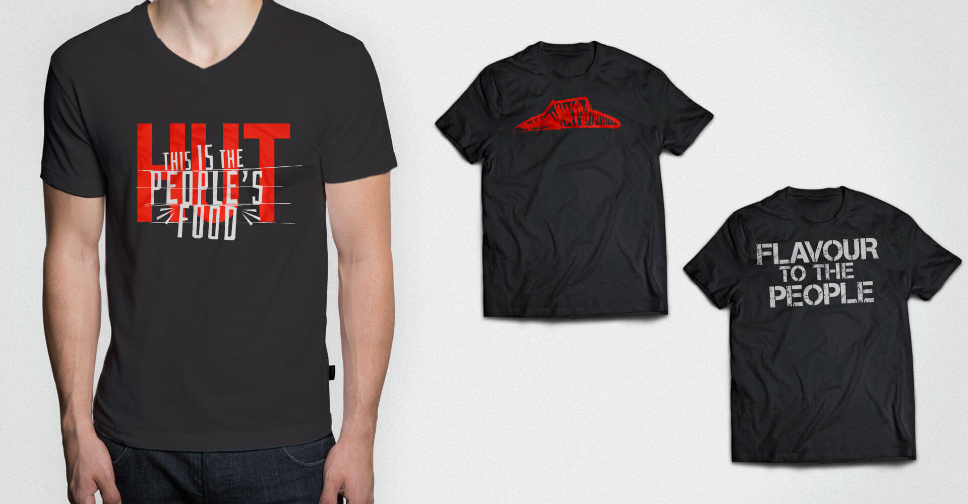
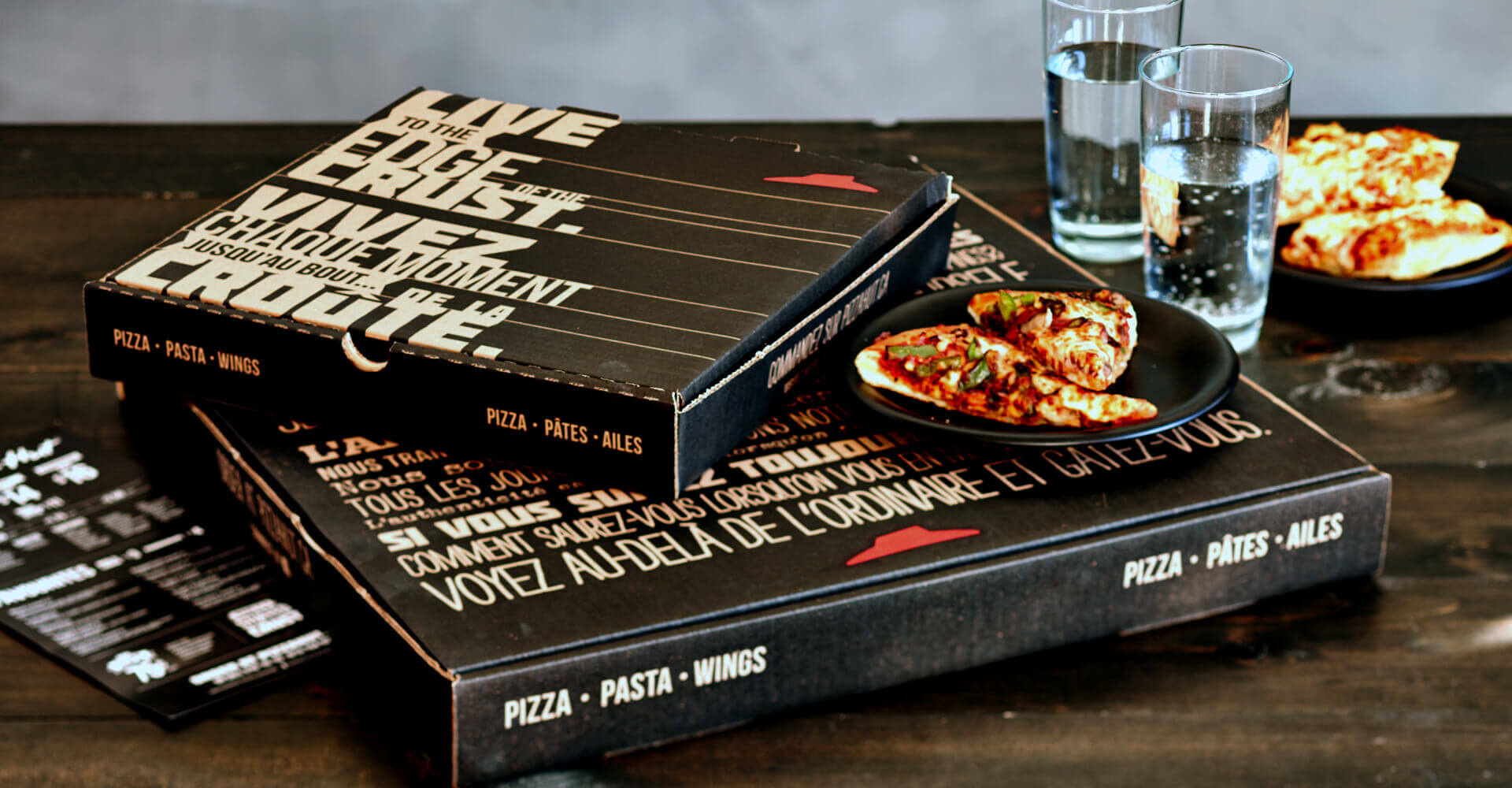
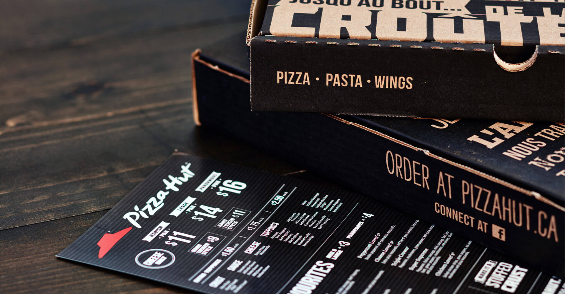
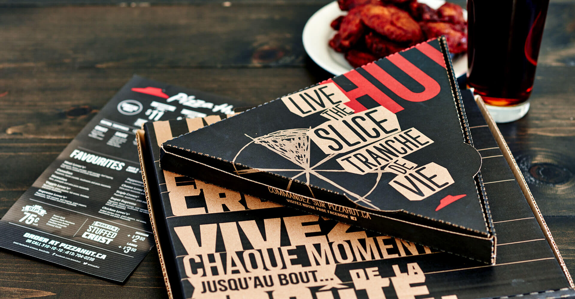
The “Live to the edge of the crust” and “Slice of life” messaging speaks to a new demographic, but also resonates with an older one. Brand messaging on black & white and sepia-toned backgrounds speak to the legacy of the iconic brand, encouraging customers to reconnect with their inner “Hut”.
A NEW LOOK FOR A CHANGING MARKET
The restaurant is a shift from the Pizza Hut that Gen Xer’s will remember from the family dining days of the 80’s and 90’s, but it more accurately reflects the change in dining expectations of the post-millenial generation, and establishes Pizza Hut as a player in the fast casual pizza market.
GOING GLOBAL – GLOBAL RESTAURANT REDESIGN (2007)
Early in 2007, Yum! Restaurants International engaged us to work with them to create global alignment and a new design image for their Pizza Hut asset base. As an international brand with thousands of restaurants around the world, managing the brand at the individual restaurant design level is an enormous task that requires understanding, cooperation, and a strict, but flexible set of guidelines that defines the Pizza Hut image moving forward, yet provides latitude for regional variation and influence.
We worked closely with the corporate teams out of Kentucky and Dallas and in consultation with regional managers on 5 different continents. We first tried to understand and discover challenges and successes within the current asset base. Researching the existing assets uncovered wide regional differences in approach, interpretation, and execution, and allowed us to craft identifiable and reachable objectives for all parties within the new program. Defining current best practices on both the exterior and interior of the design image while flushing out regional concerns arrived at a set of guidelines for the new asset image that accommodated regional variances.
After exploring conceptual work on the restaurant exterior, we shifted our focus to exploring design options for the interior of the restaurant, creating multiple tiers with different materials and finishes based on regional demand. We also developed artwork packages for each tier, utilizing existing artwork where appropriate and developing new artwork more appropriate to the new design image.
DELIVERING THE GOODS – PIZZA HUT DELIVERY (2006)
Launched by Yum! Restaurants International in 2006, PHD is a value pizza pickup and delivery platform by Pizza Hut that is present in several international markets.
We’ve worked in partnership with Yum! RI since the launch of PHD to assist in the development of both the brand and the retail environments. Working with small front-of-house footprints, we developed the retail space planning for an optimal customer experience, creating key graphic messaging at all consumer touchpoints.
We worked to integrate the Running Man iconic photography into both the interior and exterior signage programs, retouching that high-resolution image for exterior applications up to 4 storeys tall. We developed multiple floorplan configurations for different footprints, accommodating separate delivery doors in the front of house and call-centre stations at the front counter. We developed a finish package dominated by shiny metallic finishes, expansive red colour blocking, speed lines throughout the space, and transparency into the back of house through the use of glass at the prep table. As part of the Hot and Fast delivery program we suggested edgy, youthful ways to kill wait time with web surfing, interactive media, and iPod media control stations. We designed packaging for pizza boxes, leaflets for direct mail, exterior signage, uniforms, vehicles, menu boards, counter menus, website templates for regional roll-outs, advertising and billboards. We also developed a new product logo for the CHZ-360 promotion, including the box design, leaflet, and box topper to support the launch of this new product line.
To support regional design teams in other parts of the world, we created a comprehensive 100 page field guide with print-ready artwork and CAD files for a fast and efficient roll-out of the branding design program. Finally, to support the PHD online initiative, we created design templates and translated these to HTML pages, including all of these with a 150-page guide dictating the proper and improper use of the brand online.
Launched in 2006 in Beruit, Lebanon, PHD by Pizza Hut quickly grew to become a significant player in several international markets, with more than 50 stores in 11 different countries.
Each market has presented unique challenges that Jump has helped us to manage through their methodology and understanding of our brand.
Patrick Taillat, Marketing Manager, YUM! Restaurants International
MAKING THE MENU – PIZZA HUT CANADA (2005):
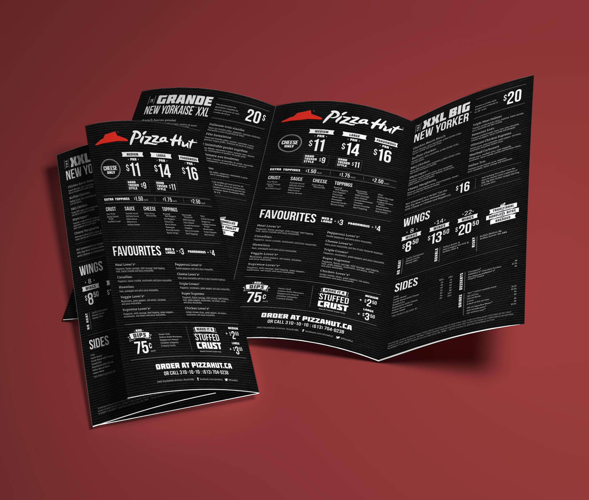
In 2005, YUM! Canada, the parent company of Pizza Hut Canada, was looking to redesign their table and takeout menus. Their existing menus utilized large blocks of primary colours and juvenile typefaces which communicated value and fun but not quality. With the restaurant looking to elevate their dining experience they needed to improve the menus to generate appetite appeal and create anticipation, in a cost-effective manner.
YUM! Canada partnered with us to find a solution. We chose to keep the existing menu folder format to minimize costs but began to restructure the layout to read in a more logical and engaging order. The Kids menu offerings were moved out of the main menu to keep the focus on quality. We used the inside flaps to separate the communication of the appetizers and drinks and moved the lunch buffet options to the back cover to avoid confusion. On the front cover we replaced the nostalgic images with shots of fresh ingredients to convey a message of freshness and health. Once fully opened the menu is a multi-page billboard of pizza, pastas, sandwiches and salads. We shot all new photography for these items and styled them in a more sophisticated way to evoke a natural and healthy feeling. By using contemporary, light fonts against a white backdrop we were able to create a light, fresh feel to the menu. A romantic story of the dough-making process and elegant descriptions of the food brought warmth to the layout, celebrating Pizza Hut’s passion for food and cooking.
We then adapted the final menu design to a reduced offering format as well as a hand-held and wall-mounted take-out menu. Overall, we created a menu system that was aligned with Pizza Hut Canada’s brand vision, conveying a much improved sense of quality and freshness.
