A Froyo Wonderland
Yogurty's
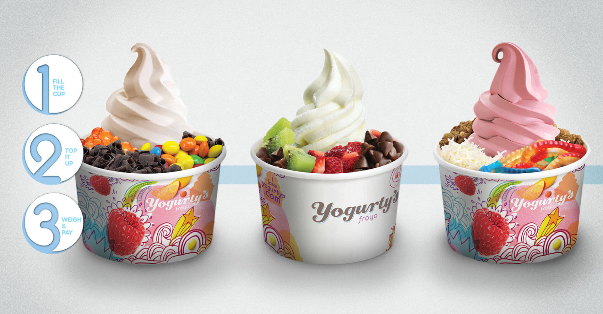
Yogurty’s is a quickly expanding frozen yogurt concept that has gained remarkable traction around the philosophy that patrons should serve themselves. Delivering all natural, fat-free frozen yogurt (froyo) from a rotation of 12-16 flavours and 60 plus topping options per location, the store design empowers customers to build their froyo how they choose, with a weigh-and-pay pricing format. We have served as their agency of record since the company’s 2010 re-launch, charged with the creation and evolution of the Yogurty’s brand experience across all consumer touchpoints.
A sense of creativity, abundance and possibility guided our design rollout with a brand strategy that directly empowers consumer experimentation. Yogurty’s retail environment bursts with vibrant colours, flavours and textures to match the fun of the breadth of toppings and the abundant flavours they represent. The architectural palette follows a whimsical theme emblematic of a froyo wonderland, underscoring the sense of interaction and exploration definitive of this new self-serve concept.
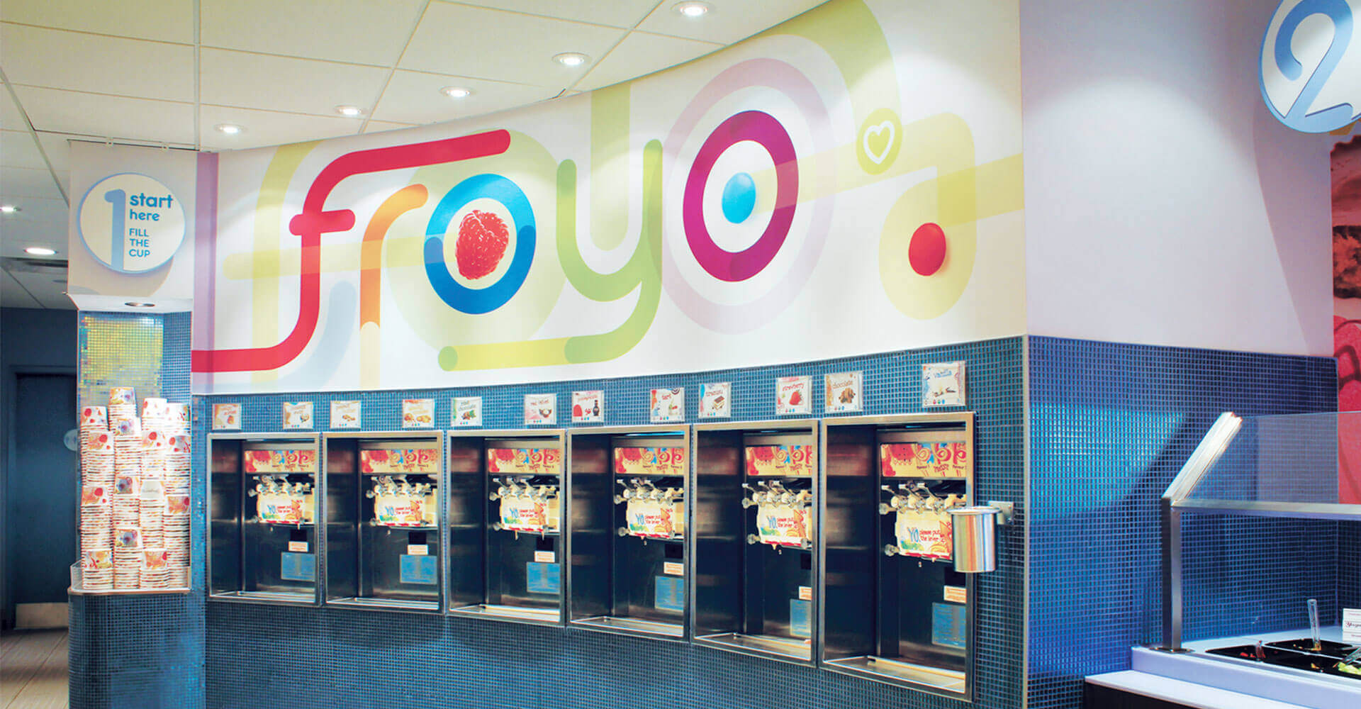

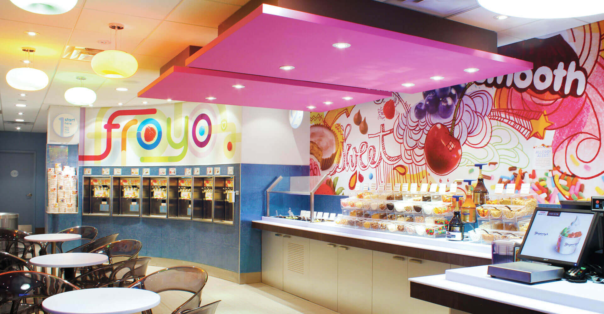
Vivid pink and blue tones cover the interior space. Punches of Yogurty’s irreverent and explanatory messaging enlighten the atmosphere and facilitate understanding of the compelling self-serve product experience. A strong use of colour blocking and texture aligns in the creation of the self-serve froyo bar. A signature ‘froyo’ graphic and crystal candy-blue mosaic backsplash successfully directs consumers to their initial in-store destination. The guest then moves along a path through the toppings bar until reaching the scale and point-of-sale terminal.
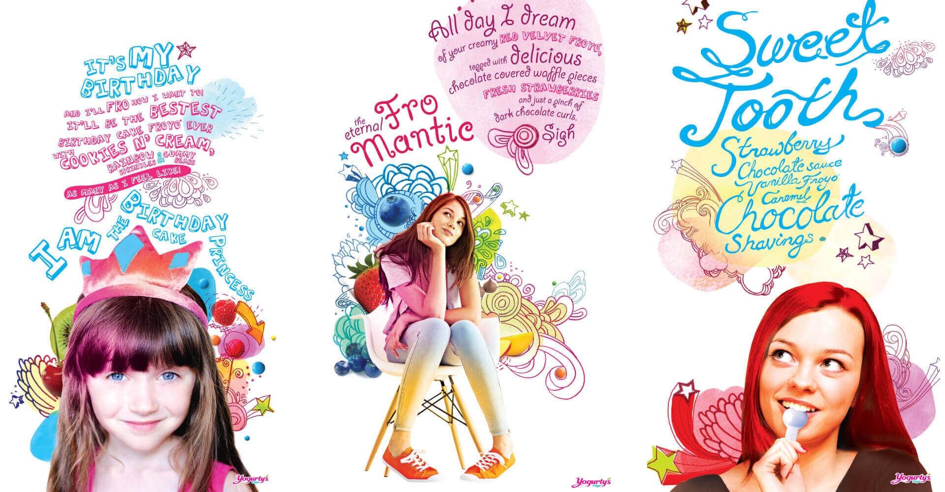
For the in-store graphics, different design mediums bridge traditional and modern aesthetics. The brand’s broad appeal is captured through messy, distinctive 70s doodle-art inspired murals. Celebrating the unlimited choice and customization possible, these oversized topping photo-illustrations mix fresh and sweet – fostering both healthy and indulgent desires. Custom décor artwork packages further deepen the branded experience by identifying and connecting with the guest’s needs and cravings with an approach that is playful and lighthearted.
Storefront transparency is achieved through a frontal glazing and casual, display seating. Candy-glass lighting pendant features provide colourful interior warmth while funky, acrylic furnishings populate the space. At night, the full luminosity of the environment radiates through the full-length windows, inviting patrons into the energy and fun of the Yogurty’s experience. Exterior white ledge-stone cladding offers a proprietary framing, working alongside the signature pink logo fluorescent signage to build a bold, highly visible branded architecture.
In rolling out our design model, of the highest importance was incorporating Yogurty’s philosophy of customization. To facilitate franchising, the store design is constructed like a kit of parts – adaptable to a wide range of configurations and store models. Calling for minimal build-out by contractors, defined layout options specify the majority of fixture, décor and equipment installations required. Our proprietary brand standards management platform, brandstandards.ca outlines the specifications of the brand identity in the construction of each new location and franchise model, ensuring brand consistency and integrity is retained.
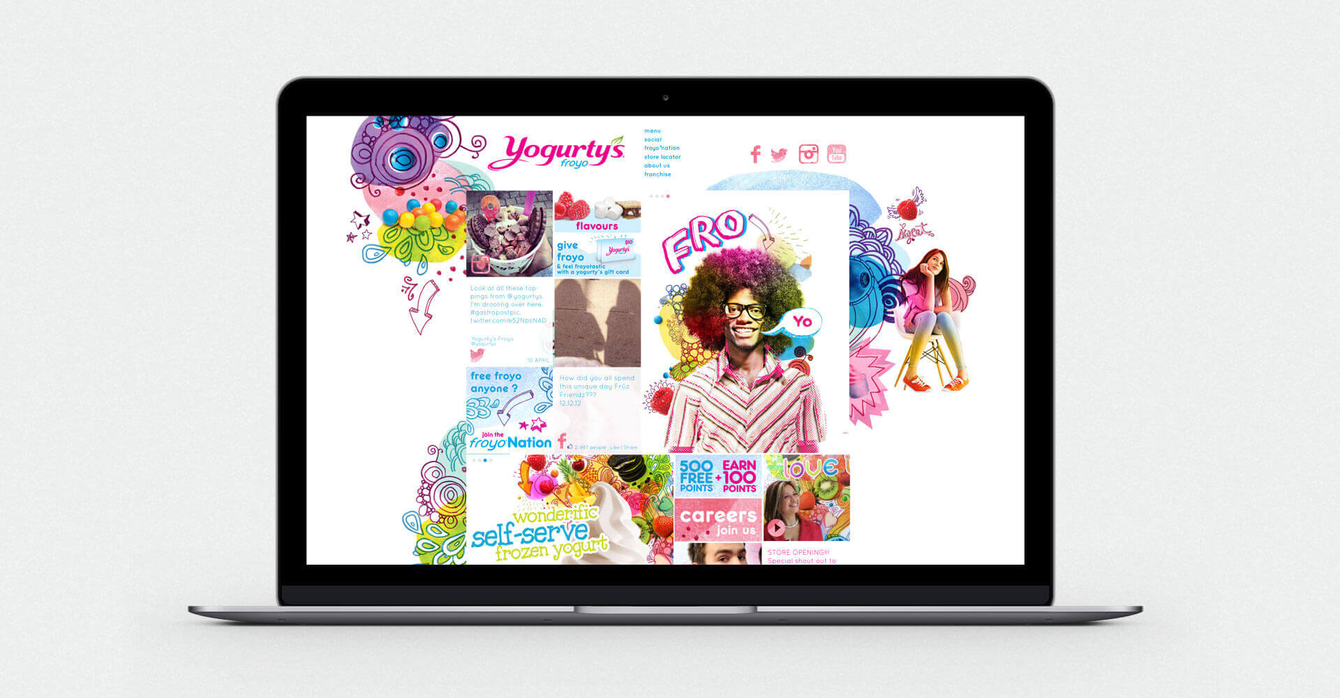
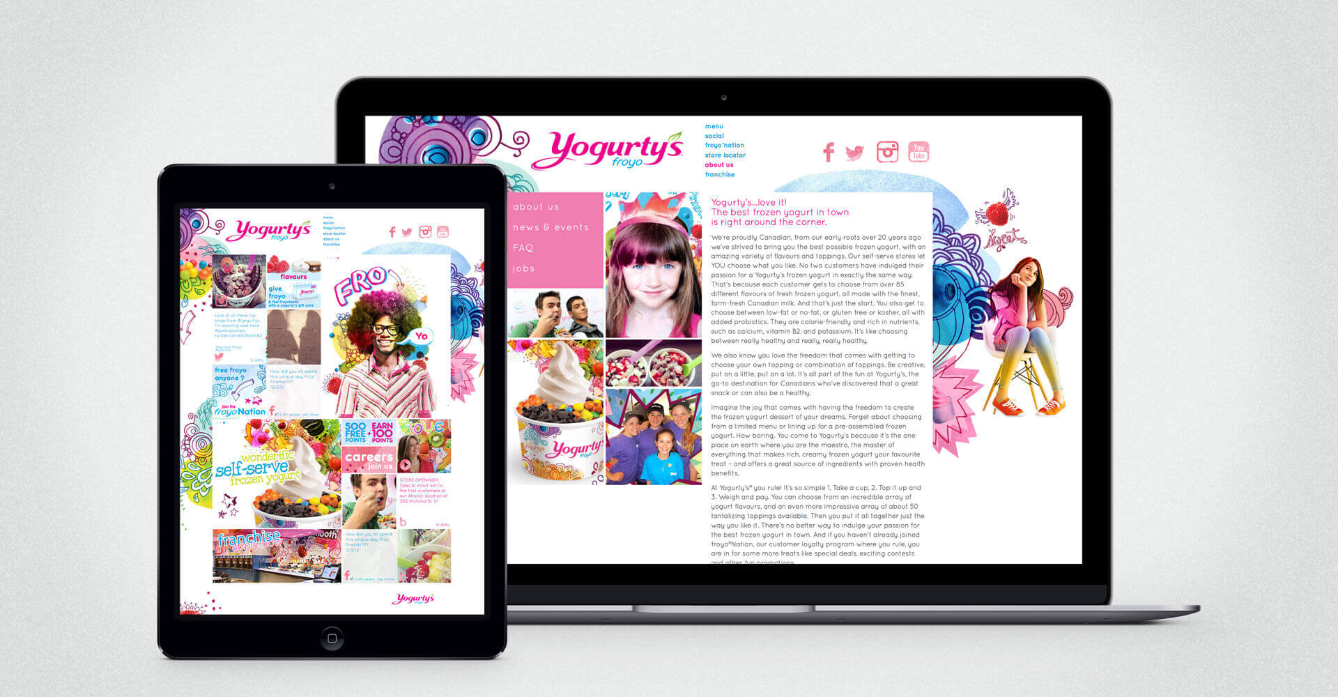
Yogurty’s in the Digital Space: We were also engaged to design and develop the Yogurty’s website, yogurtys.com. It was important for us to extend the brand online, capturing the creativity and abundance that is the Yogurty’s point of difference in their digital presence. It was also important to communicate that Yogurty’s service model was different than all of the other frozen yogurt brands in the market, giving their guests complete control over their froyo experience. Promotion and Social Media engagement was also a critical component in the design layout, giving their guests opportunities to interact with the brand online, and a reason to visit their site more frequently. We also integrated the Yogurty’s customer rewards program and promoted their app in an effort to increase brand loyalty. Brand voice is an integral component of the site, both in the engagement of their customers and potential franchisees.
You can find Yogurty’s online at www.yogurty’s.com
.yogurtys.com
explore the website
Since rolling out the first Yogurty’s location in summer 2011, the brand has been met with unbelievable market success and massive expansion. With over 50 stores now open across Canada, Yogurty’s has become synonymous with froyo. The company has further opened or is in development of international locations in Mexico, Costa Rica, and UAE. Leveraging brandstandards.ca as their brand asset management platform , Yogurty’s has also begun franchising.
