Drafting a Winning Identity
Wayne Swadron Architects
Wayne Swadron Architects is a premier boutique architecture firm located in Toronto that specializes in city homes, country estates and vacation residences. They are very passionate about their work, which shows in the spectacular homes they design. Their previous brand identity was a simple typeface and lacked the beauty and personality that is apparent in their work. They knew that in order to attract the top tier of clientele the presentation of their brand needed to be improved.
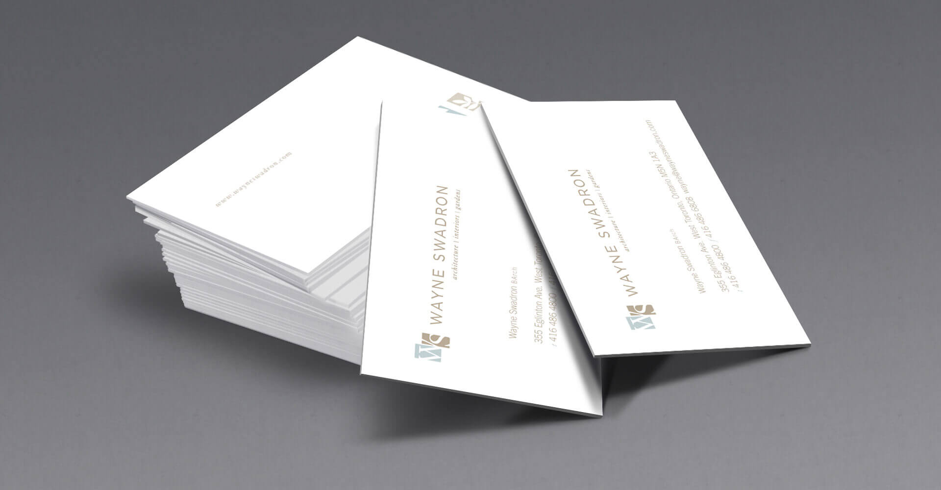
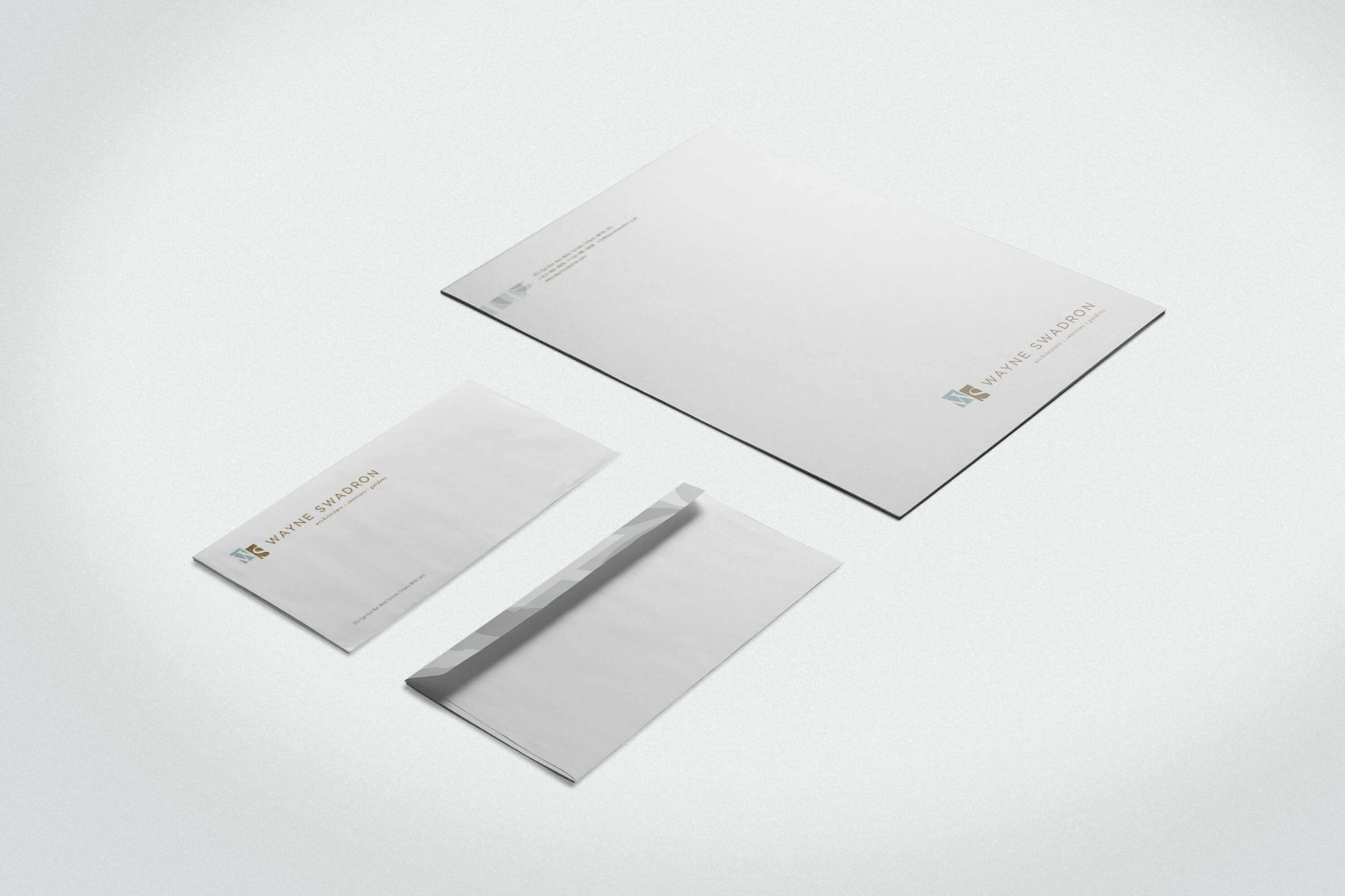
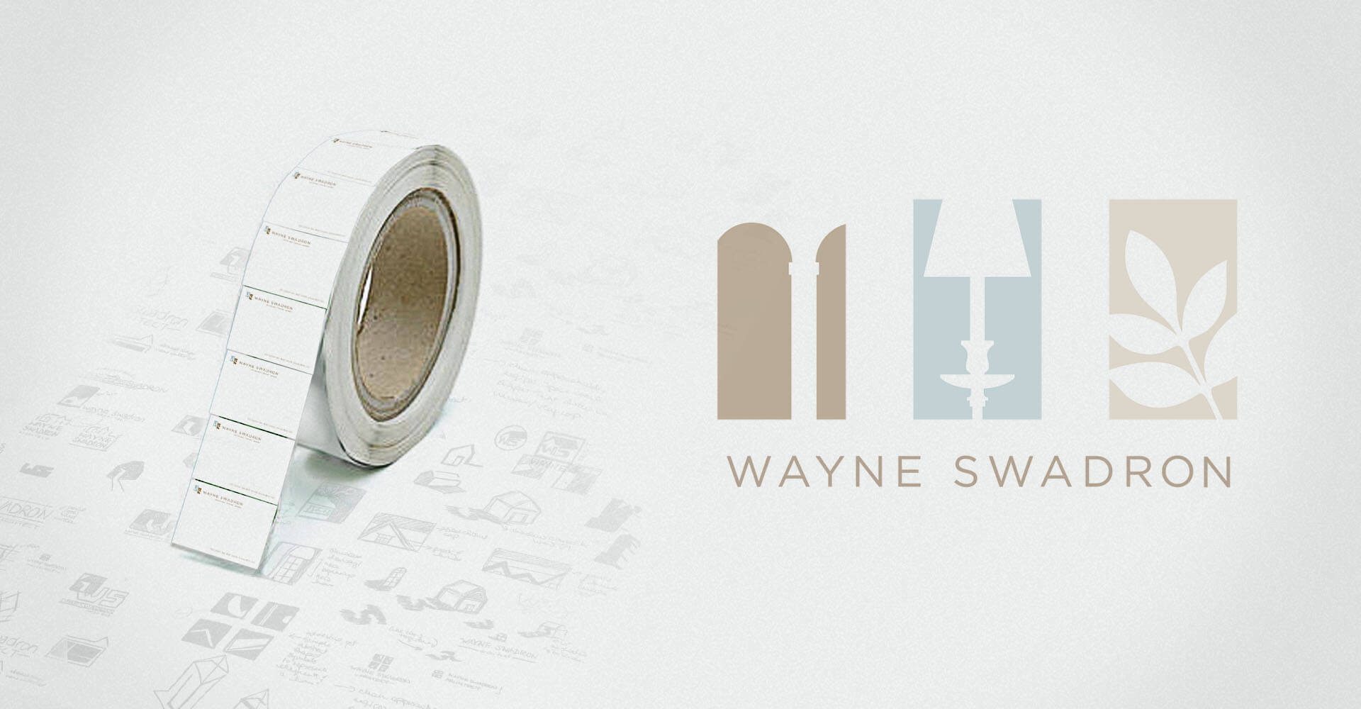
Wayne Swadron engaged us to develop a brand identity that would project a premium image of the company and instill confidence into prospective clients. We created a sophisticated logo that utilizes muted green and grey shapes containing a subtle ‘WS’ acronym. The new contemporary moniker is complemented by their name in a clean and elegant typeface. In addition, we developed a series of three brand icons that represent their three core areas of expertise – interior design, exterior design & landscape design. These secondary icons are used on the business cards and other collateral material as an intriguing way of deepening their brand communication.


The new corporate identity elevated consumer perception of the Wayne Swadron brand and their offering. We continue to work with Wayne Swadron on their brand communications, helping them to round out their design presentation across all consumer touchpoints.