What's the password?
The Treehouse Cannabis Co.
Treehouse Cannabis is a small batch cannabis retailer that specializes in the craft side of the cannabis market, with a curated product line that the store owners believe in and stand behind. Capturing the spirit of adventure and inclusion, Hamilton, Ontario’s newest cannabis retailer recreates the energy of youthful exuberance in a shop that is fun, exciting, and super casual.
Looking to become a trusted community choice, Treehouse wanted to capture the freedom of childhood summers spent beneath a canopy of leaves, exploring the forest, and forging lifelong friendships. The essence of the brand hearkens back to youthful days and creates nostalgia and longing for a return to simpler times.
Project Type:
Related Projects:
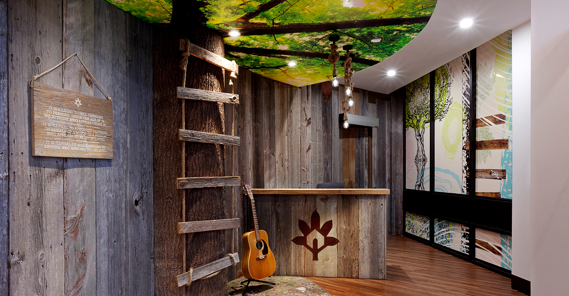
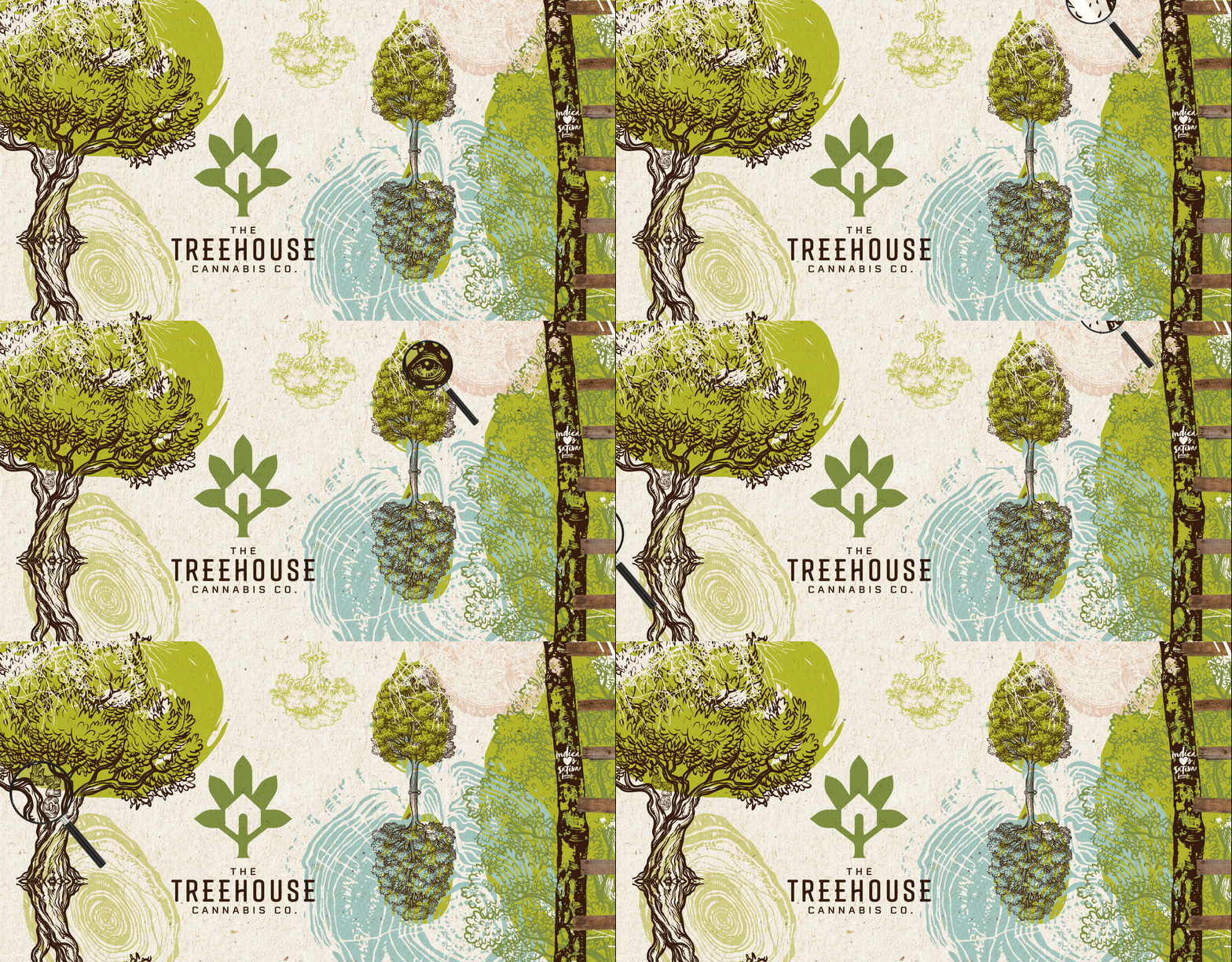
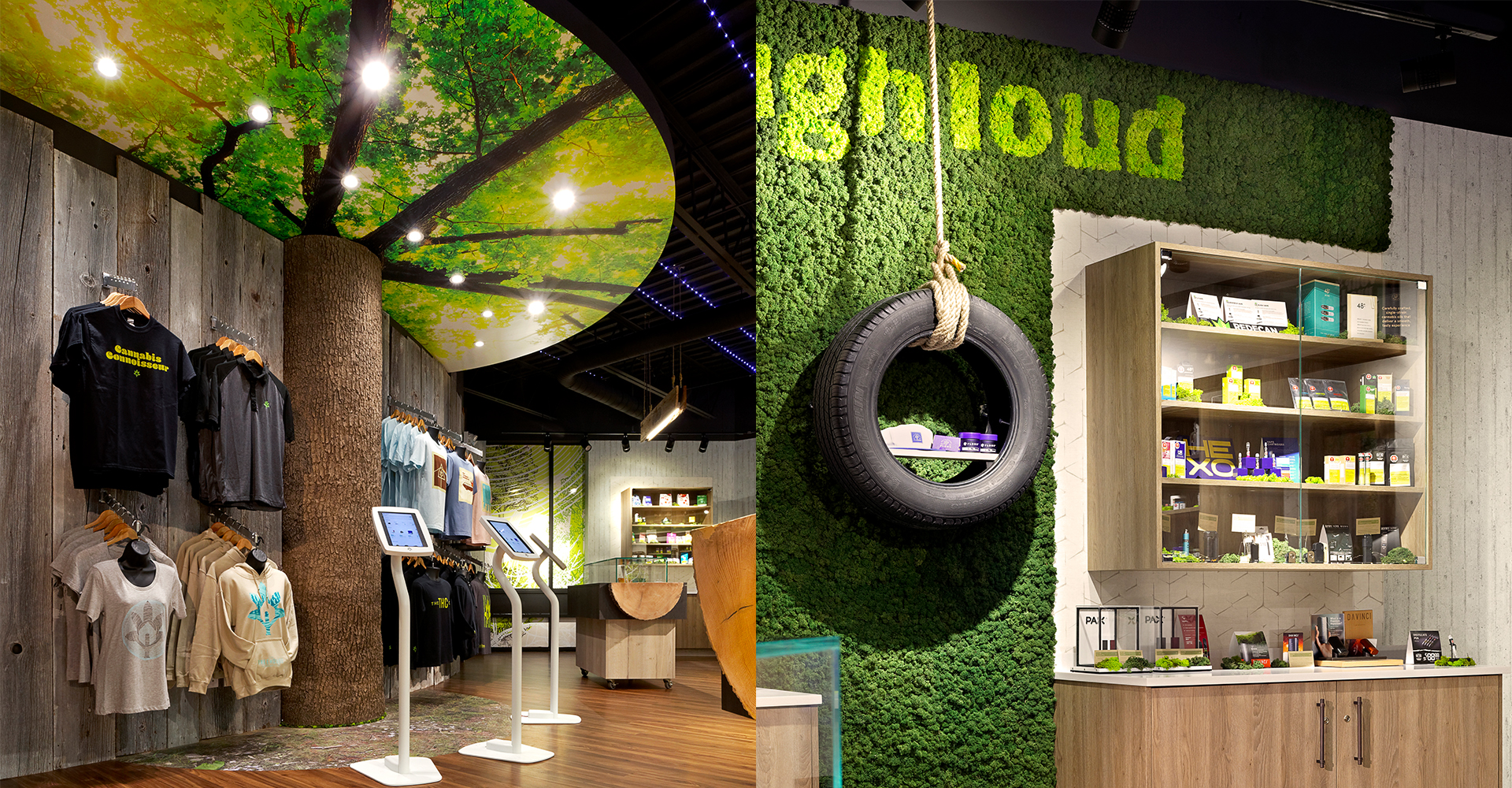
The interior is an obvious nod to the outdoors. The reception area sets the tone with a huge tree trunk set into the wall with a rope ladder that climbs to a leaf and limb ceiling graphic, with a forest floor vinyl as an apron. Hanging knotty rope lighting lends rustic authenticity, as does the guitar on the stand and the “Little Rascals”-esque disclaimer sign that turns a necessary regulatory element into a playful branded element. The window glazing graphics are intentionally surreal, with floating trees spreading in all directions and hidden elements such as the eyeball in the tree and the 420 graphic hidden in the branches that provoke exploration. Everything you see is made of wood, just as it would be in a treehouse.
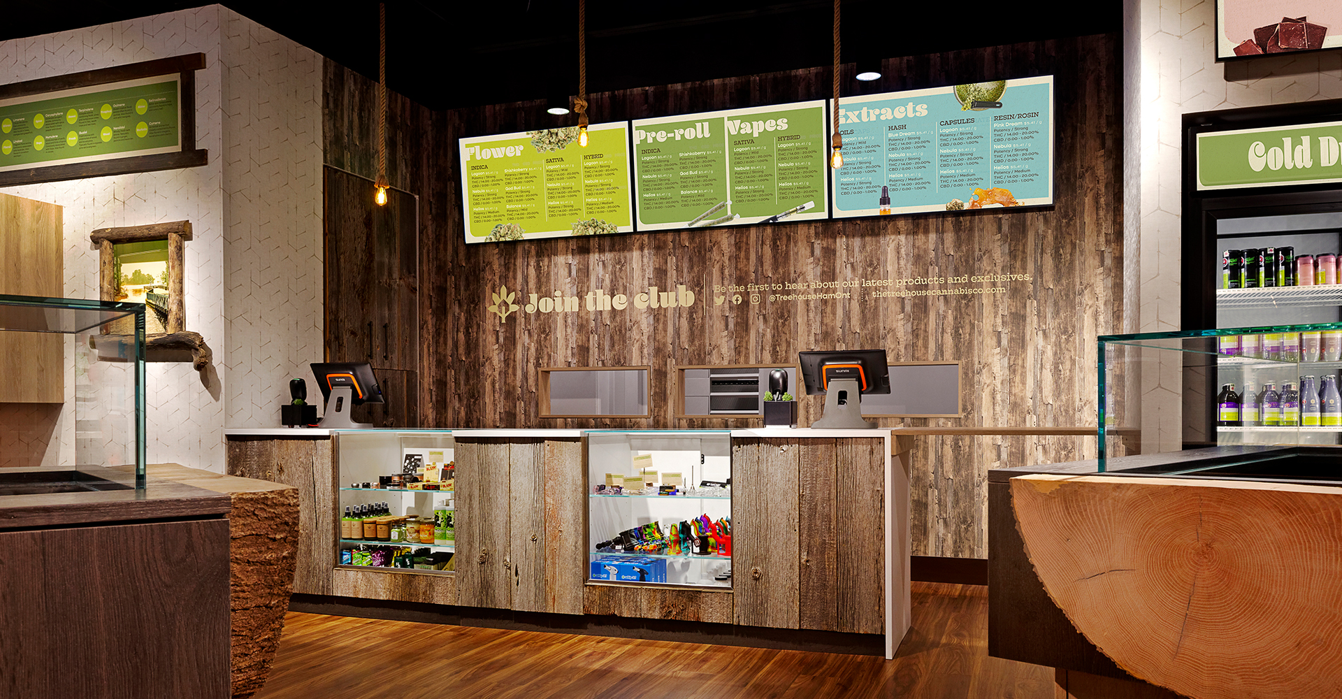
Menu boards and signage go retro with 70’s-style font treatments and colours, while live-edge tree facings on display cases offer substance and a feeling of longevity and heritage. Birch-bark-framed artwork that contains photos of the Hamilton the owners remember growing up in also set the nostalgic tone.
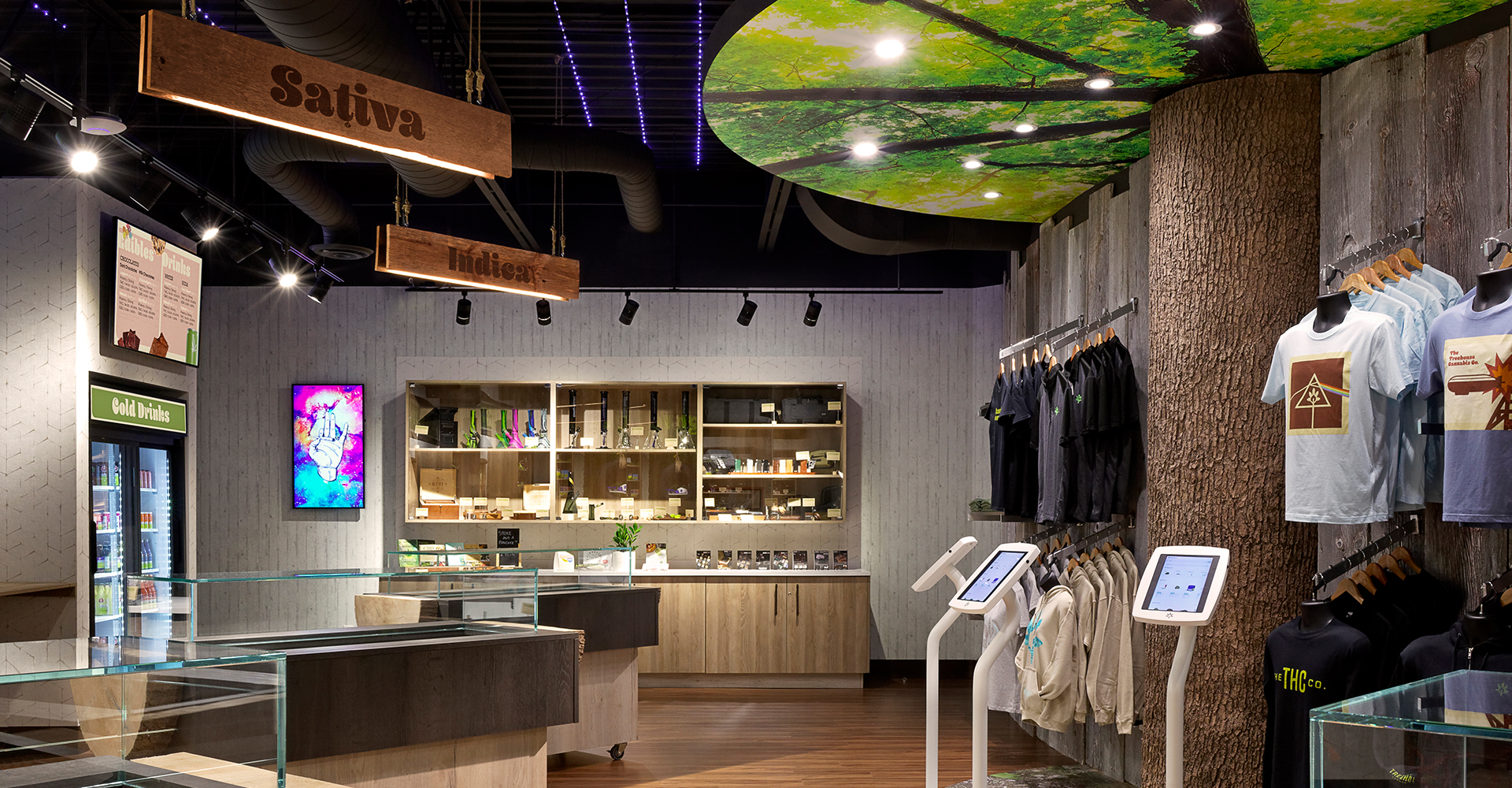
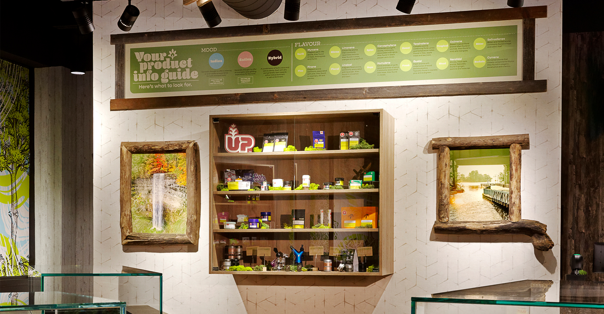
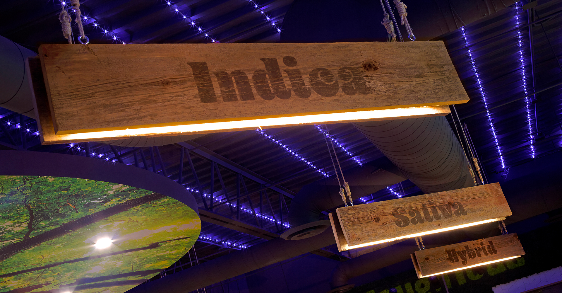
Blue LED lighting in the ceiling suggests a starry night above the canopy of trees, and wooden signage suspended from knotted ropes and stainless-steel eyehooks contain lighting elements within, shining light on the display cases below.
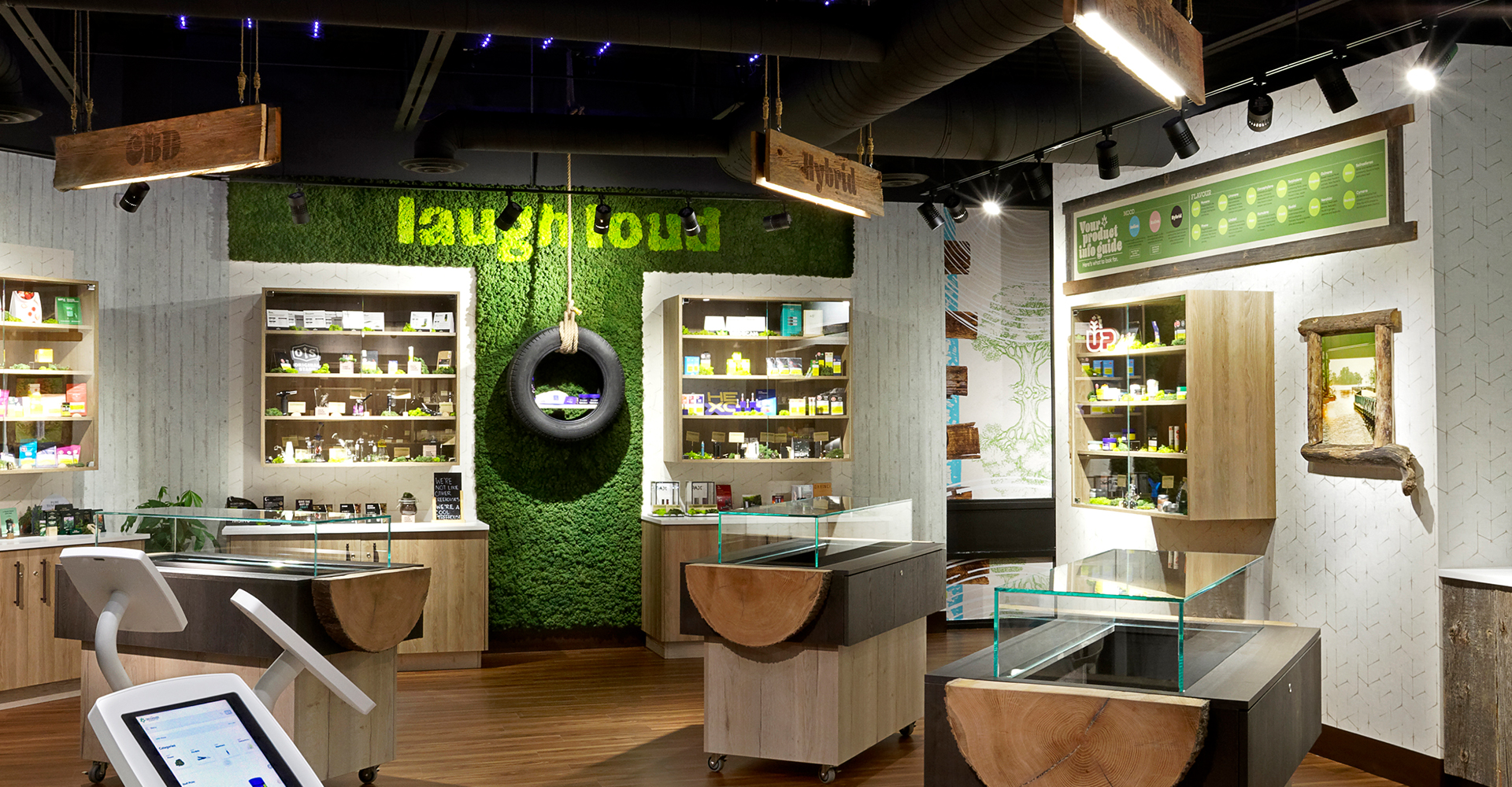
A moss wall implores customers to “Laugh Loud”, adorned with a tire swing that doubles as a display unit, all to suggest to visitors that the Treehouse Brand stands for having fun and enjoying cannabis responsibly in a carefree and open environment.
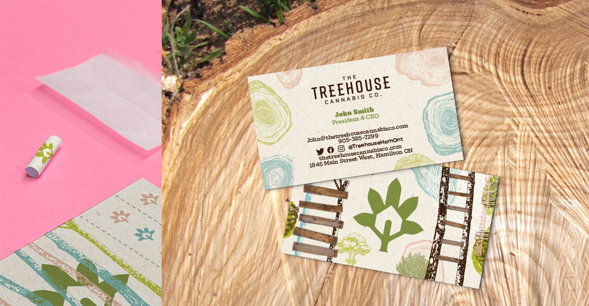
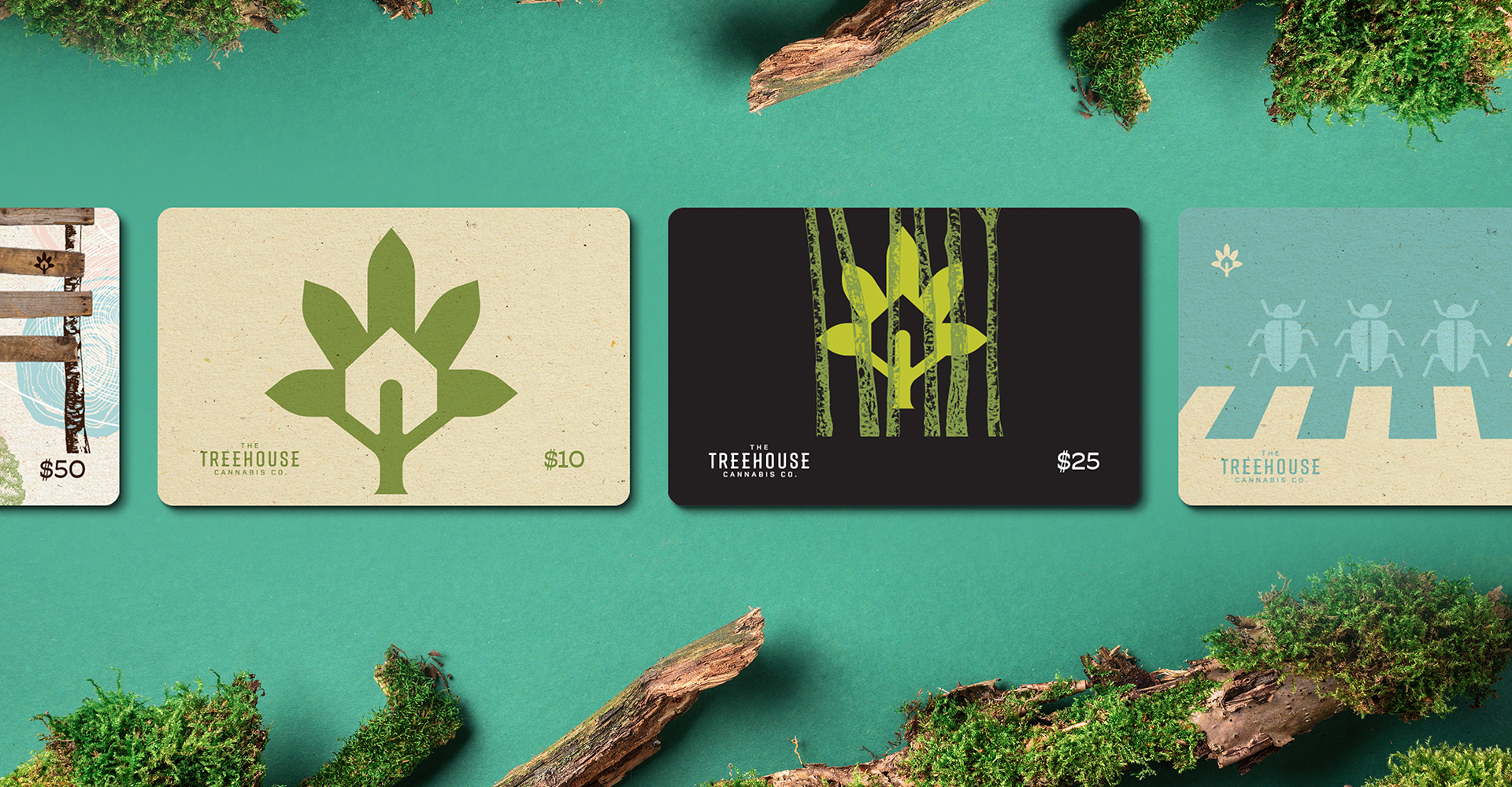
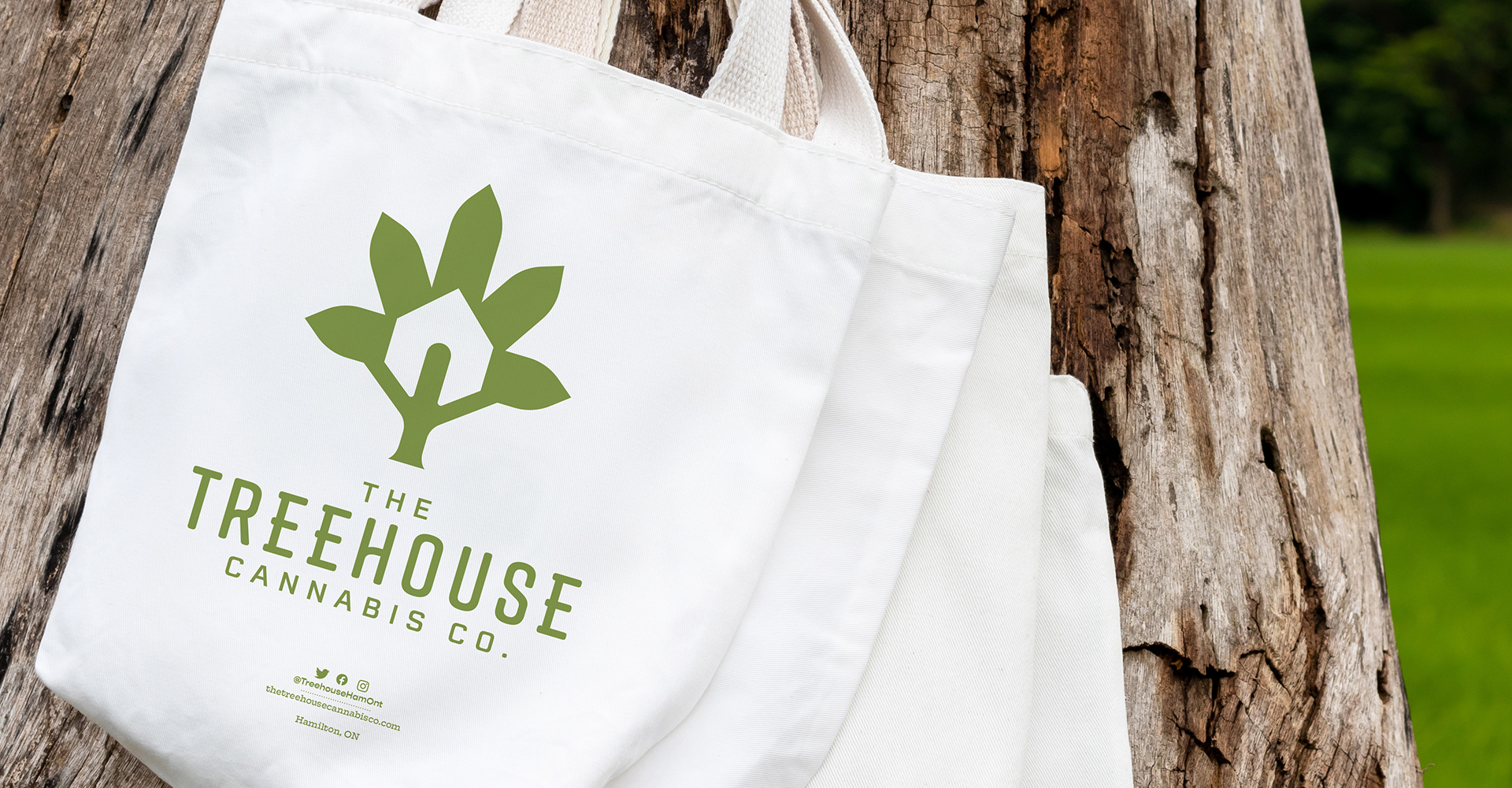
The Treehouse logo features an icon that is a combination of tree and cannabis leaf, with a house carved out of the centre using the negative space. The resulting trunk doubles as a figure with outstretched arms supporting the leaf, tree, and house above, introducing a human element and a supportive and inclusive spirit to the design. Business cards include tear lines suggesting use as filter tips by budding enthusiasts.

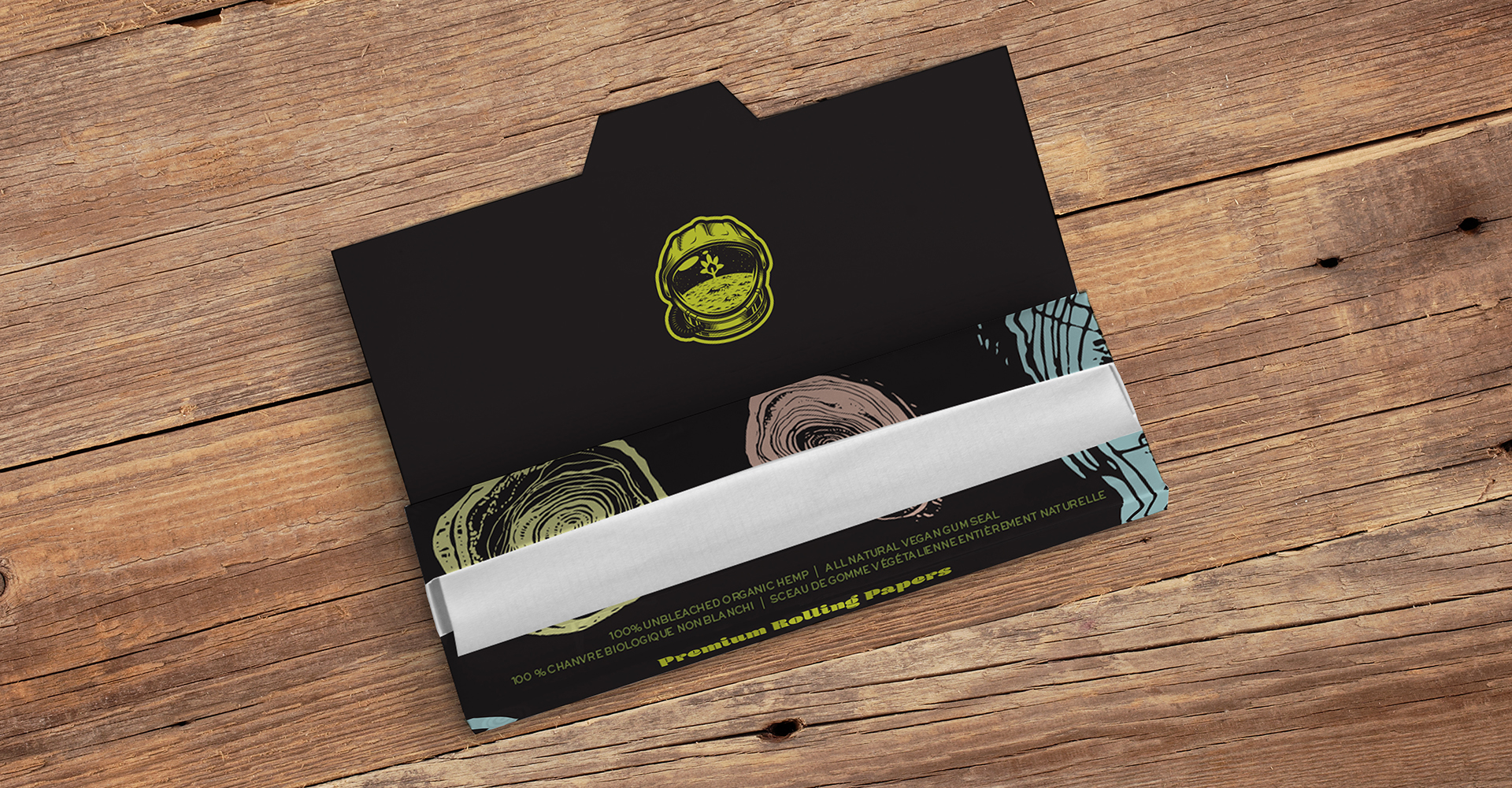
Striking a balance between outdoors-y nostalgia and contemporary convenience led our team to explore retro applications that spark intrigue and create conversation. Adaptations of classic album covers from the seventies such as Pink Floyd’s Dark Side of the Moon and Led Zeppelin IV suggest a mood and create a playlist for the experience.
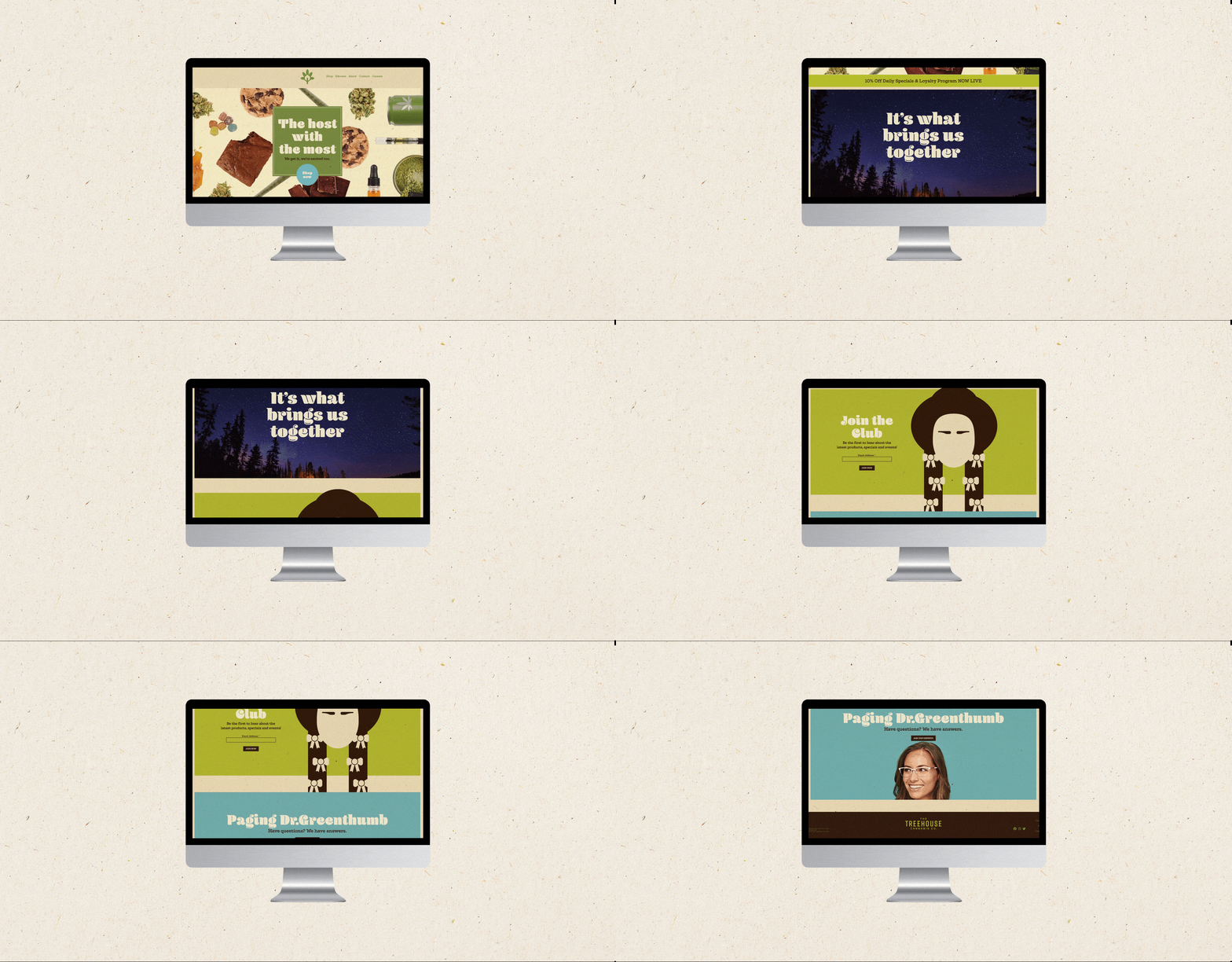
The website extends the brand online, with playful illustrations symbolic of the retro vibe in the store, and language that warmly invites customers to come on up and join the Treehouse club.
