
A Burger and Fries Story
South St. Burger
New York Fries first came to us in August of 2004 with the idea of expanding their offering to include a ‘Best-of’ Burger along with their infamous fresh fries. Burgers would be a new category for NYF but certainly not unknown as a food combination to the general public. The development of what would become the South St. Burger brand began with a vision, a defined process and a set of achievable goals.
The collaborative process outlined by Jump included setting up internal task force teams responsible for executing their key areas of expertise. Our discovery process was perhaps the most important aspect of the brand development. It began with an alignment session that included all task-force leaders, to begin to understand their preconceived visions for the new brand. A walking tour of Manhattan took us to almost twenty burger joints over a two-day period, and helped our group to better understand the burger category. It also gave us the opportunity to deep dive into the category, and into a lot of burgers as well! With a strong understanding of the food offerings, brand opportunities and overall consumer experiences, we undertook this same exercise in Toronto to get a handle on how this new brand could position into our test market.
Project Type:
Related Projects:
Awards:
2011 — A.R.E. Sustainability Awards (Innovation In Energy)
BACK TO THEIR ROOTS
A series of internal and client name generation sessions followed, which eventually saw us name the new concept after the South Street Seaport where the first New York Fries was opened. It made sense, as this history provided some real and credible strength to the development of the brand.
DEFINING THE ENVIRONMENT
Further to this, Jump developed a series of Brand Fingerprint boards, a visual brand mosaic of images and phrasing that allowed us to narrow in on NYC loft style visuals. We developed a series of logos that ranged from evolutions of the NYF brand mark to entirely new logos that were a full departure from existing brand references. From this point the essence of the brand was defined, and the development of the new South St. Burger Co. could begin.
If you’re going to open a new burger concept in an extremely crowded, even overpopulated part of the QSR business, it’s safe to say you have to do something pretty spectacular to stand out. That said, there is often a difference between slick and compelling, so it is critically important that brand and design work together. Jump doesn’t just get that; it’s what they are.
Jay Gould, President, South St. Burger
MAPPING CONSUMER INTERACTION
All consumer touchpoints were reviewed and in order to understand how the consumer interacted with the brand at all points along their journey; before entering, during their visit, and after leaving the store. The architectural branding and integrated brand signage program we developed provided a strong and differentiated experience for the guest.
THE UPSCALE GUYS’ BURGER
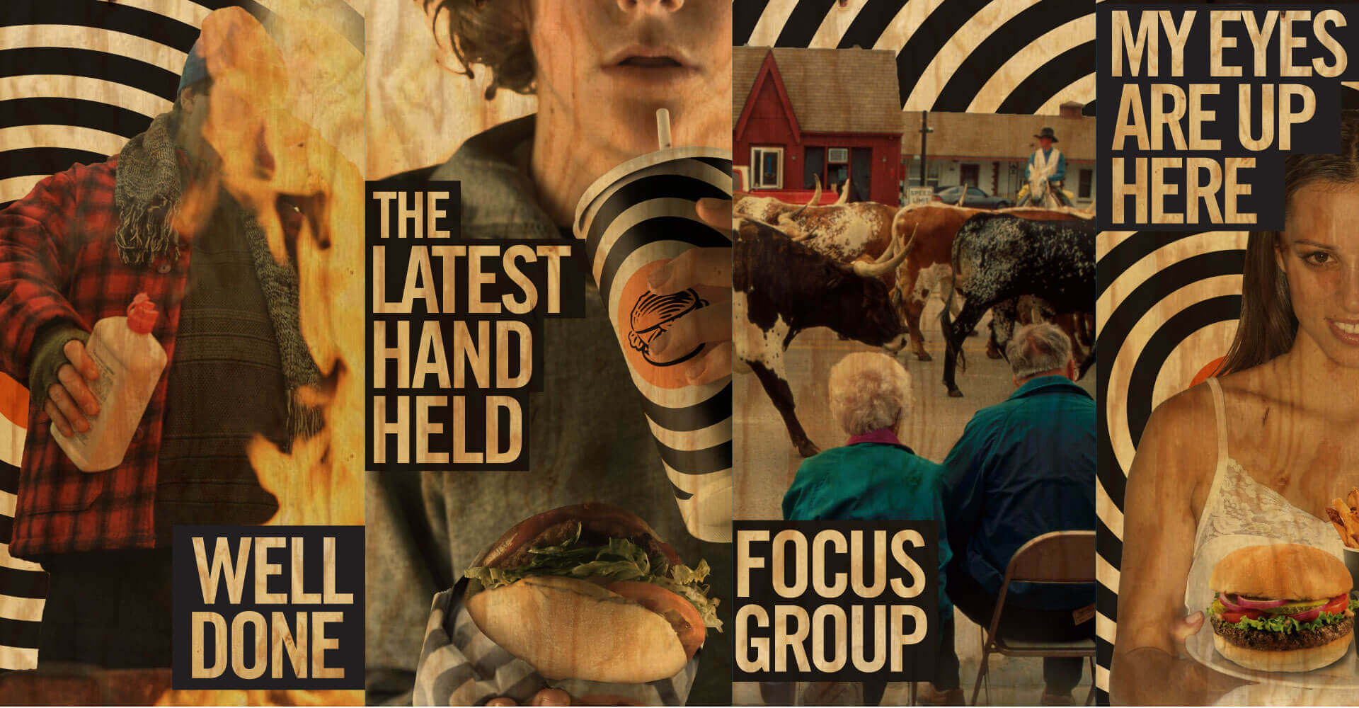
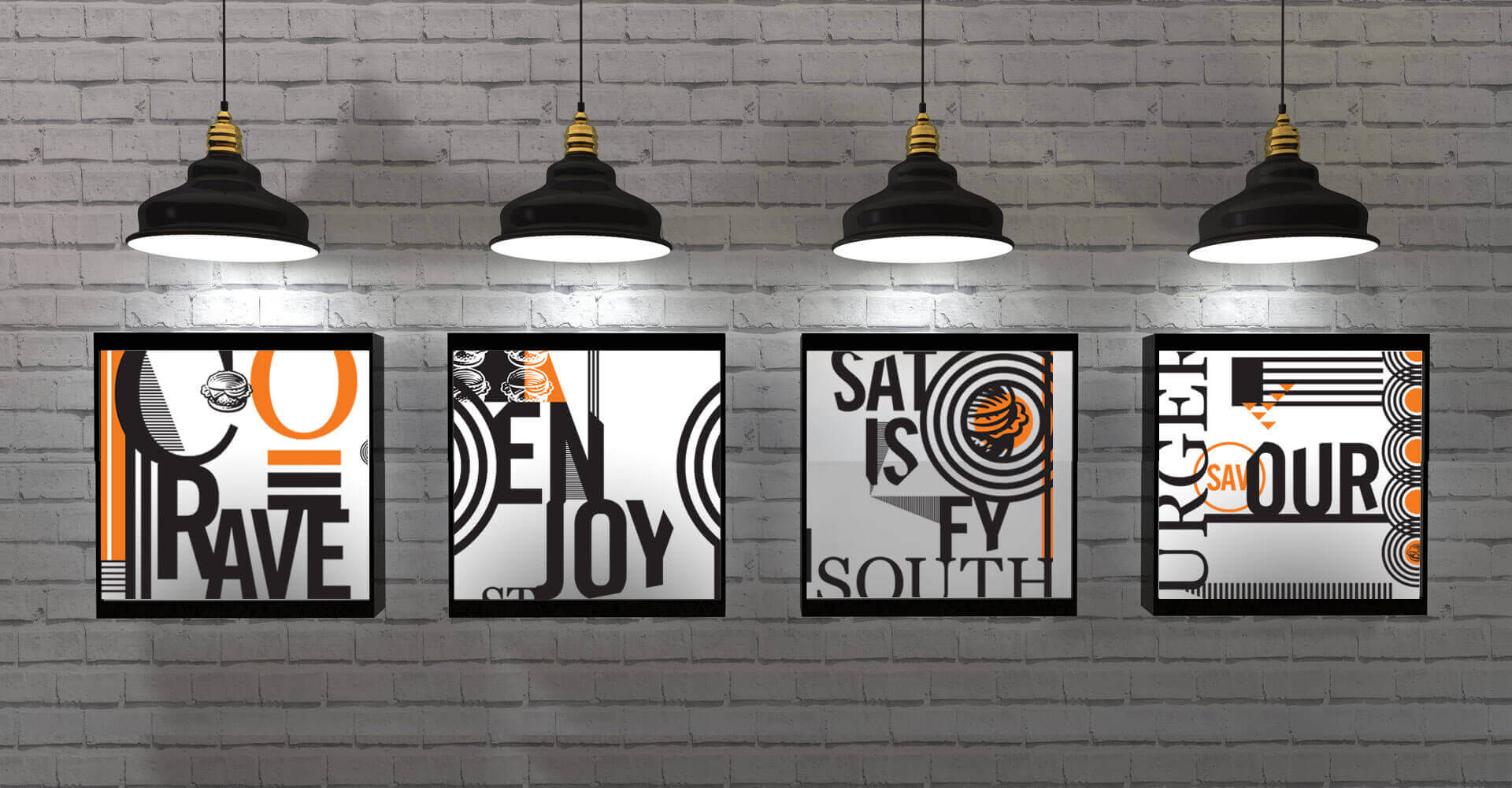
Brand Humour graphics that define ‘guy’ moments and inject humour are in contrast with the upscale fast-casual dining restaurant environment.

WHAT’S ON THE MENU?
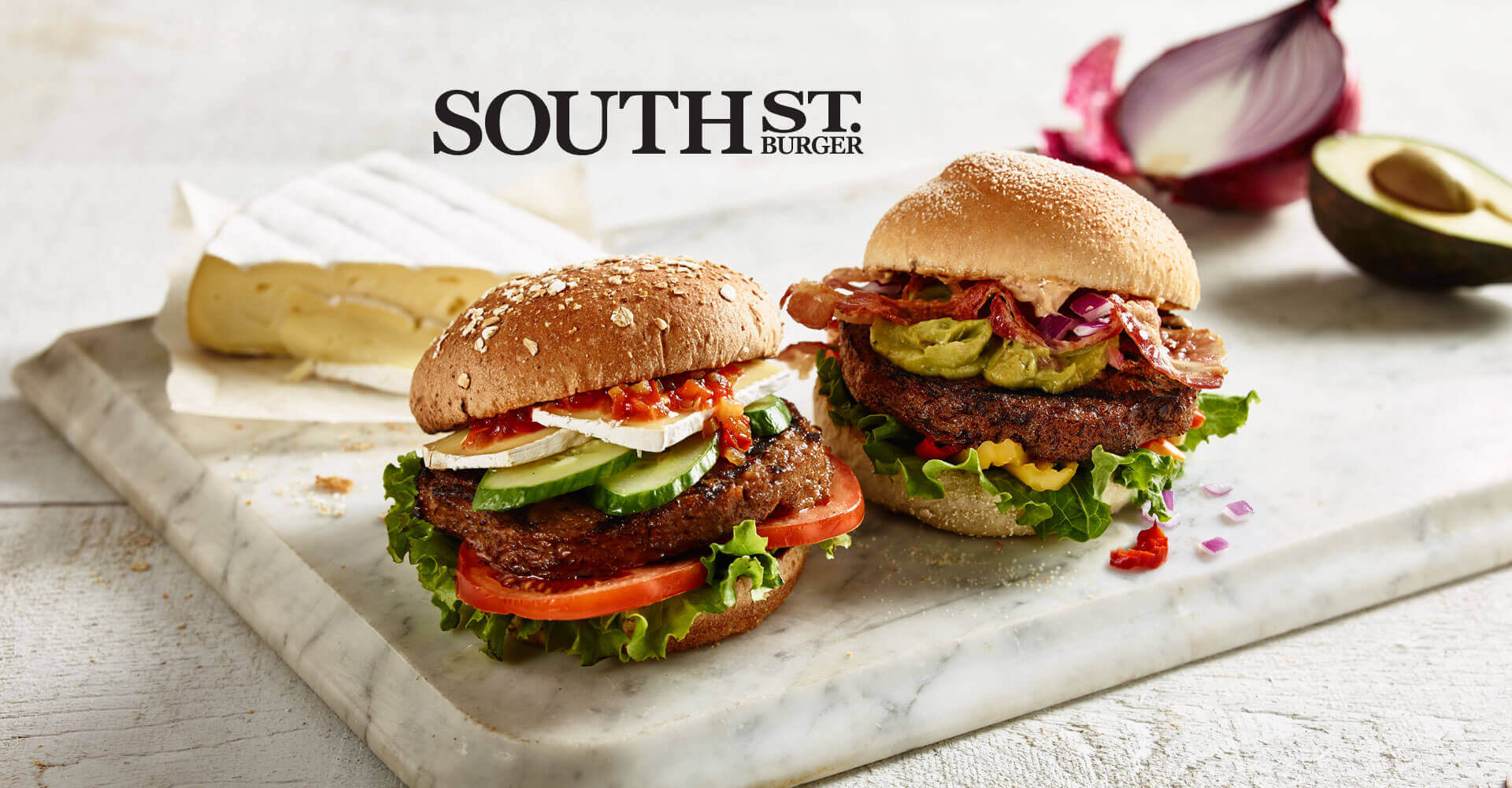
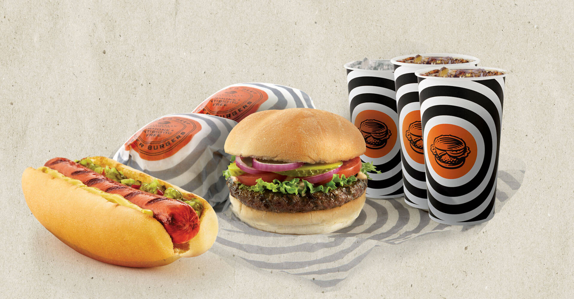
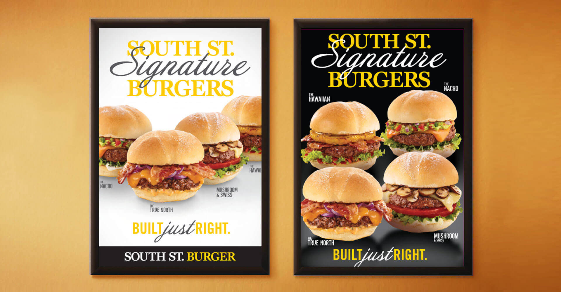
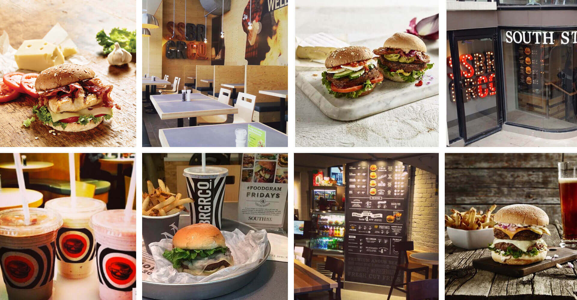
The menu system and the order process characterize the simplicity of the concept. Appetite appeal is generated through close-cropped food photography that categorize the three main food items, which are all best-in-category.

CONTEMPORARY AND URBAN
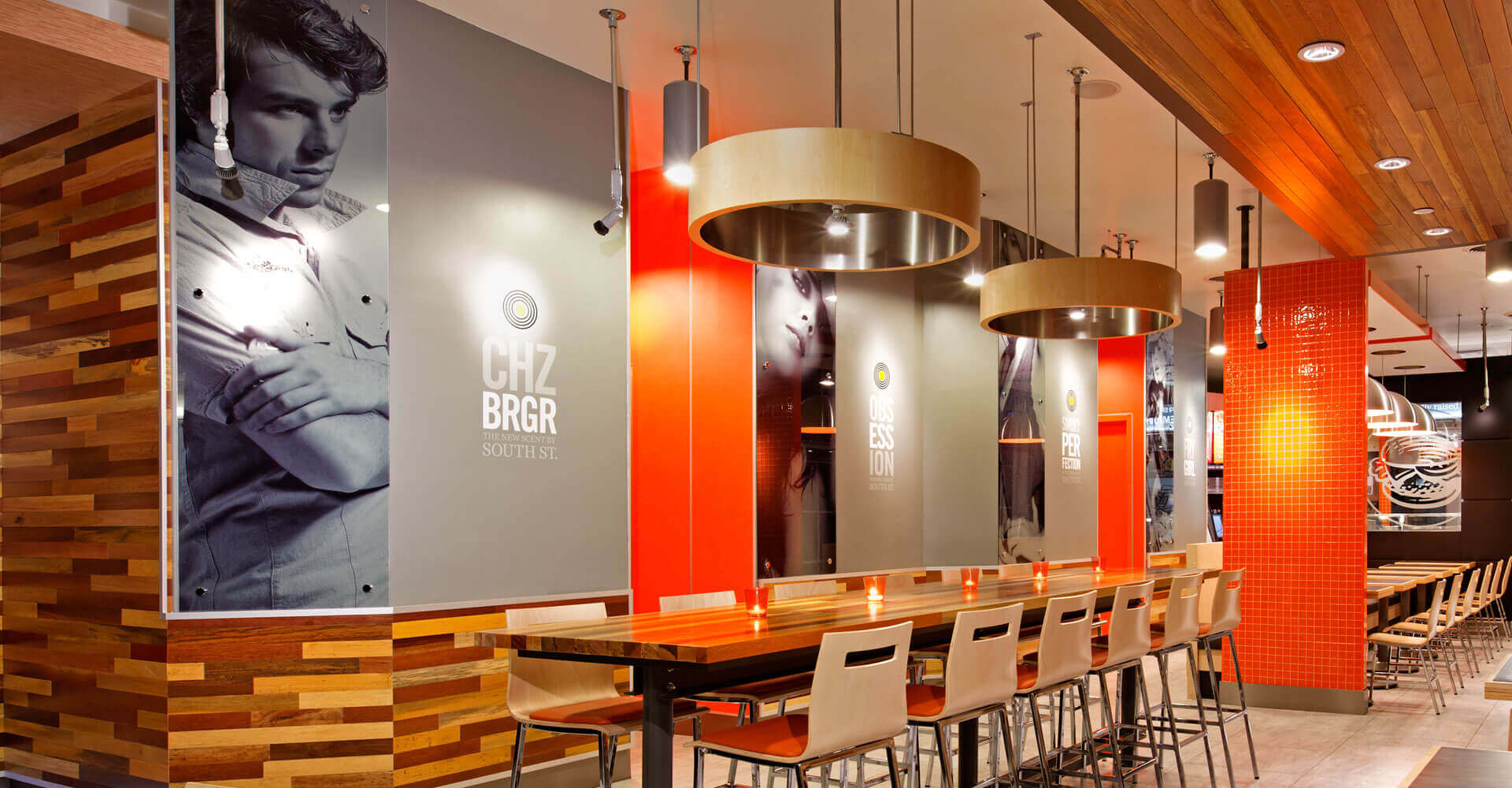
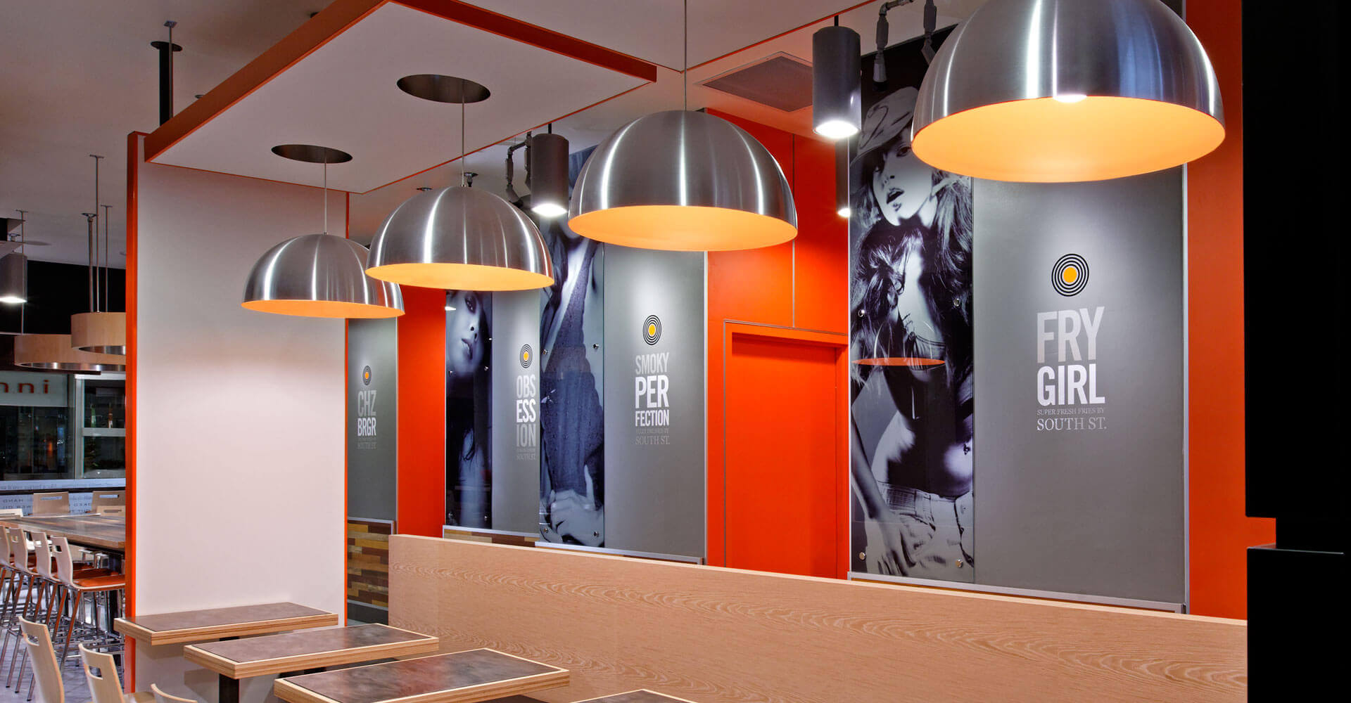
The loft-style architecture, rich in colour, detail, and texture, is exemplified by the exposure of beams, columns, concrete and glass, and balanced with warm, light, maple woods. Horizontal and vertical planes, matched by the strong use of colour blocking and texture, effectively highlight key areas within the store. The architectural palette features modern materials selected for their appeal and strength. The environment illustrates the contemporary, urban style that defines this new fast-casual restaurant concept.

BUILDING THE BRAND
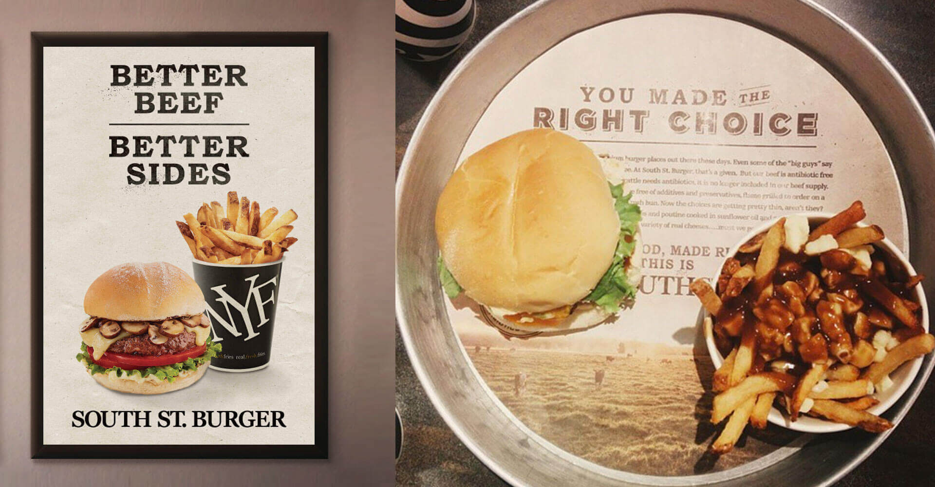
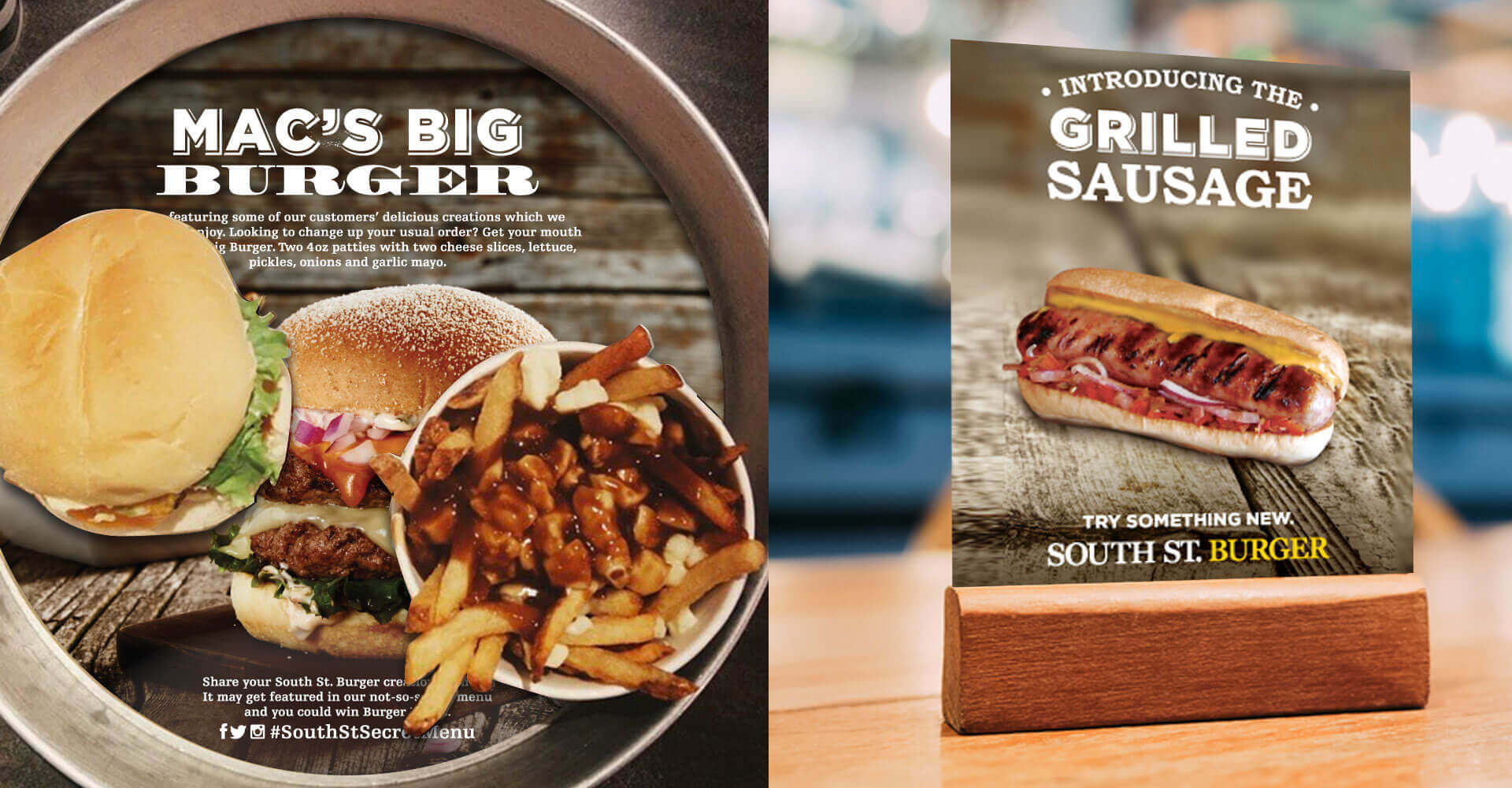
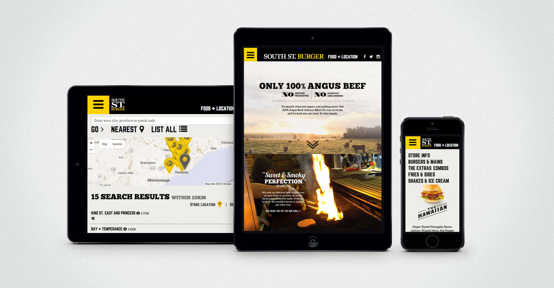
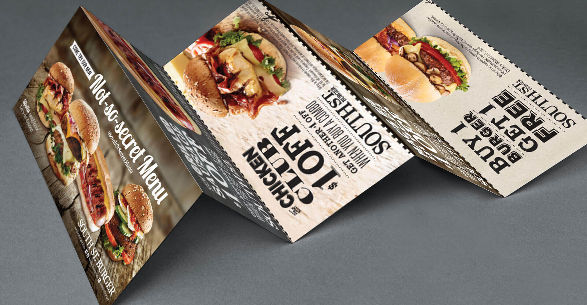
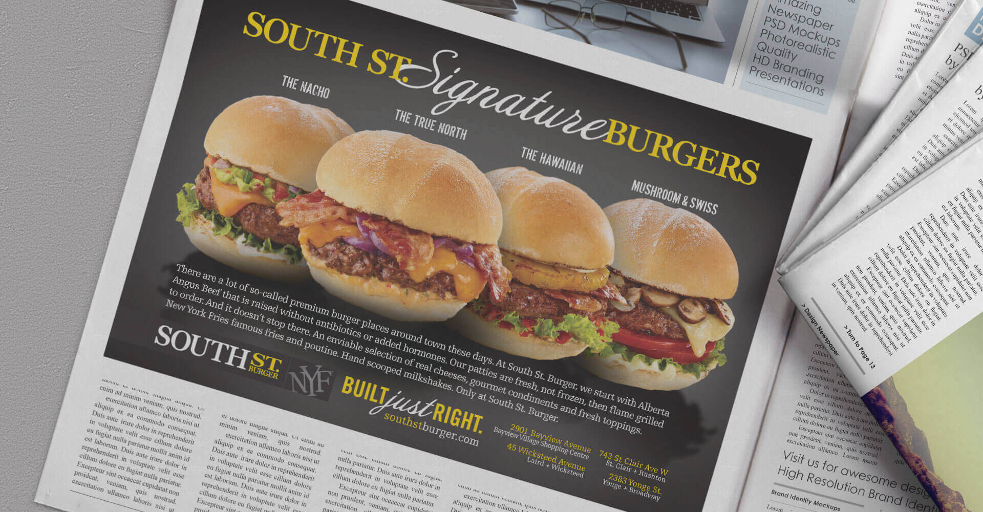
Take-out packaging, brand collateral materials and the website all work to complement the consumer experience and guest interaction with the brand. The clear and consistent use of the brand elements help to create and define the South St. Burger brand, and visually provide the distinction to compete in what has now become a very competitive ‘premium burger’ market.
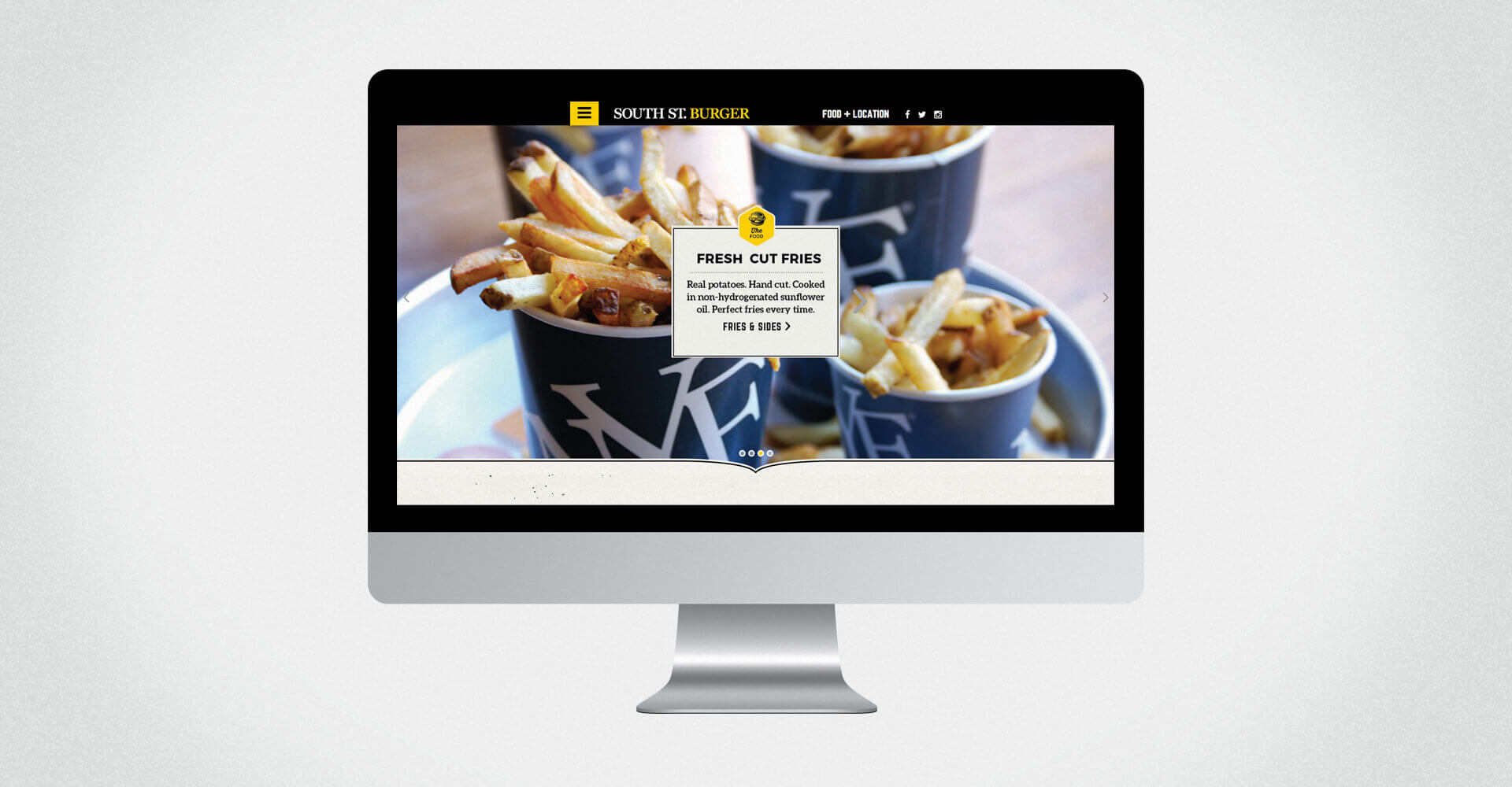
.southstburger.com
explore the website
THE EVOLUTION OF SOUTH ST.
Throughout the South St. journey we have been fortunate enough to serve as brand stewards, constantly reviewing the brand and the marketplace and continuously evolving to remain relevant in a busy category. Each store offers opportunities to evolve and to increase brand visibility and awareness.
IT’S ALL ABOUT THE FOOD
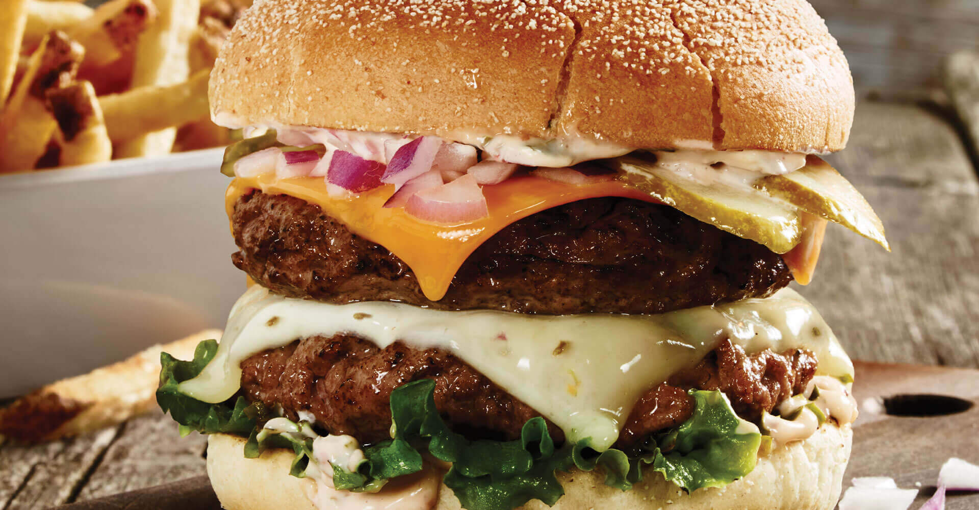
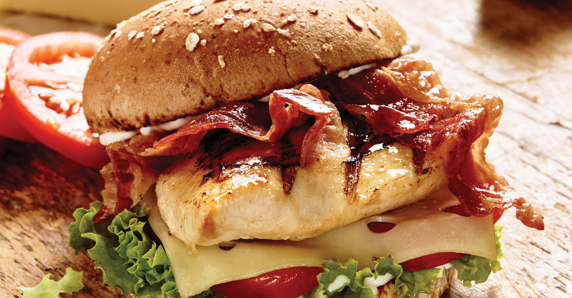
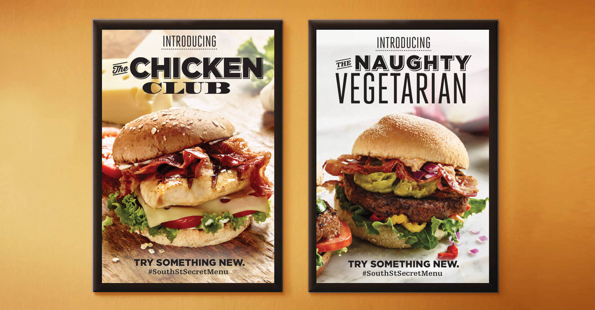
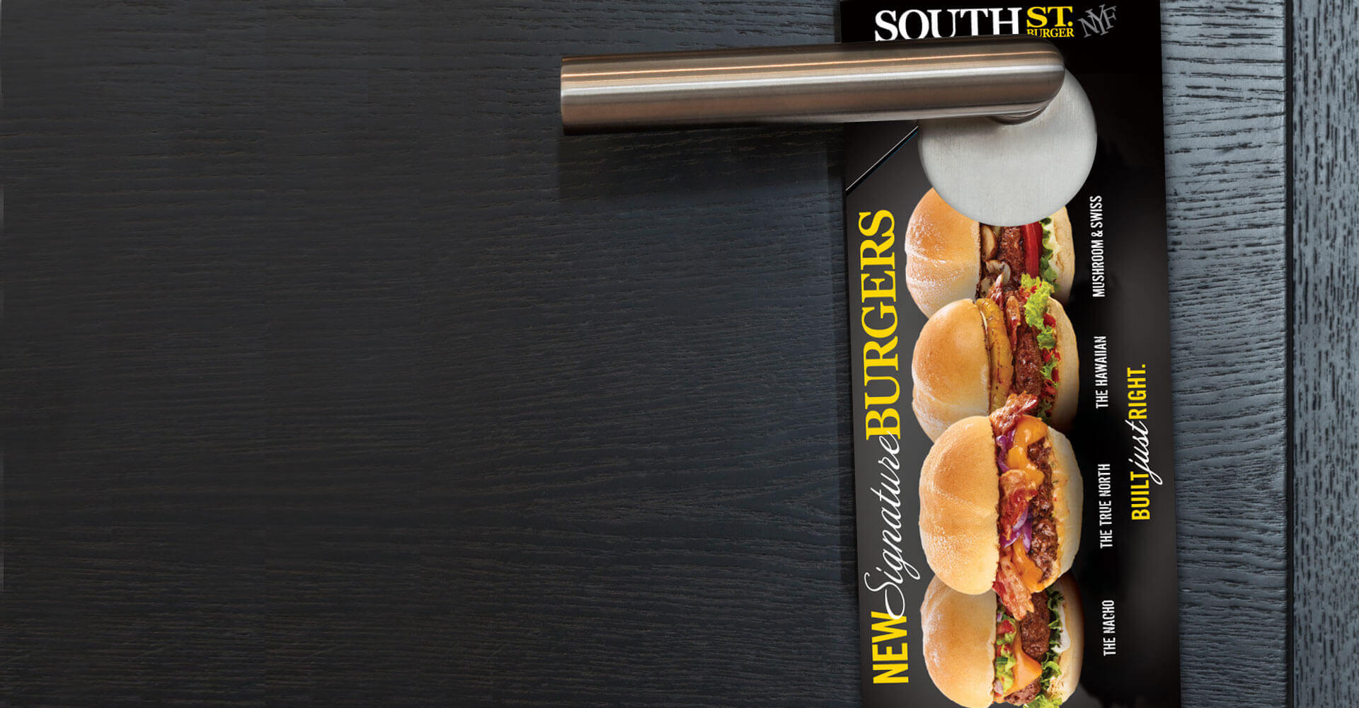
Food photography for South St. Burger has always emphasized quality and flavour, and the unique gourmet toppings that are available.

BURGERS: THERE’S AN APP FOR THAT
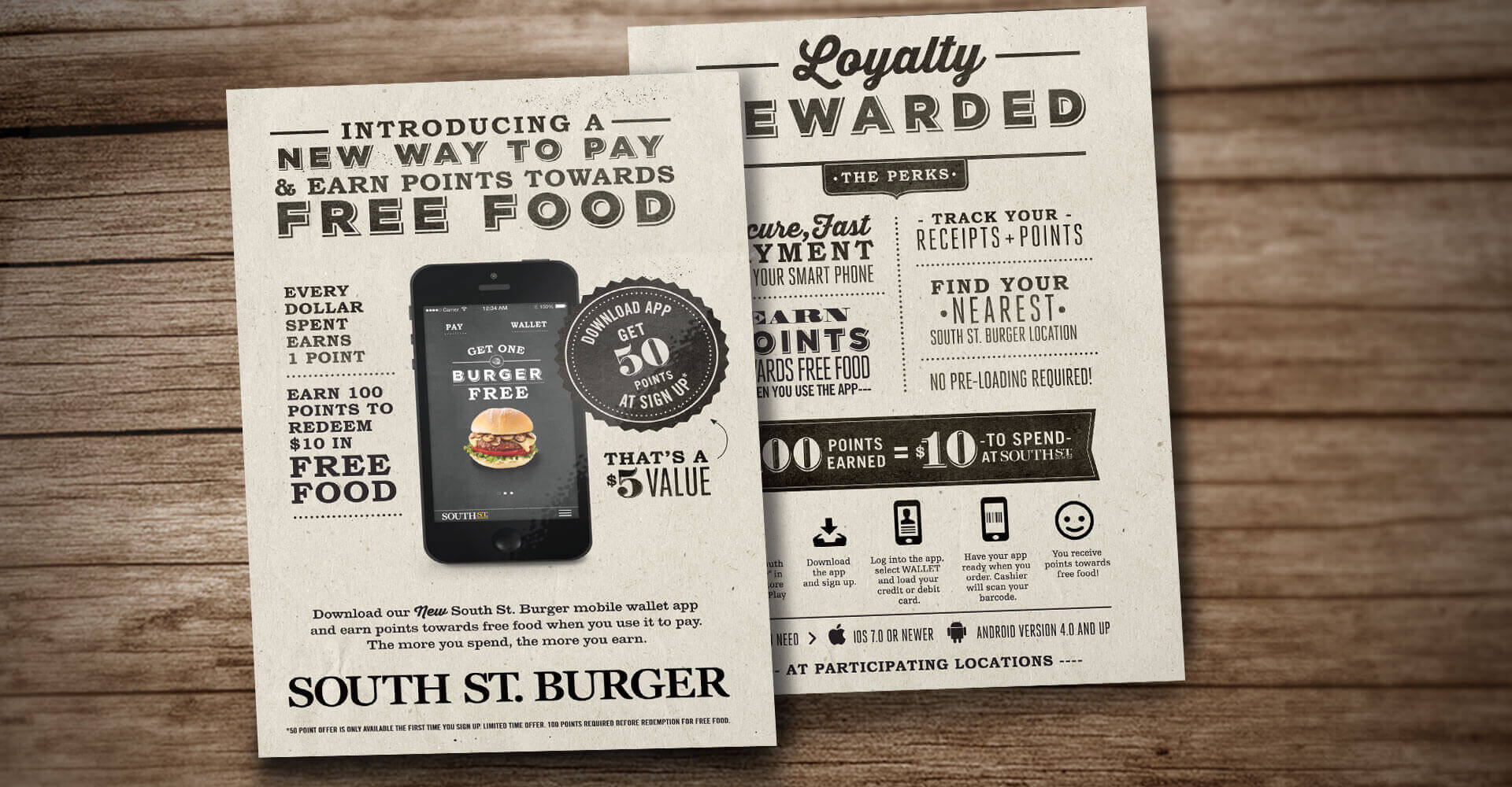
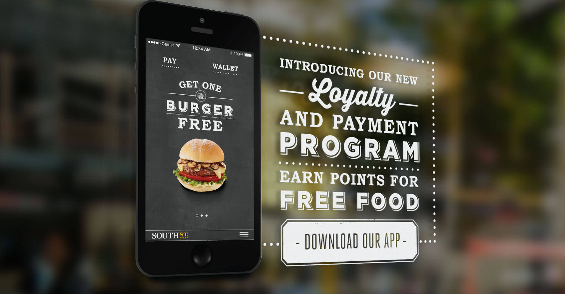
We designed and developed the South St. Burger Mobile Wallet app as both a loyalty and payment program that extends the brand to the mobile device. Customers can earn points while paying securely and conveniently with their mobile devices.
AWARD-WINNING DESIGN
In 2007, the interior store design was recognized with an Outstanding Merit award in Las Vegas at NASFM. In 2010, South St. was written up in Multi Unit Magazine recognized for it’s green initiatives, and FoodService Magazine awarded South St. with a Green Leadership award. In 2011, the Urban Concept at the Shops at Don Mills was awarded a Sustainable Design award at the A.R.E. awards in Las Vegas in recognition for Innovation in Energy. The greening/sustainable initiatives led to the development of the upscale South St. Burger Co. at Bayview Village in Toronto. This location has received LEED Certification, becoming the first burger chain in Ontario and only tenant of Bayview Village to achieve this designation. LEED Certification validates the sustainable initiatives included in the design and the operations choices that continue to develop this brand as a responsible corporate retailer. In February of 2012, this particular store was recognized at the A.R.E. Design awards in Las Vegas.
MORE SOUTH ST.
Since then, we have helped South St. open several more restaurants, and finally to develop and launch the South St. Burger Bar concept.