Packaging The Miracle Pasta
NuPasta
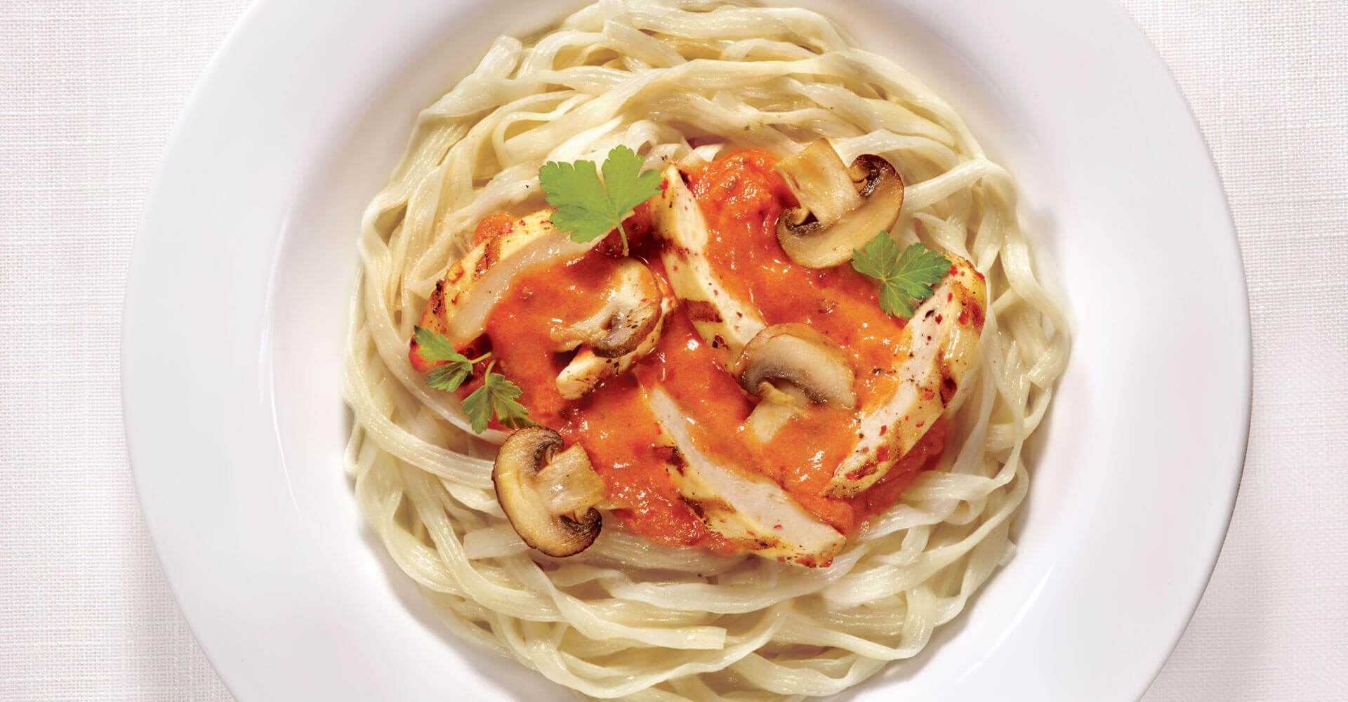
A pasta that is low in calories, high in fibre, and comes without the worry of too many carbs? This isn’t your nonna’s pasta, this is nuPasta, and our job was to get it in the hands and kitchens of North American consumers so that they could see for themselves what this “miracle” pasta had to offer.
nuPasta is made from the root of the Konjac plant. Well known in the Asian community, the Konjac plant has been grown and harvested for food in Japan for over 1500 years, and is popular in China, Korea, Taiwan, and in southeast Asia. And while there are several Asian pastas made from the Konjac root, our clients wanted to introduce nuPasta to the North American market in a way that gave it a premium feel, in contrast to the many inexpensive Asian pastas available on shelf.
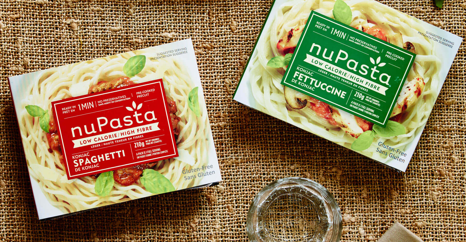
nuPasta offers fettucine, spaghetti, and angel hair pasta, in both regular and organic/gluten free lines. The product comes precooked, requiring only heating in order to serve.
MAKING PASTA NU AGAIN
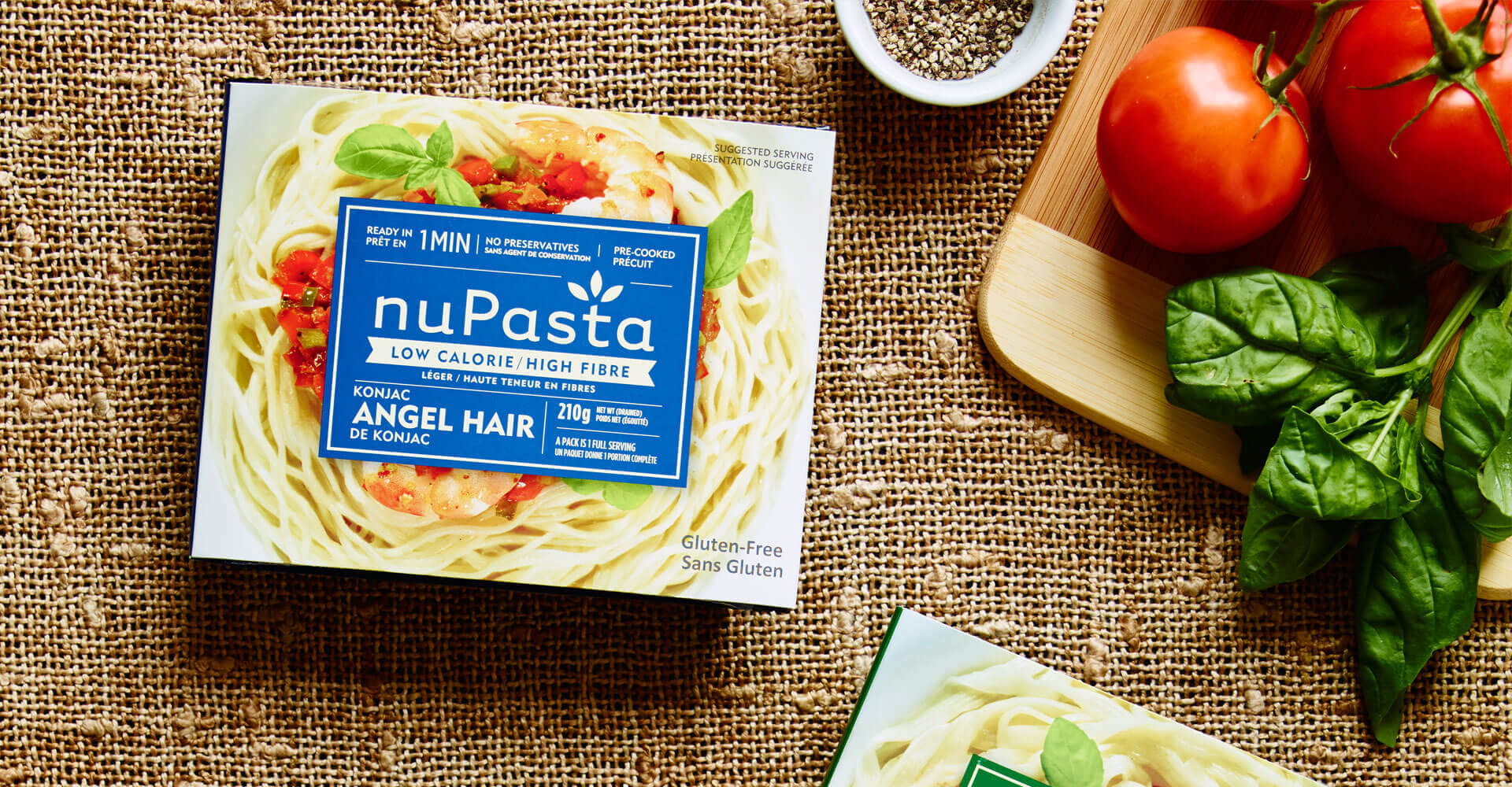
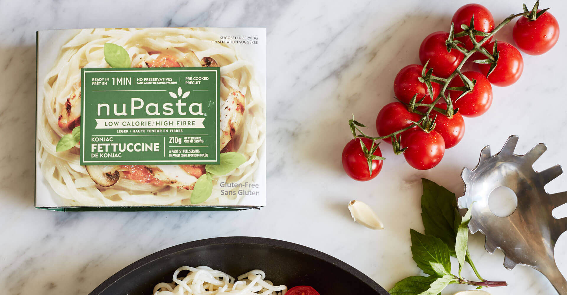
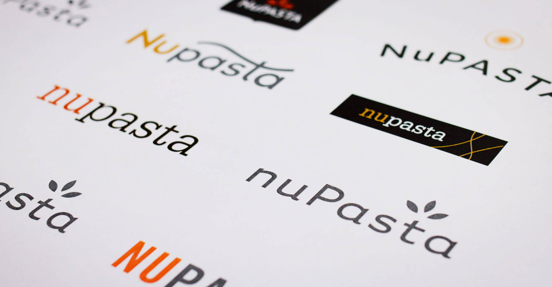
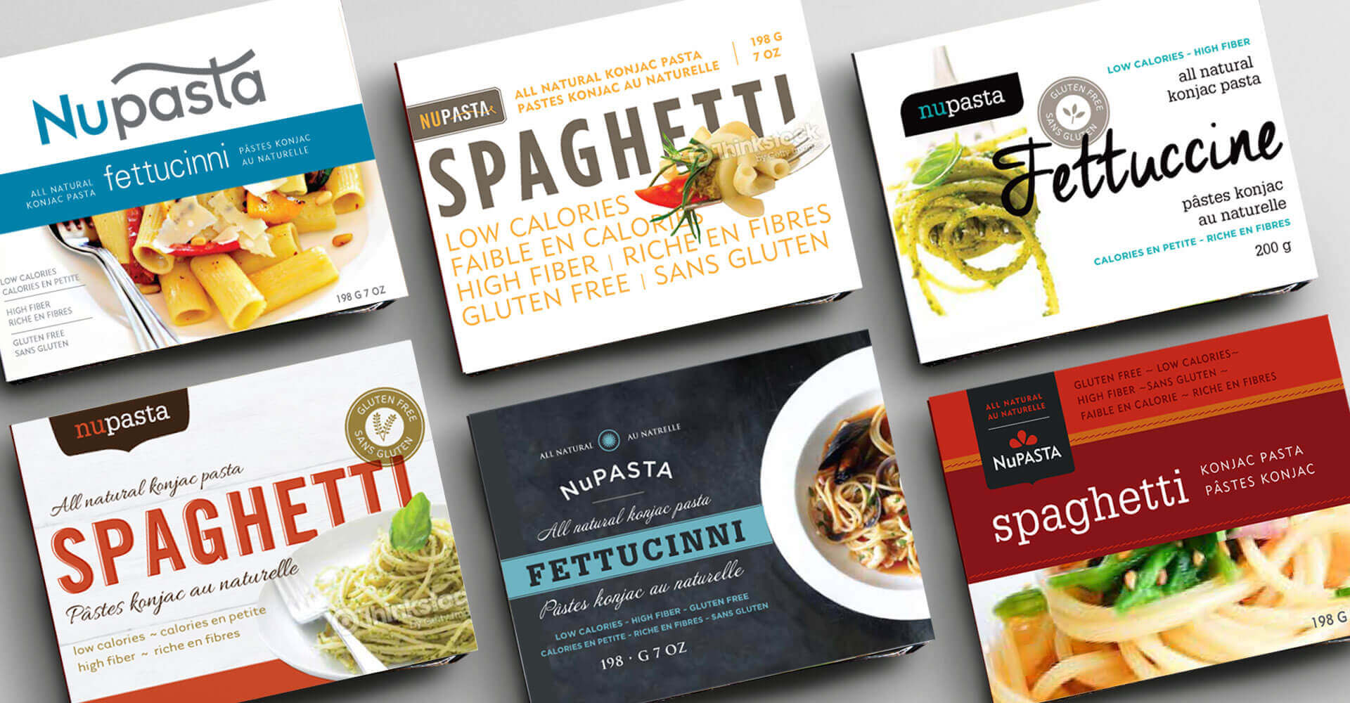
Our job was to design a brand and packaging for nuPasta that communicated the nutritional benefits of the food, was accessible to the Asian market that would be the early adopters of the product, but retain a North American premium feel that would appeal to non-Asians and encourage them to try it as an alternative to the wheat pastas they were used to. Logo exploration landed on a visual mark that leveraged the “t” in pasta as the stem of the Konjac plant, with the leaves radiating from it. This communicated the natural ingredients, and gave it a healthy feeling. Rather than tie the logo to a single colour, designing it as a one colour gave us permission to allow the different SKUs to assign the colour to the mark.
FOCUSING ON THE NOODLE
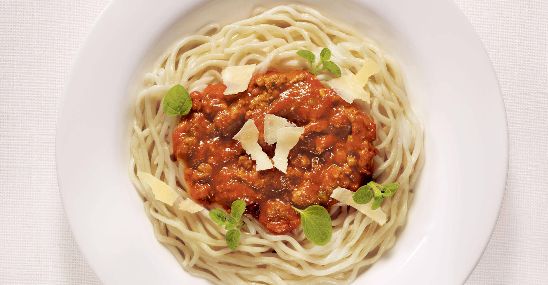
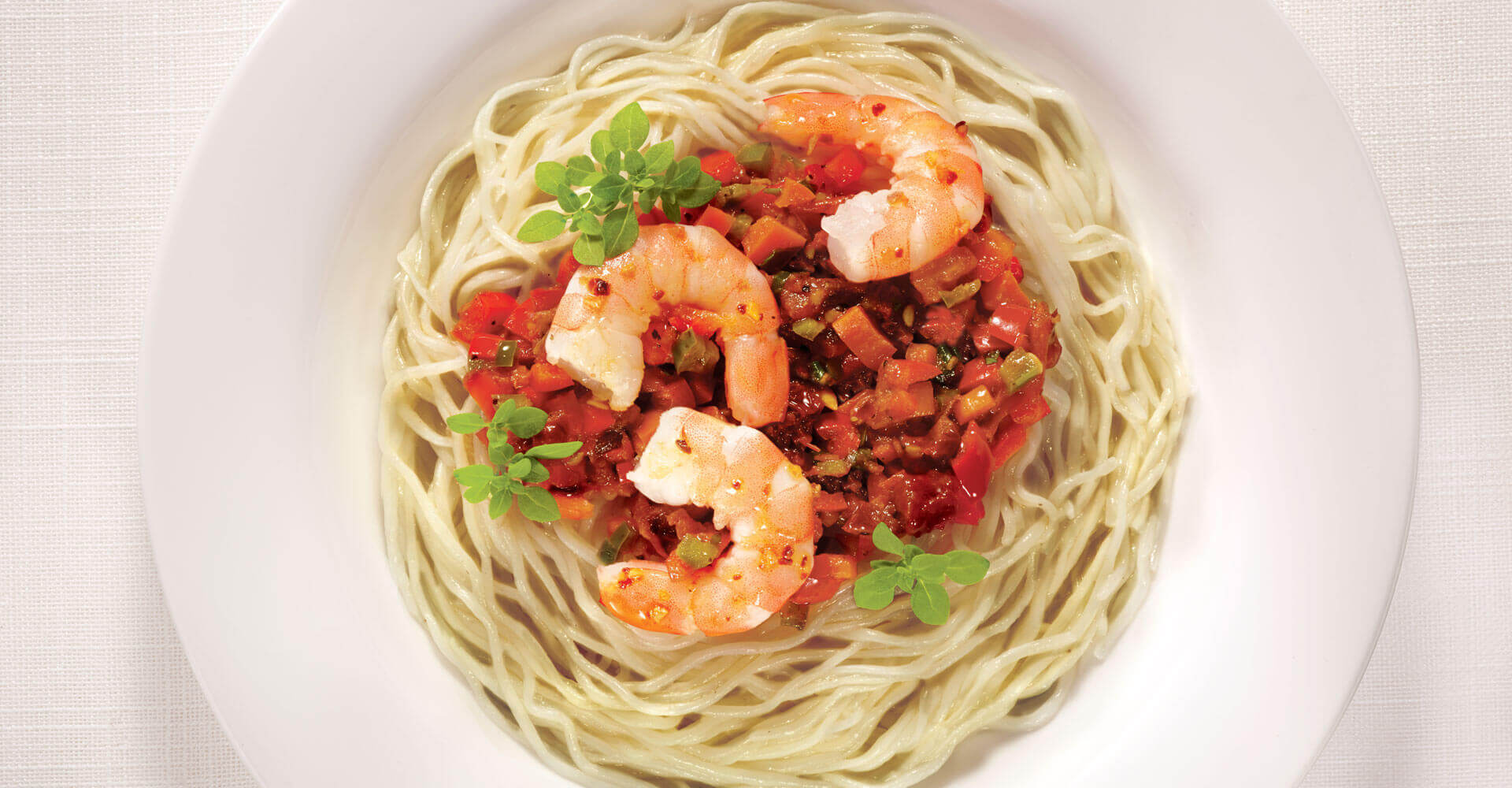
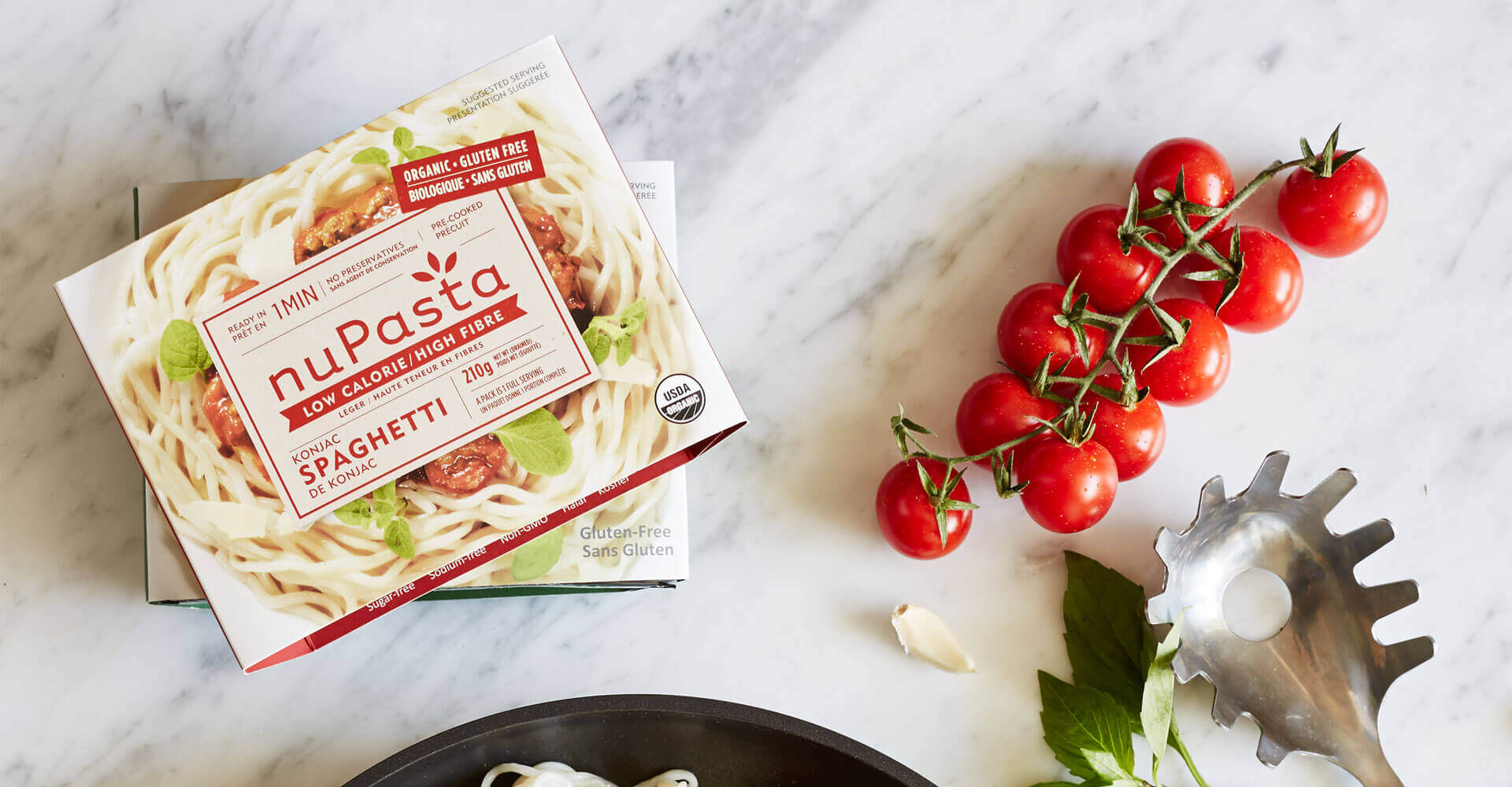
The pasta is packaged in a tray, and we designed a sleeve that allowed for the tray to slide out and the product to be viewed. The noodles are sold on their own, so on the sleeve we were challenged to focus on the noodles in the photography without overselling by including sauce or other ingredients that are not included. We accomplished this by keeping the sauces and additional items in the middle, and largely blocking them out with the box containing the product information. This allowed us to fully show the noodles around the outside, and only hint at the more appetizing ingredients around the informational box label.
MARKETING A NU PRODUCT
As a product that is entirely new to the market, it was important to communicate the nutritional differentiators that make this product unique, but in a way that was comfortable and appealing to the consumer.
