Fresh Pasta To Go
Dal Moro's
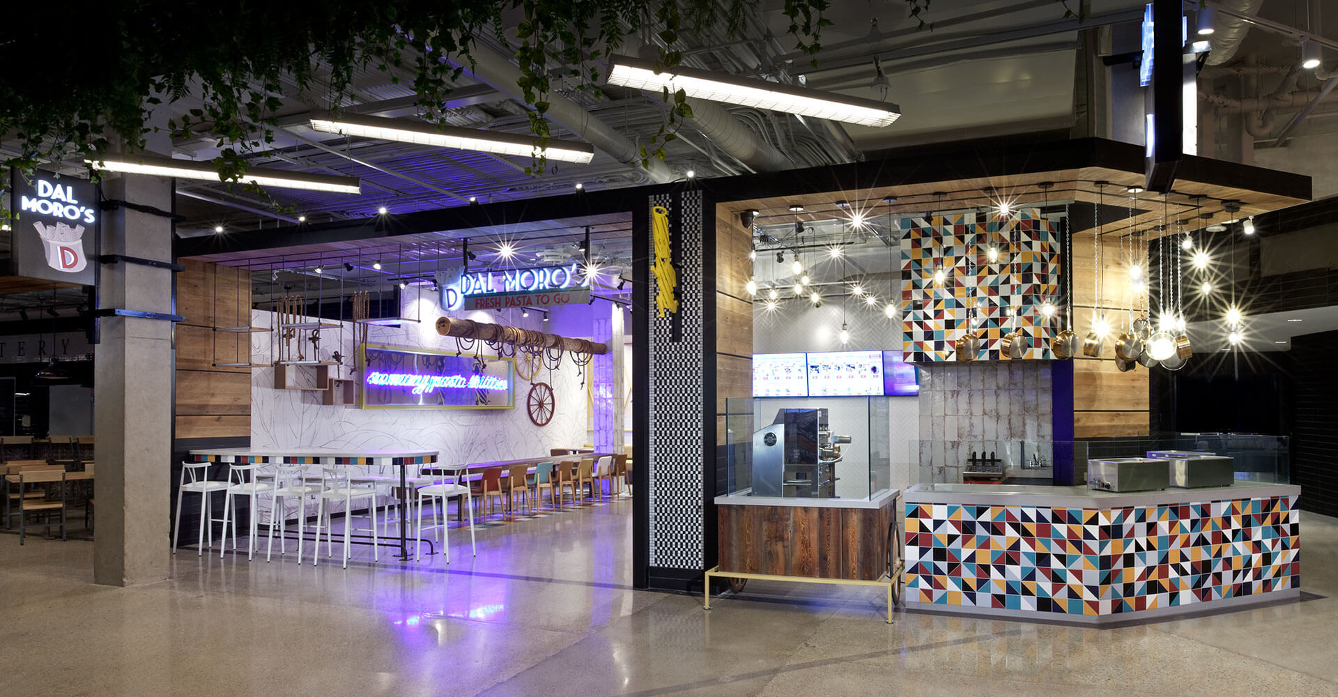
When seventh-generation Venetian chef Gabriele Dal Moro opened Dal Moro’s Fresh Pasta To Go in Venice in 2012, he saw an opportunity to bring pasta to the masses in the same fast-food format customers had grown accustomed to, but with a focus on freshness and quality. With one location in Canada (at Bloor & Yonge), Dal Moro’s decided to open their second Canadian location in the Food District at Square One.
Far from a food court, the Food District has gathered a collection of Toronto’s favourite neighbourhood foodie concepts and assembled them together in an eclectic mix of sought-after restaurant and market brands. Dal Moro’s wanted to dial up the fast, fresh, on-the-go and family-fun nature of their fresh pasta concept, and convey it quickly to potential customers, most of whom would be unfamiliar with the offering.
Kids like pasta. In order to capture their – and mom and dad’s – attention, we created a rhythm and layering within the space that carries the eye inwards and compels potential customers to come in to try the food. We needed Dal Moro’s to be fun in a sea of upscale, adult-oriented food offerings. The walk-up counter and opportunity to eat-in offers a respite to hungry families seeking a family-friendly option. Dal Moro’s Food District design commands attention without being intimidating, and communicates the value proposition and positioning of the brand from the moment our customer sets foot in the Food District.
To that end, we looked to develop a concept that feels happy with an element of quirkiness to it. Building off the core brand elements from their original restaurant, we emphasized family fun in their ‘to-go’ format. With a burst of bright colours and some clever design elements, we developed an environment that emphasizes fun and excitement. This gives patrons an experience that goes beyond the food to become a wholesome offering that includes cool seating, a pasta show and an eclectic design that begs to be shared, both in the restaurant and on Instagram.
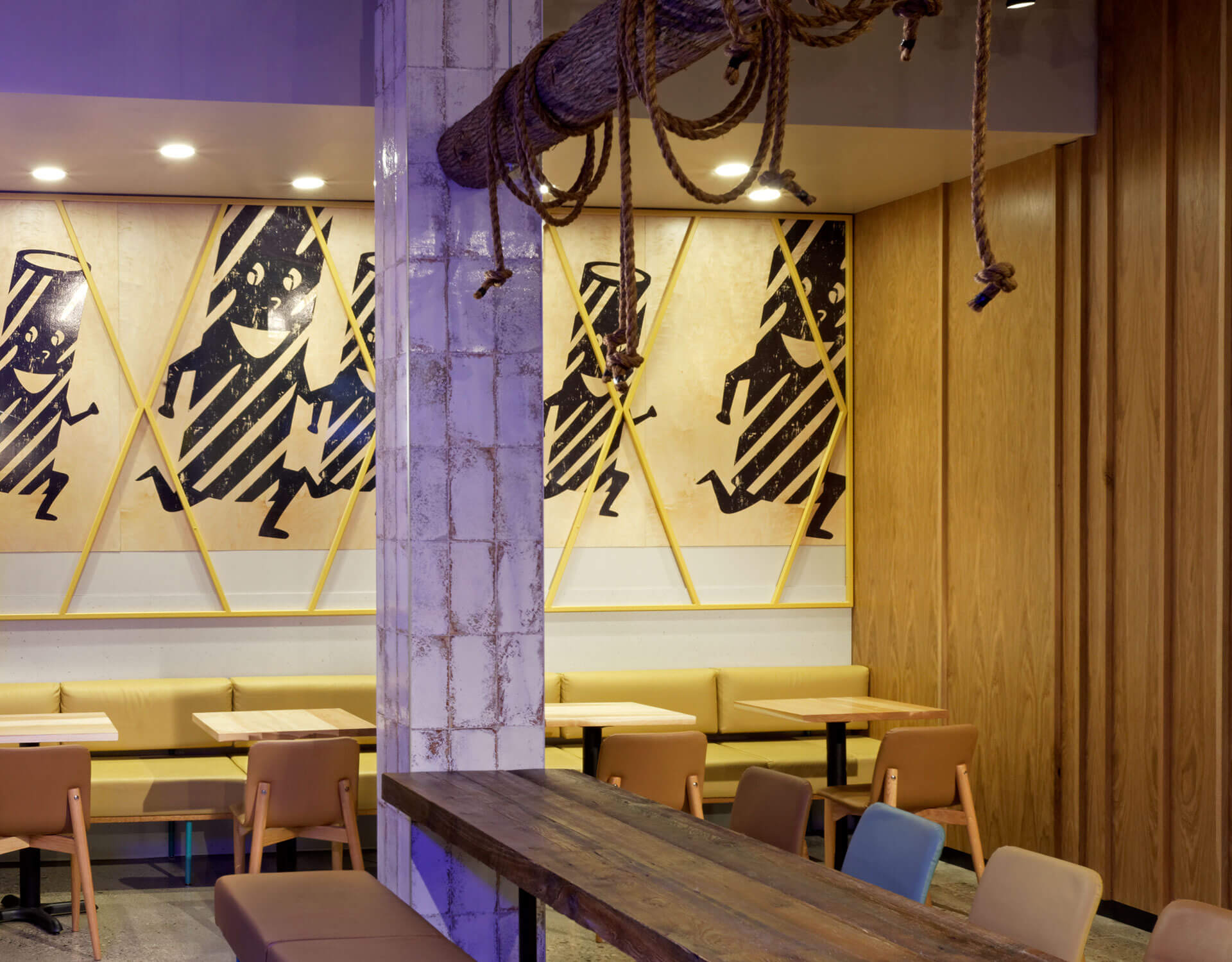
We revamped original Dal Moro’s icons, like the ‘noodle guy’ that was part of the original logo, and re-imagined them in a more contemporary execution. Adding motion and energy, these fun characters are not only prominent in a larger-than-life execution on the back wall, but on the blade sign on the exterior as well, creating a fun and memorable brand icon that brings the brand to life.
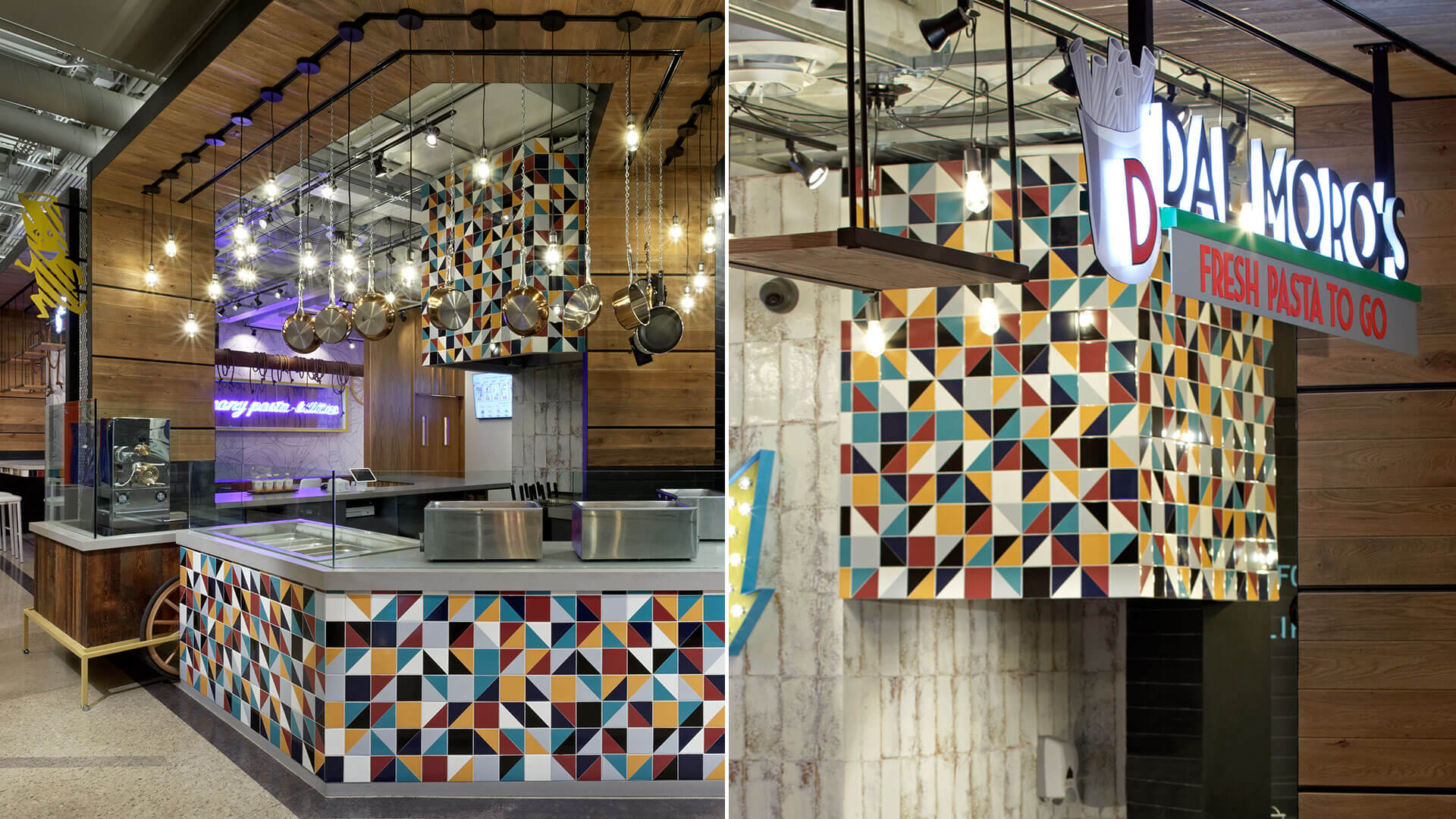
Dal Moro’s also relied on our experience to assist them with streamlining their kitchen processes while maintaining quality and promoting the freshness of the food. We separated the kitchen from the dining area, and then further divided the kitchen into back-of-house preparation and front-of-house theatre. Since all of the pasta is made fresh in-house and cooked and sauced to order, it was important to create a space that made the fresh pasta-making process a feature at the front of the store, but to do so in a way that made the food prep process efficient and transparent.
The corner end unit gave us more space to emphasize the front-of-house. We pushed the counter out, and had a custom-made wagon built for the pasta making machine in order to give it a heritage marketplace feel, showcasing the theatre of fresh pasta-making behind a wall of glass for visibility. All of this takes place under an array of hanging pots and pans reminiscent of your nonna’s kitchen, adding authenticity and comfort to the fresh and modern execution. Multi-level hanging pendants and vibrant tile selection adds an element of fun and sophistication to the prep area.
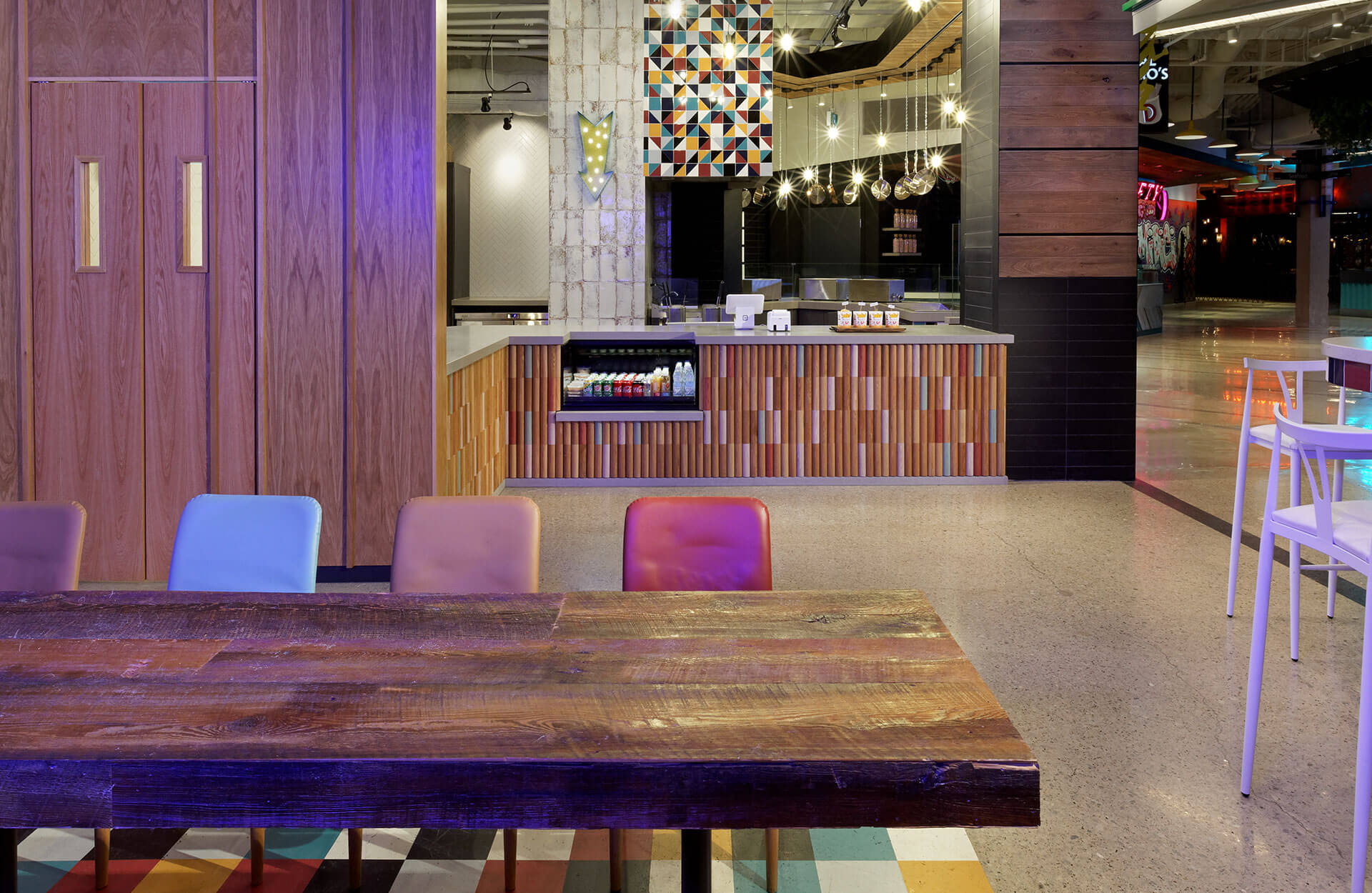
In the dining room, a variety of seating options carry the fun theme throughout by matching chair and bench fabrics to the tile colours. Hand-painted floor tiles below the long harvest table reflect the front-of-house tiling as well, which can also be found in the facing of the high table at the front. On the wall below the counter we cut and painted/stained wood blocks in a vertical pattern, again to mimic the look of stacked pasta noodles in yet another execution.
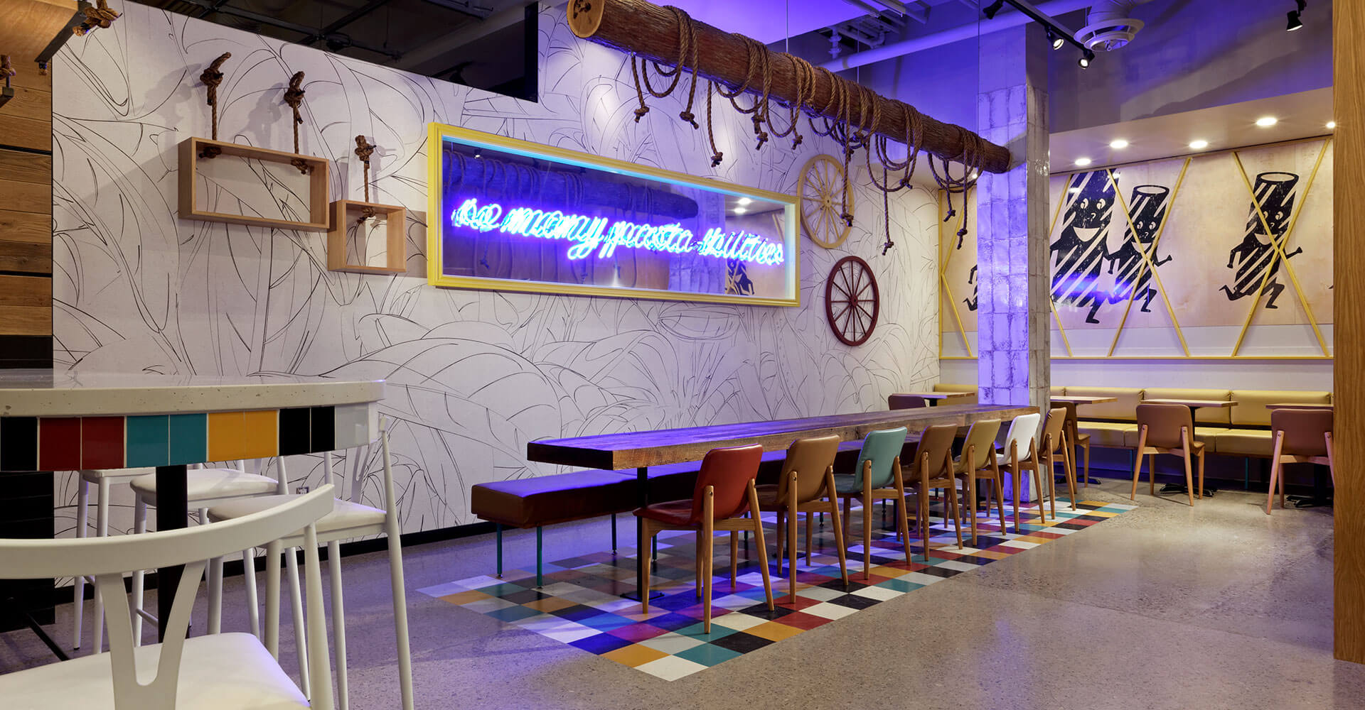
Above the harvest table a real wood log wrapped in loose ropes with hanging pendants simulates a fork tine with noodles wrapped around. Ropes also hang wood box displays on the walls beside a mirror-backed frame that features a neon sign saying “so many pasta-bilities”. This sign has now become a featured brand messaging element, with unique pasta-related puns at each location.
Dal Moro’s in the Square One Food District opened in Spring 2019, with more locations in development.