A Little Less East Side
East Side Mario's
East Side Mario’s is the Home of All-You-Can-Eat – a Canadian chain of casual dining restaurants that specializes in Italian-American food. They strive to deliver a fun atmosphere, maintain value & quality, offer family-focused service, and be involved in the neighbourhoods they serve.
In the past, East Side Mario’s has been “A Taste of Little Italy”, with restaurants themed around recreating the historical ambience of the Lower Manhattan neighbourhood. East Side Mario’s has begun to shift their brand position away from the Lower East Side to a “Best of Italian Lifestyle” position – not Italy, but not New York either – that captures all that is great about Italian food and food culture. They have removed many of the New York references from their environment and messaging, and have kept brand messaging to fun, Italian lifestyle-oriented images and copy.
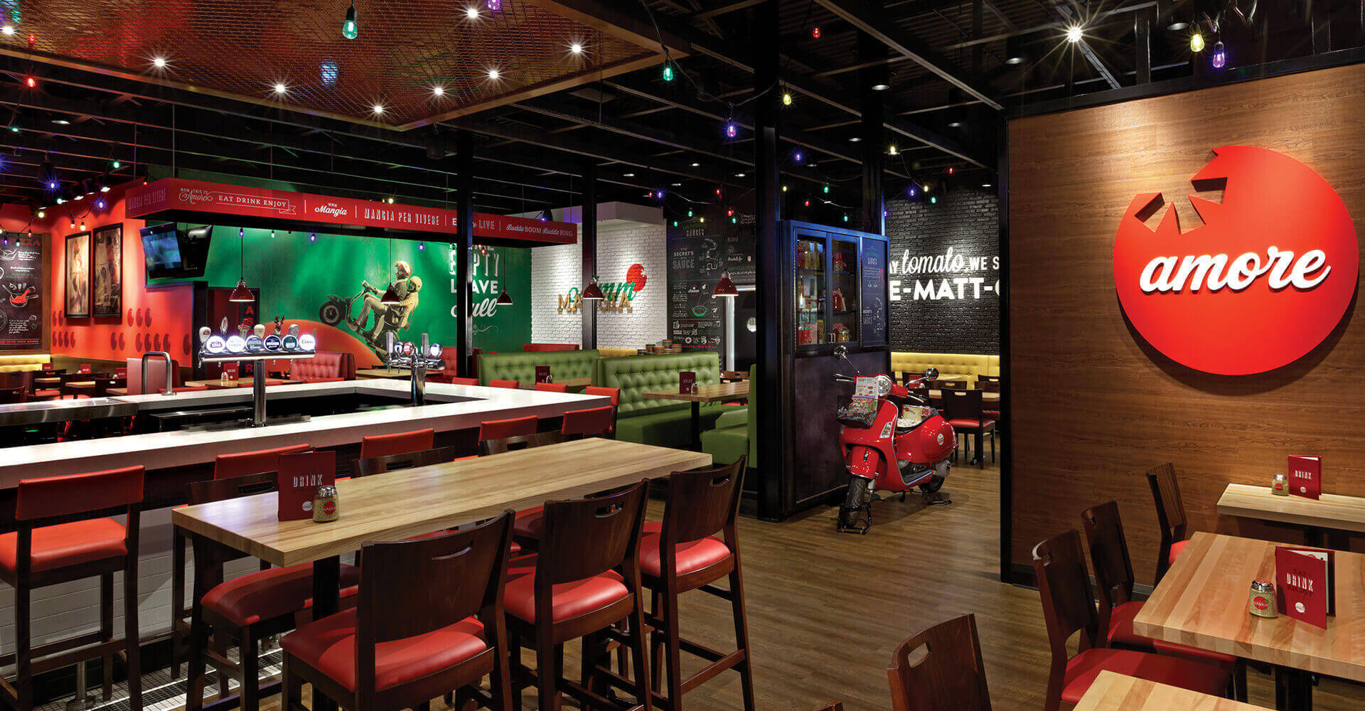
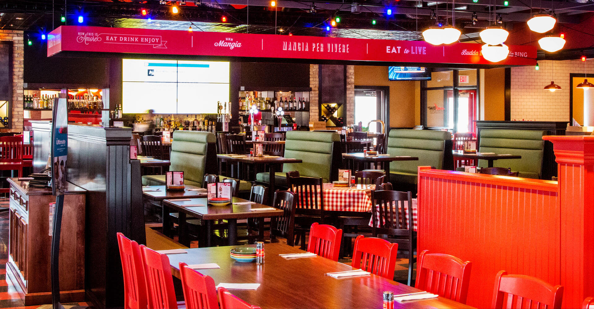
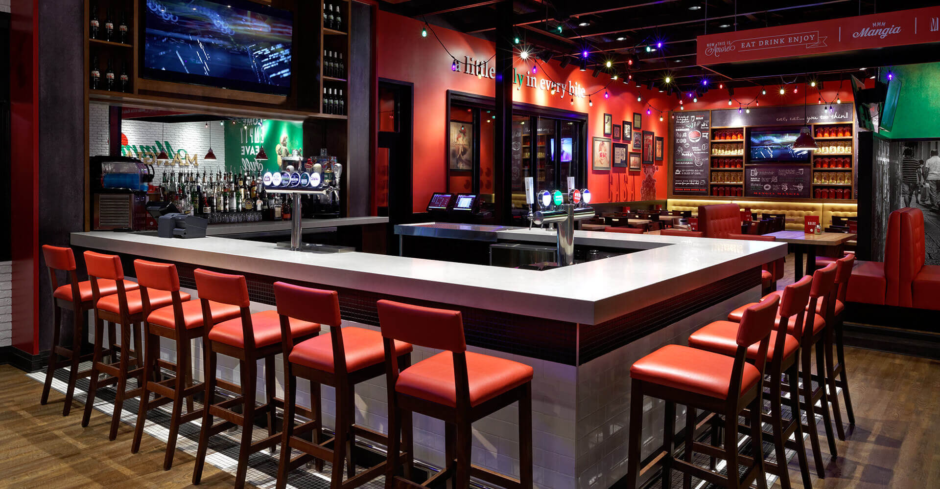
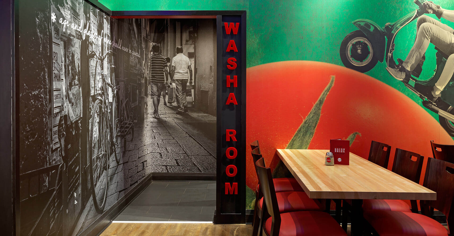
After working on the East Side Mario’s menus, website, and signage, they asked us to help them to pull it all together in their Dundas St. restaurant, to be developed as a prototype for future new builds and renovations. Our mandate was to inject the youthful fun into the environment that the East Side Mario’s brand is known for, and make it accessible for everyone to enjoy.
COME EMPTY, LEAVE A BRAND AMBASSADOR
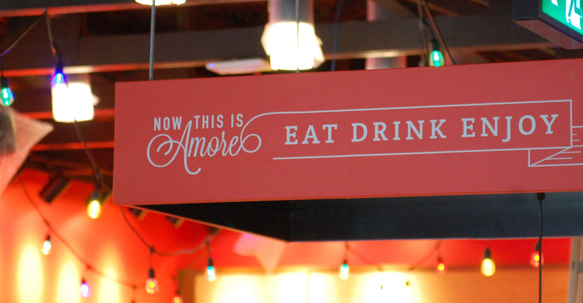
After we had completed the menus, we were asked to develop a branded signage program for their restaurants that would carry throughout the environment and continue to communicate the new brand position in a fun, exciting way.
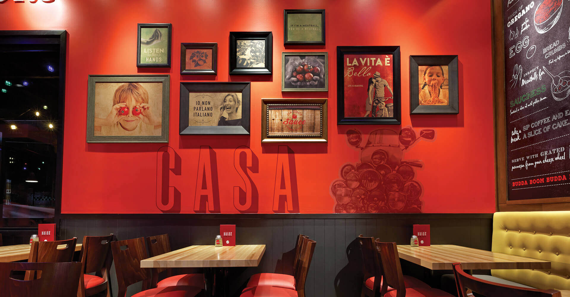
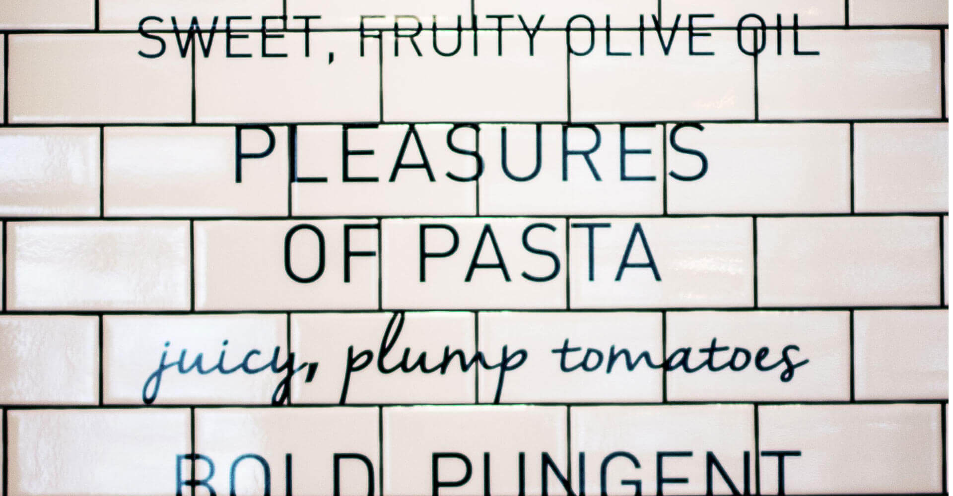
THE SPIRIT OF ITALIAN LIFESTYLE
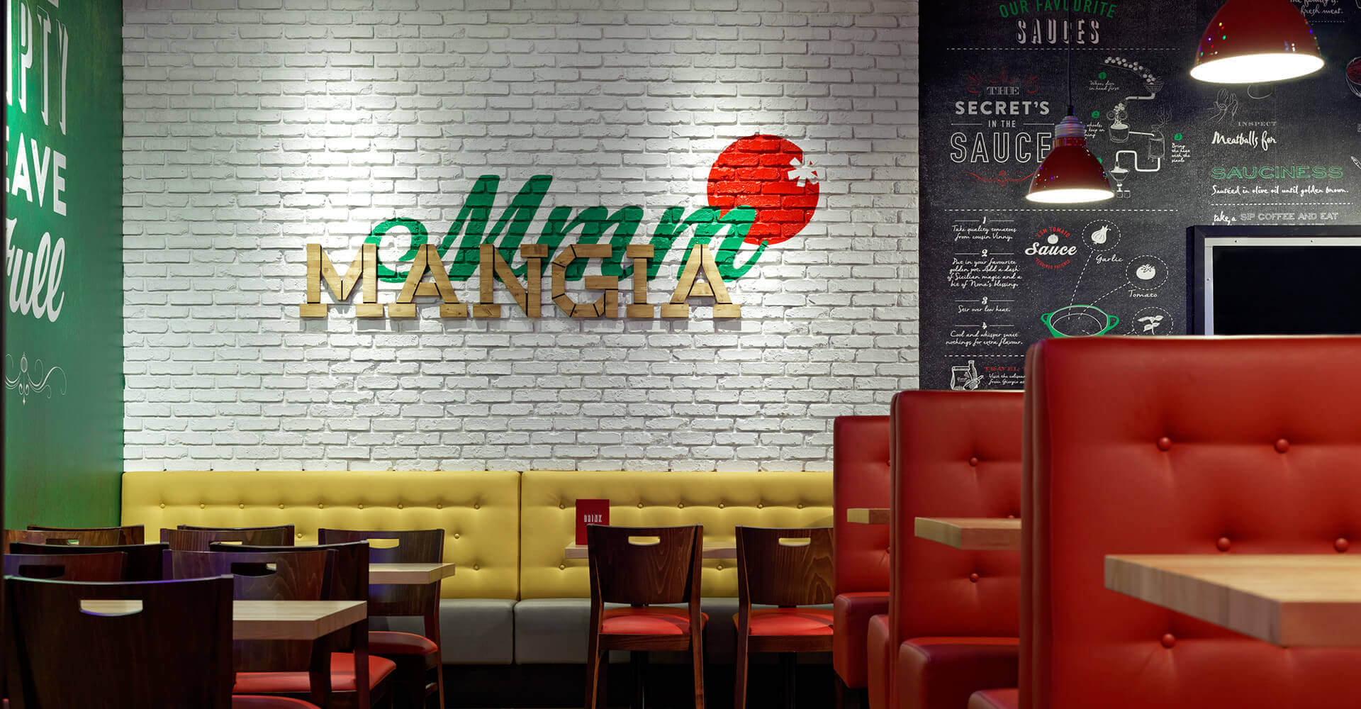
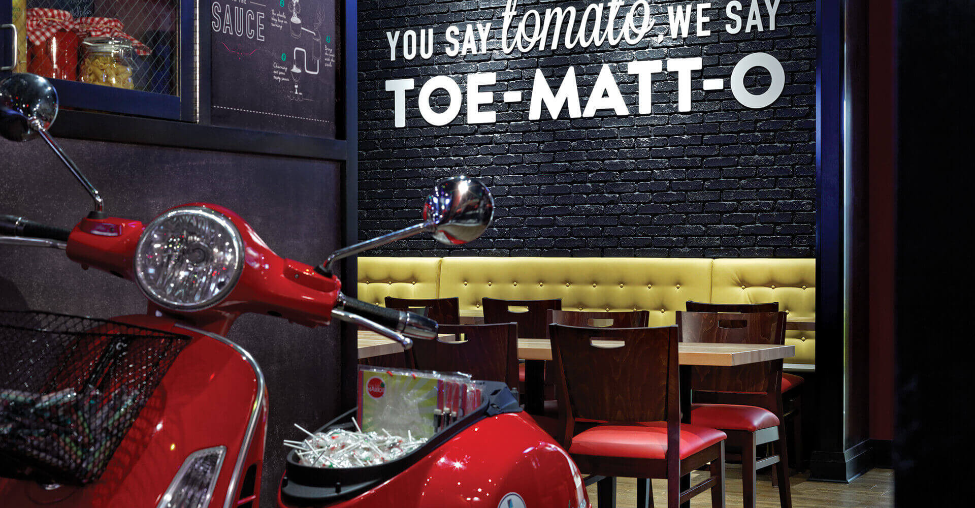
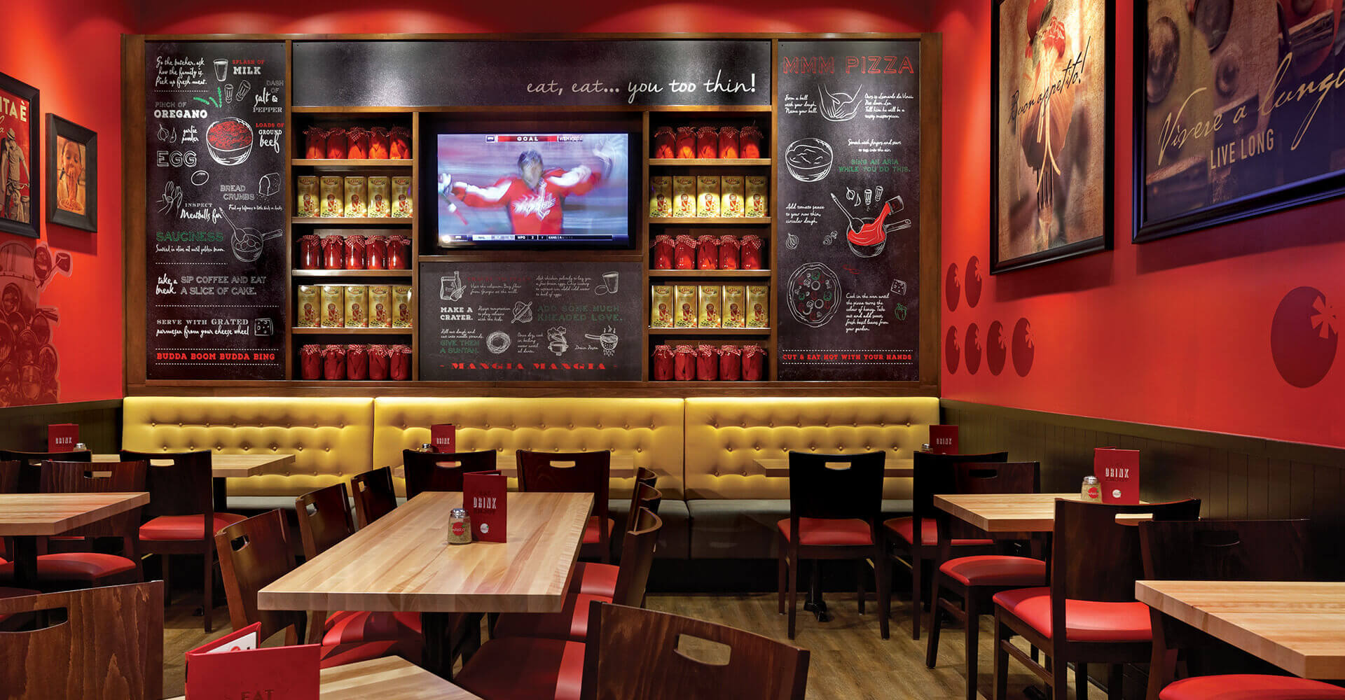
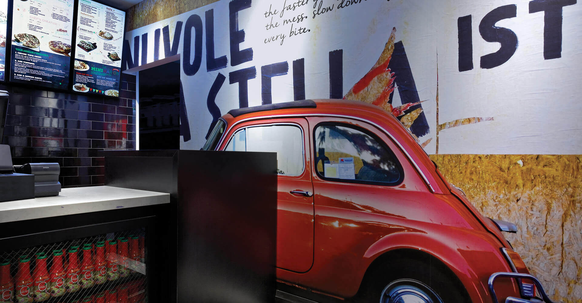
Their existing signage featured chalk murals and stock “Italian” images that lacked inspiration. We developed new artwork that captured the spirit of “Italian Lifestyle” in a fresh, lively execution.
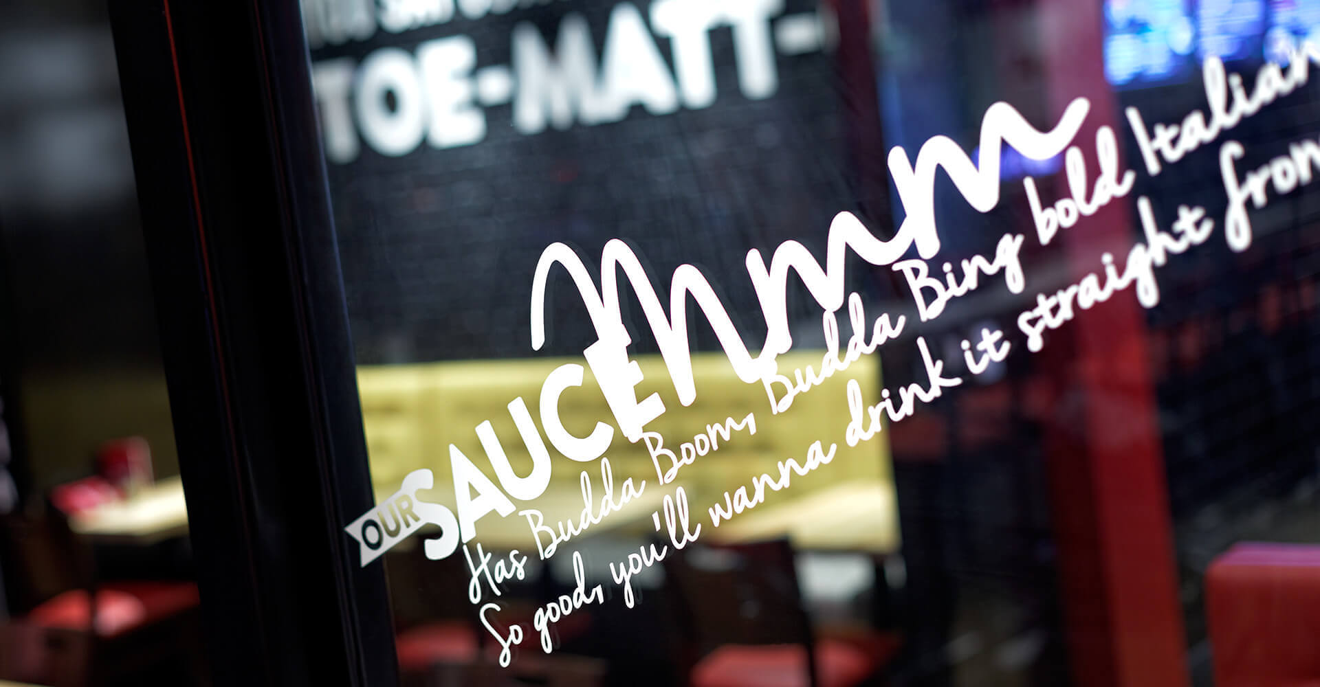
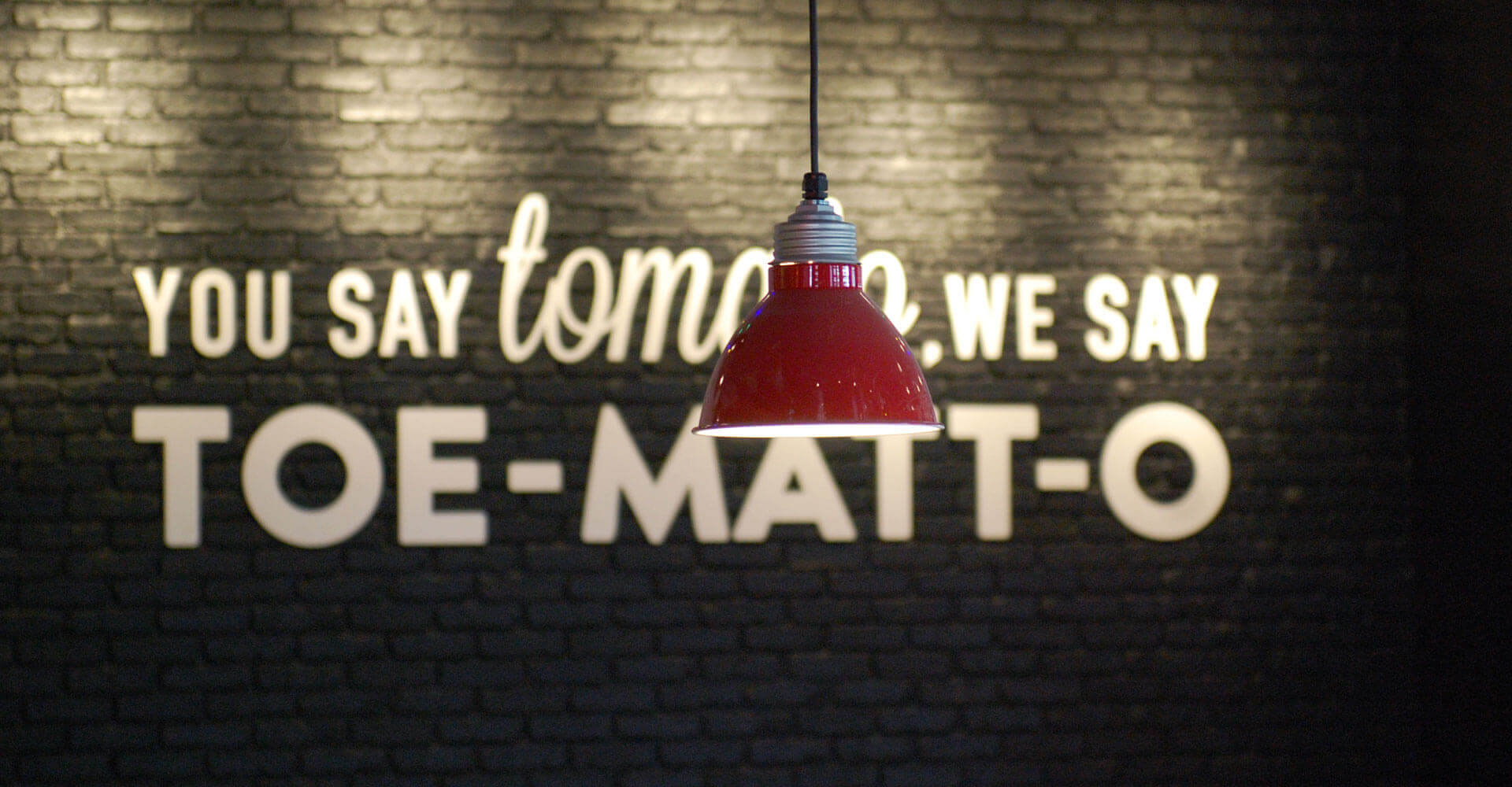
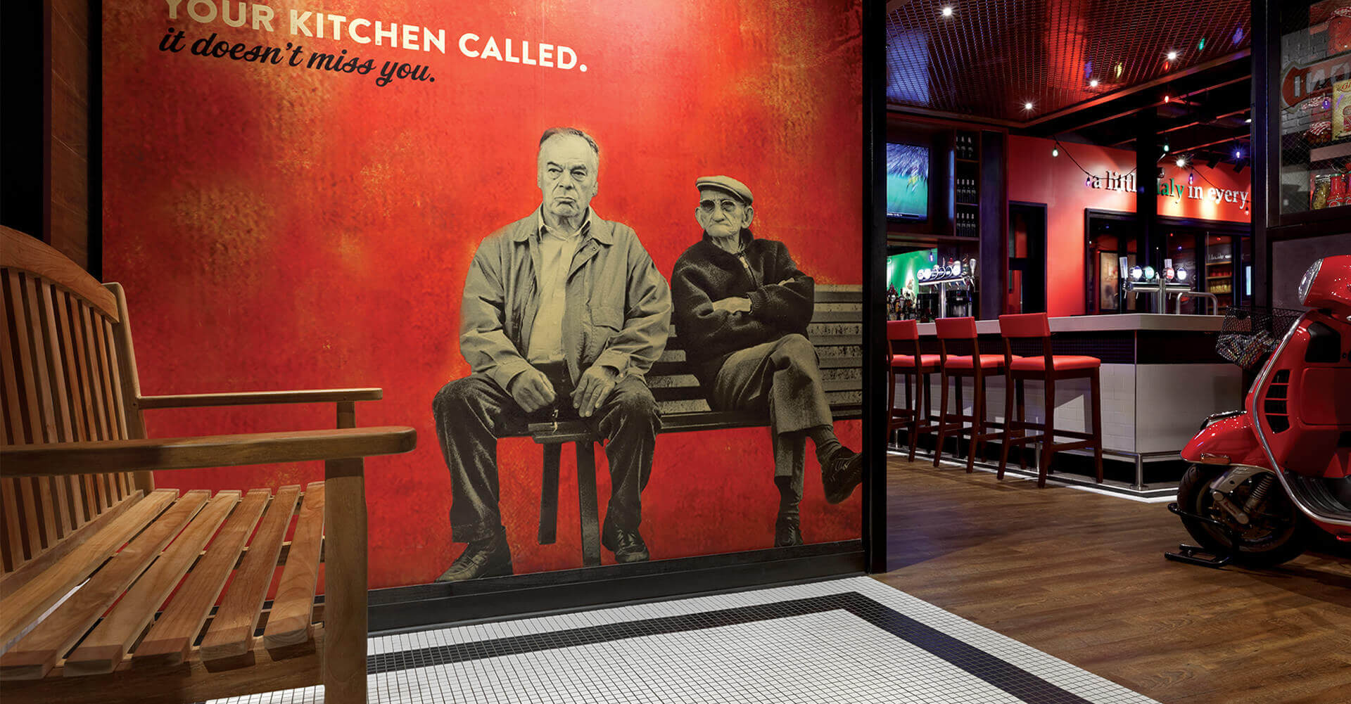
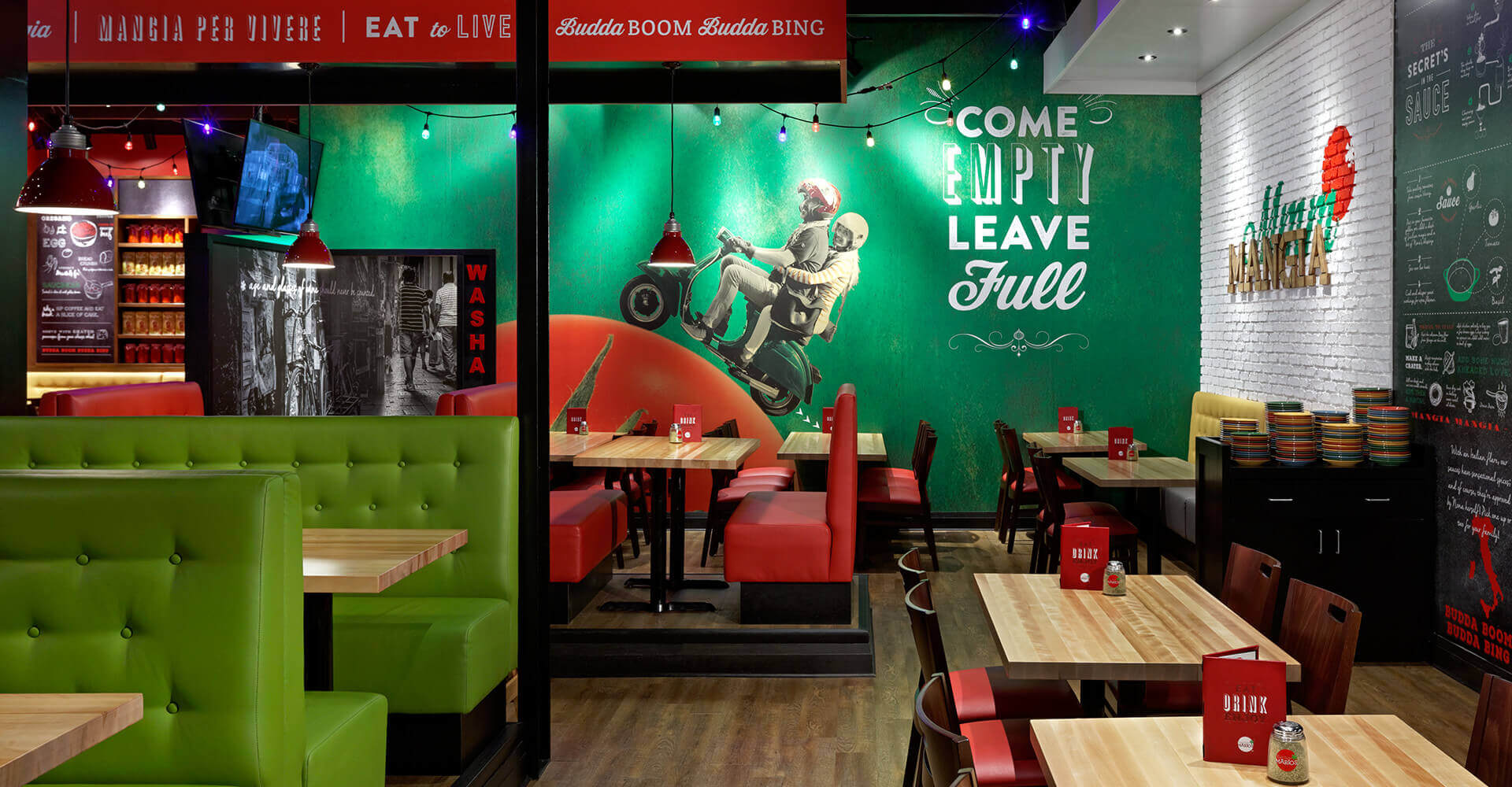
COME EMPTY, LEAVE FULL
We reinforced the value proposition with more “Come Empty, Leave Full” signage in the space, and created artwork that introduces take-out to the guest. We developed graphic sauce and pizza stories, and featured kids having fun with the food and ingredients in eclectic art walls that are classic with a modern twist. Overall, the signage package breathes new life into the East Side Mario’s restaurant in a fun, energizing way. The East Side Mario’s team tested the menus and new store signage in market, and they were very well received.
.eastsidemarios.com
explore the website
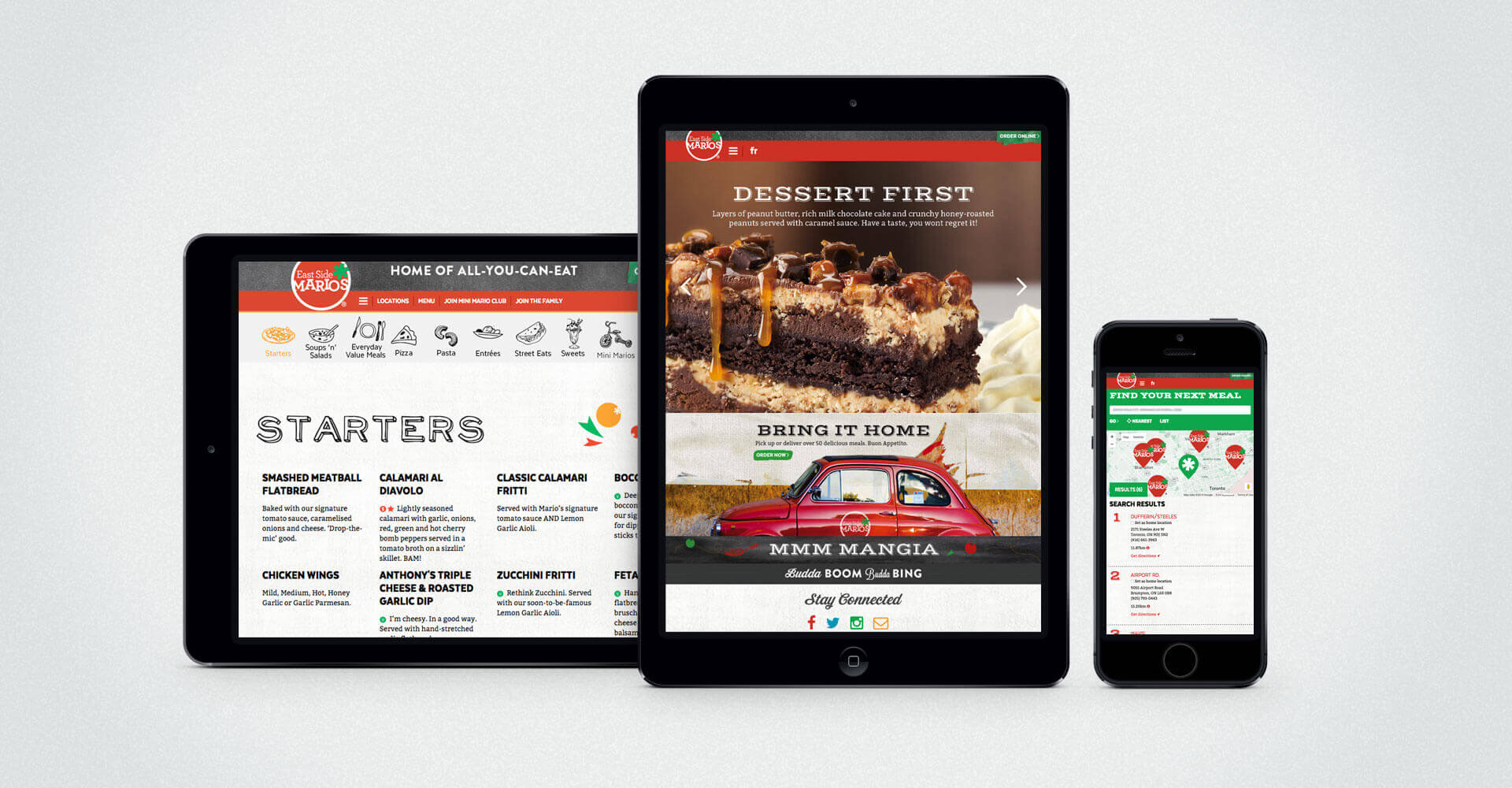
HEY BUDDA BOOM BUDDA CLICK!
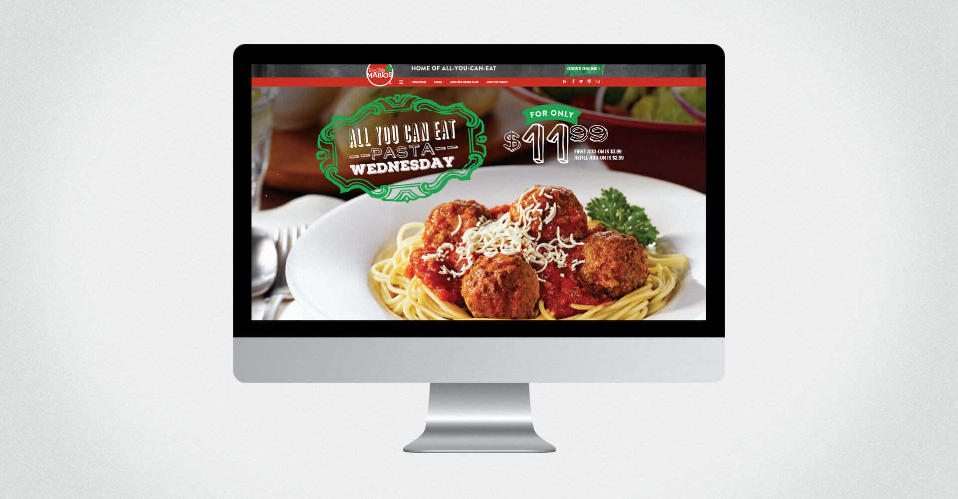
The East Side Mario’s website had also become stale, and failed to deliver the revised brand position. It was difficult to navigate, and was not mobile-ready, an absolute must in today’s online marketplace. We brought the fun and beautiful photography of the menus and signage to the website in a fresh execution that delivered on all counts. We introduced a new location finder that uses Google Maps to quickly locate nearest restaurants for mobile users, and can create directions on the fly. We retained the Kid’s Club and Newsletter sign-up pages from their existing site, and designed menu pages that are consistent with the in-store menus. Lastly, the site is responsive, producing an optimized experience for each specific user device.
THAT’S A-MENU!
Developing a new menu system for East Side Mario’s isn’t an easy task. In addition to capturing their extensive food offering and authoring a shift in brand position, the entire menu had to be created under Nonna’s watchful eye. Talk about pressure.
The existing East Side Mario’s menus were too generic to stand out in a competitive marketplace, and lacked brand voice. They had a café-style menu execution, with plastic coating and vinyl edges, and page inserts. They lacked uniqueness, and left the food offering feeling less special than it deserved. Inside, the design execution featured angled type that was difficult to read, and included restaurant facts that got lost on the page and did not succeed in communicating the fun that was intended. The campy look of the menu failed to elevate the offering, instead relegating it to “average” status.
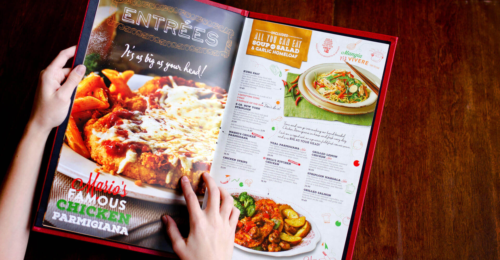
As part of our discovery process, we toured Italian restaurants in the US, looking for the cues that communicated the essence of Italian lifestyle. Many of the restaurants were more formal, but they were consistent in expressing a pride in the food they prepared and served. Their menus were much taller and felt more upscale, representing a proud tradition of quality dining.
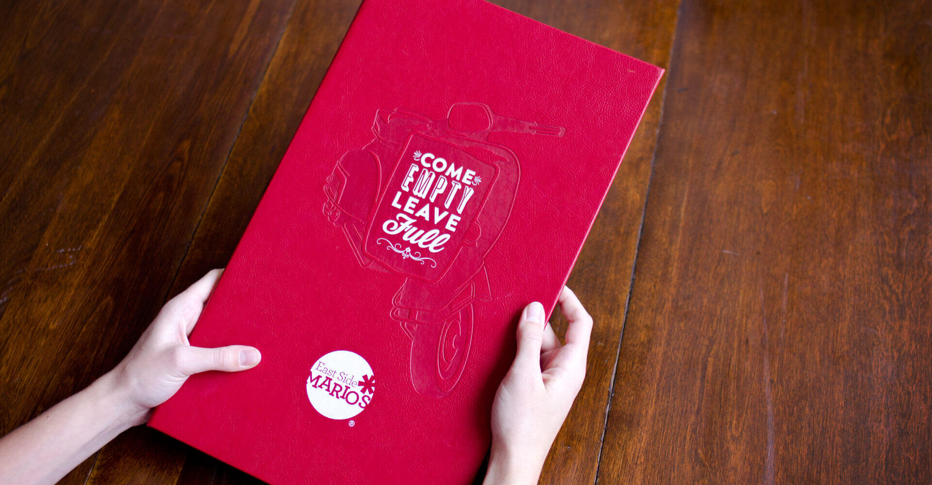
We were inspired to introduce an oversized menu that represents the pride in the Italian food tradition, but also the larger-than-life fun factor that is the East Side Mario’s brand. We added a hard cover, and embossed the front with an image of a Vespa. The East Side Mario’s restaurant environments have include Vespas for years, but dusting off such an iconic Italian vehicle and making it a focal point on the menu design moves East Side Mario’s away from New York and more closely connects them to their “Best of Italian Lifestyle” position. The addition of the “Come empty, leave full” messaging articulates the East Side Mario’s value proposition and begins to build the brand voice.
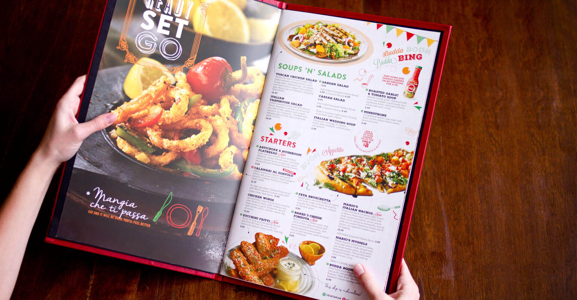
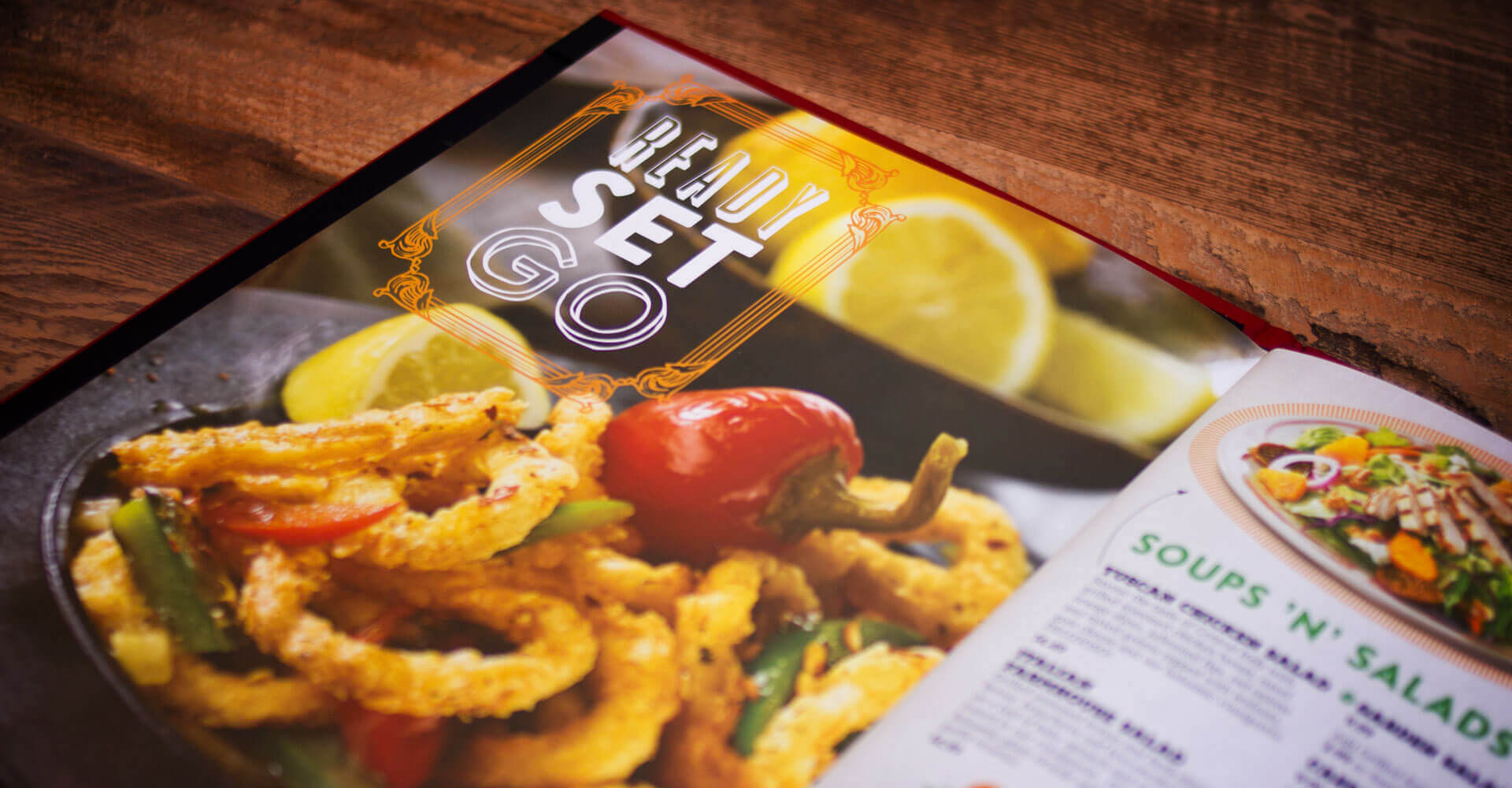
Opening it up, we find craft paper that boasts an eclectic mix of textures, fun doodles, and fonts that dial up the fun and bring energy to the menu. Pulling back on the food photography to show whole meals, and placing existing food shots on new table settings really amps up the appetite appeal, while Italian images like street festivals support the new brand positioning. We created a consistent device for the “Build Your Own” items that really calls attention to this option, and converted the lost fun facts to brand sound bites that are sprinkled throughout and continue to build and support the brand voice.
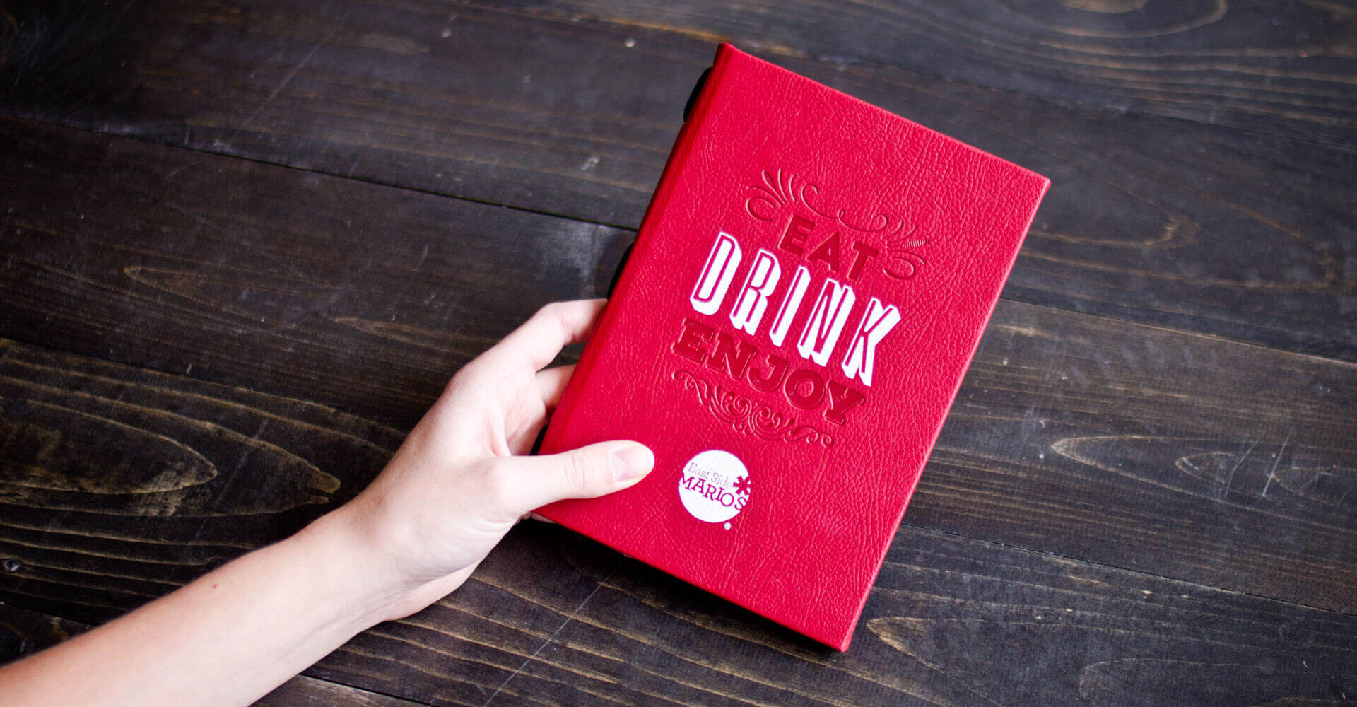
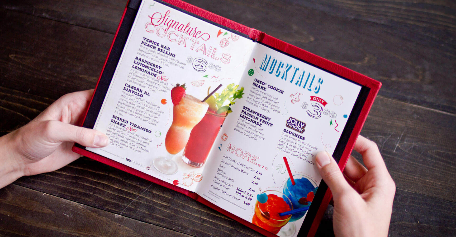
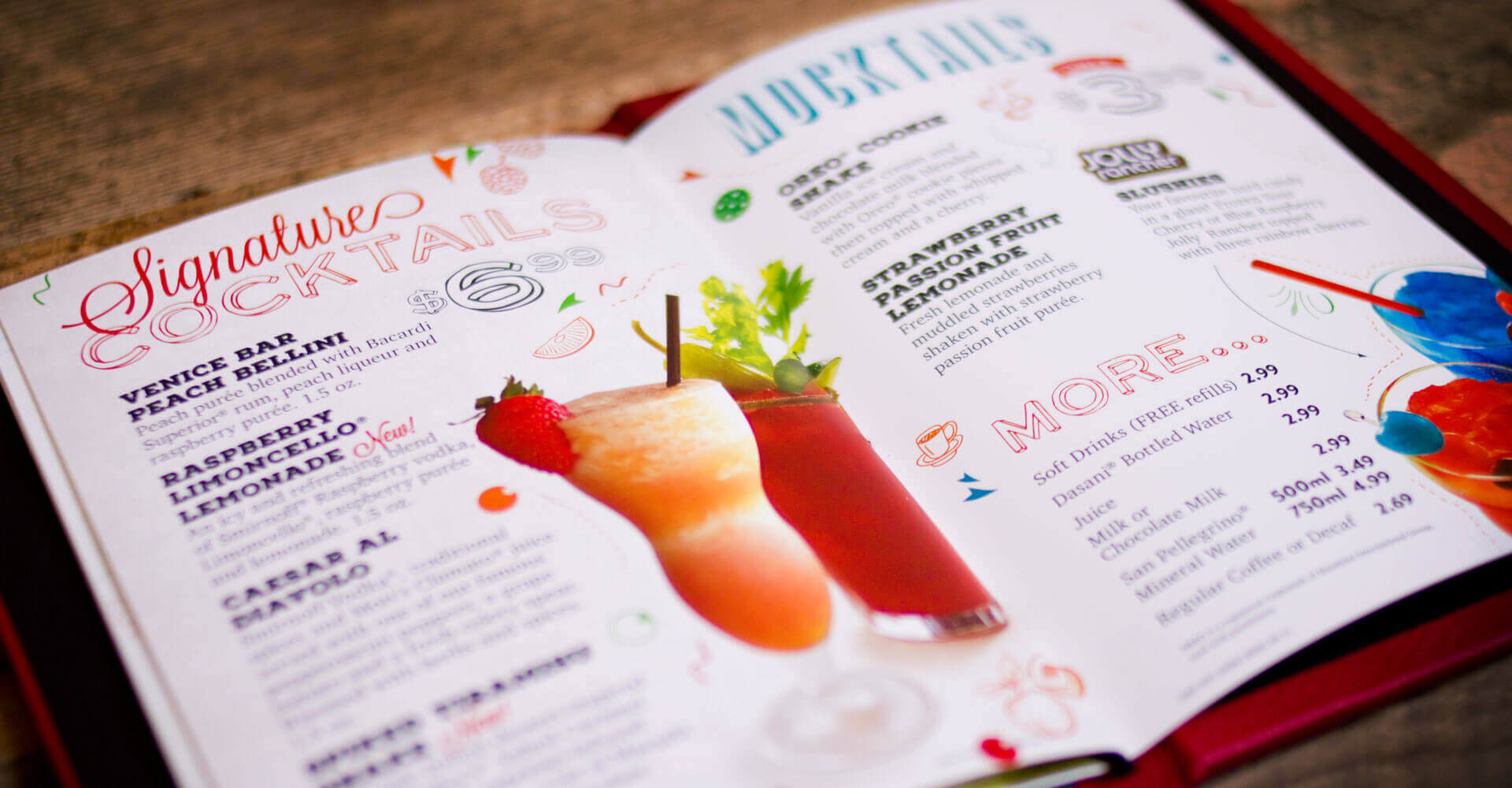
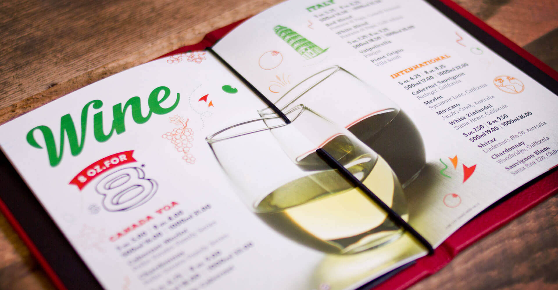
DRINKS, DESSERTS AND LUNCH
We went on to create separate Drink and Dessert menus that are companions to the dining menu and match it in style and execution, in order to elevate the guest perception of these offerings. Finally, we developed a matching Lunch menu that now feels like it’s part of the entire menu program.
