The Evolution of Brar's
Brar's
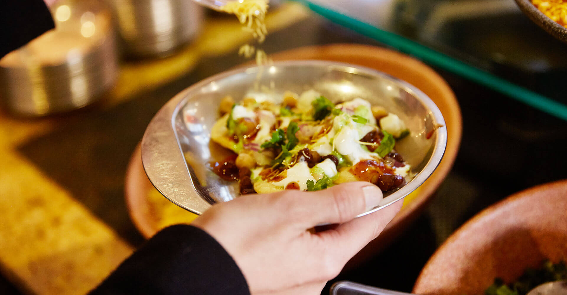
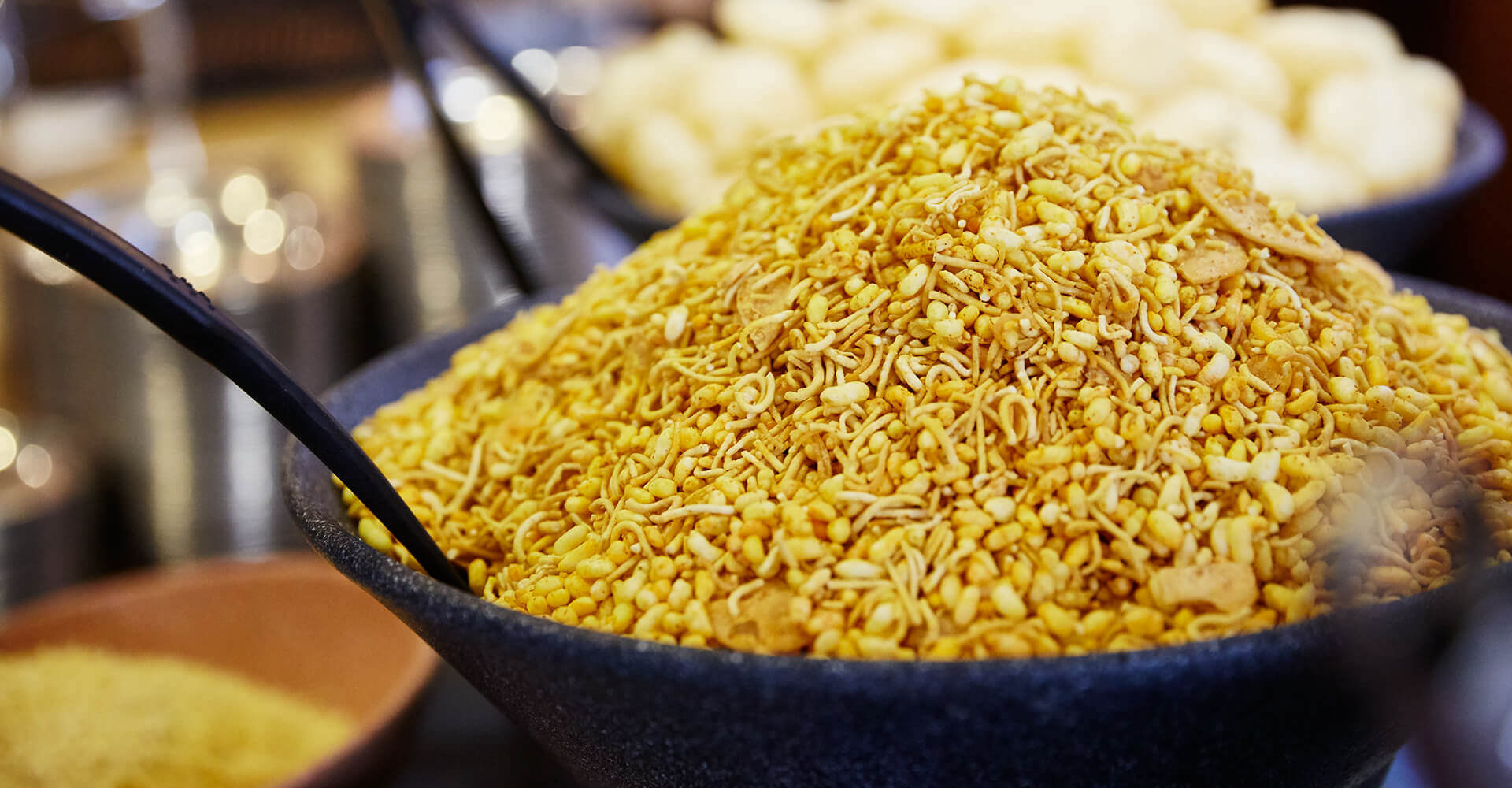
Brar’s has been providing premium Indian sweets to the North American market since 1986, and in the 30 years since that market has changed considerably. No longer is Indian food consumed exclusively by those of Indian descent, and the Brar’s offering has changed from sweets to include dining, catering, and takeout. At the root of their offering is a vegetarian offering that has its roots in the Hindi culture of North-Central India, but has broad appeal.
The evolving nature of the Brar’s offering and the market it serves demanded a new identity that could still deliver on authenticity for their core customer, but also appeal to a new customer base looking for authentic Indian food packaged for a North American market. A new visual look and feel for both the brand and their physical space would invite new guests in by being more approachable and less intimidating to a non-Indian audience.
Project Type:
Related Projects:
Awards:
2016 — Transform Awards (Bronze Medal)
SIMPLICITY AND AUTHENTICITY
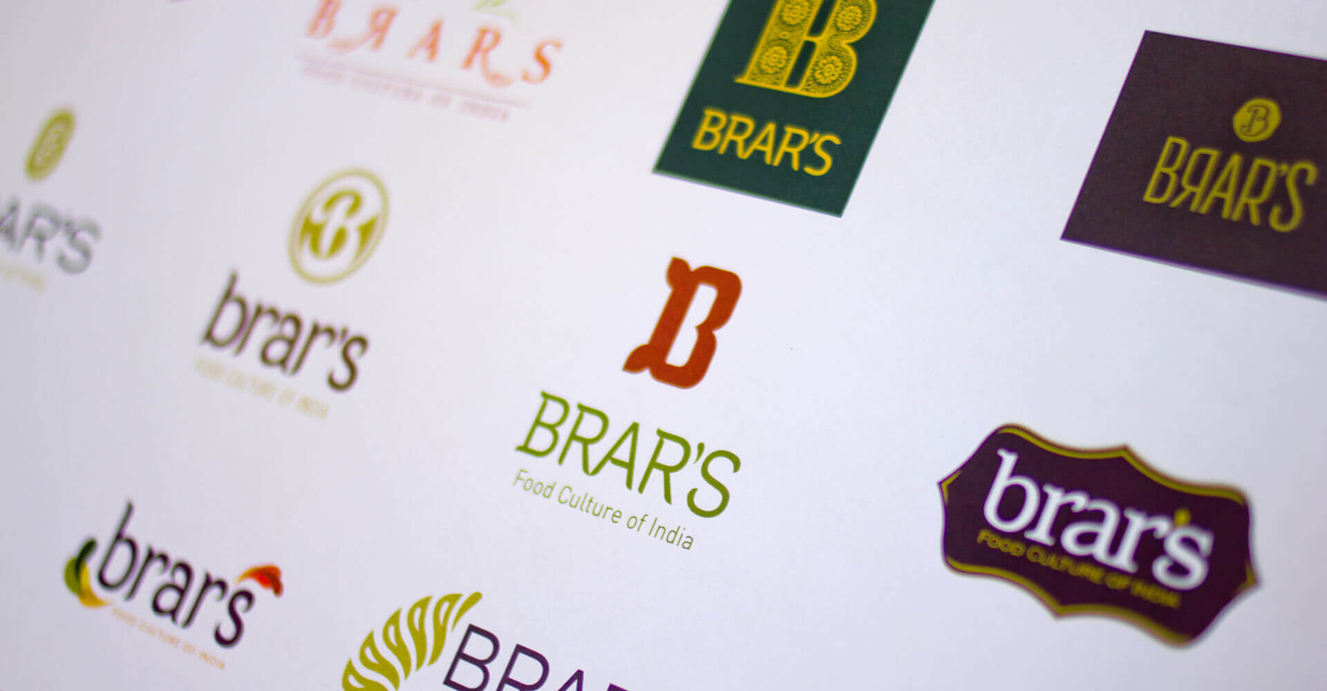
To begin, we developed a new visual identity for Brar’s that would provide the platform for future brand elements. The logo itself is an evolution of the existing Brar’s logo, stylized to make it more approachable and improve legibility, especially when reduced in size on packaging and promotional materials. While the old logo had lettering that gave it an authentic feel, the detailing was too ornate and lacked a simplicity that would elevate it to a more premium offering. A new “A” in the wordmark anchors it while giving it a bold symmetry that the old mark hinted at with the mirrored “R”s, which were retained and refined. The whole wordmark was opened up, again to improve legibility, and to give it a more premium feel.
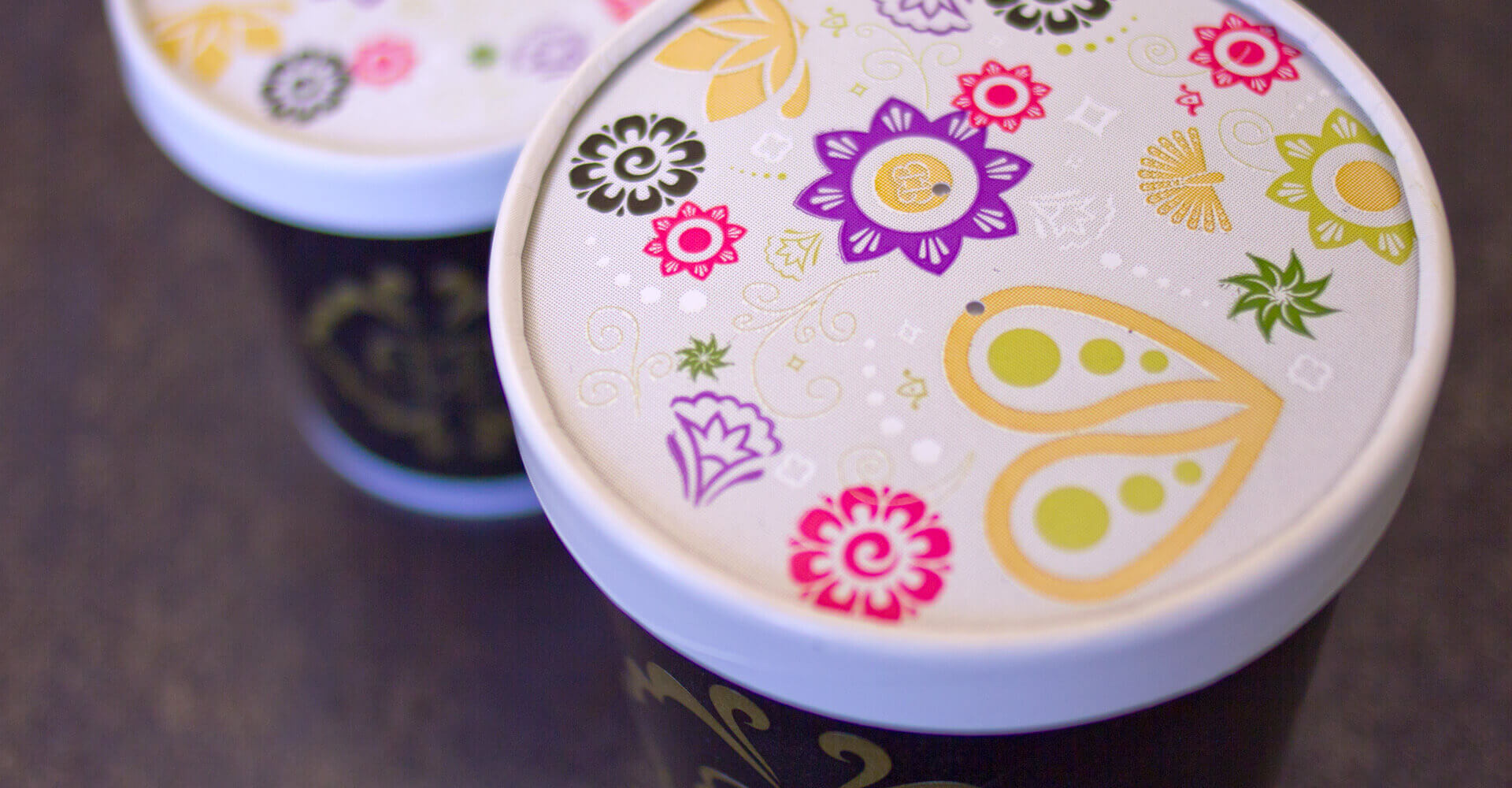
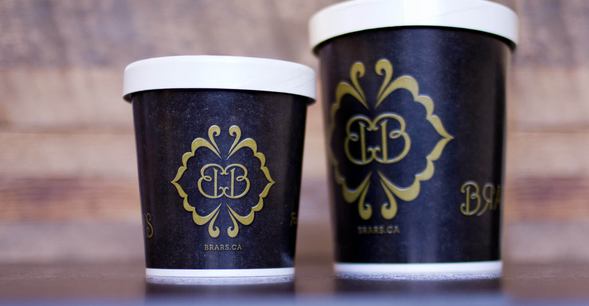
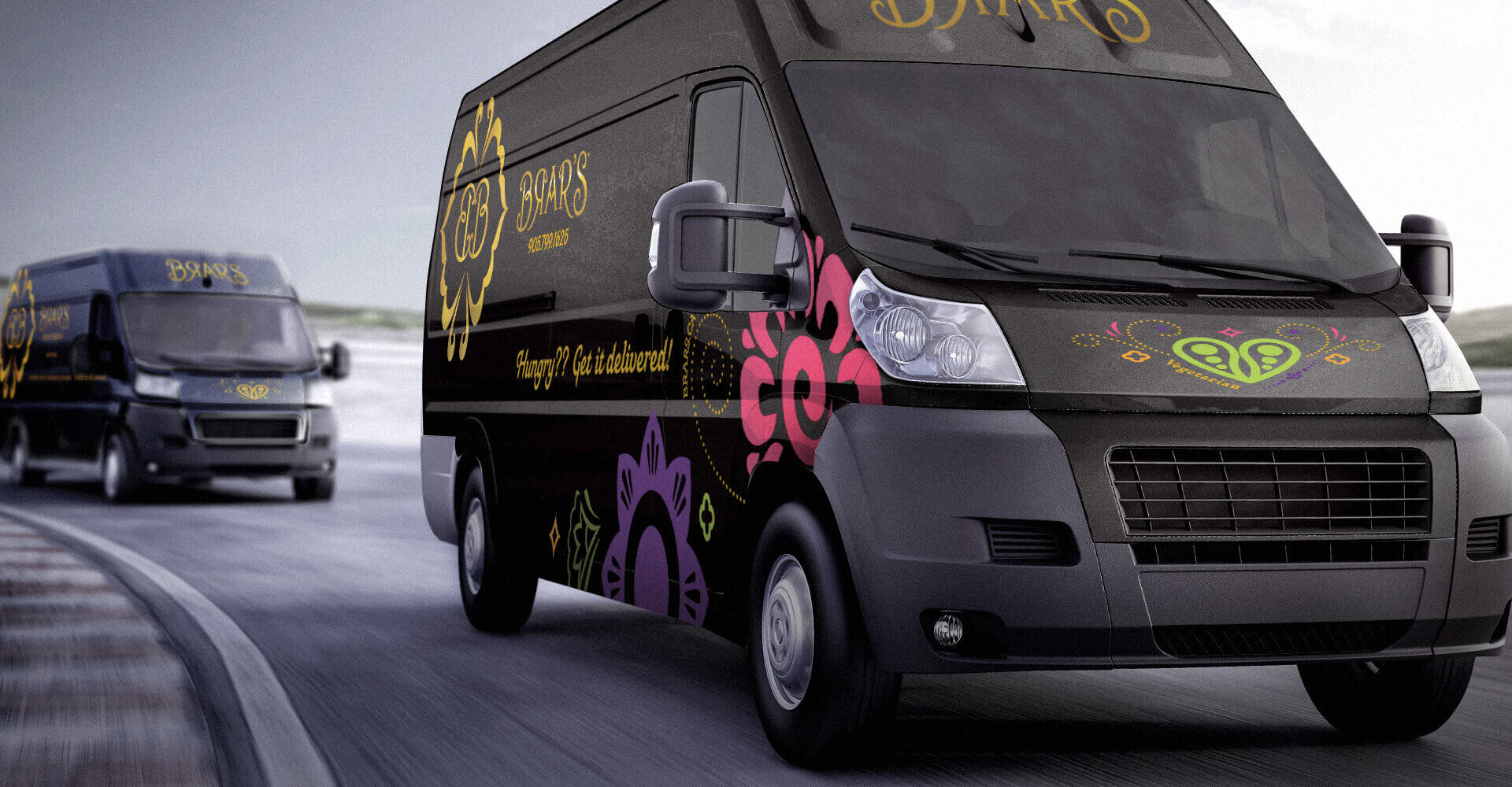
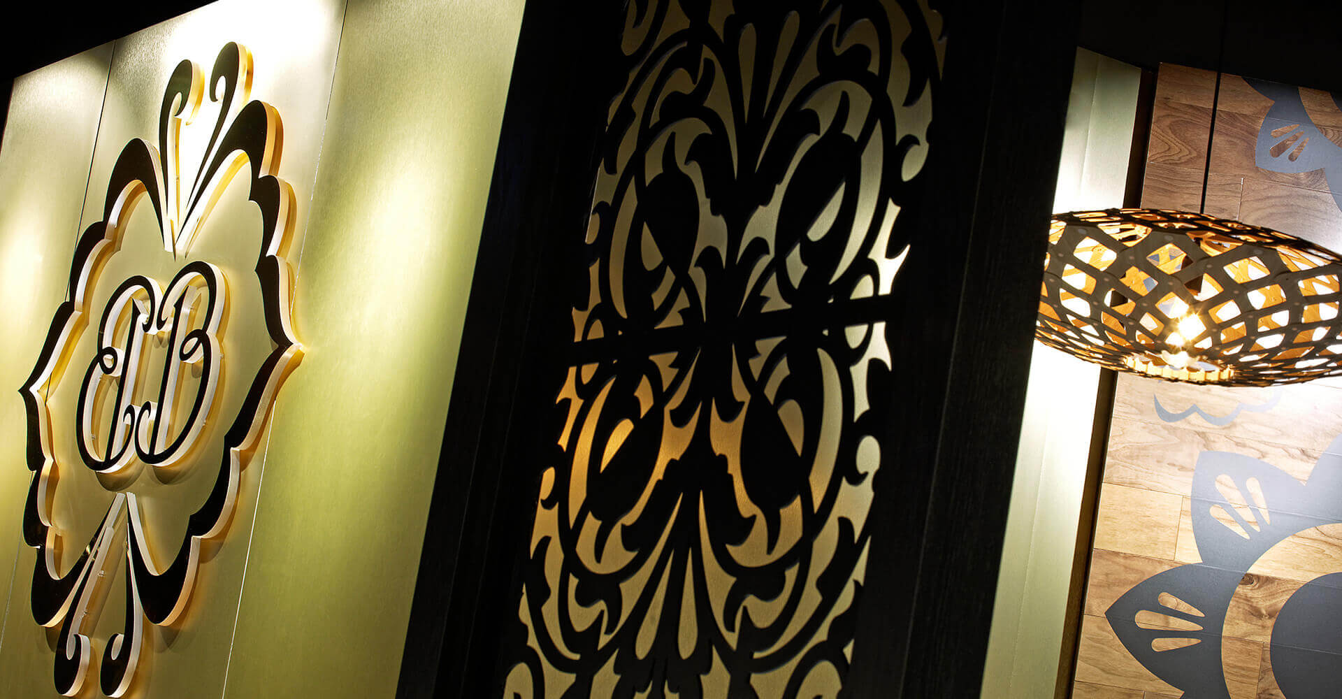
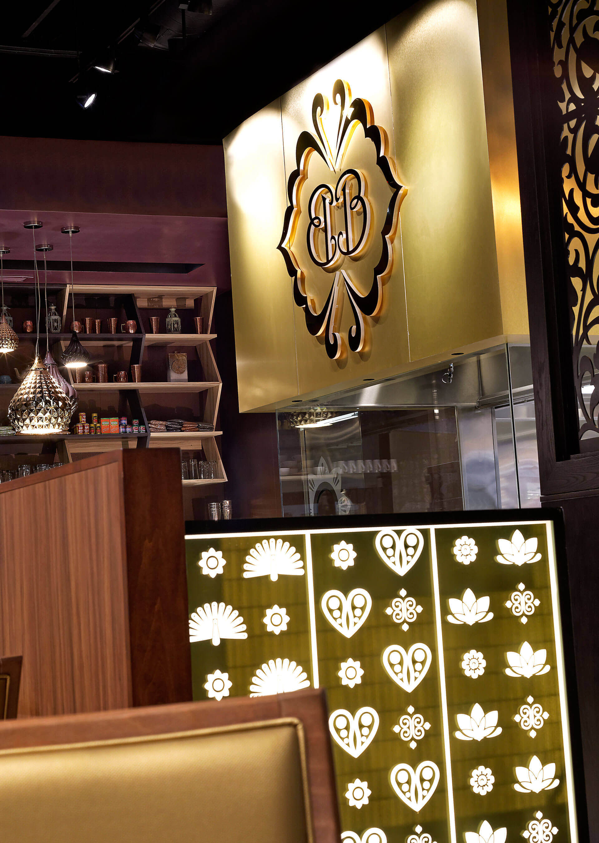
We also created iconology to support the new mark, including illustrations of flowers, the lotus, henna dots, hearts and a peacock, all inspired by the style and art of Northern India, but with a modern execution. The elements are not only artistic, beautiful, and fun, but they double as proprietary icons that reflect the vegetarian, healthy food choice. The Double B is a new brand icon that has an elevated feel, and is a useful brand mark that appears on delivery vehicles, catering trucks, and on store signage.
PREMIUM PACKAGING AND PROPRIETARY BRAND ELEMENTS
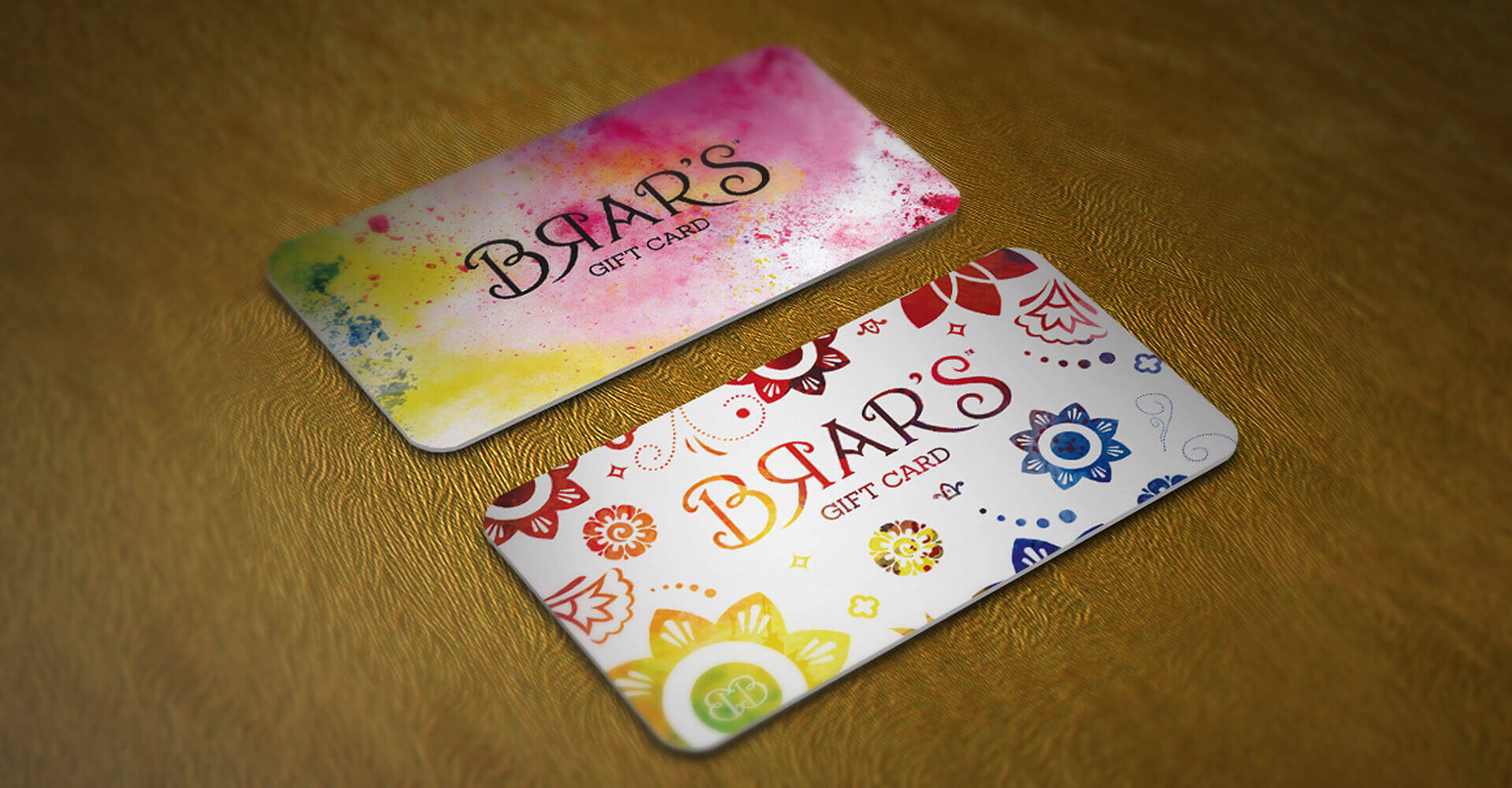
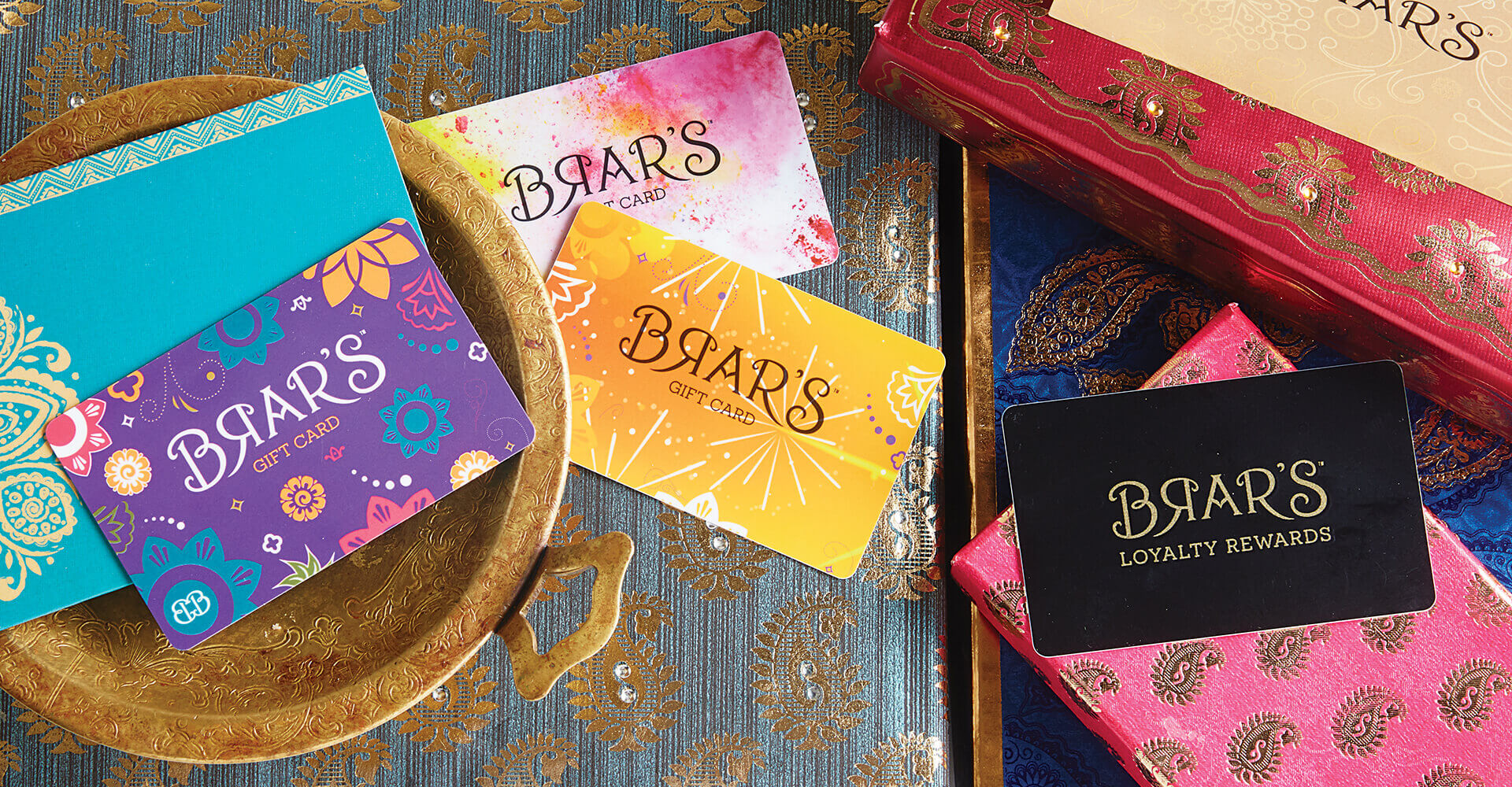
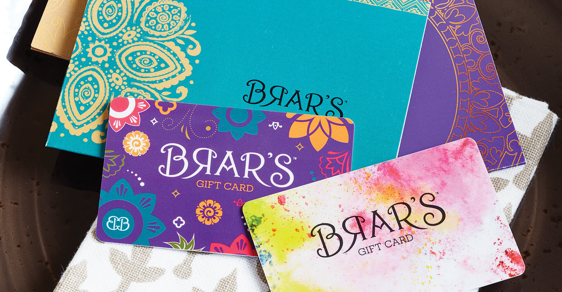
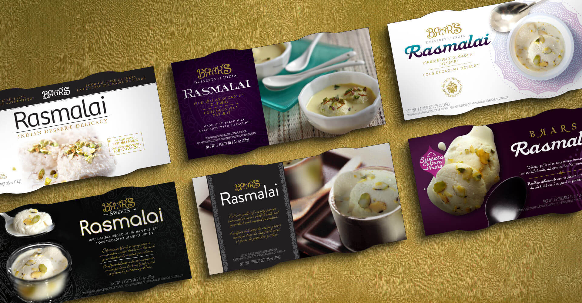
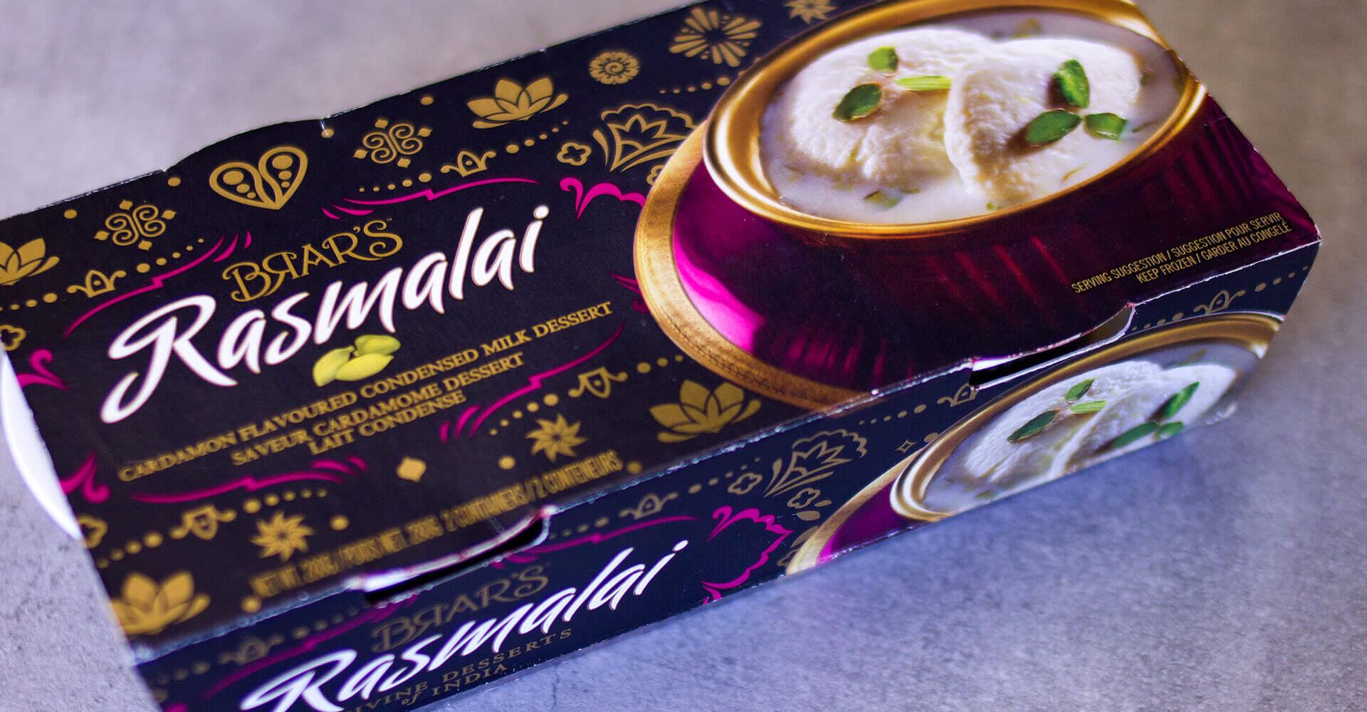
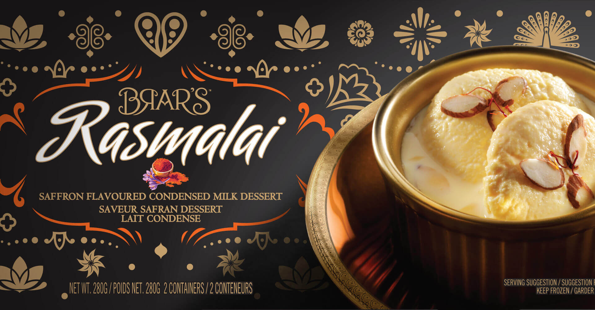
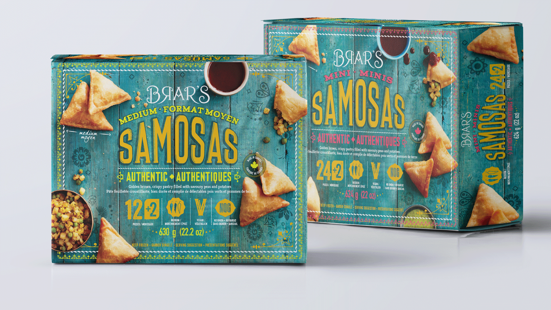
In addition to the brand work we also designed new packaging for Brar’s Rasmalai and Gulanjab, shooting new photography as part of the project, and working with existing photography to retouch it to make it feel more premium. We also developed gift card designs and delivery vehicle graphics that employ the new identity in bold and colourful designs that have injected new life into the Brar’s brand.
IN SEARCH OF THE MEANINGFUL MOMENT
The Brar’s restaurant design also required our attention. In an effort to better understand the Brar’s vision for their offering, we travelled with our client to Delhi in March 2014 for 8 wonderful days spent immersed in the street culture of modern India. We wanted to capture the meaningful moment: not the typical romanticized version of India, but a modern interpretation of a vibrant and evolving country. During this trip we also got to experience Holi, a Hindu religious festival that has become quite popular with non-Hindu people across the globe for its celebration of spring and carnival of colour.
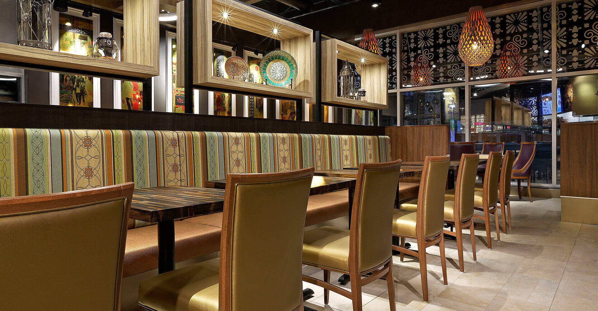
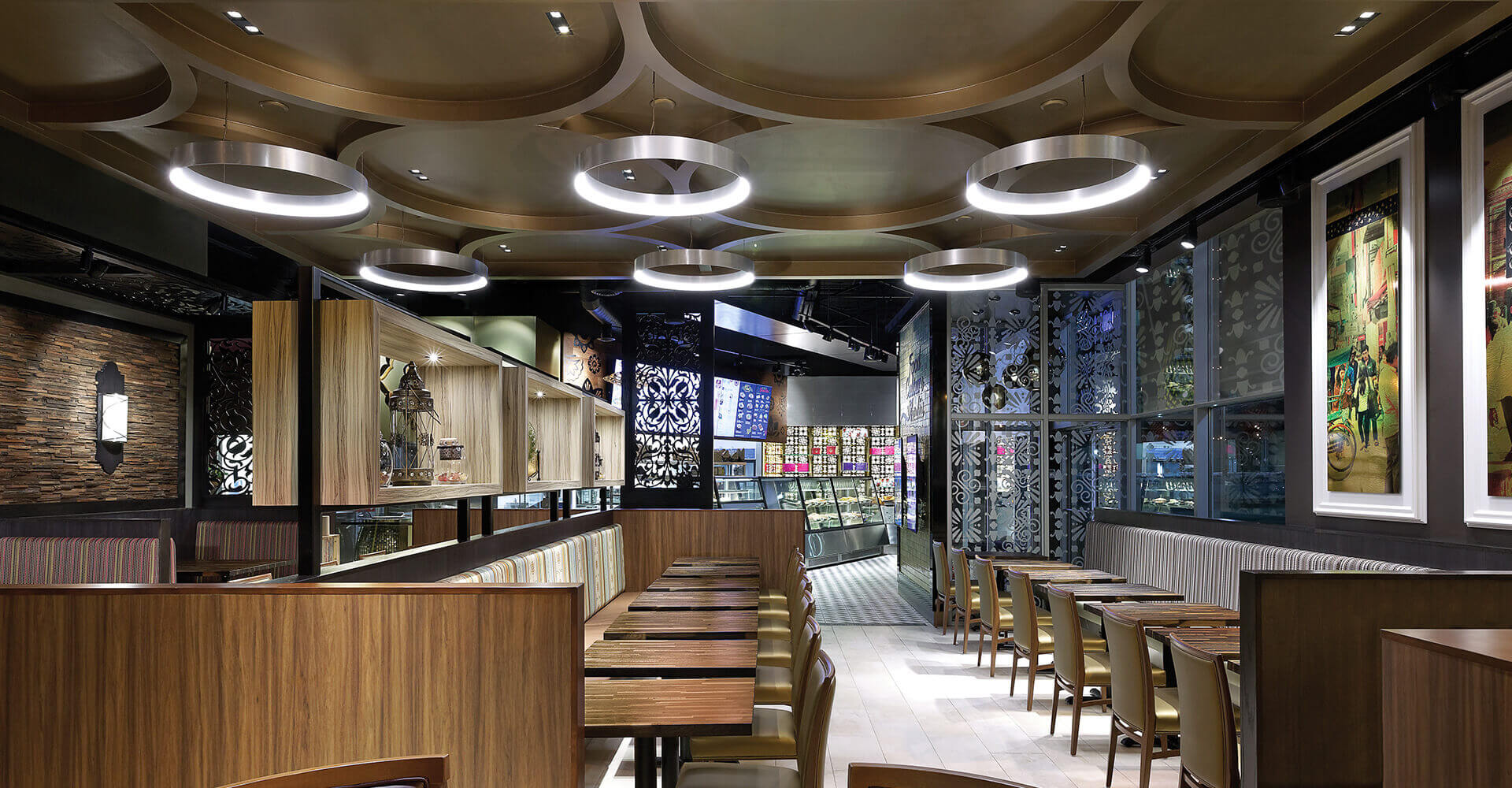
The Brar’s restaurant design is intentionally indulgent. It is a reflection of the food they serve, and the richness of the experience. It is a fast-casual concept with all the premium cues that you’d expect from fine dining, with an order counter and grab and go area that, while luxurious and premium, create a more casual vibe in the interior. Seating is warm and approachable, with rich finishes and special moments throughout the dining area, but the seating styles are decidedly casual and encourage a faster turnaround time than the traditional Brar’s restaurants or buffet offerings.
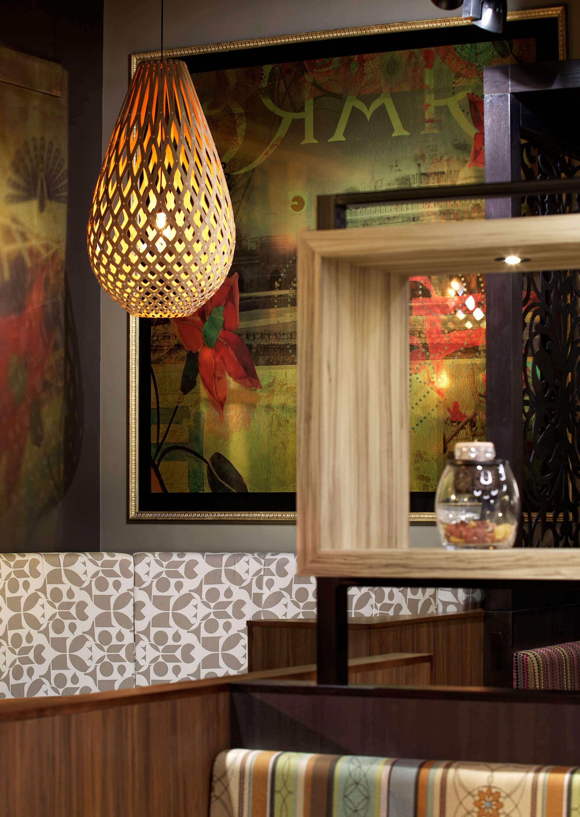
Everything in the restaurant was designed to be special. Each material and design element is intentional, and each is used individually to make a statement about the inspiration behind the Brar’s brand. Taken as a whole, they combine to create a stunning interior that sets the design direction for Brar’s as they continue to strengthen their brand position.
DEFINING THE CATEGORY AT THE COUNTER
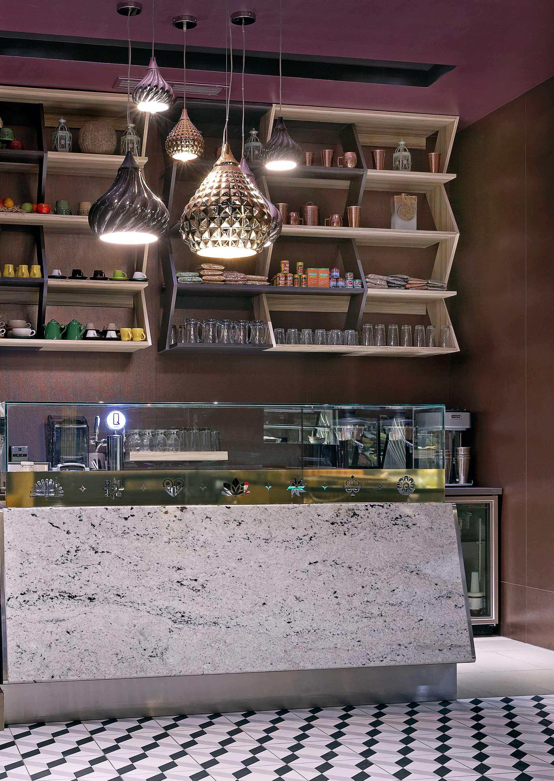
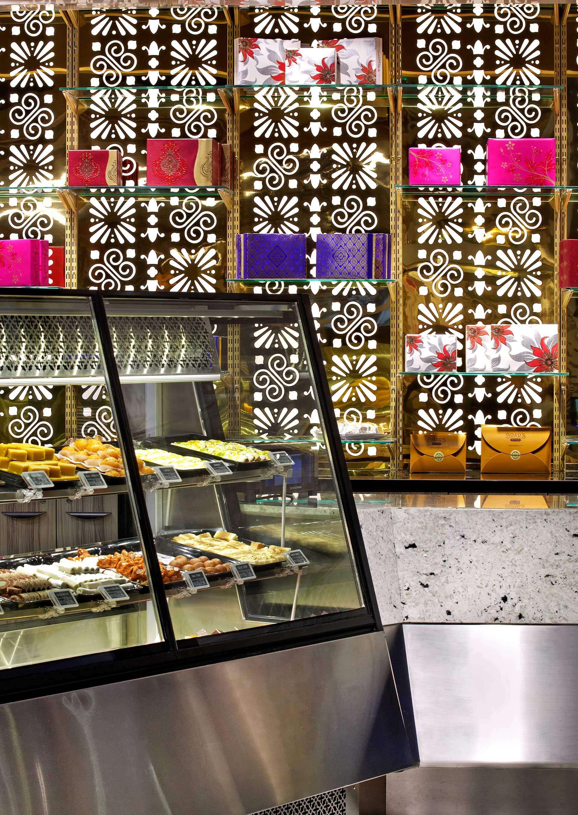
At the counter, customers can place their food orders, get grab and go items, or buy sweets, which are a big part of Indian culture. The clean, modern displays are custom made, with an angled marble facing reminiscent of much of the marble we saw in the old country. A custom patterned wall behind the sweets counter features sparse glass shelving on brass pilasters, arranged for form rather than for function. The wrapped, colourful gift boxes are more art than storage, and make a strong statement about how special these sweets are. The beverage counter is all glass and stainless steel, softened by the geometric stained wooden shelving above that uses angles and colour to create interest.
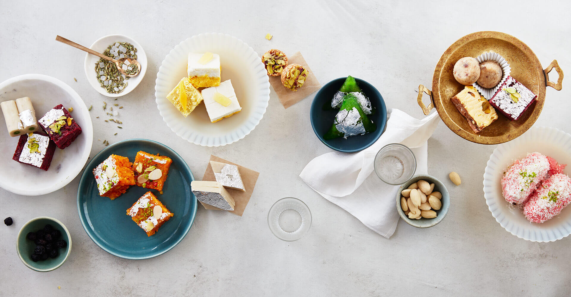
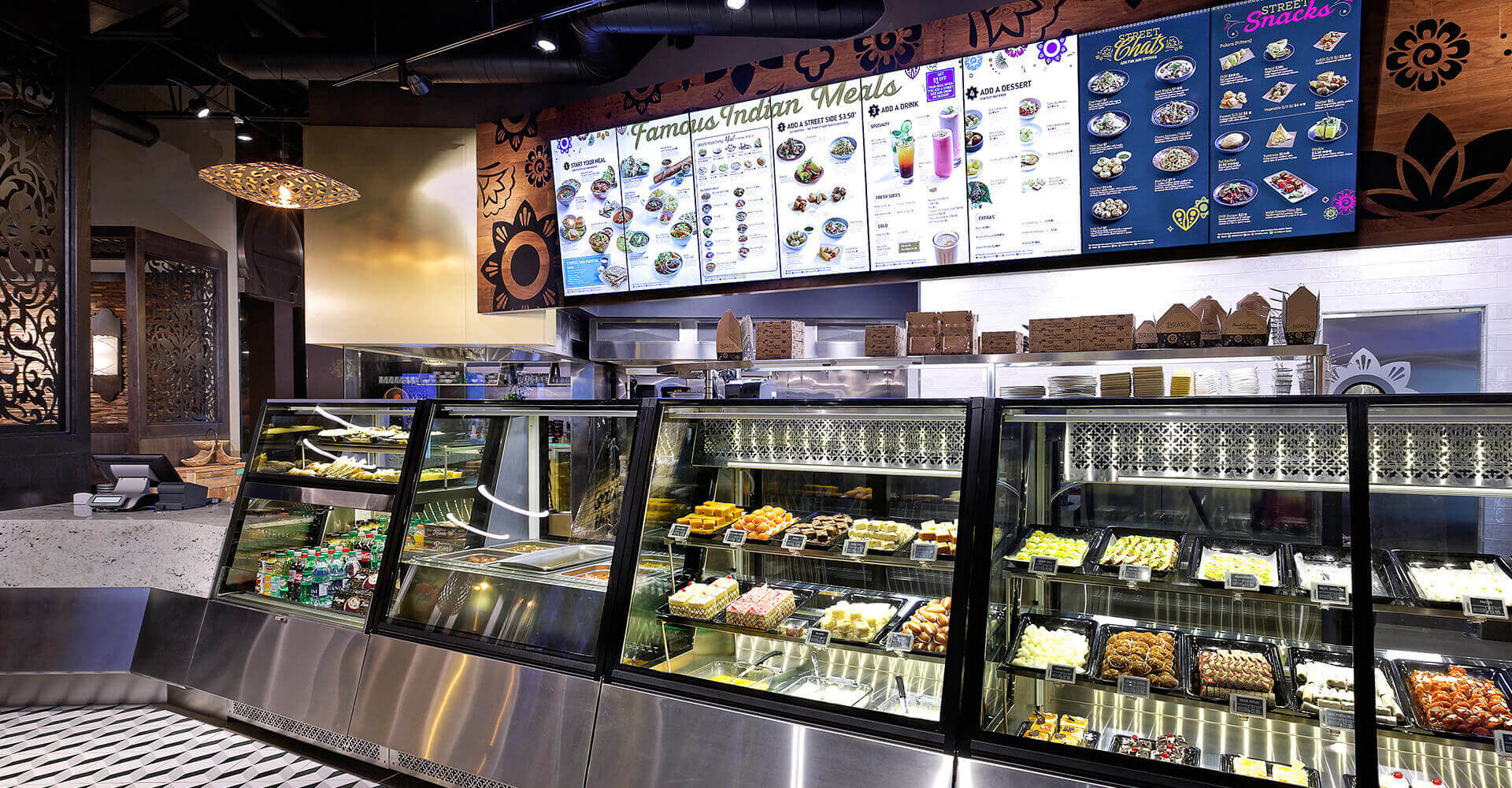
The digital menu boards above the order counter are a significant departure from Brar’s traditional restaurants and buffets, and much effort was made to try to simplify a large offering in order to make it easier for guests to find favourites and encourage trial. We directed photography for the menu, which included over 200 food shots that amplify appetite appeal and better communicate the offering.
ARTWORK INSPIRED BY INDIA
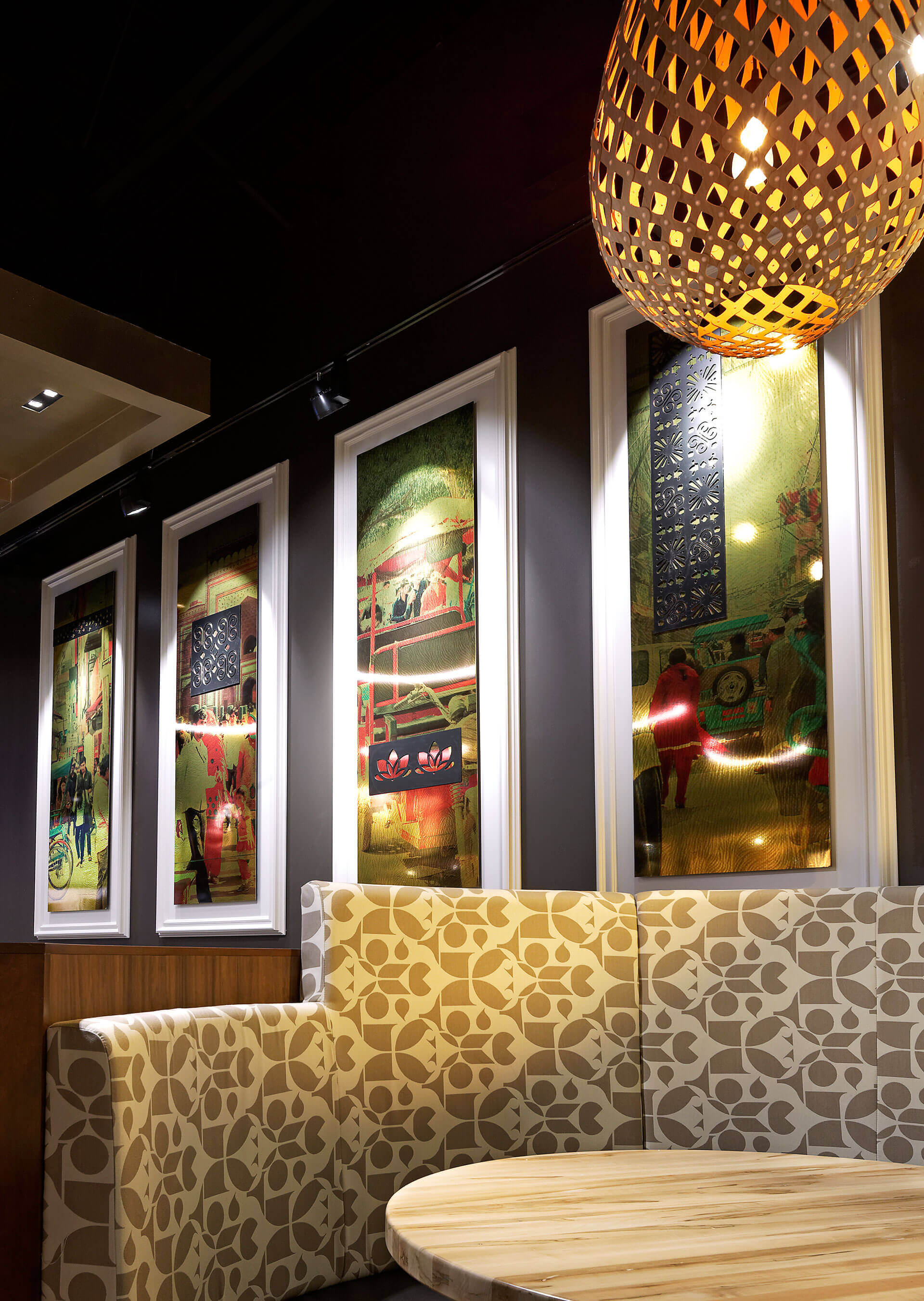
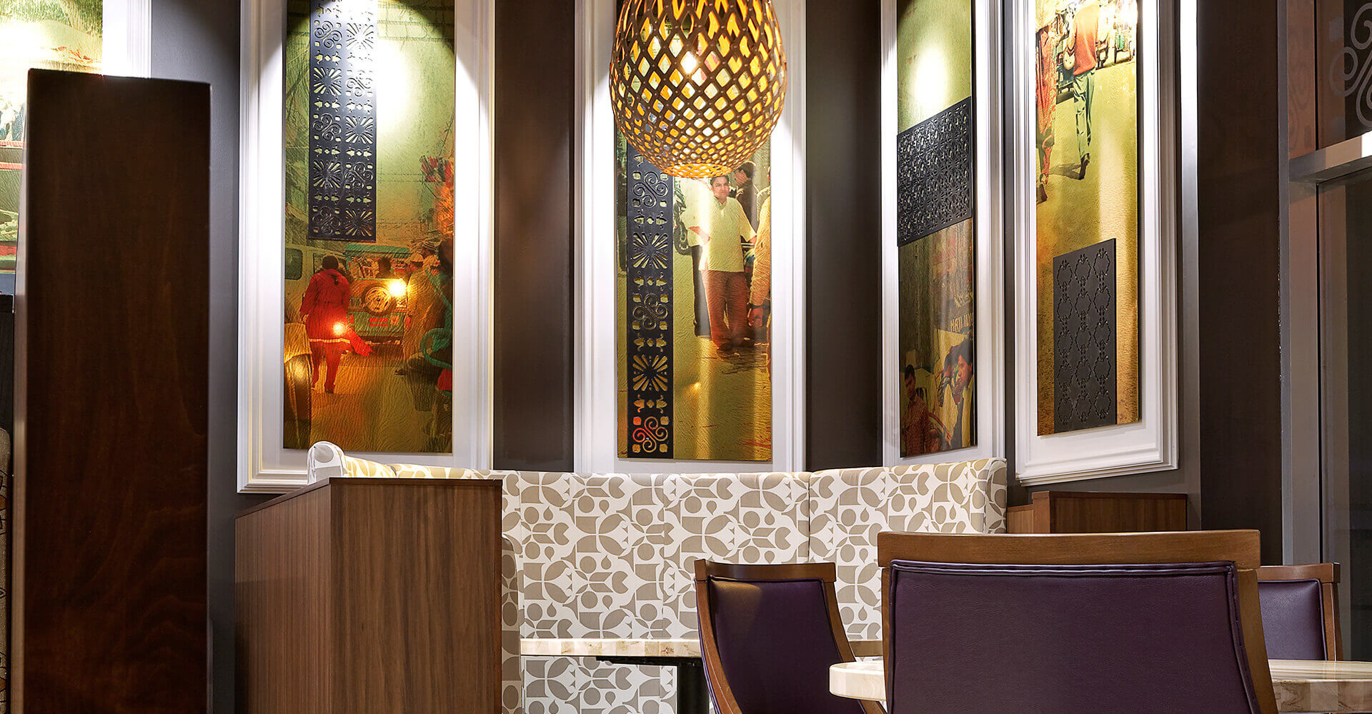
The artwork in the space is all inspired by the research trip to India, and many of the graphic elements used there are actual photos from the trip. Rather than showing predictable landmarks like the Taj Mahal and the Lotus Temple, the artwork instead pulls out architectural elements of these famous buildings, and includes people, as they, more than bricks and mortar, are the lifeblood of India. Even photos of rickshaws from the busy streets feature them in use rather than stationary, in order to capture the human element. The artwork in the dining area is printed on brass panels to give it warmth, and feature layers of photography, illustration, patterning, and textures to give it a richness and sense of place. We overlaid this with custom cut panels featuring the brand icons we created arranged into proprietary patterns inspired by the architectural grates on windows and gates we saw in Delhi.
Overall, we wanted the space to capture the warmth and approachability of the Indian people. While we knew that it had to be a modern interpretation of the old world, we had to be careful in our design so that it felt natural. Fumed oak tabletops and a variety of millworked wood facings helped to achieve this. A dramatic feature dining wall employs reclaimed wood pieces pressed together, and creates more of an installation art piece than a simple wall finish. In a word, we wanted every moment in the environment to feel special, in order to elevate Brar’s to a more premium position.

In the ceiling we wanted to create a signature element, again employing patterning – this time with simple circles – to create visual interest above. Signature bamboo lighting illuminates the dining area, aided by downlighting on the artwork panels and in the custom wooden divider shelving, and feature lighting on the wood wall piece.
MUCH ADO ABOUT SEATING
A mix of seating gives permission for different dining occasions. Benches with tables and chairs dominate the dining area, and provide flexible options for a more fast casual experience. Booths wrapped with a proprietary CNC cut patterned panel provide more intimacy, and round tables in the corners allow for more traditional family dining.
THE THEATRE OF THE TANDOOR
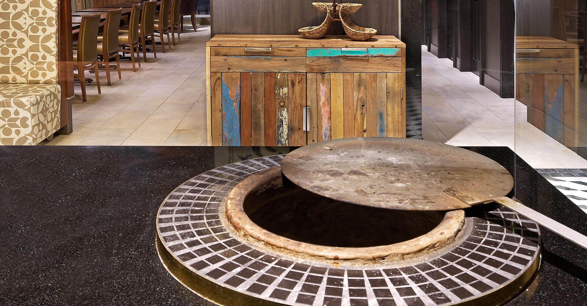
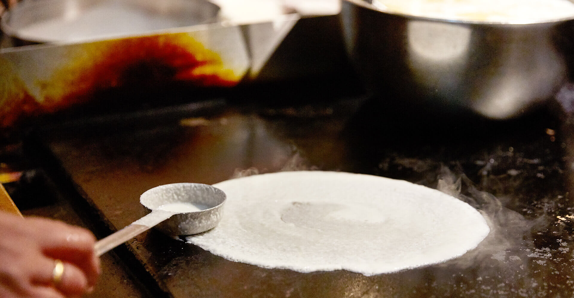
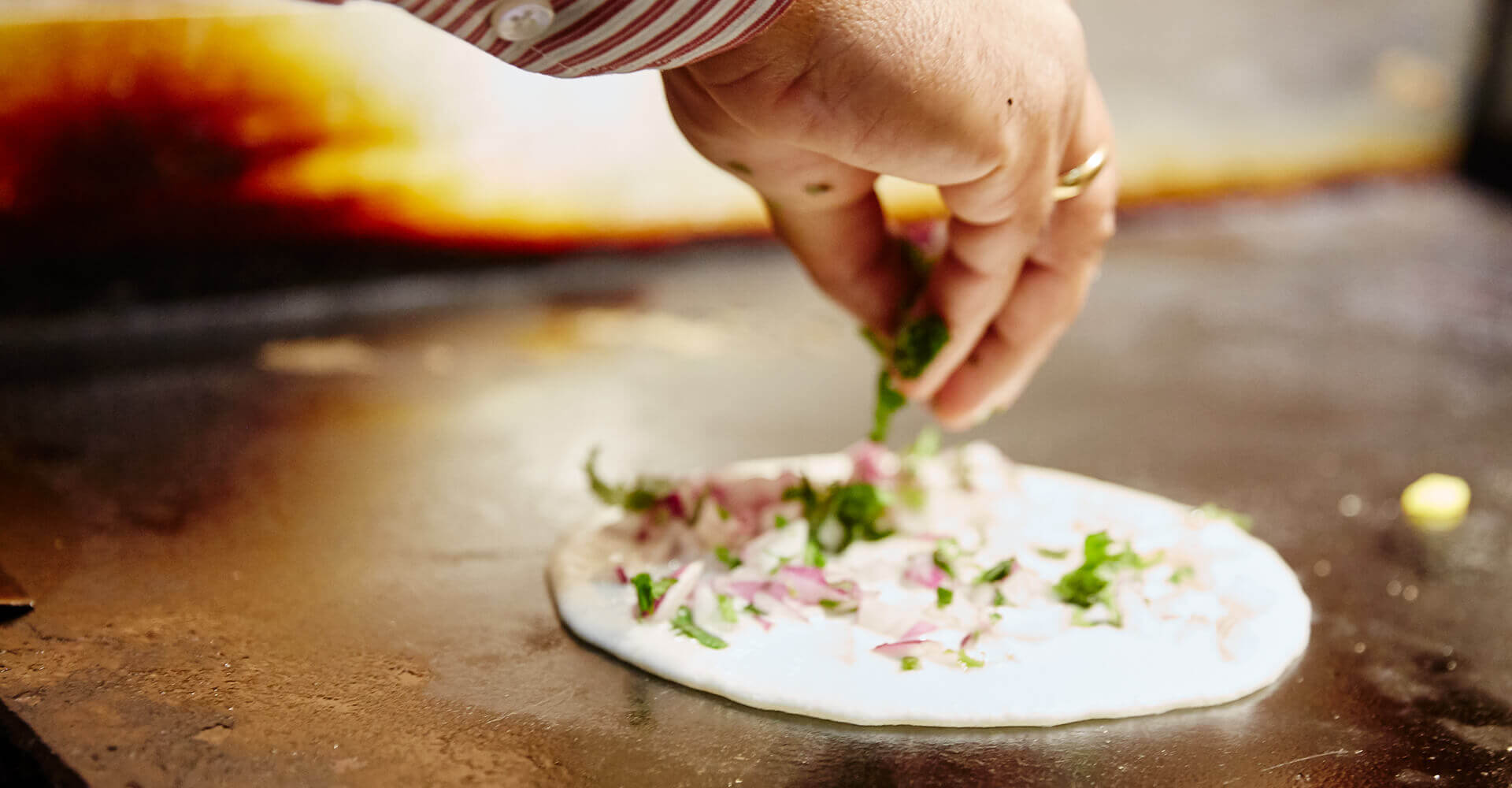
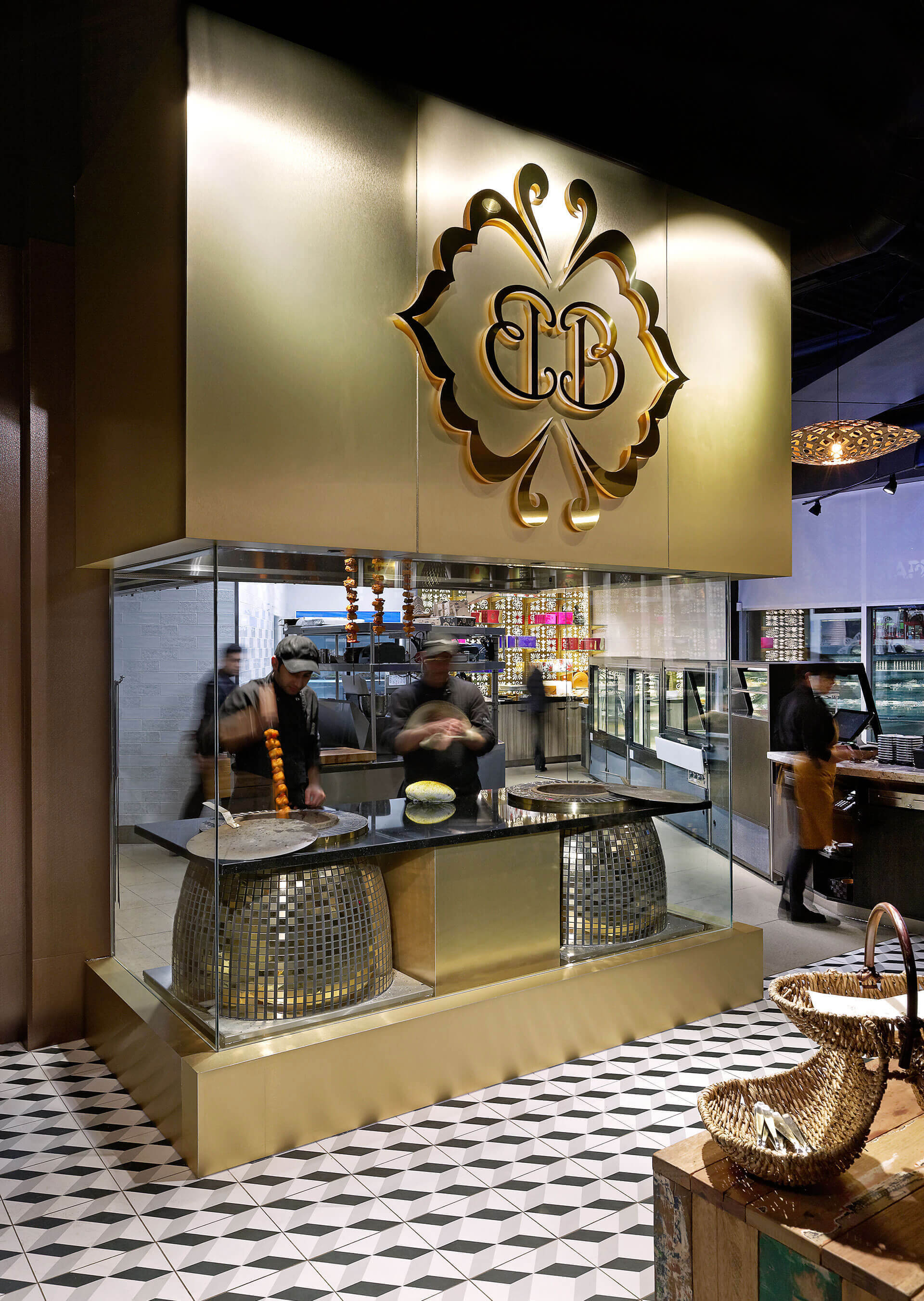
Theatre is a prominent part of the street market scene in India, and we brought that to the design by making the tandoors a feature of the space. Glassed-in with the large Double B icon illuminated overhead and geometric tiling surrounding it, the tandoor area provides a view into the kitchen for diners, allowing them to watch their bread being prepared in tile-lined tandoors mounted into a large marble countertop. This provides transparency into the kitchen, reinforcing quality and freshness cues, as well as providing some entertainment to guests.
MAKING IT SPECIAL
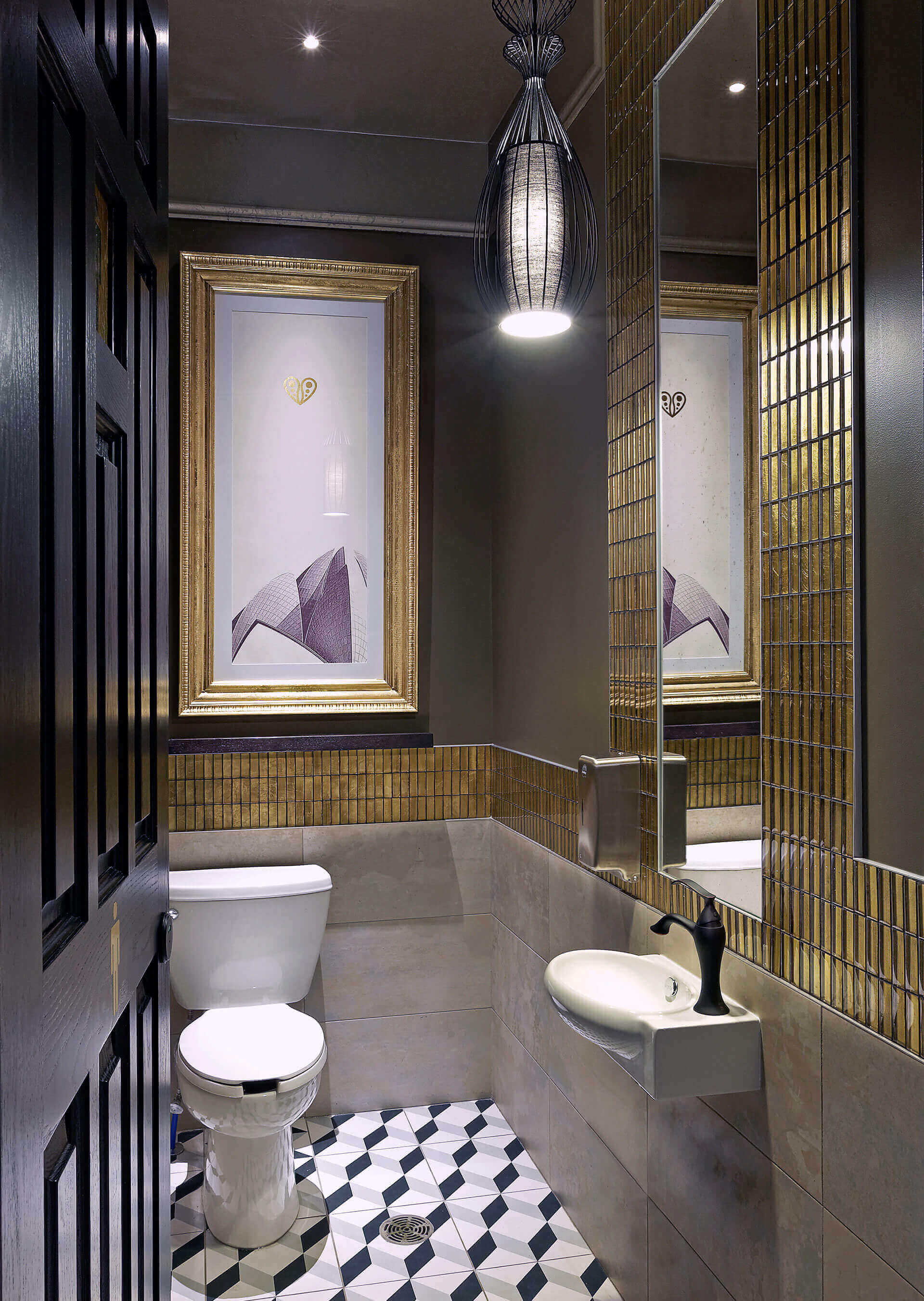
Even the washrooms are special – gold glass tile lines the walls behind a heavy 6 panel wooden door, and heavy stone-look tile and premium fixtures give the space an elegance and crispness that speaks to attention to detail. A large gold-framed art piece featuring the Lotus Temple, adorned with a simple gold-stamped proprietary Brar’s icon is a punctuation mark on this space.
