Rolling on Sushi
Bento Nouveau - Bento Zushi
Bento Nouveau creates, prepares and distributes delicious and nutritious ready-to-eat foods such as sushi, sandwiches, salads and heat-and-serve entrees. They operate gourmet food kiosks in premier shopping malls and office towers, sushi chef stations in quality supermarkets and food service facilities, and service over 1000 supermarket and institutional food service locations.
Bento Nouveau came to us with a plan to reintroduce sushi to the retail customer. The new brand would be relevant and meaningful to the consumer looking for a fresh and healthy alternative to traditional on-the-go fare. Their existing Bento Nouveau and Sushi! retail stores and kiosks offer grab-and-go sushi, sandwiches, boxed meals, breakfast, and drinks within small footprints located on consumer pathways and with limited seating. Both concepts had begun to look dated and a step behind the rest of the burgeoning sushi retail market.
Project Type:
Related Projects:
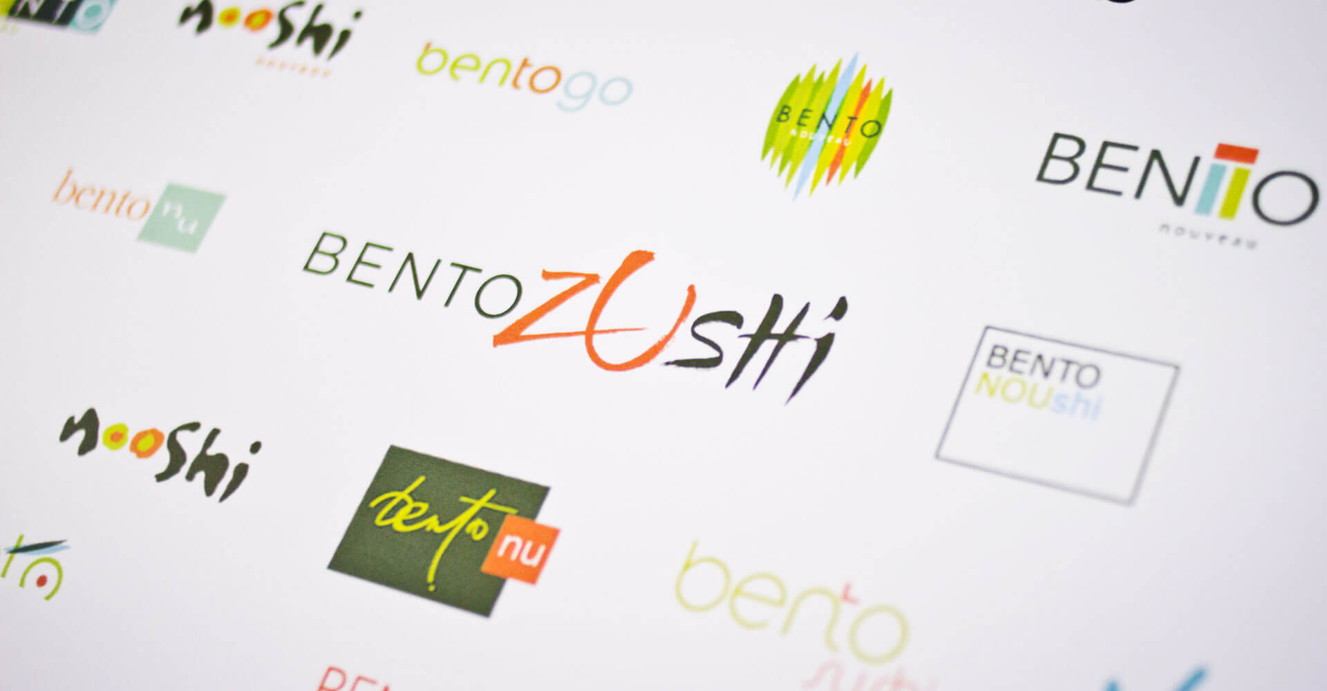
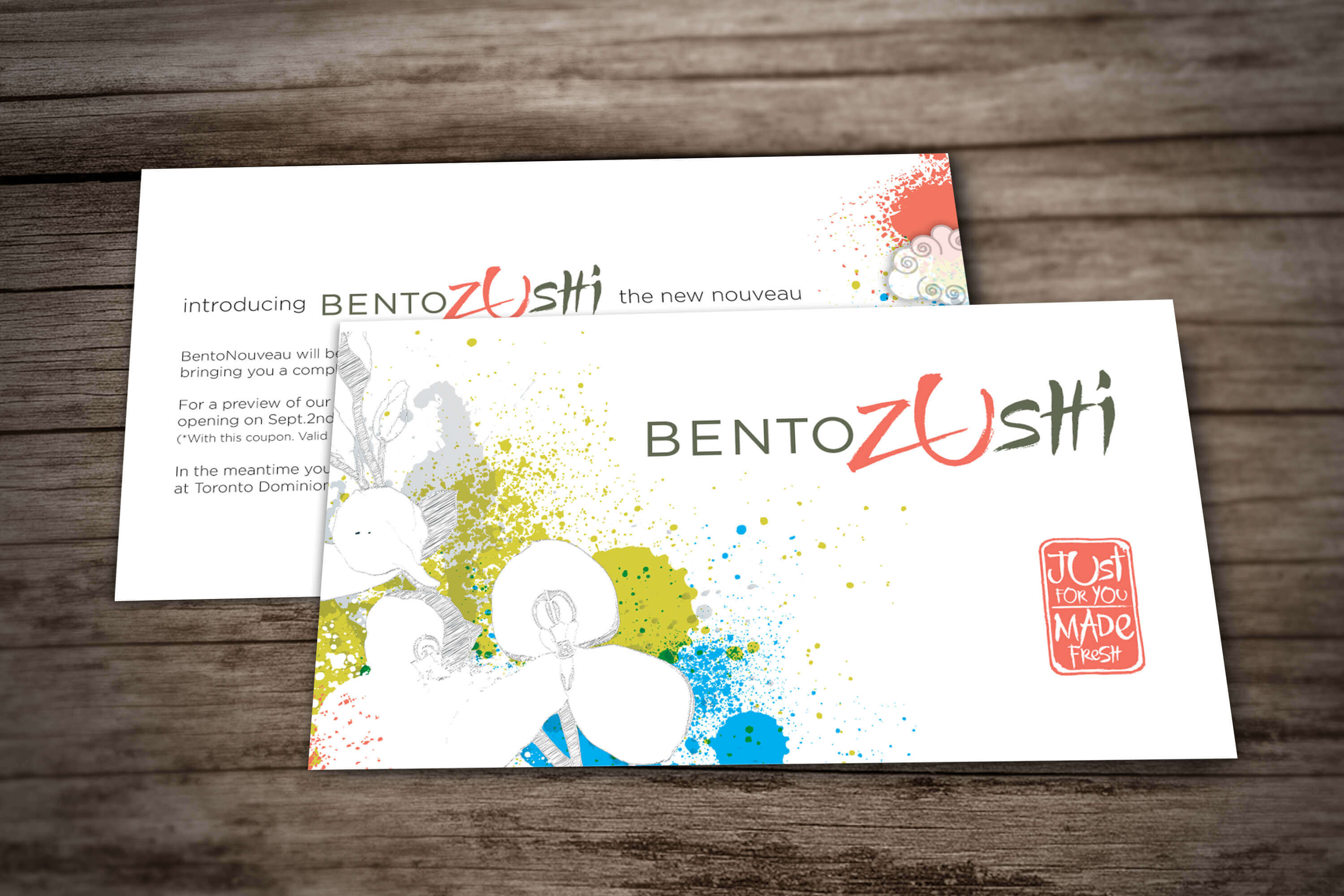
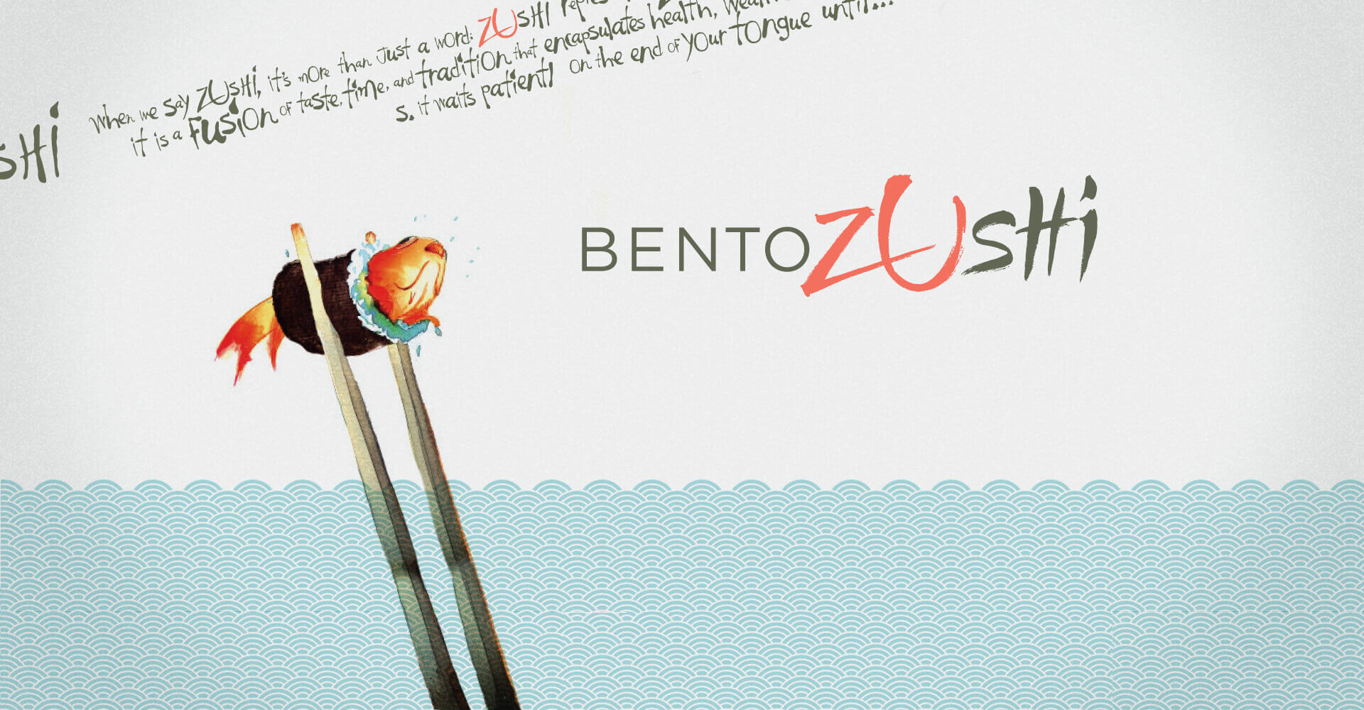
Bento Zushi was born out of a desire to create an Asian-inspired product line built around a core platform of sushi and noodles – but with a North American appeal. Through the name generation process we discovered that retaining the word Bento was important both to associating the brand with Bento Nouveau as well as describing the nature of the offering. We looked to find another word that would evoke a Japanese-inspired feeling within the customer, with a passion and excitement for the food being served. Discovering that placing the word sushi after another word in Japanese changes the ‘S’ to a ‘Z’ was a natural fit and satisfied our naming requirements. After a comprehensive logo exploration we landed on this combination of modern letters for Bento and the art/calligraphy/brush strokes for the word Zushi, combining art with modern food prep practices. The salmon colour in the logo is representative of the roe or salmon featured in many sushi dishes while the dark green/grey represents the seaweed wrap.
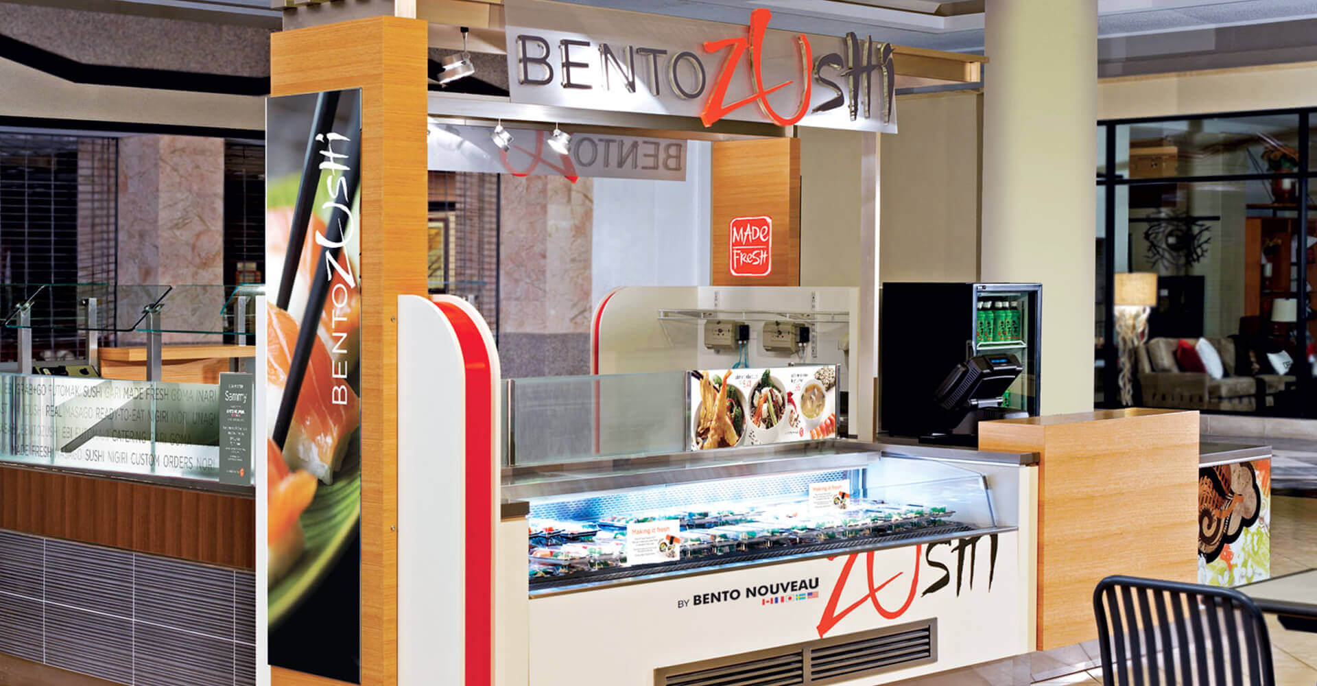
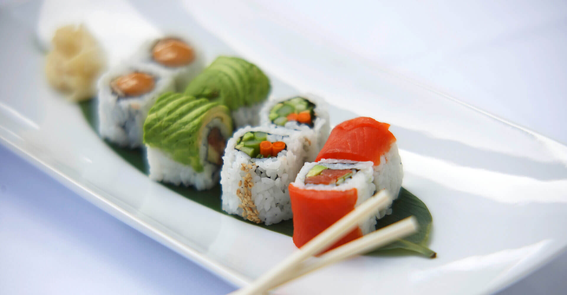
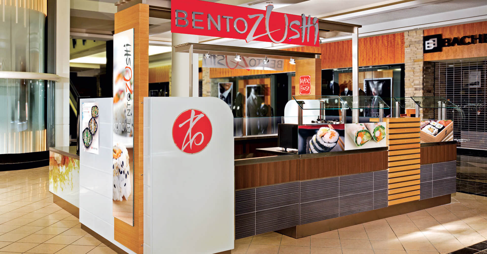
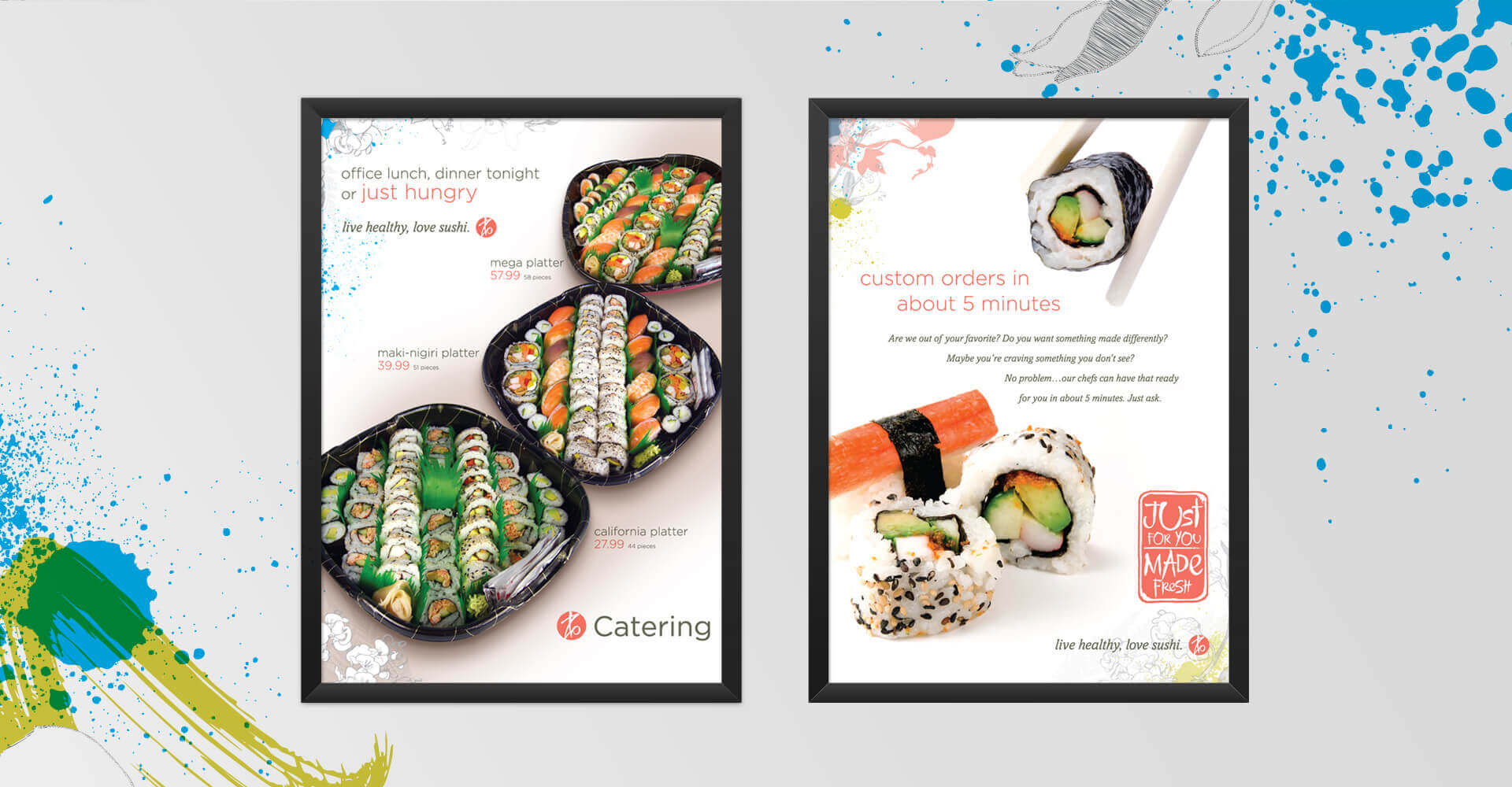
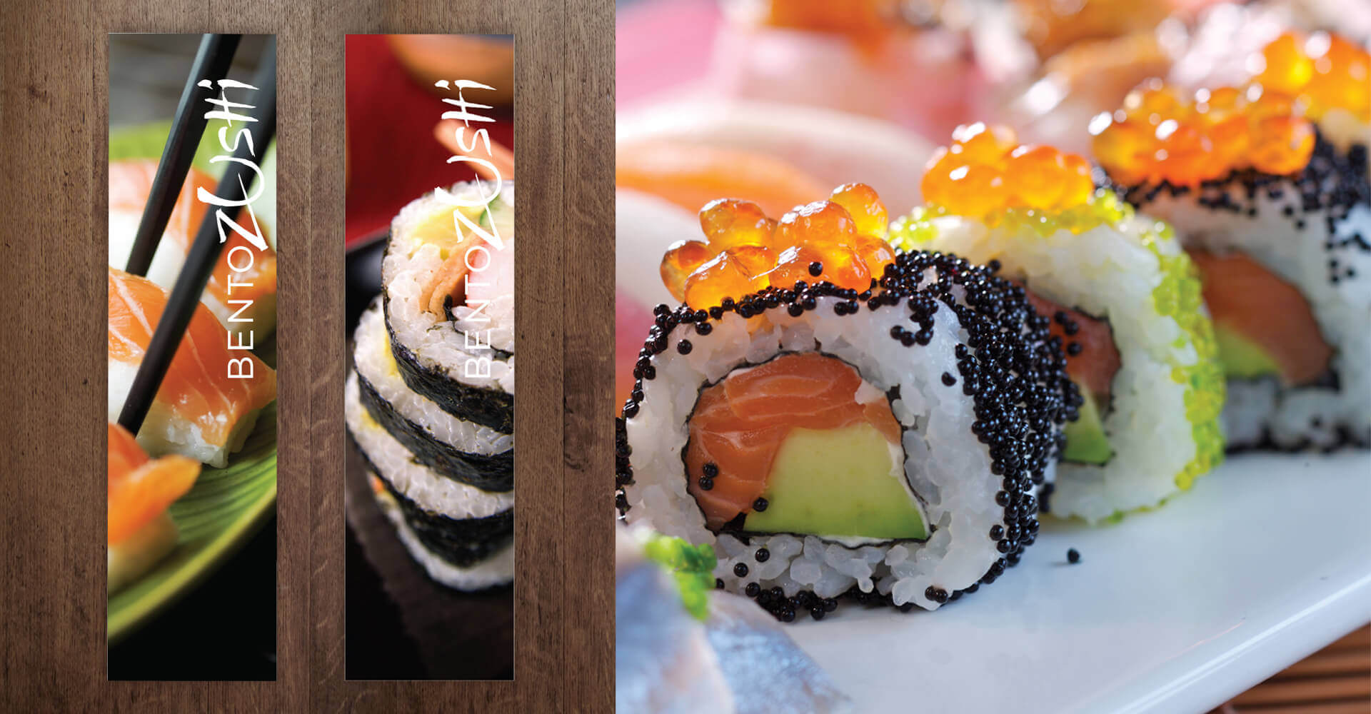
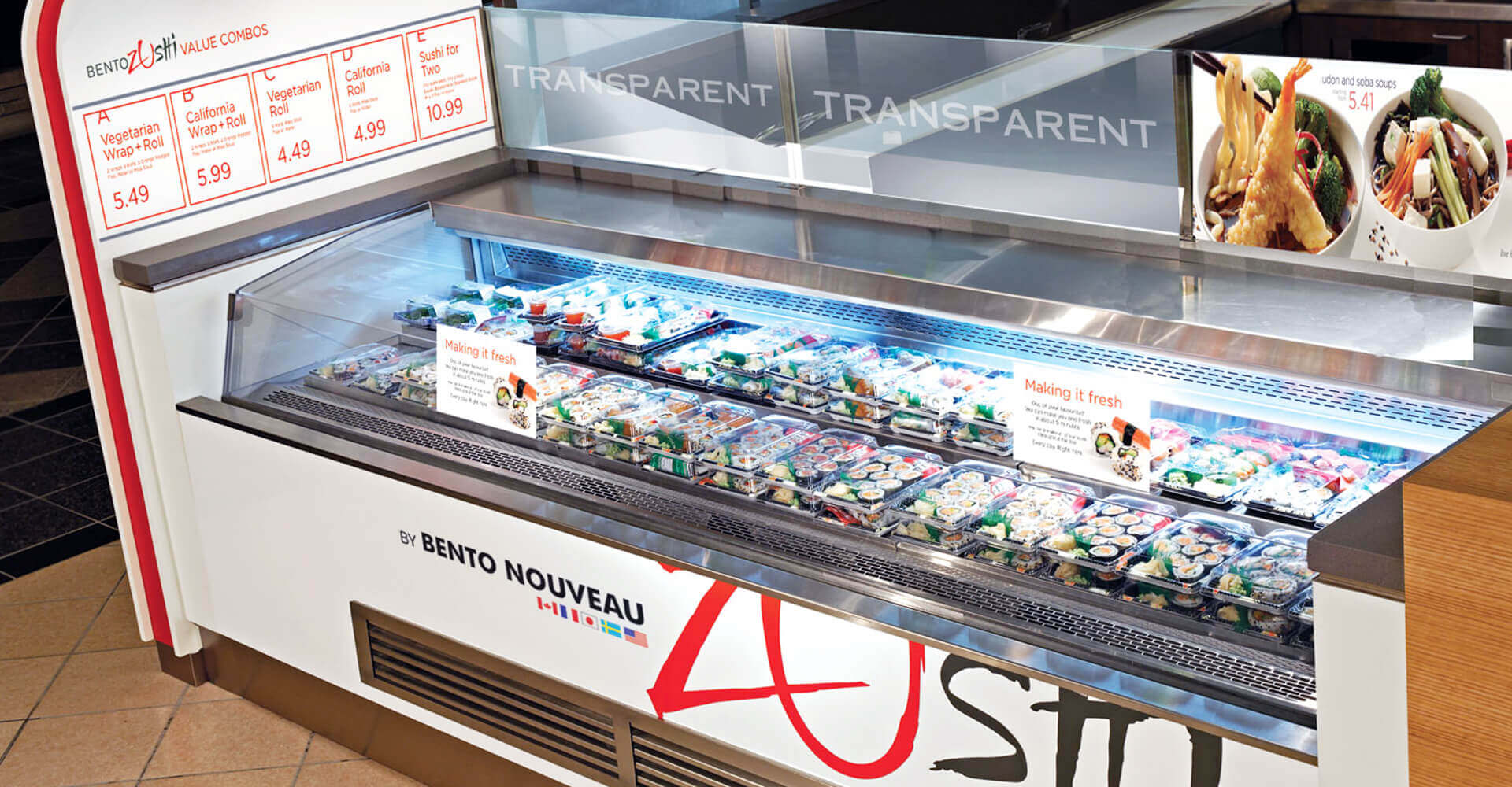
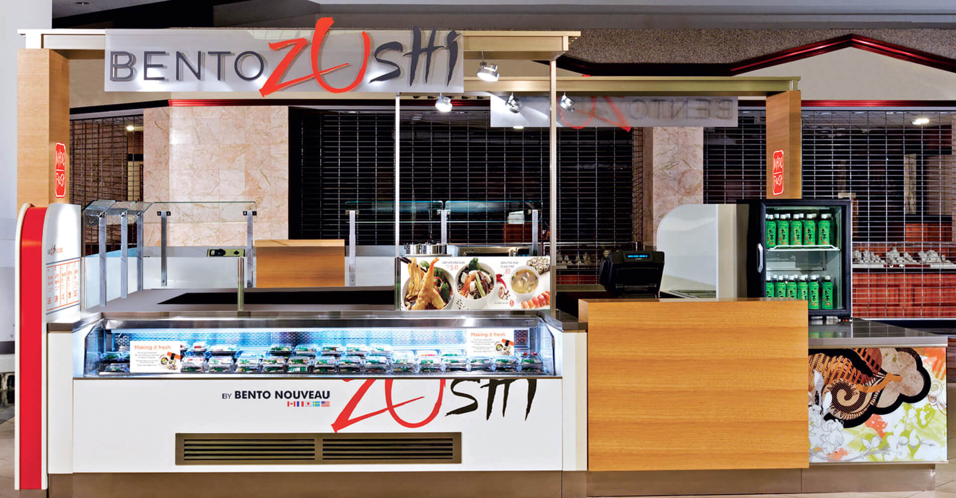
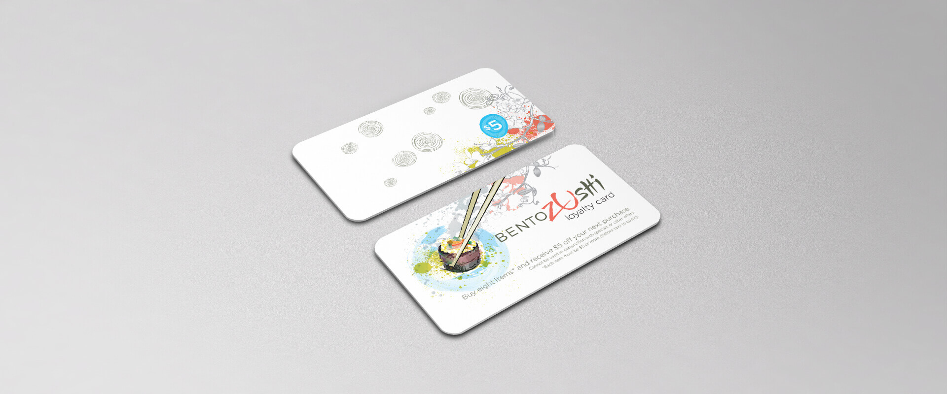
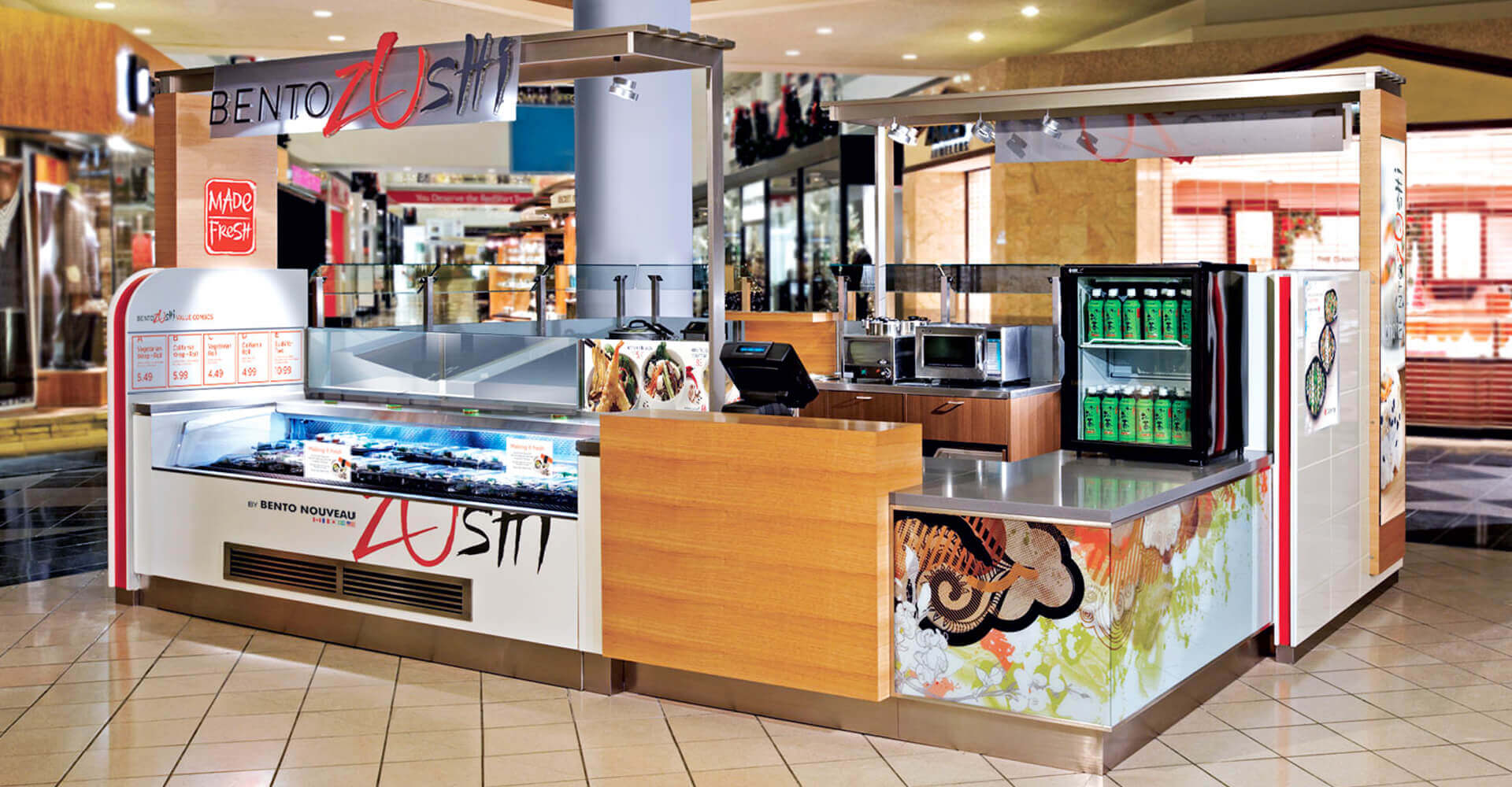
We developed the concept using bold, striking visuals and Japanese-inspired materials. A large scale wall mural with interpretive imagery is a backdrop for the sushi chefs and represents their passion for the art of sushi preparation. It is a powerful beacon in the food court setting. A vertical noodle illustration highlights the unique features of udon noodles and the fun of the eating experience, and also commands attention in the food court. It was important for Bento Zushi to own the soup category in their environment. To this end we designed a noodle order card to train customers how to order this product and to foster interest in future purchasing. Product imagery panels create appetite appeal and offer real health benefits for consumers looking for a healthier food choice. Jump developed the tagline “live healthy, love sushi” to resonate with this consumer mindset. A “Just for you, Made Fresh” icon was created in the style of a traditional Japanese signature hand stamp as a personal guarantee of the freshness of all Bento Zushi products, which are prepared each day. We also created a “BZ” icon which is the seal of quality and trust and is used to sign all important consumer messaging. Uniforms defining and separating customer care staff from sushi chefs were chosen and designed. T-shirts and sampling cards were developed to create interest at opening events.
A total of 10 Bento Zushi concepts were developed in 2008 with the Toronto, Ontario location launching in the RBC Centre.
