

Thinking Inside the Box
Basil Box
When we were approached about creating a new Asian food concept inspired by the street food of Thailand and Vietnam, we couldn’t resist. Enter Basil Box.
In a Toronto market that had seen several small-scale attempts at similar concepts succeed, the Basil Box team was convinced that launching a scalable brand in this category – one that was ready for national rollout – would be a sure winner. The Canadian palate now understands and craves Asian food, but is ready for more authentic, inspired taste and experience. They also want customization; the ability to assemble their own “recipe” of ingredients on the spot into a delicious meal that reflects their personal preferences. Basil Box worked tirelessly to create a menu that is true to the roots of the concept, uses fresh and healthy ingredients, and has a flavour profile that is distinctly Asian.
We were fortunate enough to be included by Basil Box in all aspects of the concept’s development. Their team sought our input on everything from store locations to involving us in testing and cooking sessions where we could taste different bases, proteins and sauces, and provide feedback.
Project Type:
Related Projects:
Awards:
2016 — Transform Awards (Silver Award)
2015 — W3 Award (Design Excellence Awards)
2015 — W3 Award (Silver Award)
2015 — W3 Award (Design Excellence Awards)
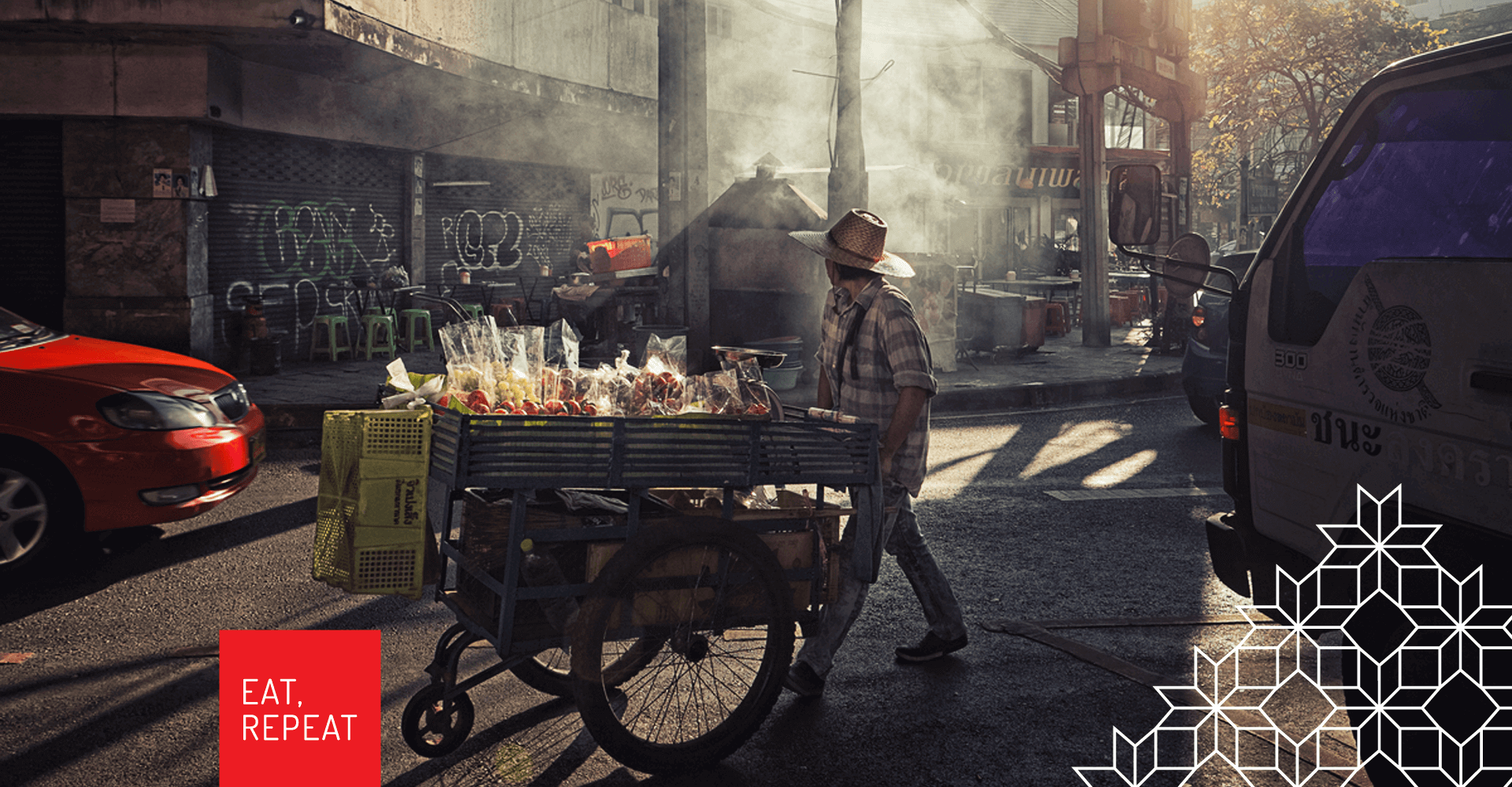
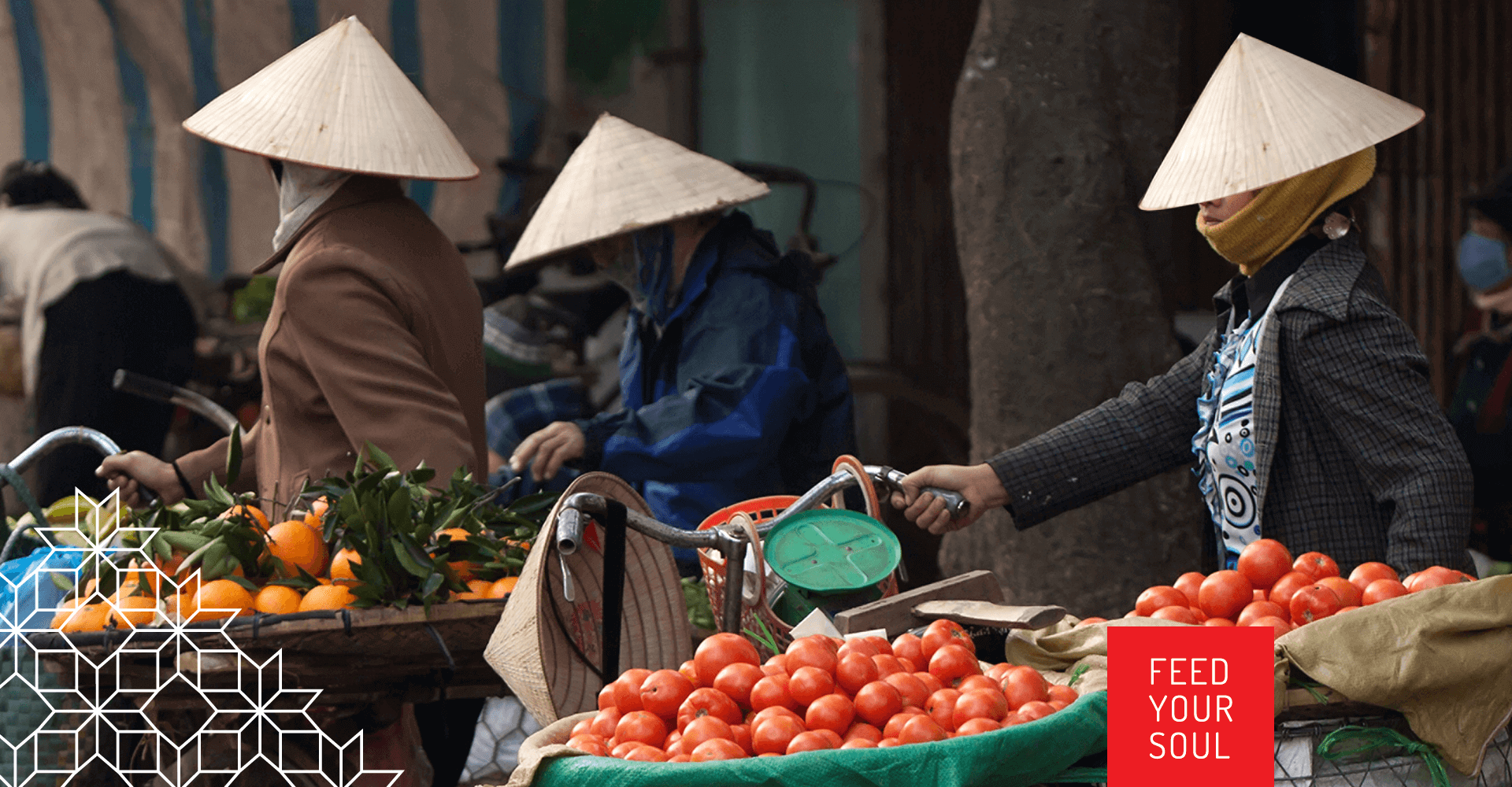
Still in our discovery phase, we toured San Francisco with the Basil Box team to get a handle on what was happening on the West Coast in this emerging category. A select group of similar concepts already exist there, so it was imperative that we see what they’ve done aesthetically, and operationally, to inform our design process. We also toured other trending restaurants to ground us and provide insight into what is driving the market.
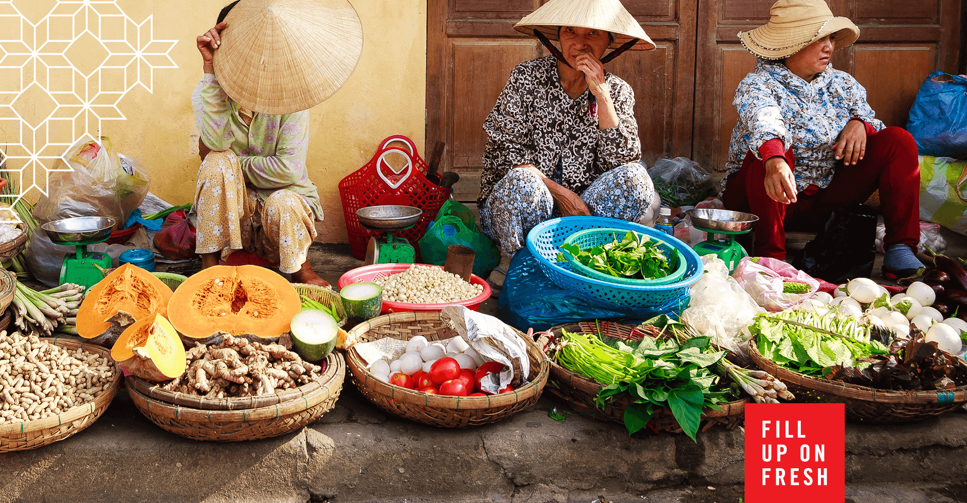
With research done, we used learnings and service model concepts from the most popular and profitable fast-casual offerings to develop the Basil Box concept. The customer needed to feel as though Basil Box is a healthier alternative to many of their competitors, but at the same time can be an indulgent treat. Above all, it must convey the Southeast Asian inspiration behind the concept, but in a very modern, North American execution.
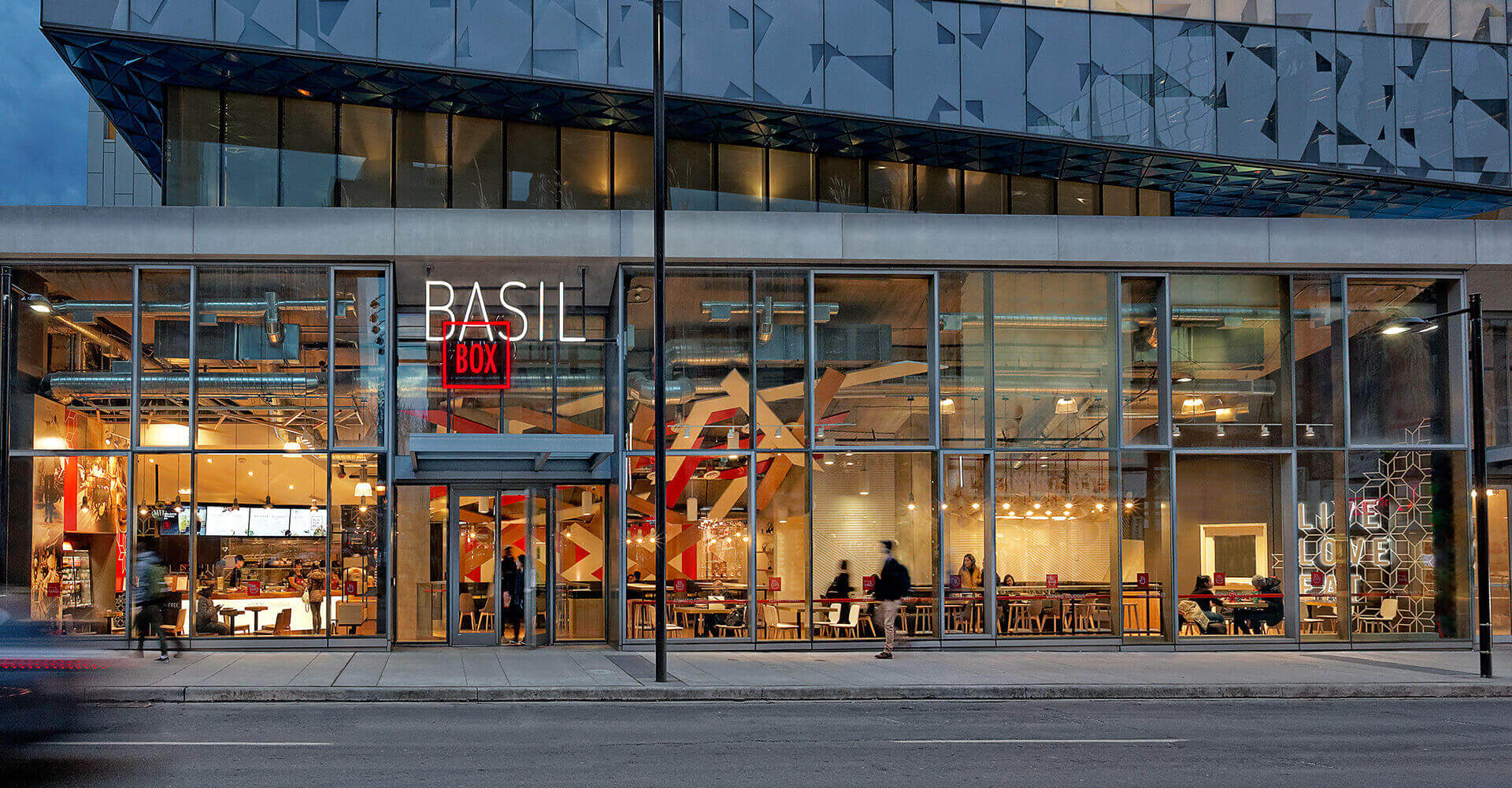
The first Basil Box opened in the Square One food court in the spring of 2015, followed later that year by the opening of the flagship restaurant on Yonge Street, near Ryerson University and Yonge-Dundas Square. This flagship restaurant will drive trial and awareness for the brand.
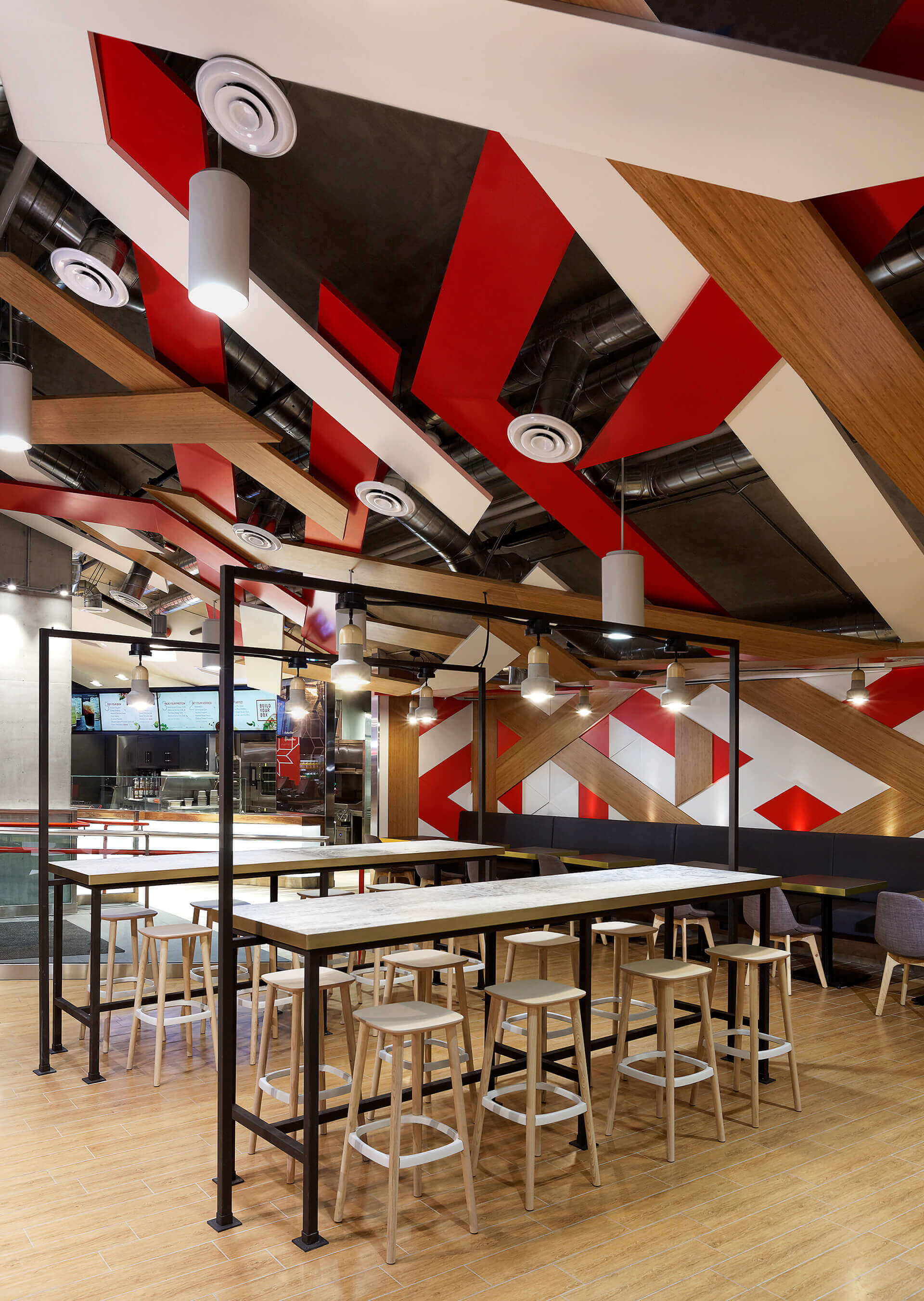
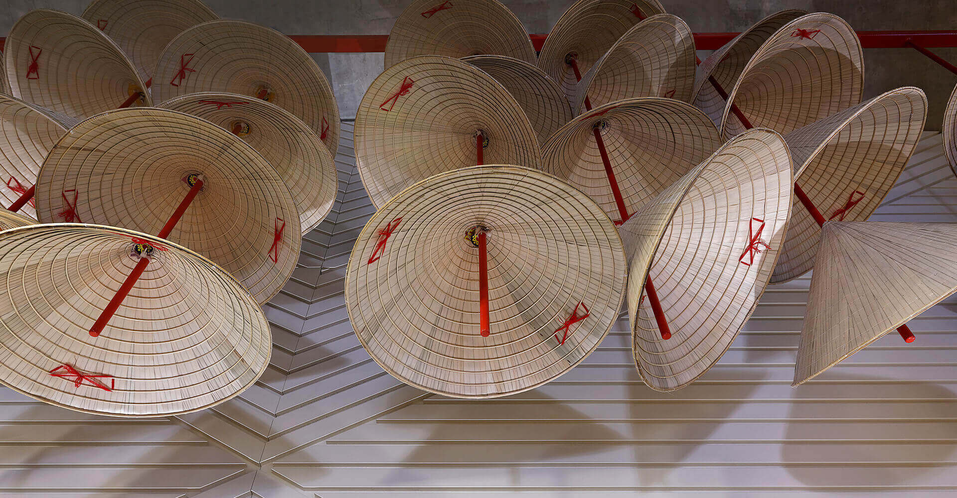
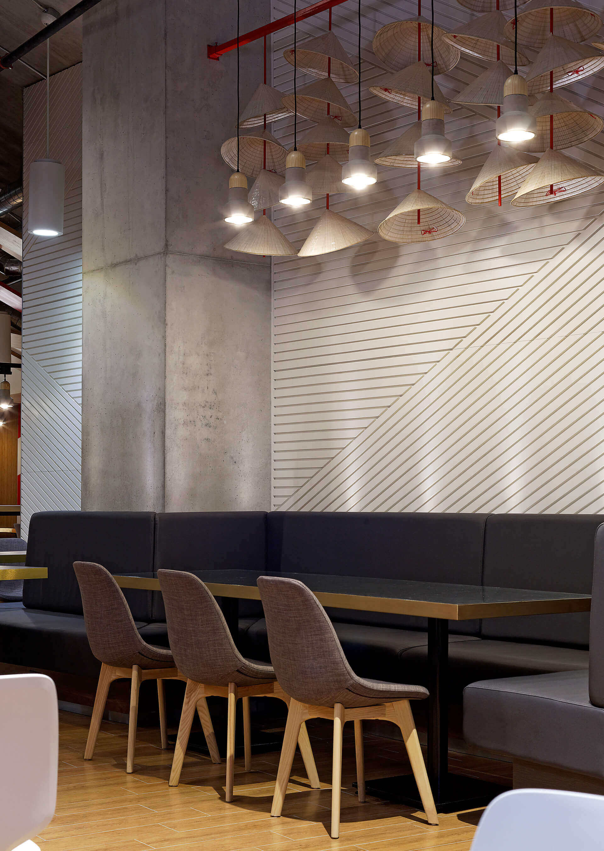
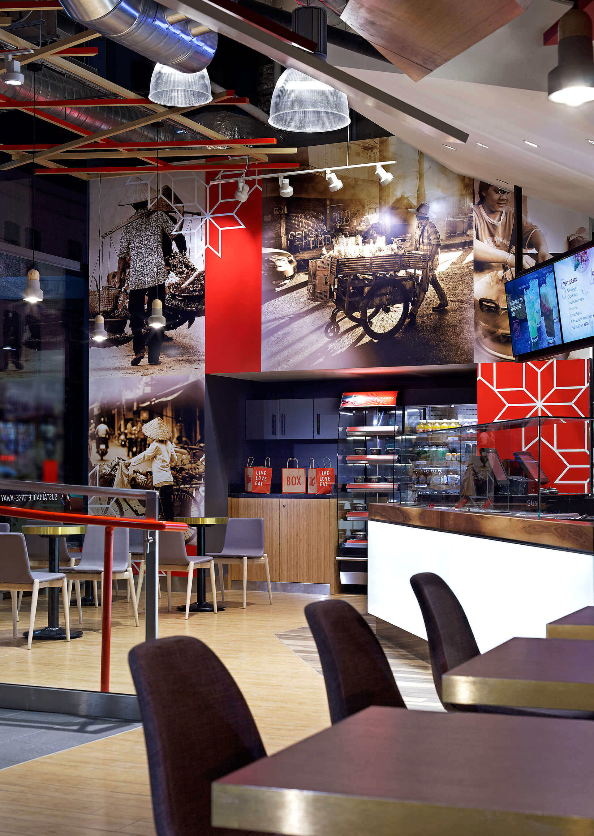
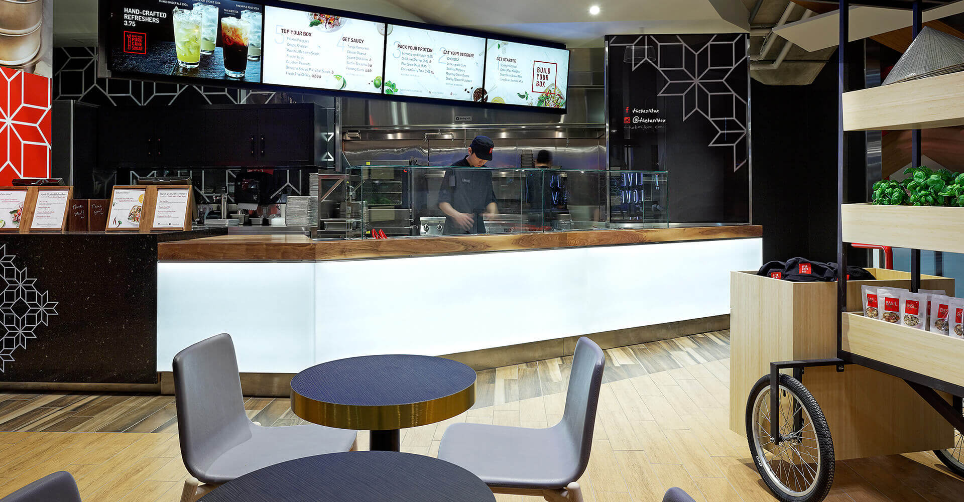
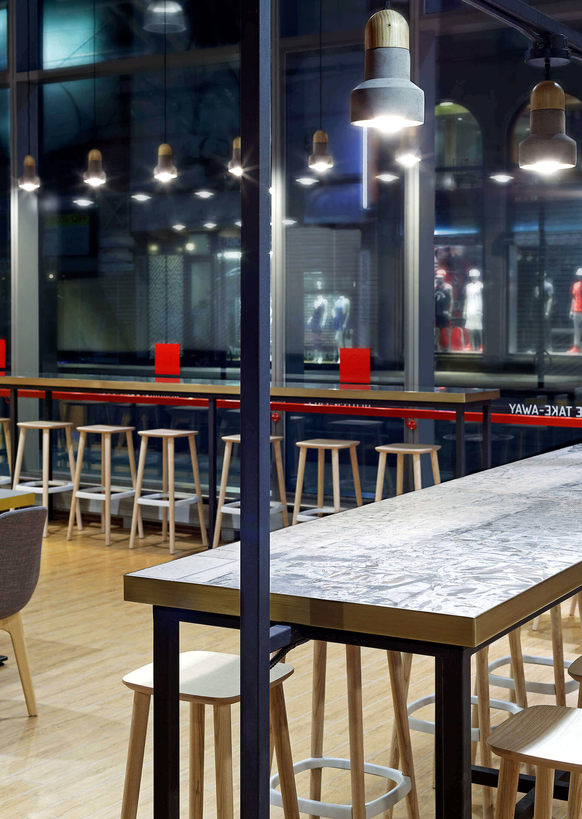
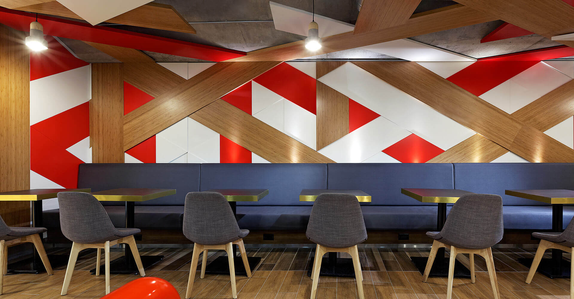
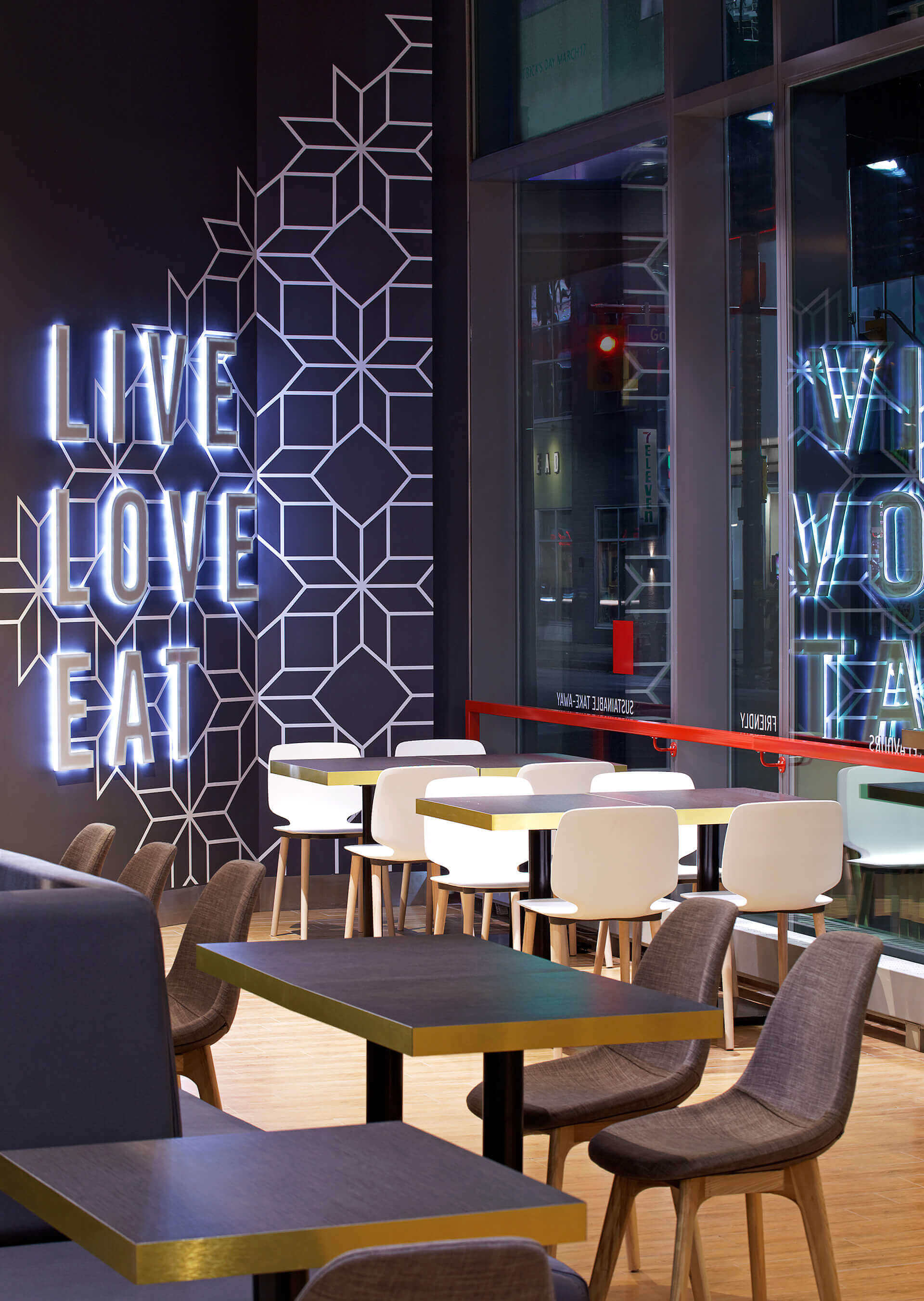
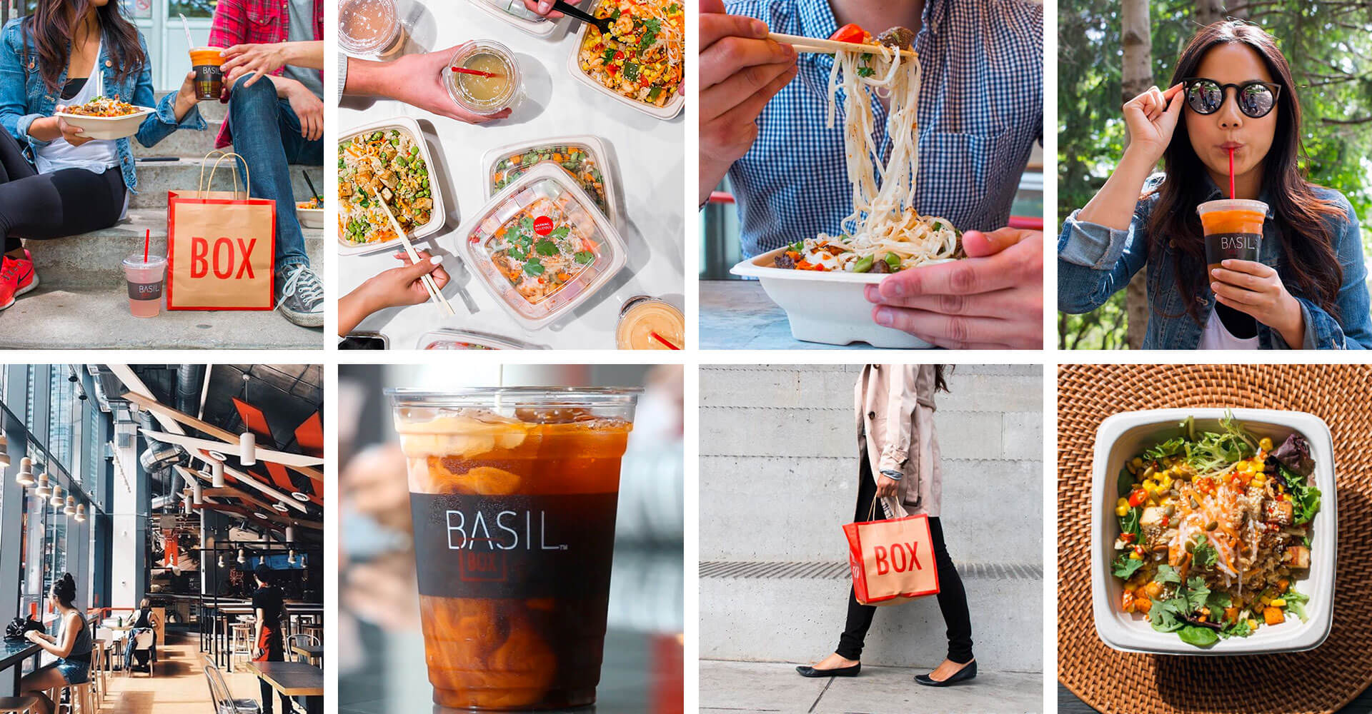
In the Environment: messaging is minimal, and the branding is thin and modern. the food is placed out front and lets the rich, warm colours and textures of the ingredients create a vibrancy in the space. The bamboo weave pattern on the wall represents the woven baskets that are prevalent in the street food markets of Thailand and Vietnam, taking textures, patterns, and materials from the Old World and employing them in a modern way in the environment. It was critical not to over design the space, letting important consumer-focused elements like sustainable, biodegradable packaging and gluten- and allergen-free menu options resonate with customers. Highlighting premium features like the custom drinks program set Basil Box apart from their competition in the food court and the fast-casual segment.
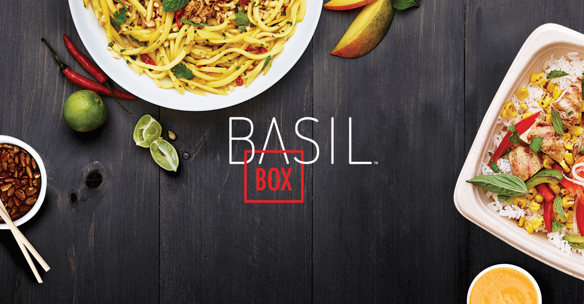
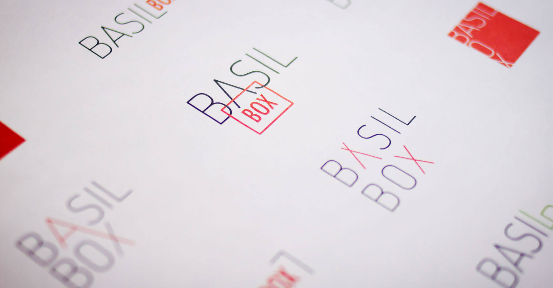
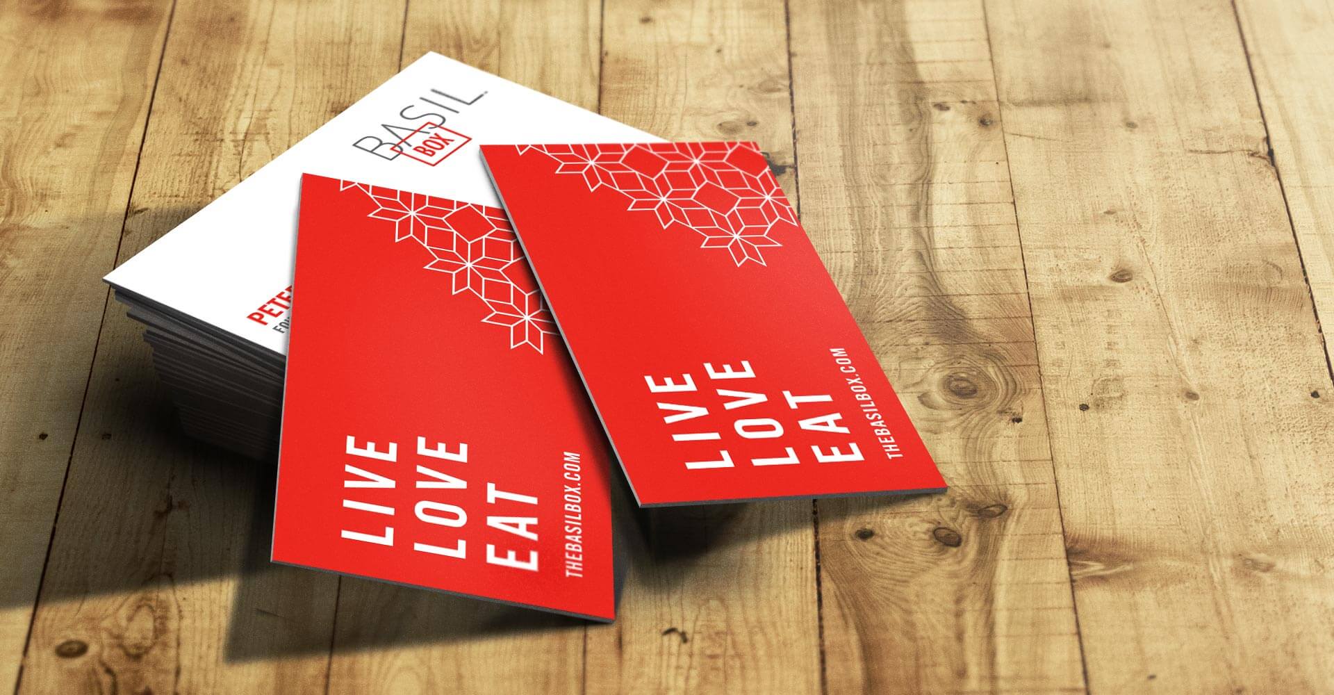
The Basil Box logo is comprised of two very simple sans serif fonts, one for each word. The red “BOX” is bold, and contained inside a square that is quite literally the “box”, but also forms the bar in the capital letter “A” in “Basil. In doing so, it ties the two words together, and also creates a scene where the angled lines in the “A” form either chopsticks reaching into the “box’, or can represent the handles of a carryout bag, suggesting the portability of the offering. This strong but simple wordmark is more North American than Asian, creating comfort with the target consumer.
.thebasilbox.com
explore the website
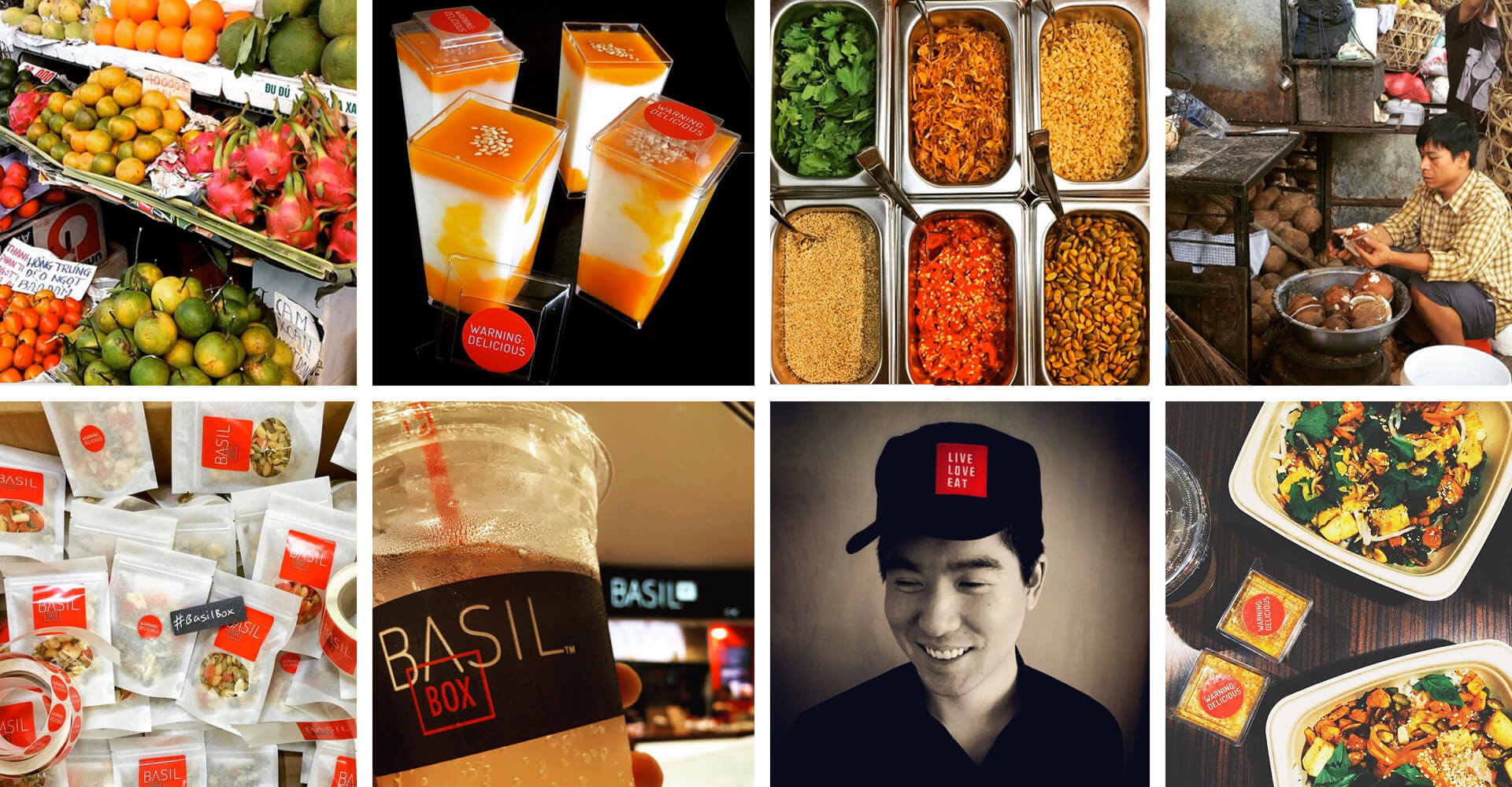
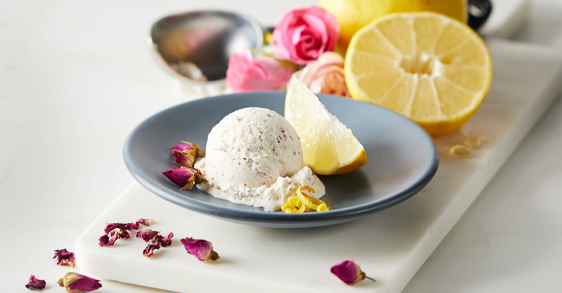
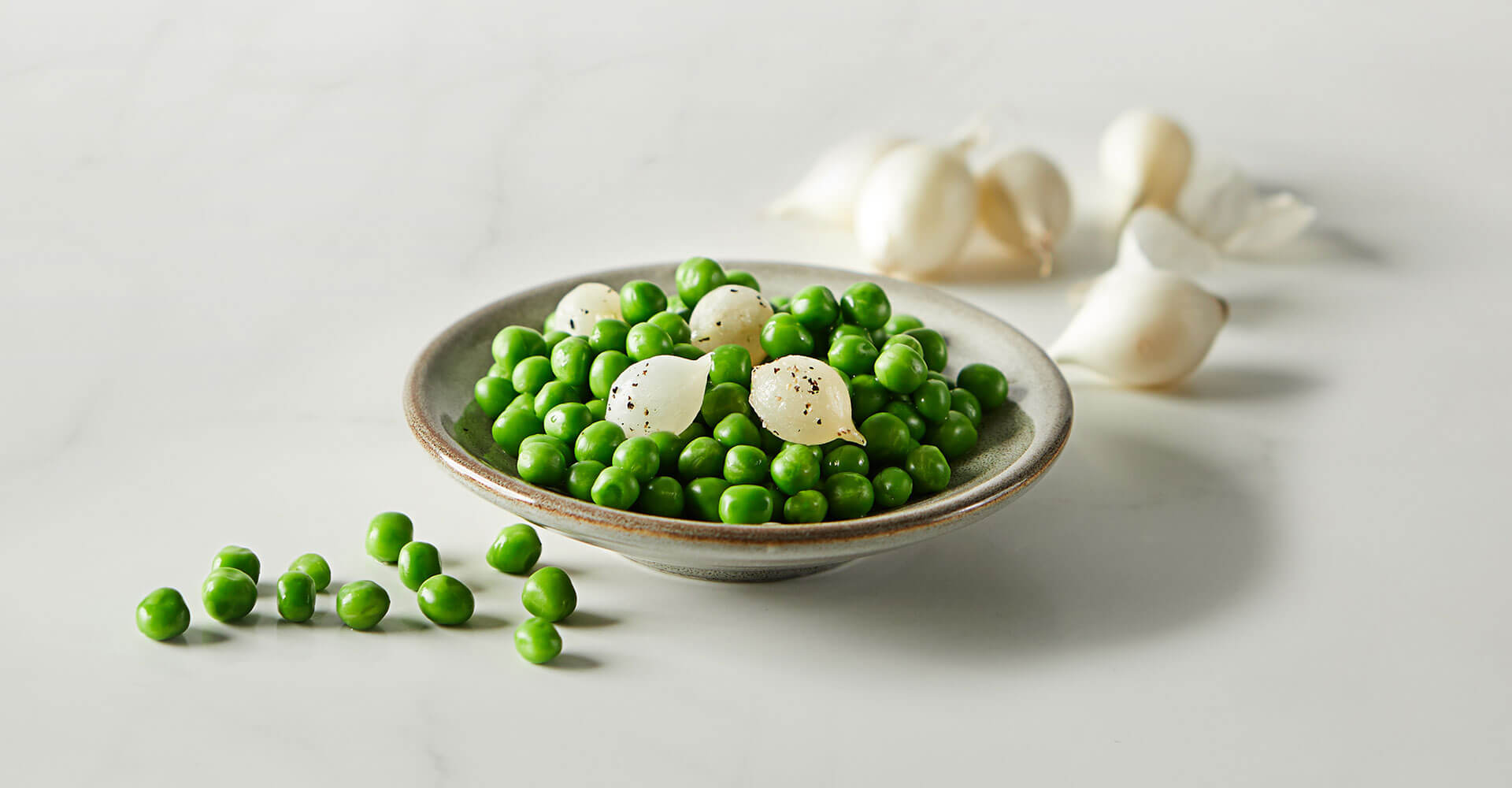
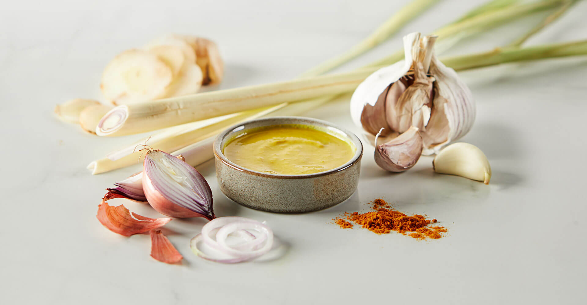
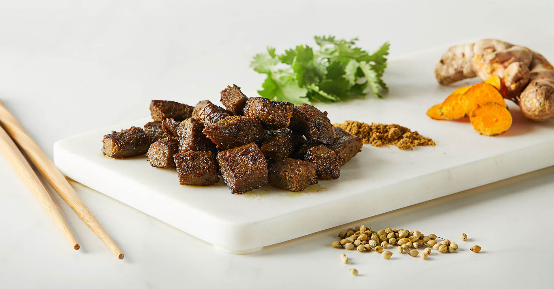
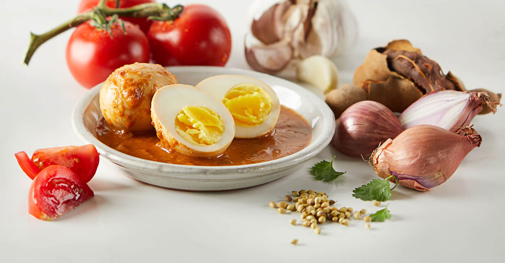
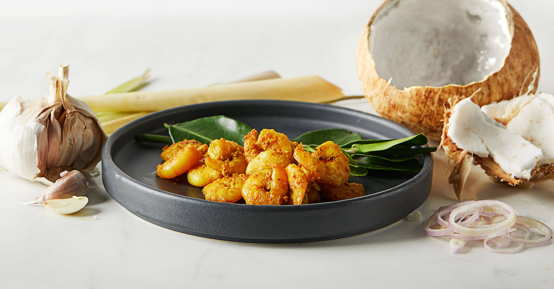
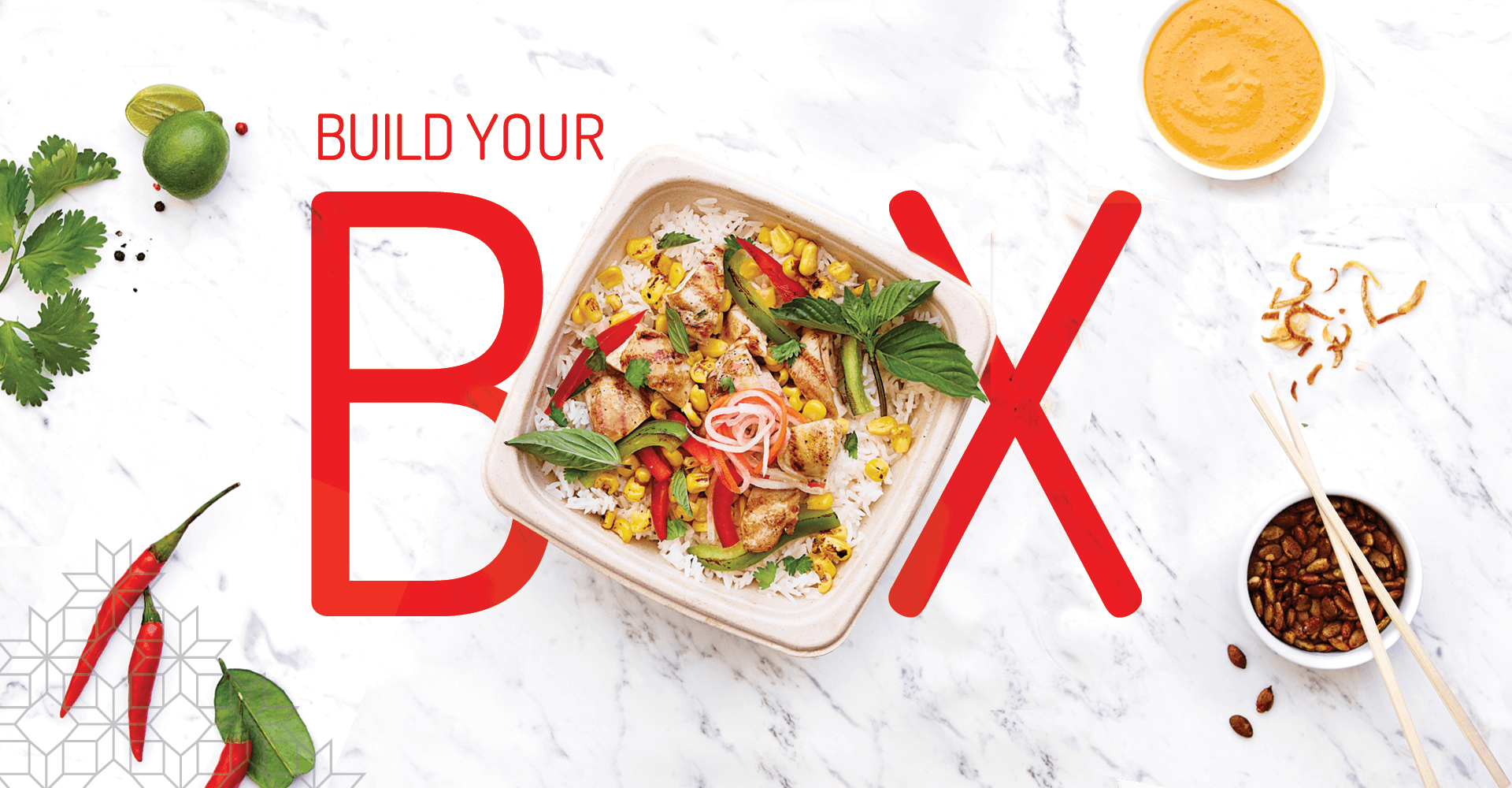
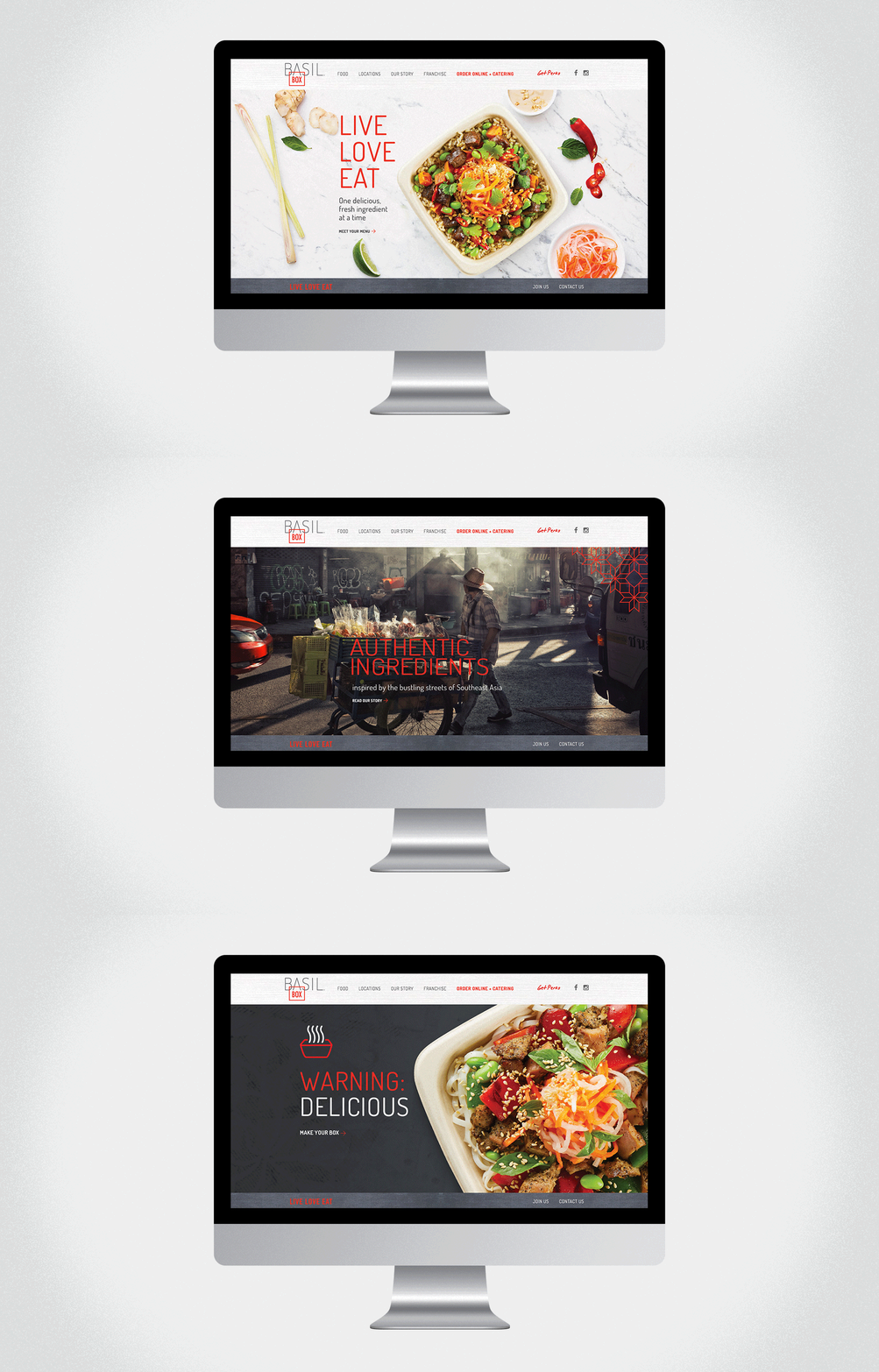
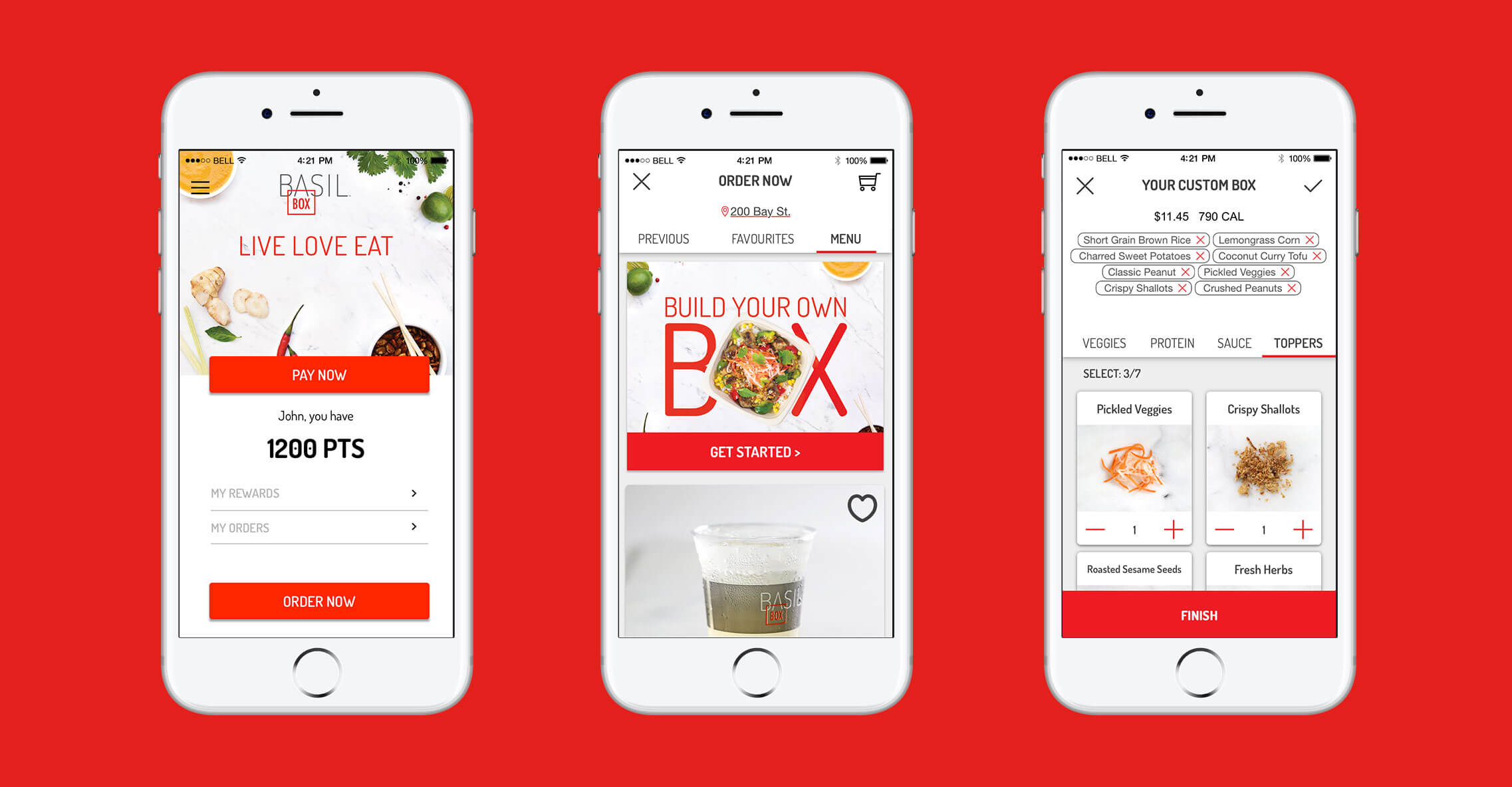
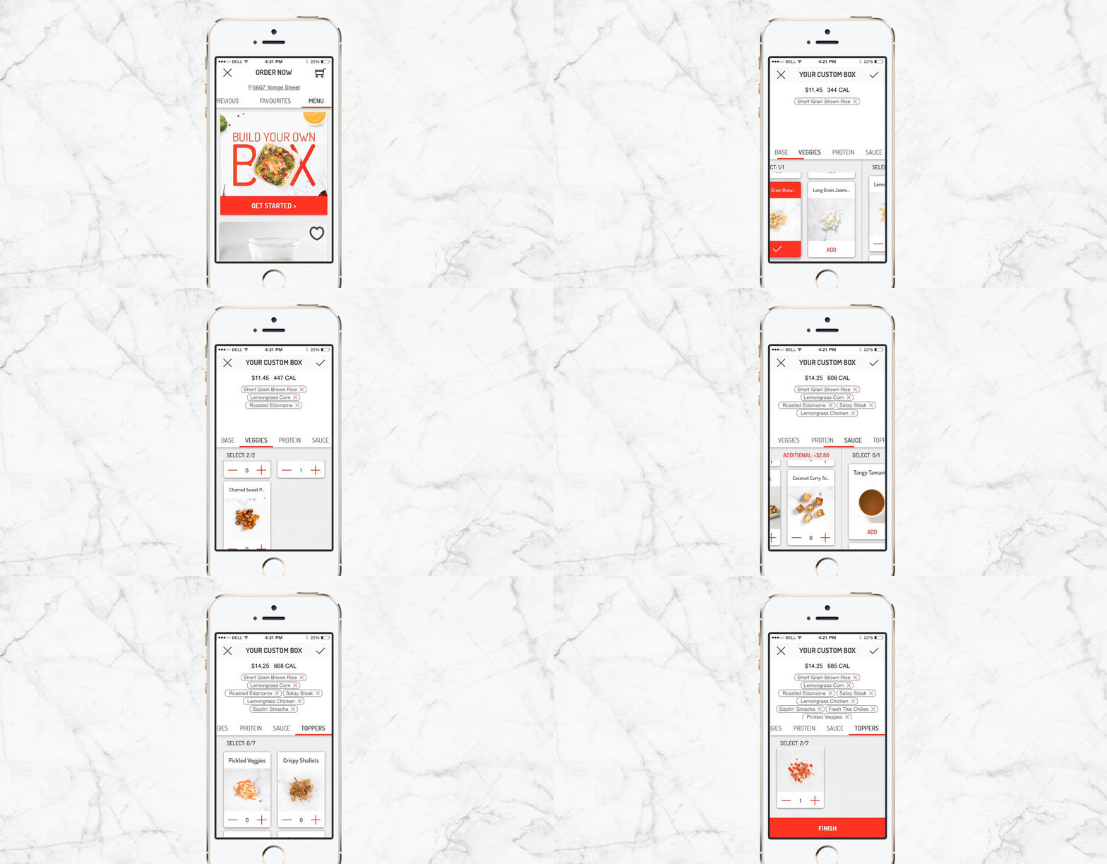
On the Website: The food is the star of the show. It was important to highlight the different ingredients, spices, and sauces in order to communicate the freshness and authenticity of the offering, but we also had to balance that with shots of complete meals that create appetite appeal. Shooting the food on authentic surfaces like bamboo and dark hardwoods bolsters the Basil Box position of being inspired by the streets of Southeast Asia. Contrasted with the white stained wood background of the rest of the site and the hits of the signature brand red throughout, the food really pops, and encourages trial. Messaging throughout the site reinforces the order process and the complete customization that is the hallmark of the concept.
Working with Jump was easy. We know how to execute on the food side, but their understanding of the consumer mindset challenged our preconceptions about Basil Box and in the end delivered a much better restaurant for our guests. They have positioned us for growth out of the gate.
Peter Chiu, Founder & Chief Basil, Basil Box
