Getting the Drop on Cider
Labatt‘s - Alexander Keith's Original Cider
The latest beverage to sweep the liquor market is not new at all. A resurgence in popularity of ciders has elevated the category to one of the fastest growing segments in Canada’s liquor market. Not convinced? In 2011 domestic sales alone were up 14.5% while imports saw a 9.5% increase. Despite the staggering growth in demand apple cider has remained relatively under served in Canada when compared to its market share in Europe and the USA. Realizing the potential of this market opening, Labatt came to us with the concept of a cider offering. Their objective, as outlined by Brand Manager Mike Bascom, was “to develop something for Canadian palates that has a well-balanced refreshing taste and would appeal as a social ritual”. Particularly with the on-set of patio season, “cider’s a really interesting proposition because it enables consumers to have both taste and refreshment all in one”. Crafting an appealing alternative to wine and beer options meant highlighting the distinct refreshment that only a glass of apple cider poured over ice can bring.
Project Type:
Related Projects:
Awards:
2013 — PAC Leadership Awards (Silver Award)
2013 — PAC Leadership Awards (Silver Award)

Labatt‘s first step in the roll out process was selecting an appropriate label from its extensive portfolio to launch the new product. Alexander Keith’s has been brewing quality beers since 1820 with a clearly Canadian social character perfectly suited for this product proposition. An iconic beverage matched with an iconic label set the tone for creating an identity that would chiefly target the young male demographic and dissociate Alexander Keith‘s Original Cider from the overly sweet domestic ciders on the market. The cider is crafted to offer a crisp, refreshing, clean taste with just the right balance of sweet and tart. The package and label design needed to maximize these qualities and highlight Alexander Keith’s Original Cider’s masculine appeal.

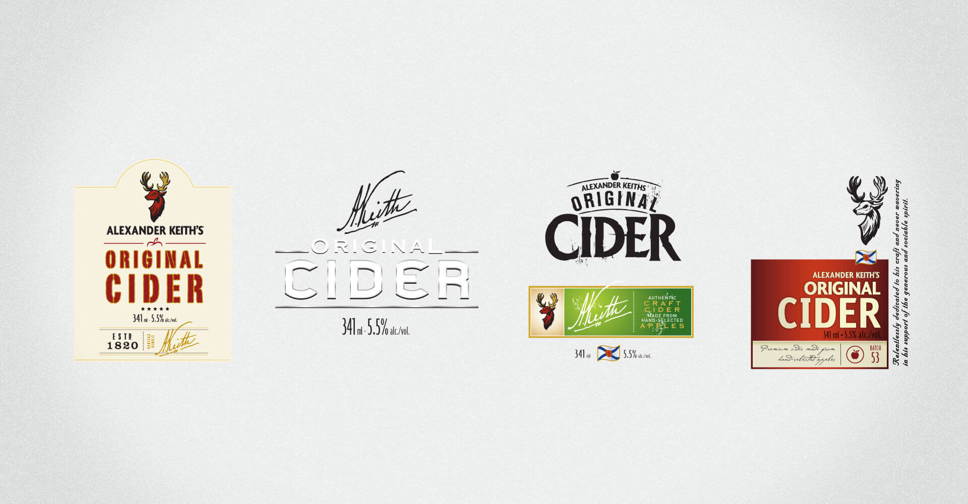
The initial challenge involved balancing the emphasis of Alexander Keith’s brand with that of the product name “Original Cider”. Of chief concern was ensuring the design differentiated the cider in order to clearly communicate that the product was not a beer-line extension in Alexander Keith’s portfolio, in turn avoiding any consumer confusion. Similarly, the beverage packaging design needed to incorporate the light apple cider flavour cues without giving off the appearance of an overly sweetened beverage. Working collaboratively with Labatt in the initial exploratory phases, Jump embarked on creating a beverage packaging design that perfectly tied-in product elements and brand signifiers. Achieving the proper proportioning between the Alexander Keith’s logo and product wordmark entailed a reach-out to consumers. This began with qualitative studies with current Alexander Keith’s customers and existing cider drinkers in which the preferred design options were determined and the most successful designs were tested in quantitative consumer polls.

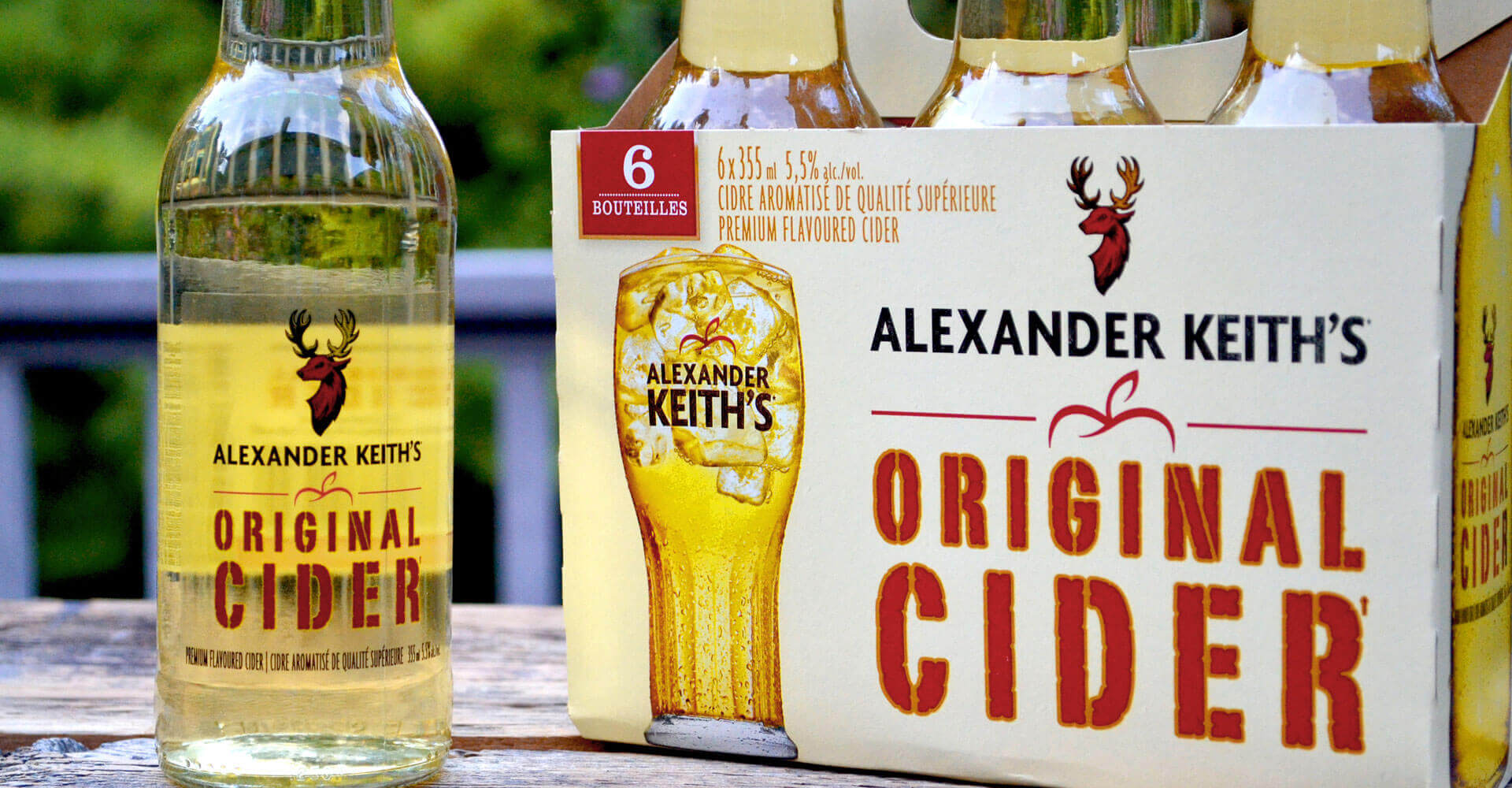
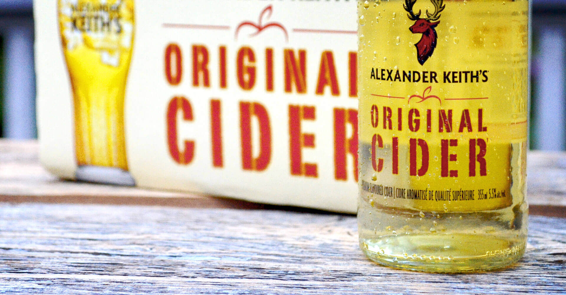
The final design utilizes rustic large-face block lettering highlighting the masculine sensibility that Labatt looked to target, giving the logo a deconstructed, craft feel. The word cider is oversized to maximize on-shelf distinction and communication while the clean design highlights the crisp taste. Clear bottles and cream-coloured cans were employed to elevate the sense of lightness and refreshment and to compliment the simplicity of the logo design. Again looking at the taste, the use of apple imagery is minimal, appearing subtly above the brand’s bold red workmark. The Alexander Keith’s name is featured in smaller bolded-black while the red stag ties in prominently at the top to give the logo a completed look. To elevate the refreshing appeal further, the six-pack carrier features the golden liquid served in an ice-filled glass. This reiterates Labatt’s brand messaging to position Alexander Keith’s Original Cider as an offering to ‘share over ice’ and maximizes the distinct appeal of choosing cider.
Alexander Keith’s Original Cider was rolled out to LCBO locations in April 2012 and launched across the rest of Canada shortly after. The response was very positive. The ‘share over ice’ slogan and light, clean packaging put the brand in peak position to capture a large market share.