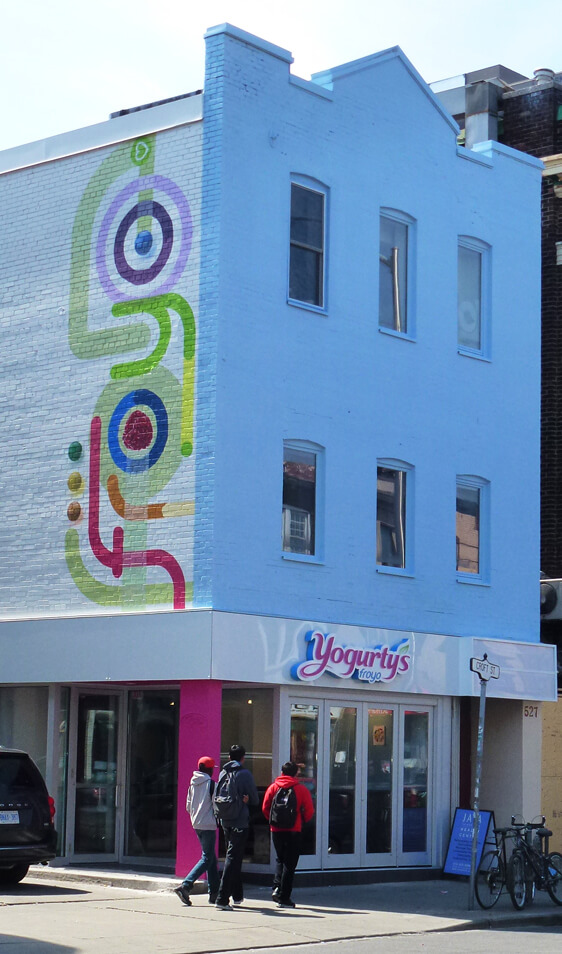
Jump’s Yogurty’s Froyo Logo Design Tags the Side of Bloor West
18, May. 2012

source: www.occasionaltoronto.blogspot.ca
Enter into the new Yogurty’s location at Bathurst and Bloor and immediately find yourself enveloped by the freshness and freedom of their tasty delights. The extensive selection offered at their self-serve froyo bar and the abundance of invigorating and colourful toppings serve as inspiration for the Jump designed environment that pops with bright hues and vibrant graphics. Yogurty’s froyo offers customers the ability to customize their treats according to their personal desires with an emphasis on froyo’s low-fat qualities. Indulgence is guilt-free, and the environment resonates with a feeling of complete satisfaction. Their logo echoes this sensibility with a colour palette and design aesthetic that immediately grabs attention. Bold colour and tone variations integrate with samples of their fruit toppings to create a wordmark that fully encompasses their brand without even using their name.
Yogurty’s recently utilized this Jump design to make their mark on the Bloor West neighbourhood permanent by commissioning Toronto Muralists to recreate this wordmark on a grand scale. The group is known for their ability to replicate any image to any size without sacrificing design integrity. Armed with their seasoned artistry and nuanced painting techniques, Toronto Muralists transformed the side of the building’s facade into a dynamic spectacle of colour that clearly communicates to passersby the Yogurty’s brand and the treats inside.
Whether you were thinking of froyo before or not, once you spot Yogurty’s tag it’s a safe bet you’ll be thinking of it long after. Check out the Youtube video to see how Toronto Muralists skillfully recreated Jump’s design into a Bloor Street staple.
If you haven’t checked out Yogurty’s yet, make sure not to miss out this summer! Since opening the response has been unbelievable at each location, just look at what happened last June on Avenue Road…